1. FRONT COVER ANALYSIS
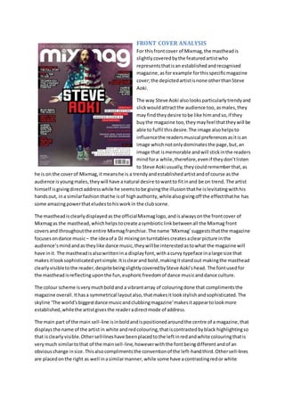
For thisfrontcover of Mixmag,the mastheadis
slightlycoveredbythe featuredartistwho
representsthatisan establishedandrecognised
magazine,asfor example forthisspecificmagazine
cover;the depictedartistisnone otherthanSteve
Aoki.
The way Steve Aoki alsolooksparticularlytrendyand
slickwouldattractthe audience too, asmales,they
may findtheydesire tobe like himandso,if they
buythe magazine too,theymayfeel thattheywill be
able to fulfil thisdesire.The image alsohelpsto
influencethe readersmusical preferencesasitisan
image whichnotonlydominatesthe page,but,an
image that ismemorable andwill stickinthe readers
mindfora while,therefore,evenif theydon’tlisten
to Steve Aoki usually,theycouldrememberthat,as
he is on the coverof Mixmag,itmeanshe is a trendyandestablishedartistandof course as the
audience isyoungmales,theywill have anatural desire towantto fitinand be on trend. The artist
himself isgivingdirectaddresswhile he seemstobe givingthe illusionthathe islevitatingwithhis
handsout, ina similarfashionthathe isof highauthority,whilealsogivingoff the effectthathe has
some amazingpowerthateludestohisworkin the clubscene.
The mastheadis clearlydisplayedas the officialMixmaglogo,andisalwaysonthe frontcover of
Mixmagas the masthead, whichhelps tocreate asymbioticlinkbetweenall the Mixmag front
coversand throughoutthe entire Mixmagfranchise.The name ‘Mixmag’suggeststhatthe magazine
focusesondance music– the ideaof a DJ mixingonturntables createsaclearpicture in the
audience’smindandastheylike dance music,theywillbe interestedastowhat the magazine will
have init. The mastheadisalsowrittenin a displayfont,with acurvy typeface inalarge size that
makesitlooksophisticatedyetsimple.Itisclearand bold,makingitstandout makingthe masthead
clearlyvisibletothe reader,despitebeingslightlycoveredbySteve Aoki’shead. The fontusedfor
the mastheadisreflecting uponthe fun,euphoricfreedomof dance musicanddance culture.
The colour scheme isverymuchboldand a vibrantarray of colouringdone that complimentsthe
magazine overall.Ithasa symmetrical layoutalso,thatmakesitlookstylishandsophisticated.The
skyline ‘The world’sbiggestdance musicandclubbingmagazine’makesitappeartolookmore
established,whilethe artistgivesthe readeradirectmode of address.
The main part of the main sell-line isinboldand ispositionedaroundthe centre of a magazine,that
displaysthe name of the artistin white andredcolouring,thatiscontrastedbyblack highlightingso
that isclearlyvisible. Othersell-lineshave beenplacedtothe leftinredandwhite colouringthatis
verymuch similartothat of the mainsell-line,howeverwiththe fontbeingdifferentandof an
obviouschange insize.Thisalsocomplimentsthe conventionof the left-handthird.Othersell-lines
are placedonthe right as well inasimilarmanner,while some have acontrastingredor white
2. highlightedbackgroundtoitor simplynone atall.We thensee that the barcode is clearlyvisible on
the bottomright handcorner.The sell-linesare also verymucha key role inattractingand enticing
the target audience of Mixmagastheywill make the readerwantto purchase andread the
magazine astheywill wantto findout the storybehindthem.
In conclusion,the Steve Aokifrontcoverof Mixmagiseffectivein attractingthe musicmagazine’s
target audience,asithasmany elementssuchasa vibrantcolourscheme,a dominatingmainimage
and effective use of mode-of-addresstoappeal tothe readerandmake themwant to purchase the
magazine.Itwill be successful indrawinginthe targetaudience asithas createdthe frontcover
withtheminmind;everyinchof detail onthe frontcover somehow appealstothe audienceinone
wayor another.Also,the elementsstatedabove as well asmanyotherelementsonthe frontcover,
combinedtogethermeansthatthe audience will definitelybe attractedtoandinterestedinthe
magazine.
For thisfrontcover of Mixmag,the mastheadisslightlycovered
by the featuredartistwhorepresentsthatisanestablishedand
recognisedmagazine,asforexample forthisspecificmagazine
cover;the depictedartistisnone otherthanCarl Craig,who isa
Detroit-bornmusicproducerthatspecialisesinTechnomusic.
The artist himself isgiving directaddresswhile he isholdingupa
little blackdogthatcomplimentshisoutfitandbackground.His
outfitconsistsof a suitthat isunbuttonedatthe top as he gives
directaddresswithanintimidatinglookonhisface.The use of
dog relatesandcomplimentsthe mainsell-line’ssubtitle,
‘Techno’sTopDog’ foreffect.
The mastheadisthe Mixmaglogo;thisisa commonconvention
of magazines.Ithelpstoreinforce andmaintainalinkbetween
all theirplatformsof media,either itbeingtheirwebsite,differentissuesof magazines,appsona
smartphone andmore. The audience will understand the name ‘Mixmag,andthe two‘M’sat the
beginningof the twowordswill help the name of the specifiedmusicmagazinestayinthe readers
mindas it isshortand soundscatchy.
The colour scheme isverymucha mixture of dark andlightcolourslike white,lilacandblack, anda
mysterious arrayof colouringdone thatcomplimentsthe magazineoverall. The blackandwhite
coloursgive Mixmaga mature feel asthisisa classiccolourcombination,whichappealstomature
malesintheirtwenties,ratherthan those whoare in theiryoungerteenage years. The skyline‘The
world’sbiggestdance musicandclubbingmagazine’makesitappeartolookmore established,while
the artist givesthe readeradirectmode of address inorderto give a sense of intimidationand
authorityoveranyone lookingatthe frontcover,promptingthemthattheyhave tobuy this
magazine inorderto please him. Aswithkeepinginwithbrandidentity,there is nofeature article
photographswhichmaintains Mixmag’sbrandidentityandkeepsthe trendyfeel tothe magazine,
goingwiththeirsimplisticlayout.
3. The main part of the main sell-line isinboldandispositionedaroundthe toplefthand cornerof the
specified magazine,thatdisplaysthe name of the artistinwhite andlilaccolouring,thatis
contrastedbyblack highlightingsothatisclearlyvisible forthe readertosee andacknowledge.
Othersell-lineshave beenplacedtothe left inlilacandwhite colouringthatisverymuchsimilarto
that of the mainsell-line,howeverwiththe fontbeingdifferentandof an obviouschange insize.
Thisdoesn’talsocompliment the conventionof the left-handthirdasmostof the sell-linesare
positionedtothe rightinstead,whichtokeepthe mainimage forclearerandvisible tothe reader.
Othersell-linesare placedonthe left;yetdonothave a highlightedbackgroundtothem.We then
see that the barcode isclearlyvisibleonthe bottomrighthandcorner. The sell-linesonthe coverare
alsoquite importantin orderto pull the targetaudience in;theygive the audience asneakpreview
as to what will feature inthe magazine.