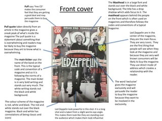
1. Front cover
Puff says ‘free CD’
makes the consumer
feel that they are getting
a good deal and may
persuade them to buy
the magazine.
Led Zeppelin are in the
center of the magazine,
they are the main focus.
They are very iconic. They
are the first thing that
people will see when they
look at the magazine and
because they are very well
known consumers will be
likely to buy the magazine.
They use direct mode of
address which creates a
relationship with the
reader.
The main kicker says the
name of the band on the
front. This is the typical
code and convention of a
magazine and so it is
following the norms of a
magazine. The main kicker
is in very bold writing and
stands out very much. The
white writing stands out
the black and white
background.
The Masthead is in a large font and
stands out over the black and white
background. The title has a drop
shadow which adds focus to it. The
masthead appears behind the people
on the front which is often used on
magazines and therefore follows the
codes and conventions of a typical
magazine.
Pull quote taken directly from an
article in the magazine gives a
sneak peak of what's inside the
magazine The pull quote is a
statement about something that
is overwhelming and readers may
be likely to buy the magazine
because they ant to know what is
overwhelming.
The word ‘exclusive’
gives the magazine
exclusivity and will
persuade the reader
to buy the magazine
because they want to
be involved in the
exclusivity.
The colour scheme of the magazine
is red, white and black. The red and
white stands out over the black
magazine. Black and white has
connotations of being classic and
iconic
Led Zeppelin look powerful in this shot. It is a long
shot and is taken from a slight worms eye angle.
This makes them look like they are standing over
the audience which makes them look influential.
2. Contents Page Colour scheme has been
carried on from the front
page. This is a typical code
and convention of a
magazine. The two main
colours used are dark,
intense and mysterious.
The red adds a bit of
brightness to the page
The masthead is white and
stands out over the black
background. They have used a
shadow to make it bolder and
stand out more to attract the
attention of the reader. The
masthead is at the top of the
page which is a typical code and
convention of a magazine
The date is an important
feature as it identifies how
current the magazine is and
when it was published.
The main image is a long
shot of the guitarist from
Led Zeppelin, who is
shown on the front cover.
It is the only image on the
page which indicates it is
the main feature of the
magazine
The sub headings are in capital
letters and are black and bold
which stands out. The subheadings
show the reader what the main
features of this magazine is. The
colours relates to the colour
scheme of the rest of the
magazine.
Brief headings and summary of content
with page number . The brief headings
are positioned under the sub headings
which gives a brief explanation of
which each article is about to tempt the
reader to read the articles and
therefore buy the magazine. The page
number is in a bold red font which
indicates it is slightly more important
The writing is on
the left hand side
which follows the
rule of thirds.
There is a issue number on the top,
telling us that MOJO has published
229 magazines. This shows that it is
a very successful, popular
magazine.
3. Double Page SpreadLots of pull quotes are
used throughout the
article which will entice
the reader to read the
whole article
The text is in
capital letters
which is slightly
informal as their
audience are
mostly teenagers
who do not want
everything in the
magazine to be
formal The white
bold text stands
out over the dark
background.
The colour
scheme is the
same as the front
page and the
contents page.
This shows
continuity
throughout the
magazine and is
also a code and
convention of
magazines
The article uses columns which follows
the codes and conventions of a double
page spread.
The pictures on the article are of members of the
band that the article is about. In this image, the band
member Is wearing sunglasses however it seems as if
he is using direct mode of address, which forms a
relationship with the reader.
This picture shows an action shot of the
band member on stage, holding a guitar,
it is of the band rehearsing backstage and
so the reader may feel this is an exclusive
photo that only you can get by reading
the magazine.
The fonts and colours used are bold ,
which suggests that the bands
personality is bold.
The style of the text
is laid out clearly and
makes the page look
easy to interpret.
The structure is well
ordered and the
photograph is
positioned
underneath the
article, therefore not
interrupting the text
and distracting the
reader from the
article
The article is a
questionnaire and the
questions are in bold which
gives the reader a simple
way to differentiate the
questions from the
answers. This is a typical
code and convention of
magazine