VIP ℂall Girls Hazira 8527049040 WhatsApp AnyTime Best Surat ℂall Girl Serviℂ...
Contents analysis
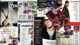
1.
2. Image: The contents page has a full bleed
image of Kanye West as the centric focus on
the page. The contents has no supporting
images therefore no distraction from the
main image. The meaning behind this could
be to draw the attention of their target
audience who would be interested in an
urban artist like Kanye West. The magazine
plays on the interests of who they are
trying to attract through more visuals then
text. Another way the magazine captures
their audience is through the direct address
of the studio image. This is done to allow
them to connect with the artist on a
personal level and relate to an aspiration of
theirs.
Title: The title saying ‘contents’ is visibly
spread out over three lines to create this
authentic, retro look. This makes the title
stand out more but is done in a way that
the reader can still understand it through
the alternative layout. Its bold, black impact
font suggests the magazine is trying to
make a statement and reflects the style of
the company representative of the urban
music industry.
Text: The actual contents is featured on the side
showing its lack of significance compared to the full
bleed image taking over the page. The micro size text
is almost being pushed to the side to indicate that the
text is not as important but almost has to be there as
a compulsory feature of the magazine. The fancy font
used does make the page look classy and
sophisticated which contrast the bold statement font
used for the header. This could simply be to
differentiate between the titles or could be to fit with
the urbane style of the page with Kanye West being
dressed in formal attire. The contents is divided into
two sections, feature and fashion, which effectively
allows the reader to know where to turn to in the
magazine depending on what they would like to read.
Page numbers is also a key feature on a contents page
to help the reader navigate their way through the
magazine.
In terms of the colour scheme, the contrasting shades
of grey and the black text establishes a serious tone
to the page and creates a sense of mystery.
Strengths: the contents page is very eye-catching and
grabs the attention straight away with the use of
image and the colour scheme effectively reflects the
mysterious and sophisticated look of the magazine.
Weaknesses: Contents text could be larger to make it
easer to read and more detail to give more
information to the reader about what will be
discussed in the magazine.
3. Layout: Q magazine use a similar layout
for all of their issues by having detailed
and bold subheadings for their whole
contents surrounded by supporting
images and a bigger studio image as a
centric focus. This is effective because the
layout design means a lot of information
can fit onto the page and each section is
unique through the variety of colours and
fonts. For example, this page clearly
displays the feature section in red so it
stands out more than any other category
such as the ‘Q review’.
Images: the main image is a close up of
the British singer/ song-writer Adele. This
tells us as the reader that the main article
will be a feature on Adele and it is clearly
titled underneath the image along with
the page number to allow the audience to
easily find their way to this article. The
close up studio shot shows the artist
giving the reader direct address with the
aim of creating a connection between
Adele and the readers who would also be
a fan of her music. The supporting image
in the Q review section effectively makes
the contents page more intriguing and
visually pleasing. It adds a lot more detail
to the page making it clear to the readers
that the issue will be very informative.
Text: each section is clearly divided and has its own
unique style which differentiates them and makes it
easier for the reader to establish the most
interesting and significant pats of the inside
contents. The block capital listings under each
subheading is effective at establishing what the issue
will contain and it highlights the key aspects so it
doesn’t look too wordy which would bore their
readers. Any other information that is less relevant is
still on the page however is displayed in smaller
lower case typography underneath the titles to give
more of an insight into what each feature is about.
Furthermore, the titles are unique to the ‘Q’
magazine. For example the page includes the ‘Q’
review which is done to build on the brand name
and maintaining consistency of the name throughout
making it more recognisable and known. The page
numbers are also placed in a contrasting colour to
the actual text to make it easy for the reader to
identify and navigate their way to their preferred
article. Another way of maintaining consistency and
enticing their readers is by having a ‘every month’
feature on every contents page. This gives the reader
an insight into what will be in every month’s issue of
Q and keep them hooked onto buying every issue
that is released. The reader knows what to expect
and if they are an fan of what Q offer, it would make
them want to purchase the magazine consistently
serving the interests of the company.
4. In comparison to other magazine contents pages,
Kerrang’s are visually a lot more detailed and they
stray away from the simplistic look. However the fact
that the page is very colourful, messy and loud
reflects the image the magazine is trying to create.
The well known rock magazine would want to create a
rough, edgy look to be associated with their genre of
music. It is evident that even from the initial page
inside the magazine, the company aims to entice their
readers straight away with the use of competitions,
posters and subscriptions. The contents is seen to be
the last significant aspect on the page because a lot of
text would essentially put the target audience so
more visuals is more impactful.
Image: The image is seen to be the centric focus of the
page and its main aim is to persuade its readers to
engage in this competition. The image insinuates that
if they entered the competition they would have a
chance of meeting the famous boy band that the
target audience are fond of. This image differs from
the ones used on other magazine contents pages as
they aren’t glorifying the artists as much, as the shot
is quite a casual studio shot, unlike Q who use quite a
dramatic close up. This reflects more of a relaxed,
chilled atmosphere making the audience feel
connected with the artists. Similar to Q, the page uses
supporting images to make the image a lot more full
and exciting. The use of advertising in the bottom
right corner is also used as a way of keeping its target
audience hooked on to the product.
Text: Each article in the contents is separated
into sections for ease of the reader. The
contents is placed down the right hand side of
the page being almost taken over by the
enlarged image. The use of yellow subheadings
makes the image vibrant and stand out to draw
the attention of the audience so they are aware
of what they can find inside. The individual
contents listed underneath each subheading is
presented in bold to highlight the most
necessary parts for the audience to read. The
least important information is displayed in
lighter typography to not draw much attention
to it. The page numbers are also situated next
to each subheading in red to make it clear to
readers and obvious where they can find the
particular article they would prefer to read
about.
The fact that the editor is featured on the
contents page with a separate article shows
that the magazine has a personal element to it
and tried to keep their readers connected to
the behind the scenes creation of the product.