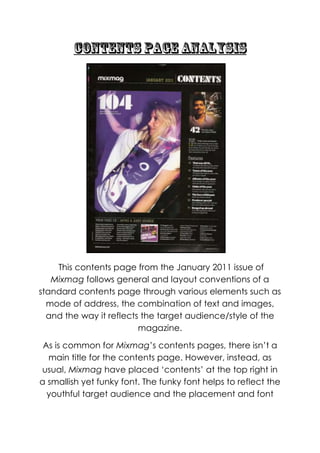
1. This contents page from the January 2011 issue of
Mixmag follows general and layout conventions of a
standard contents page through various elements such as
mode of address, the combination of text and images,
and the way it reflects the target audience/style of the
magazine.
As is common for Mixmag‟s contents pages, there isn‟t a
main title for the contents page. However, instead, as
usual, Mixmag have placed „contents‟ at the top right in
a smallish yet funky font. The funky font helps to reflect the
youthful target audience and the placement and font
2. size helps to keep the magazines sophisticated yet
simplistic layout look organized and spacious.
Again, as is common with Mixmag‟s content‟s page there
is very few images; here we see a maximum of two. This is
conventional, however, as it has more than one image
and also features a main image on the left hand side of
the page along with a smaller feature article photograph
on the top right. Firstly, we see the main image which is on
the left hand side of the page; it is of a girl in a club/rave
setting and she looks as if she is dancing and having fun.
To her right hand side, there is the list of contents which
has a feature article photograph of a man stood in an
outdoor type setting. There is no genre specific
iconography in any of the images breaking conventions,
however the fact that the feature article photograph
features a male who is stood alone which is common in
Mixmag as it signifies that the male is a DJ and therefore
signals genre (if the audience saw a band there they may
feel confused as to what genre Mixmag is; indie/rock or
dance?). The images will be effective in drawing in the
reader because they will remind them of nights out with
friends and connote a sense of fun within the contents
page; they will make the reader want to read on as the
pictures look effortlessly cool – the reader will want to be
on trend.
The list of contents is placed on the right hand side and
looks spacious and organized. It has a list of various
„features‟ and above it there is a „VIP‟ section which has
a special article listed. Below the main image and list of
contents, the audience can see a horizontal column
3. which has information about the cover mount, a free CD,
therefore it has track listings. The list of contents is
presented to the audience in a friendly informal way
through use of mode-of-address such as “tunes of the
year”. The list of contents is divided into sections of main
features such as “banged up abroad” and “that was
2010...” and these suggest that audience is cool and fun;
they understand the colloquial language, making them
feel clever and can also relate to it. Therefore they will be
attracted to magazine as they will feel it is on their
wavelength. It also makes the contents appear organized
and gives the audience easy to access the articles. The
text is in a normal serif, small white font and stands out
against the white background, whilst the „contents‟ title at
the top of the page is presented in a funky font which
matches the big page numbers (104 and 42) on the two
images. This creates a symbiotic link; the entire font is in
white and the page numbers and contents title have the
same font, making Mixmag‟s contents page look
professional and sophisticated.
The layout is also creating a strong symbiotic link and
maintaining Mixmag‟s brand identity; it is the same layout
used every issue, with the main image being on the left
hand side, the contents list being on the right with
information about the cover mount in a horizontal column
on the bottom of the page. The choice of layout is
simplistic; it only has one main image which is the central
focus of the page. The list of contents on the left isn‟t too
text heavy – unlike inside the magazine – therefore it
doesn‟t intimidate the reader who may be put off by a
4. text heavy contents. It also creates a symbiotic link
between the magazine itself as Mixmag tends to follow a
simplistic layout on the cover, contents page and
throughout the magazine, with text being in columns and
lists.
The colours which dominate the contents page are black
and white; however, the same can‟t be said for the main
image which is a violet shade, with random colours (from
the lights of the club/rave she‟s at) appearing subtly on
the image. The black and white colour scheme is key as it
reflects the target audience‟s hobbies and the genre it
promotes – it reminds the audience of the night time,
which is when they would go out to a club or a rave and
listen to dance music. The colours are also very basic
colours and so it emphasises Mixmag‟s simplistic layout
whilst also reflecting the serious side of the target
audience. The fact the background is black and the text
is white also suggests that Mixmag isn‟t afraid to break
boundaries and twist conventions as usually the
background of the contents page is white and the text is
black. There is also a subtle use of yellow on the contents
page which helps to maintain brand identity as in most
other contents pages Mixmag‟s key colour scheme is
yellow, black and white. The use of colour in the main
image is also key in attracting the reader; it makes the
image look vintage and the random use of coloured
lights connotes the fun side of the readership – although
they are hardworking individuals who take dance music
seriously, they like to have fun and let loose occasionally.
5. The fonts and typefaces that are used on the contents
page are significant as some of the text (the list of
contents) is written in a more basic, everyday type, small,
serif font whereas the „contents‟ title and the page
numbers are written in a large display font. This again
conveys the reader‟s fun and serious sides to them – the
normal everyday font being used on the list of contents
shows that they take dance music and what‟s in the
magazine very seriously as they are passionate about it,
whereas the „contents‟ title and page number makes the
page look more aesthetically pleasing, reflecting the
readers fun side, showing that they can let loose. The
display font used for „contents‟ and the page numbers on
the images create a funky vibe on the page and reflect
the audience is a young audience. The fonts also
maintain brand identity and create a symbiotic link for
Mixmag – it is known for using funky, out-there fonts in its
magazines.