SlideShare a Scribd company logo
1 of 18
MARKET RESEARCH
Karis Hays
ROCK SOUND
The media pack
starts off by
highlighting all the
ways you can access
the magazine giving
it multiple uses and
the audience can
use it when they are
out and about as
well.
The media pack also gives the
reader key information about
their audience, for example it
shows that the amount of
people who read the
magazine is bigger than the
amount of people who buy it.
It also advertises
there social media
sites and gives the
reader key
information on how
to find more
information about
their magazine and
how to become
more involved.
They also have a
page explaining to
the audience who
they are and what
they do. They brag
about how they have
used big rock bands
like Paramore as
some of their front
covers, it also adds
the information of
what your issue of
Rock sound includes
i.e.. a free CD.
They also have
highlighted the fact
that they have a
partnership with
Impericon, they’ve
highlighted it to
draw more
attention to the fact
that they are in
partnership with
someone who
creates the ‘best
live music’.
The British copy of Rock
Sound was launched in March
1999 by the French publisher
Editions Freeway. The
magazine was then bought
out by its director, Patrick
Napier, in December 2004.
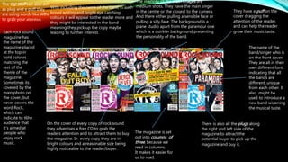
Each rock sound
magazine has
the name of the
magazine placed
at the top in
bold colours
matching the
rest of the
theme of the
magazine.
Sometimes its
covered by the
main photo on
the cover, but
never covers the
word Rock,
which can
indicate to t6he
audience that
it’s aimed at
people who
enjoy rock
music.
The name of the
band/singer who is
on the front cover.
They are all in their
own different font,
indicating that all
the bands are
different, unique
from each other. It
also might be
used to introduce a
new band widening
the musical taste.
On the cover of every copy of rock sound
they advertises a free CD to grab the
readers attention and to attract them to buy
the magazine. In every copy they are in
bright colours and a reasonable size being
highly noticeable to the reader/buyer.
The majority of the main images are
medium shots. They have the main singer
in the centre or the closest to the camera.
And there either pulling a sensible face or
pulling a silly face. The background is a
plane studio apart from the paramour one
which is a quirkier background presenting
the personality of the band.
There is also all the plugs along
the right and left side of the
magazine to attract the
potential buyer to pick up the
magazine and buy it.
With including the name of the band in such
broad writing and bright eye catching
colours it will appeal to the reader more and
they might be interested in the band
meaning they pick up the copy maybe
leading to further interest.
They have a puff on the
cover dragging the
attention of the reader,
and can help the reader
grow their music taste.
The magazine is set
out into columns of
three, because we
read in columns.
It makes it easier for
us to read.
The top stuff can also act
as plug and a puff they
are using words like WIN!
to grab your attention.
A list of the main
feature of the magazine
are listed with the page
number next to them,
not all the numbers are
listed only listing the
articles that are
plugged on the cover. It
is then followed by
extra information and a
brief explanation of
what's happening in the
article. The number is
bigger than the rest of
the text emphasising
the page to read. Its
also in a different
colour compared to the
text.
The name of the artist is
in bold white writing,
making it known of the
artist, with this being
next to the number
indicating to the reader
who is included to the
article.
The main image matches the cover
picture; which is used as a plug to get
people to buy their magazine, this
might be the main reason they
bought the magazine. The picture is a
very intense picture with it being a
medium close up creating a closer
bond with the artist.
This quote can act as a plug to
keep the reader interested, by
giving a quote it also gives an
insight into what to expect from
the article.
The colour theme is blue, white and black,
they all contrast each other causing the
words to stand out and grab your
attention. With the black background it
contradicts the white and blue.
75% picture
25% writing
The tracking
between each
line is even ach
time creating an
equal look to the
magazine.
The main image is sometimes
related to the main image on the
cover and in the contents page, it
reflects the personality of the band
as a whole. If the reader has never
heard of the band its sort of like an
introduction/first impression of the
band/artist. The main image takes
up the whole of the spread with
the writing over the top of it. Its
taken in a re-make of a studio with
very low dim lighting. It acts as a
visual effect to help put an image
with the article.
The pull quote attracts the reader
by pulling out an interesting part
of the article later on making them
want to find out more from what
they are talking about.
The leading text acts as
an introduction to the
audience, like they are
introducing the artist
and giving them
background information
of what to expect from
the up coming article.
The drop cap lets the reader
know that the beginning of
the story theses are used
because they are associated
with fairy tales which we are
used to from when were
younger, they are also used
for a stylistic feature making
the article look more
efficient.
The gutter is used to separate the text into
columns making it easier for the reader to read.
The tracking between the texts as well makes the
texts easier to reader but also gives it a classy
effect by being separate.
The layout of the magazine spread has the
image on the right hand side with the main
article to go with the image on the left side. It’s
a very spread out spread giving the image a lot
more visual attention. This sort of layout makes
it very easy to navigate yourself around the
magazine creating a very simple effect.
This can act as a inside magazine plug, because if
the reader is just briefly reading over this can drag
their attention to this imparticular article. This is also
seen as graphic art for visual pleasure of the reader.
The layout of the main title of the band is
bright with using the white on red
combination they contrast each other
making it more eye-catching. Its also in
gender neutral colours not stereotyping
the bad to any gender making it more
open.
The dominant image
is 50% but the hole
image goes behind
the 50% ratio of text.
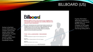
BILLBOARD (US)
Similar to the Rock
sound media pack this
contains some of the
statistic about their
reader/buyers. It gives
information you
wouldn’t expect them
to now like their
household income.
It gives information
about the magazine, it
exaggerated it to sound
like this amazing
company, as the reader
we don’t know if this is
true but go along with it.
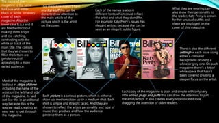
The name of the
magazine is the same
font size and either
black or white on every
cover of each
magazine. Also the
lower case b,o,a and d
are filled with colour
making them bright
and eye catching,
contrasting with the
white or black of the
main title. The colours
that they’ve chosen to
fill in the letters are
gender neutral
appealing to a more
varied audience.
Each picture is a serious picture, which is either a
close up, medium close up or a medium shot. Each
shot is simple and straight faced. And they are
chosen to reflect the artists personality and type of
music they produce and how the audience
perceive them as a person.
Each of the names is also in
different fonts which could reflect
the artist and what they stand for.
For example Katy Perry’s issues has
elegant writing because she can be
seen as an elegant public figure.
There is also the different
setting for each issue using
either a coloured
background or using a
white or grey one. On each
magazine there’s a lot of
white space that hasn’t
been covered creating a
deeper focus on the artist.
What they are wearing can
also show their personality to
the reader, Katy Perry is known
for her unusual outfits and
these are displayed on the
cover of this magazine.
Most of the magazine is
laid out in strips of three
including the name of the
artist on the left hand side
of the magazine, its laid
out like this in an editorial
way because this is the
way we read, creating an
easy way to get through
the magazine.
This magazine doesn’t have
any top stuff this can be
done to draw attention to
the main article of the
picture which is the artist
on the cover.
Each copy of the magazine is plain and simple with only very
little added plugs and puffs this can draw the attention to just
the artist/artists. It also creates a very sophisticated look
dragging the attention of older readers.
The main logo of the
magazine is repeated
throughout the magazine,
making it branded to the
reader and ensuring the
reader knows what they
are reading. And makes
this sense of consistency
so when they see this
logo they know what
company it is .
This list of their personal
charts, recommending
music to the reader
widening their music
capacity. It takes up 35%
of the contents page
showing its importance to
the reader and making
sure that they have drawn
their attention to it.
Acts as a plug and helps the reader navigate
themselves to wherever the feature might be.,
can drag the attention towards the article with
the use of the image.
The layout of the magazine is very cramped
and there is a lot of content going on, this
much information can cause the reader to
become distracted but can also make the
magazine look like it has a lot more content
than it really does; especially having the chart
list on the left hand side it makes it very
cramped.
The sub headings can act as a plug as
well by only giving a glimpse of what
the article is about its dragging the
readers attention to what is to be
included in the magazine.
The added extras at the bottom are
advertisements for the added
subscriptions that come with the
magazine, it gives the purchases a
wider variety of ways to access the
magazine, causing its popularity to
rise. Its encouraging the reader to
buy more magazines before they’ve
even bought the magazine.
The main image isn’t very eye catching and only takes up a
small proportion of the page leading to he reader being
confused with what the image is linked when in matter of
fact it is ,linked to the main article. Personally I would like
the main image to be bigger and have more indication of
what it is linked to.
The main heading is placed
on the left hand side of the
magazine along with the
text that falls into columns.
The font represents what
the words are saying, the
boldness of the word
‘fiercely’ is in bold writing
this later on creates a
fierce look for the word.
Whereas ‘creative’ is in a
font that isn’t normal but is
seen as artistic standing for
creative. This also
juxtapose the girly pink
background. The size of
the texts also shows it
going over the middle
crease showing just how
big it has been written in.
The caption is in the top right
corner and says ‘women of the
year’ this informs the reader that
the women that they will be
reading about is most likely
going to be famous. By using the
colour white which contrasts with
the grey back ground it causes it
to stand out and become more
eye-catching for the reader and
giving them more information
about the person in the article. It
could also act as a plug to grab
the readers attention.
There are two columns of writing in this article located on the left hand
side of the page underneath the main heading, by using columns to
read in the article is then easier to read and saves the reader time.
With their being quite a bit of writing by placing it on the right hand
side that would be the first thing they see and could instantly put them
off the upcoming article.
The main image is placed on the right hand side of the page, and takes up
the whole of the page this has been done so when the reader turns to this
page it is the first thing that you see immediately catching your attention.
The image is also very unusual also making it eye-catching.
The leading text includes words like ‘honoured’ implying to the
reader that what she has been awarded is a very big deal in the
music industry, it’s also written in smaller writing than you of
expected kind of contradicting it’s self of being a massive important
thing.
The first three words ‘fans are still’ is used as a cap drop it
starts of the sentence but in a very bold way it grabs the
readers attention straight away from the first line. This can
also be a puff for the reader as well.
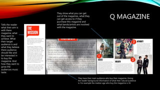
Q MAGAZINE
Tells the reader
what their aim is
with there
magazine, what
they want to
achieve. What
their target
audience is and
what they believe
there audience
should like and
be interested in
to buy the
magazine. And
how they want to
grow the
audiences music
taste.
They have their main audience who buy their magazine. Giving
the reader background information of what their natural audience
is. For example the median age who buy the magazine is 34.
They show what you can get
out of the magazine,, what they
can get access to if they
purchase this magazine and
what bands/artists are involved
with the magazine.
On the cover of every
magazine the ‘Q’ is
always in the left corner
of the magazine, with a
red background and
white writing for the Q.
its bold and appealing
for the reader. It’s also
memorable and simple
but still remains in your
mind. The colours are
also gender neutral
showing there is no
specific gender the
magazine is aimed at.
All of the pictures on the front cover are
medium close ups, focusing on the
artist/bands face. It creates an intimate
relationship between the reader and the
artist. It also makes it clear who they are and
what they create.
All the pictures are set in a studio not taken in an outside
location. The women always have dramatic make up and
are being really poesy. Whereas the boys are just plain but
put across their own individual styles. For example the Tinie
Tempeh issue has him wearing his signature sunglasses,
which people will recognise when seeing the copy will
recognise who it is.
Each copy has the
additional information on
the side on what else you
can get out of the
magazine. This could be
used to make the magazine
look busier than it actually
is and persuade you to buy
it. Makes it look packed
with information. These are
called plugs, they pull in
the readers by intriguing
them by what's inside.
At the top of some of the Q magazines they
have the words ‘The UK’s biggest music
magazine’ it’s boasting to the reader that
they are a highly popular magazine, by
seeing the word ‘biggest’ it emphasises to
the reader and persuades the reader that
they are the best of the best and can help
on part of the magazine as a selling point.
The magazines look very
crammed to create a busy look
and to make it seem jammed
packed full of information
when in reality it’s not. Its
crammed with puffs and plugs
gaining the attention of the
potential reader and making it
seem amazing.
On the cover with Tinie
Tempah the font of
which his name is in,
looks like a signature
creating a closer bond
with the viewer.
The layout is what you would traditionally
expect from a magazine, the main image is on
the right hand side and takes up the majority of
the page, this image is also linked to the main
story which is advertised on the front cover. The
contents uses a strong contrast between black,
white and red. The main titles are bold ad in
bigger writing compared to the rest of the
writing. The contents can also be used to assure
the reader knows exactly what they are looking
for. Using red for the page number creates a
neat and classy look to the page and gives it an
over all good first impression to the reader.
Date of the publication is used to show
that it is all up to date content and not
out of date. All the content is relevant.
The main columns on the
contents page is the main
feature section which shows
what is going to be featured
in the magazine; which also
comes with a brief
description of what is
included. They also have a
different colour for the page
number to act as a plug to
show where abouts in the
magazine they have to go to
get the article that draws
attention to them. The
contents of the special
edition matches the
advertisement on the front
cover adding a colour
scheme and a theme to the
magazine.
The logo for Q magazine is
aliened with the title of the page
‘contents’ they are both in bold
font showing there importance to
the reader. Q is in a red box which
follows the house theme of the
whole magazine.
At the bottom right hand corner there is
a review section where the list the pages
numbers they are on and give a brief
overview of what is available in the
article, this can show that Q is a very
trustworthy company if people trust
there reviews and there content. The title
is in bold writing showing the
importance of the review section and
showing it is another part of there
magazine.
They have a ‘every month column showing what is popular
within there magazine that they bring it back monthly for the
enjoyment of there readers.
With the picture of Lady
Gaga taking up the whole
of the left hand side it
shows her power and
relevance to the article. It is
also quite a risky photo to
be including in a magazine
but in a way it shows who
she is and what she’s about
and maybe how much
sophistication Q magazine
has. With the filter of the
image being grey it adds
and artistic style to the
magazine, maybe showing
her class as well as the
class that Q magazine has.
It also themes three main
colours: red, black and
white these colours anchor
the genre of Q magazine.
The ‘S’ at the start of the article can
act as plug to get the reader to read
this part of the article which could be
the main content of the article.
The graphical ‘L’ has been added for an artistic image is can show the importance of
lady gaga to the interview and the article, making her the main focus point of the
double page spread. It also adds a classy look to the magazine and it fits into the
colour theme of Q magazine with it being red. Also with it being red it could reflect
her personality as being sexy and lustrous as they are the connotations you associate
with the colour red.
The format of the article goes in columns reading from
left to right which is the standard format of any
magazine, it also has symmetrical white space between
the columns making it easy to read and creating a very
classy look for the article.
With the name of the artist being in
the right hand corner it gives an
indication to a reader who maybe
doesn’t know who she is an idea of
who she is and what relevance she has
to the article with her being on the
main picture as well. It’s not in any
different colour causing it to not be
very eye catching but the ‘GAGA’ part
of it is in capitals making it stand out in
contrast the graphical L.
NME
Gives you the main
statistics of what their
audience is. For
example 20% of their
readers are female
whereas 74% are
male, wh8ich gives us
the idea that the
magazine may be
more appealing to
men or the genre of
music they follow is
stereotypically what
men listen to.
They give examples of what
there readers think about their
magazine, how they can trust
the content and how they have
helped there knowledge of
music grow.
They include where and what
different devices you can access their
magazine. And what you can get out
of their devices.
They give you even
more information about
their readers and what
else you can access
when being a reader of
NME. They don’t just
focus on the music
made they also focus on
how to keep you up to
date all the time and
how you can access
music videos.
They give there publisher
and their website so you can
find out even more
information about them.
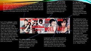
The name of the magazine is always in red and so is the name of the
artist featuring in the picture on the front cover. Its always in the top
left corner, in the same thick font it never changes the size. Also with
the ‘NME’ and the name of the artist being in the colour red it shows
that the magazine is aimed at all genders, not just a specific one and
there's no stereotype behind the colour red.
Judging by the length of the name of
the artist also depend on the font. For
example if you look at the cover with
Amy Winehouse on it’s in a much
bigger font than the Artic Monkeys
cover because of the length of name.
Each of the pictures in either
a medium shot or a medium
close up, this can create
extreme intimacy with the
reader especially if they are a
fan of the artist/band on the
cover. Their clothing reflects
what they are like and what
their individual styles are like.
They are in a studio never in a
outside location. The way
they are stood can also reflect
them as a character.
The additional writing
underneath the name of
the artists, excluding the
copy of Amy Winehouse.
Its in a font that looks like
someone has written it, it
makes the magazine look
messy but it’s laid out in
a neat way, it presents
the image of the
magazine as rouged but
it also has a bit of class.
Whereas the copy of Amy
all her writing is elegant
in a way presenting her
as an elegant figure.
The magazine is split into three
columns, it has the name of the
magazine name of the artist and
what's to find out about the artist.
The second column has the face
of the artist, and the final column
has the plugs of what you can
find inside.
The colour scheme is always
gender neutral not causing any
stereotypical gender to buy the
magazine, it shows that it’s
welcome to each one and
welcomes all ages.
The top stuff includes all
the artists that are
mentioned within that
issue of the magazine.
Creating a broader
audience to buy a
magazine that includes
an artist that they enjoy
listening to.
The header holds the NME logo
which can show the reader who
produced the magazine and it also
shows consistency throughout the
magazine of showing people who
they are and there importance to the
magazine and they can look up the
name of the magazine and find out
some facts about the magazine. By
using ‘NME THIS WEEK’ instead of
‘CONTENTS’ it gives a young and
fresh feel to the magazine making it
not an copy of every other magazine.
The colour palette follows the house
colours of the magazine it keeps the
magazine consistent. They also use
contrasting colours to make the
magazine feel more unique
representing the music they write about
(indie music). The ‘NME THIS WEEK’
writing is contrasted with red and white
writing with a black background making
it stand out more at the top.
The layout of the contents is very controversial
to the other NME magazine contents page. The
way it is set out is very neat and is all in
columns, they are not shoving a lot of
information down your throat they are just
directing you to the right places to go in the
magazine. They have clearly sectioned of where
you need to go for the main story advertised
on the cover of the magazine.
They include advertisements for there own subscriptions, telling them where
to go and what to expect when they get there. It is also presented in a black
box making it easier to grab the readers attention and persuade them to
spend more money on this magazine.
One of the main features included in the magazine
is the band index which gives an A-Z of the names
of bands in the area of music they are writing
about. They are showing there readers whop they
are involved with and get them to buy the
magazine.
It includes a brief part of one of the
articles included in the magazine
making it a plug getting the reader to
want to read on they are teasing the
reader with a short snippet from one of
there main article to make them want to
find out what happens in the rest of it.
The image is one of the main
focuses of the spread, she is
looking straight into the camera
like she is directly addressing the
audience. She is making a direct
connection with the buyers of the
magazine, it’s like she is
persuading them to buy the
magazine. It also takes up about
45% of the spread making a very
dominant image for the reader to
look at. She also has very dark
make up and her red top fits into
the house colours of NME
magazine.
The main header is an unusual
size for a main header as it
takes up another 45% of the
spread this indicates that they
want to catch the readers
attention. It also a quote of
Lily Allen which also makes it a
plug attracting the buyer to
read the magazine. The font
of the writing links with what
the quote is saying about
being out spoken and
different to other artists. It’s a
very controversial font to use
for a header. It could also be
used to show what NME
magazine is about, how they
like being a bit reckless and
go against the rules from
other magazines. The language used is very basic, and is also a sort of slang this
shows who the audience, which is mainly students and older
teenagers; so they use the language that they will use to try and
relate to them. They also capture what Lily Allen likes giving extra
information to the reader, making them relate to her and make
the article feel more personal.
The colour pattern follows the same scheme all the way kind of making a
trade mark on there magazine. The colours red and black are the colours you
normally connote with indie/rock music which is what the magazine write
about. The red text has been added to match the artists clothing to keep the
consistency of colours all the way through.

More Related Content

What's hot

Representations In My Own Music Magazine
Representations In My Own Music Magazine   Representations In My Own Music Magazine
Representations In My Own Music Magazine KatieWoodcock1
 
Focus Group Interview Summary
Focus Group Interview SummaryFocus Group Interview Summary
Focus Group Interview SummaryKatieWoodcock1
 
AS Media Magazine Evaluation
AS Media Magazine EvaluationAS Media Magazine Evaluation
AS Media Magazine EvaluationNoctisStar
 
AS Media Studies - Music Magazine Evaluation
AS Media Studies - Music Magazine Evaluation AS Media Studies - Music Magazine Evaluation
AS Media Studies - Music Magazine Evaluation SundasBostan
 
Questionnaire prep
Questionnaire prepQuestionnaire prep
Questionnaire prepHarry_Frampton
 
AS Media Studies- Music Magazine Evaluation
AS Media Studies- Music Magazine EvaluationAS Media Studies- Music Magazine Evaluation
AS Media Studies- Music Magazine EvaluationNickySahota
 
Evaluation Presentation
Evaluation PresentationEvaluation Presentation
Evaluation Presentationkatrinaamorton
 
Jessica's evaluation
Jessica's evaluationJessica's evaluation
Jessica's evaluationjessicabartrum
 
Evaluation write up
Evaluation write upEvaluation write up
Evaluation write uppopk44
 
Magazine Evaluation
Magazine EvaluationMagazine Evaluation
Magazine Evaluationsophiesharkey
 
Evaluation
EvaluationEvaluation
Evaluationguest4eeb20
 
Evaluation
EvaluationEvaluation
EvaluationJack Barlow
 

What's hot (20)

Representations In My Own Music Magazine
Representations In My Own Music Magazine   Representations In My Own Music Magazine
Representations In My Own Music Magazine
 
Focus Group Interview Summary
Focus Group Interview SummaryFocus Group Interview Summary
Focus Group Interview Summary
 
AS Media Magazine Evaluation
AS Media Magazine EvaluationAS Media Magazine Evaluation
AS Media Magazine Evaluation
 
AS Media Studies - Music Magazine Evaluation
AS Media Studies - Music Magazine Evaluation AS Media Studies - Music Magazine Evaluation
AS Media Studies - Music Magazine Evaluation
 
Questionnaire prep
Questionnaire prepQuestionnaire prep
Questionnaire prep
 
Evaluation
EvaluationEvaluation
Evaluation
 
Evaluation q 5
Evaluation q 5Evaluation q 5
Evaluation q 5
 
Question 2
Question 2Question 2
Question 2
 
AS Media Studies- Music Magazine Evaluation
AS Media Studies- Music Magazine EvaluationAS Media Studies- Music Magazine Evaluation
AS Media Studies- Music Magazine Evaluation
 
Question 1
Question 1Question 1
Question 1
 
Evaluation Presentation
Evaluation PresentationEvaluation Presentation
Evaluation Presentation
 
Jessica's evaluation
Jessica's evaluationJessica's evaluation
Jessica's evaluation
 
Evaluation write up
Evaluation write upEvaluation write up
Evaluation write up
 
Magazine pitch
Magazine pitchMagazine pitch
Magazine pitch
 
Magazine Evaluation
Magazine EvaluationMagazine Evaluation
Magazine Evaluation
 
Task 9
Task 9Task 9
Task 9
 
Evaluation
EvaluationEvaluation
Evaluation
 
Mine
MineMine
Mine
 
Evaluation
EvaluationEvaluation
Evaluation
 
Evaluation
EvaluationEvaluation
Evaluation
 

Viewers also liked

Textual analysis- The Fray and One Republic
Textual analysis- The Fray and One RepublicTextual analysis- The Fray and One Republic
Textual analysis- The Fray and One RepublicKaris Hays
 
Відкритий урок «Поняття про файл і каталог (папку), їх імена. Перегляд списк...
Відкритий урок «Поняття про файл і каталог (папку), їх імена.  Перегляд списк...Відкритий урок «Поняття про файл і каталог (папку), їх імена.  Перегляд списк...
Відкритий урок «Поняття про файл і каталог (папку), їх імена. Перегляд списк...270479
 
5to Ciclo de formaciĂłn a maestr@s GEN Reflexiones PedagĂłgicas
5to Ciclo de formaciĂłn a maestr@s GEN Reflexiones PedagĂłgicas5to Ciclo de formaciĂłn a maestr@s GEN Reflexiones PedagĂłgicas
5to Ciclo de formaciĂłn a maestr@s GEN Reflexiones PedagĂłgicasGeneraciĂłn ConCiencia
 
Primer ciclo de formaciĂłn a maestros GEN 2016
Primer ciclo de formaciĂłn a maestros GEN 2016Primer ciclo de formaciĂłn a maestros GEN 2016
Primer ciclo de formaciĂłn a maestros GEN 2016GeneraciĂłn ConCiencia
 
Memorias 2do ciclo de formaciĂłn gen 2016
Memorias 2do ciclo de formaciĂłn gen 2016Memorias 2do ciclo de formaciĂłn gen 2016
Memorias 2do ciclo de formaciĂłn gen 2016GeneraciĂłn ConCiencia
 
Ensayo estilo internacional minimalismo
Ensayo estilo internacional minimalismoEnsayo estilo internacional minimalismo
Ensayo estilo internacional minimalismoPamela Massiel BĂĄez
 
Resultados proyectos investigaciĂłn Gen 2015. Linea: Cultura, sociedad y democ...
Resultados proyectos investigaciĂłn Gen 2015. Linea: Cultura, sociedad y democ...Resultados proyectos investigaciĂłn Gen 2015. Linea: Cultura, sociedad y democ...
Resultados proyectos investigaciĂłn Gen 2015. Linea: Cultura, sociedad y democ...GeneraciĂłn ConCiencia
 
6to Ciclo de formaciĂłn a maestr@s
6to Ciclo de formaciĂłn a maestr@s6to Ciclo de formaciĂłn a maestr@s
6to Ciclo de formaciĂłn a maestr@sGeneraciĂłn ConCiencia
 
1-А
1-А1-А
1-А270479
 
Mi portafolio sesiĂłn 1 CTE 16-17 MEPP
Mi portafolio sesiĂłn 1 CTE 16-17 MEPPMi portafolio sesiĂłn 1 CTE 16-17 MEPP
Mi portafolio sesiĂłn 1 CTE 16-17 MEPPMARIO EDGAR POOT PECH
 
Conceptos de procesos administrativos
Conceptos de procesos administrativosConceptos de procesos administrativos
Conceptos de procesos administrativosBella ObregÓn
 
Школа № 7 м. Дніпро
Школа № 7 м. ДніпроШкола № 7 м. Дніпро
Школа № 7 м. ДніпроBrazhnik Svitlana
 
PROGRAMACION ANUAL DE QUECHUA CON RUTAS DE APRENDIZAJE 2016
PROGRAMACION ANUAL DE QUECHUA CON RUTAS DE APRENDIZAJE 2016PROGRAMACION ANUAL DE QUECHUA CON RUTAS DE APRENDIZAJE 2016
PROGRAMACION ANUAL DE QUECHUA CON RUTAS DE APRENDIZAJE 2016ZIPERTZ S.R.L
 

Viewers also liked (16)

Textual analysis- The Fray and One Republic
Textual analysis- The Fray and One RepublicTextual analysis- The Fray and One Republic
Textual analysis- The Fray and One Republic
 
vacature zara
vacature zaravacature zara
vacature zara
 
Concurso Aventura Bio - Colciencias
Concurso Aventura Bio - ColcienciasConcurso Aventura Bio - Colciencias
Concurso Aventura Bio - Colciencias
 
Відкритий урок «Поняття про файл і каталог (папку), їх імена. Перегляд списк...
Відкритий урок «Поняття про файл і каталог (папку), їх імена.  Перегляд списк...Відкритий урок «Поняття про файл і каталог (папку), їх імена.  Перегляд списк...
Відкритий урок «Поняття про файл і каталог (папку), їх імена. Перегляд списк...
 
5to Ciclo de formaciĂłn a maestr@s GEN Reflexiones PedagĂłgicas
5to Ciclo de formaciĂłn a maestr@s GEN Reflexiones PedagĂłgicas5to Ciclo de formaciĂłn a maestr@s GEN Reflexiones PedagĂłgicas
5to Ciclo de formaciĂłn a maestr@s GEN Reflexiones PedagĂłgicas
 
Primer ciclo de formaciĂłn a maestros GEN 2016
Primer ciclo de formaciĂłn a maestros GEN 2016Primer ciclo de formaciĂłn a maestros GEN 2016
Primer ciclo de formaciĂłn a maestros GEN 2016
 
Memorias 2do ciclo de formaciĂłn gen 2016
Memorias 2do ciclo de formaciĂłn gen 2016Memorias 2do ciclo de formaciĂłn gen 2016
Memorias 2do ciclo de formaciĂłn gen 2016
 
Ensayo estilo internacional minimalismo
Ensayo estilo internacional minimalismoEnsayo estilo internacional minimalismo
Ensayo estilo internacional minimalismo
 
Resultados proyectos investigaciĂłn Gen 2015. Linea: Cultura, sociedad y democ...
Resultados proyectos investigaciĂłn Gen 2015. Linea: Cultura, sociedad y democ...Resultados proyectos investigaciĂłn Gen 2015. Linea: Cultura, sociedad y democ...
Resultados proyectos investigaciĂłn Gen 2015. Linea: Cultura, sociedad y democ...
 
6to Ciclo de formaciĂłn a maestr@s
6to Ciclo de formaciĂłn a maestr@s6to Ciclo de formaciĂłn a maestr@s
6to Ciclo de formaciĂłn a maestr@s
 
1-А
1-А1-А
1-А
 
Mi portafolio sesiĂłn 1 CTE 16-17 MEPP
Mi portafolio sesiĂłn 1 CTE 16-17 MEPPMi portafolio sesiĂłn 1 CTE 16-17 MEPP
Mi portafolio sesiĂłn 1 CTE 16-17 MEPP
 
Conceptos de procesos administrativos
Conceptos de procesos administrativosConceptos de procesos administrativos
Conceptos de procesos administrativos
 
listrik dinamis
listrik dinamis listrik dinamis
listrik dinamis
 
Школа № 7 м. Дніпро
Школа № 7 м. ДніпроШкола № 7 м. Дніпро
Школа № 7 м. Дніпро
 
PROGRAMACION ANUAL DE QUECHUA CON RUTAS DE APRENDIZAJE 2016
PROGRAMACION ANUAL DE QUECHUA CON RUTAS DE APRENDIZAJE 2016PROGRAMACION ANUAL DE QUECHUA CON RUTAS DE APRENDIZAJE 2016
PROGRAMACION ANUAL DE QUECHUA CON RUTAS DE APRENDIZAJE 2016
 

Similar to Market research

Market research
Market researchMarket research
Market researchKaris Hays
 
Task 3 research bmth
Task 3 research bmthTask 3 research bmth
Task 3 research bmthasmediae15
 
Textual Analysis - Media Studies
Textual Analysis - Media StudiesTextual Analysis - Media Studies
Textual Analysis - Media StudiesNorah Fields
 
Magazine analysis
Magazine analysisMagazine analysis
Magazine analysismillerjess
 
Magazine analysis
Magazine analysisMagazine analysis
Magazine analysismillerjess
 
Analysing 3 magazine covers
Analysing 3 magazine coversAnalysing 3 magazine covers
Analysing 3 magazine coversblack-bird
 
Deconstruction of magazines
Deconstruction of magazinesDeconstruction of magazines
Deconstruction of magazinesLauren Holyoak
 
Format research of music magazines
Format research of music magazinesFormat research of music magazines
Format research of music magazinesellisputnam
 
Front cover analysis.
Front cover analysis.Front cover analysis.
Front cover analysis.AmyShields00
 
Content page research
Content page researchContent page research
Content page researchezreen_b
 
Task 3 music magazine analysis, Front cover and Contents pages
Task 3  music magazine analysis, Front cover and Contents pagesTask 3  music magazine analysis, Front cover and Contents pages
Task 3 music magazine analysis, Front cover and Contents pageseleanorwardmedia
 
Music magazine research
Music magazine researchMusic magazine research
Music magazine researchbroganl4
 
Contents Page Analysis
Contents Page AnalysisContents Page Analysis
Contents Page AnalysisAmyShields00
 
Evaluation
EvaluationEvaluation
EvaluationJessatprior
 
Magazine analysis
Magazine analysisMagazine analysis
Magazine analysislsuttie9
 
Music magazine analysis
Music magazine analysisMusic magazine analysis
Music magazine analysisDemiRowley
 
Magazine analysis
Magazine analysisMagazine analysis
Magazine analysisPhil Dalton
 
Textual analsis
Textual analsisTextual analsis
Textual analsisOlivia Baxter
 

Similar to Market research (20)

Market research
Market researchMarket research
Market research
 
Task 3 research bmth
Task 3 research bmthTask 3 research bmth
Task 3 research bmth
 
Textual Analysis - Media Studies
Textual Analysis - Media StudiesTextual Analysis - Media Studies
Textual Analysis - Media Studies
 
Magazine analysis
Magazine analysisMagazine analysis
Magazine analysis
 
Magazine analysis
Magazine analysisMagazine analysis
Magazine analysis
 
Analysing 3 magazine covers
Analysing 3 magazine coversAnalysing 3 magazine covers
Analysing 3 magazine covers
 
MOJO
MOJOMOJO
MOJO
 
Deconstruction of magazines
Deconstruction of magazinesDeconstruction of magazines
Deconstruction of magazines
 
Format research of music magazines
Format research of music magazinesFormat research of music magazines
Format research of music magazines
 
Front cover analysis.
Front cover analysis.Front cover analysis.
Front cover analysis.
 
Content page research
Content page researchContent page research
Content page research
 
Task 3 music magazine analysis, Front cover and Contents pages
Task 3  music magazine analysis, Front cover and Contents pagesTask 3  music magazine analysis, Front cover and Contents pages
Task 3 music magazine analysis, Front cover and Contents pages
 
Music magazine research
Music magazine researchMusic magazine research
Music magazine research
 
Magazine Cover Analysis
Magazine Cover AnalysisMagazine Cover Analysis
Magazine Cover Analysis
 
Contents Page Analysis
Contents Page AnalysisContents Page Analysis
Contents Page Analysis
 
Evaluation
EvaluationEvaluation
Evaluation
 
Magazine analysis
Magazine analysisMagazine analysis
Magazine analysis
 
Music magazine analysis
Music magazine analysisMusic magazine analysis
Music magazine analysis
 
Magazine analysis
Magazine analysisMagazine analysis
Magazine analysis
 
Textual analsis
Textual analsisTextual analsis
Textual analsis
 

More from Karis Hays

My evaluation
My evaluationMy evaluation
My evaluationKaris Hays
 
Shooting Schedule
Shooting Schedule Shooting Schedule
Shooting Schedule Karis Hays
 
Shooting schedule
Shooting scheduleShooting schedule
Shooting scheduleKaris Hays
 
Evaluation
EvaluationEvaluation
EvaluationKaris Hays
 
Seeking permission
Seeking permissionSeeking permission
Seeking permissionKaris Hays
 
Risk assesment
Risk assesmentRisk assesment
Risk assesmentKaris Hays
 
Interview analysis wilko
Interview analysis wilkoInterview analysis wilko
Interview analysis wilkoKaris Hays
 
Interview analysis wilko
Interview analysis wilkoInterview analysis wilko
Interview analysis wilkoKaris Hays
 
Locations, props and costumes
Locations, props and costumes Locations, props and costumes
Locations, props and costumes Karis Hays
 
Locations
LocationsLocations
LocationsKaris Hays
 
Textual analysis
Textual analysisTextual analysis
Textual analysisKaris Hays
 
Group idea 2
Group idea 2Group idea 2
Group idea 2Karis Hays
 
Survey analysis
Survey analysisSurvey analysis
Survey analysisKaris Hays
 
Group idea
Group ideaGroup idea
Group ideaKaris Hays
 
flat plan
flat plan flat plan
flat plan Karis Hays
 
My evaluation
My evaluationMy evaluation
My evaluationKaris Hays
 
Survey analysis
Survey analysisSurvey analysis
Survey analysisKaris Hays
 
Magazine research really official [recovered]
Magazine research really official [recovered]Magazine research really official [recovered]
Magazine research really official [recovered]Karis Hays
 

More from Karis Hays (19)

My evaluation
My evaluationMy evaluation
My evaluation
 
Pitch
Pitch Pitch
Pitch
 
Shooting Schedule
Shooting Schedule Shooting Schedule
Shooting Schedule
 
Shooting schedule
Shooting scheduleShooting schedule
Shooting schedule
 
Evaluation
EvaluationEvaluation
Evaluation
 
Seeking permission
Seeking permissionSeeking permission
Seeking permission
 
Risk assesment
Risk assesmentRisk assesment
Risk assesment
 
Interview analysis wilko
Interview analysis wilkoInterview analysis wilko
Interview analysis wilko
 
Interview analysis wilko
Interview analysis wilkoInterview analysis wilko
Interview analysis wilko
 
Locations, props and costumes
Locations, props and costumes Locations, props and costumes
Locations, props and costumes
 
Locations
LocationsLocations
Locations
 
Textual analysis
Textual analysisTextual analysis
Textual analysis
 
Group idea 2
Group idea 2Group idea 2
Group idea 2
 
Survey analysis
Survey analysisSurvey analysis
Survey analysis
 
Group idea
Group ideaGroup idea
Group idea
 
flat plan
flat plan flat plan
flat plan
 
My evaluation
My evaluationMy evaluation
My evaluation
 
Survey analysis
Survey analysisSurvey analysis
Survey analysis
 
Magazine research really official [recovered]
Magazine research really official [recovered]Magazine research really official [recovered]
Magazine research really official [recovered]
 

Recently uploaded

ECONOMIC CONTEXT - LONG FORM TV DRAMA - PPT
ECONOMIC CONTEXT - LONG FORM TV DRAMA - PPTECONOMIC CONTEXT - LONG FORM TV DRAMA - PPT
ECONOMIC CONTEXT - LONG FORM TV DRAMA - PPTiammrhaywood
 
Romantic Opera MUSIC FOR GRADE NINE pptx
Romantic Opera MUSIC FOR GRADE NINE pptxRomantic Opera MUSIC FOR GRADE NINE pptx
Romantic Opera MUSIC FOR GRADE NINE pptxsqpmdrvczh
 
Alper Gobel In Media Res Media Component
Alper Gobel In Media Res Media ComponentAlper Gobel In Media Res Media Component
Alper Gobel In Media Res Media ComponentInMediaRes1
 
Earth Day Presentation wow hello nice great
Earth Day Presentation wow hello nice greatEarth Day Presentation wow hello nice great
Earth Day Presentation wow hello nice greatYousafMalik24
 
Employee wellbeing at the workplace.pptx
Employee wellbeing at the workplace.pptxEmployee wellbeing at the workplace.pptx
Employee wellbeing at the workplace.pptxNirmalaLoungPoorunde1
 
MULTIDISCIPLINRY NATURE OF THE ENVIRONMENTAL STUDIES.pptx
MULTIDISCIPLINRY NATURE OF THE ENVIRONMENTAL STUDIES.pptxMULTIDISCIPLINRY NATURE OF THE ENVIRONMENTAL STUDIES.pptx
MULTIDISCIPLINRY NATURE OF THE ENVIRONMENTAL STUDIES.pptxAnupkumar Sharma
 
Introduction to AI in Higher Education_draft.pptx
Introduction to AI in Higher Education_draft.pptxIntroduction to AI in Higher Education_draft.pptx
Introduction to AI in Higher Education_draft.pptxpboyjonauth
 
Quarter 4 Peace-education.pptx Catch Up Friday
Quarter 4 Peace-education.pptx Catch Up FridayQuarter 4 Peace-education.pptx Catch Up Friday
Quarter 4 Peace-education.pptx Catch Up FridayMakMakNepo
 
Types of Journalistic Writing Grade 8.pptx
Types of Journalistic Writing Grade 8.pptxTypes of Journalistic Writing Grade 8.pptx
Types of Journalistic Writing Grade 8.pptxEyham Joco
 
Framing an Appropriate Research Question 6b9b26d93da94caf993c038d9efcdedb.pdf
Framing an Appropriate Research Question 6b9b26d93da94caf993c038d9efcdedb.pdfFraming an Appropriate Research Question 6b9b26d93da94caf993c038d9efcdedb.pdf
Framing an Appropriate Research Question 6b9b26d93da94caf993c038d9efcdedb.pdfUjwalaBharambe
 
Grade 9 Q4-MELC1-Active and Passive Voice.pptx
Grade 9 Q4-MELC1-Active and Passive Voice.pptxGrade 9 Q4-MELC1-Active and Passive Voice.pptx
Grade 9 Q4-MELC1-Active and Passive Voice.pptxChelloAnnAsuncion2
 
Atmosphere science 7 quarter 4 .........
Atmosphere science 7 quarter 4 .........Atmosphere science 7 quarter 4 .........
Atmosphere science 7 quarter 4 .........LeaCamillePacle
 
AmericanHighSchoolsprezentacijaoskolama.
AmericanHighSchoolsprezentacijaoskolama.AmericanHighSchoolsprezentacijaoskolama.
AmericanHighSchoolsprezentacijaoskolama.arsicmarija21
 
Field Attribute Index Feature in Odoo 17
Field Attribute Index Feature in Odoo 17Field Attribute Index Feature in Odoo 17
Field Attribute Index Feature in Odoo 17Celine George
 
AMERICAN LANGUAGE HUB_Level2_Student'sBook_Answerkey.pdf
AMERICAN LANGUAGE HUB_Level2_Student'sBook_Answerkey.pdfAMERICAN LANGUAGE HUB_Level2_Student'sBook_Answerkey.pdf
AMERICAN LANGUAGE HUB_Level2_Student'sBook_Answerkey.pdfphamnguyenenglishnb
 
Gas measurement O2,Co2,& ph) 04/2024.pptx
Gas measurement O2,Co2,& ph) 04/2024.pptxGas measurement O2,Co2,& ph) 04/2024.pptx
Gas measurement O2,Co2,& ph) 04/2024.pptxDr.Ibrahim Hassaan
 
ECONOMIC CONTEXT - PAPER 1 Q3: NEWSPAPERS.pptx
ECONOMIC CONTEXT - PAPER 1 Q3: NEWSPAPERS.pptxECONOMIC CONTEXT - PAPER 1 Q3: NEWSPAPERS.pptx
ECONOMIC CONTEXT - PAPER 1 Q3: NEWSPAPERS.pptxiammrhaywood
 
Computed Fields and api Depends in the Odoo 17
Computed Fields and api Depends in the Odoo 17Computed Fields and api Depends in the Odoo 17
Computed Fields and api Depends in the Odoo 17Celine George
 

Recently uploaded (20)

Model Call Girl in Bikash Puri Delhi reach out to us at 🔝9953056974🔝
Model Call Girl in Bikash Puri  Delhi reach out to us at 🔝9953056974🔝Model Call Girl in Bikash Puri  Delhi reach out to us at 🔝9953056974🔝
Model Call Girl in Bikash Puri Delhi reach out to us at 🔝9953056974🔝
 
ECONOMIC CONTEXT - LONG FORM TV DRAMA - PPT
ECONOMIC CONTEXT - LONG FORM TV DRAMA - PPTECONOMIC CONTEXT - LONG FORM TV DRAMA - PPT
ECONOMIC CONTEXT - LONG FORM TV DRAMA - PPT
 
Romantic Opera MUSIC FOR GRADE NINE pptx
Romantic Opera MUSIC FOR GRADE NINE pptxRomantic Opera MUSIC FOR GRADE NINE pptx
Romantic Opera MUSIC FOR GRADE NINE pptx
 
Alper Gobel In Media Res Media Component
Alper Gobel In Media Res Media ComponentAlper Gobel In Media Res Media Component
Alper Gobel In Media Res Media Component
 
Earth Day Presentation wow hello nice great
Earth Day Presentation wow hello nice greatEarth Day Presentation wow hello nice great
Earth Day Presentation wow hello nice great
 
Employee wellbeing at the workplace.pptx
Employee wellbeing at the workplace.pptxEmployee wellbeing at the workplace.pptx
Employee wellbeing at the workplace.pptx
 
MULTIDISCIPLINRY NATURE OF THE ENVIRONMENTAL STUDIES.pptx
MULTIDISCIPLINRY NATURE OF THE ENVIRONMENTAL STUDIES.pptxMULTIDISCIPLINRY NATURE OF THE ENVIRONMENTAL STUDIES.pptx
MULTIDISCIPLINRY NATURE OF THE ENVIRONMENTAL STUDIES.pptx
 
Introduction to AI in Higher Education_draft.pptx
Introduction to AI in Higher Education_draft.pptxIntroduction to AI in Higher Education_draft.pptx
Introduction to AI in Higher Education_draft.pptx
 
Quarter 4 Peace-education.pptx Catch Up Friday
Quarter 4 Peace-education.pptx Catch Up FridayQuarter 4 Peace-education.pptx Catch Up Friday
Quarter 4 Peace-education.pptx Catch Up Friday
 
Types of Journalistic Writing Grade 8.pptx
Types of Journalistic Writing Grade 8.pptxTypes of Journalistic Writing Grade 8.pptx
Types of Journalistic Writing Grade 8.pptx
 
Framing an Appropriate Research Question 6b9b26d93da94caf993c038d9efcdedb.pdf
Framing an Appropriate Research Question 6b9b26d93da94caf993c038d9efcdedb.pdfFraming an Appropriate Research Question 6b9b26d93da94caf993c038d9efcdedb.pdf
Framing an Appropriate Research Question 6b9b26d93da94caf993c038d9efcdedb.pdf
 
Rapple "Scholarly Communications and the Sustainable Development Goals"
Rapple "Scholarly Communications and the Sustainable Development Goals"Rapple "Scholarly Communications and the Sustainable Development Goals"
Rapple "Scholarly Communications and the Sustainable Development Goals"
 
Grade 9 Q4-MELC1-Active and Passive Voice.pptx
Grade 9 Q4-MELC1-Active and Passive Voice.pptxGrade 9 Q4-MELC1-Active and Passive Voice.pptx
Grade 9 Q4-MELC1-Active and Passive Voice.pptx
 
Atmosphere science 7 quarter 4 .........
Atmosphere science 7 quarter 4 .........Atmosphere science 7 quarter 4 .........
Atmosphere science 7 quarter 4 .........
 
AmericanHighSchoolsprezentacijaoskolama.
AmericanHighSchoolsprezentacijaoskolama.AmericanHighSchoolsprezentacijaoskolama.
AmericanHighSchoolsprezentacijaoskolama.
 
Field Attribute Index Feature in Odoo 17
Field Attribute Index Feature in Odoo 17Field Attribute Index Feature in Odoo 17
Field Attribute Index Feature in Odoo 17
 
AMERICAN LANGUAGE HUB_Level2_Student'sBook_Answerkey.pdf
AMERICAN LANGUAGE HUB_Level2_Student'sBook_Answerkey.pdfAMERICAN LANGUAGE HUB_Level2_Student'sBook_Answerkey.pdf
AMERICAN LANGUAGE HUB_Level2_Student'sBook_Answerkey.pdf
 
Gas measurement O2,Co2,& ph) 04/2024.pptx
Gas measurement O2,Co2,& ph) 04/2024.pptxGas measurement O2,Co2,& ph) 04/2024.pptx
Gas measurement O2,Co2,& ph) 04/2024.pptx
 
ECONOMIC CONTEXT - PAPER 1 Q3: NEWSPAPERS.pptx
ECONOMIC CONTEXT - PAPER 1 Q3: NEWSPAPERS.pptxECONOMIC CONTEXT - PAPER 1 Q3: NEWSPAPERS.pptx
ECONOMIC CONTEXT - PAPER 1 Q3: NEWSPAPERS.pptx
 
Computed Fields and api Depends in the Odoo 17
Computed Fields and api Depends in the Odoo 17Computed Fields and api Depends in the Odoo 17
Computed Fields and api Depends in the Odoo 17
 

Market research

  • 2. ROCK SOUND The media pack starts off by highlighting all the ways you can access the magazine giving it multiple uses and the audience can use it when they are out and about as well. The media pack also gives the reader key information about their audience, for example it shows that the amount of people who read the magazine is bigger than the amount of people who buy it. It also advertises there social media sites and gives the reader key information on how to find more information about their magazine and how to become more involved.
  • 3. They also have a page explaining to the audience who they are and what they do. They brag about how they have used big rock bands like Paramore as some of their front covers, it also adds the information of what your issue of Rock sound includes i.e.. a free CD. They also have highlighted the fact that they have a partnership with Impericon, they’ve highlighted it to draw more attention to the fact that they are in partnership with someone who creates the ‘best live music’. The British copy of Rock Sound was launched in March 1999 by the French publisher Editions Freeway. The magazine was then bought out by its director, Patrick Napier, in December 2004.
  • 4. Each rock sound magazine has the name of the magazine placed at the top in bold colours matching the rest of the theme of the magazine. Sometimes its covered by the main photo on the cover, but never covers the word Rock, which can indicate to t6he audience that it’s aimed at people who enjoy rock music. The name of the band/singer who is on the front cover. They are all in their own different font, indicating that all the bands are different, unique from each other. It also might be used to introduce a new band widening the musical taste. On the cover of every copy of rock sound they advertises a free CD to grab the readers attention and to attract them to buy the magazine. In every copy they are in bright colours and a reasonable size being highly noticeable to the reader/buyer. The majority of the main images are medium shots. They have the main singer in the centre or the closest to the camera. And there either pulling a sensible face or pulling a silly face. The background is a plane studio apart from the paramour one which is a quirkier background presenting the personality of the band. There is also all the plugs along the right and left side of the magazine to attract the potential buyer to pick up the magazine and buy it. With including the name of the band in such broad writing and bright eye catching colours it will appeal to the reader more and they might be interested in the band meaning they pick up the copy maybe leading to further interest. They have a puff on the cover dragging the attention of the reader, and can help the reader grow their music taste. The magazine is set out into columns of three, because we read in columns. It makes it easier for us to read. The top stuff can also act as plug and a puff they are using words like WIN! to grab your attention.
  • 5. A list of the main feature of the magazine are listed with the page number next to them, not all the numbers are listed only listing the articles that are plugged on the cover. It is then followed by extra information and a brief explanation of what's happening in the article. The number is bigger than the rest of the text emphasising the page to read. Its also in a different colour compared to the text. The name of the artist is in bold white writing, making it known of the artist, with this being next to the number indicating to the reader who is included to the article. The main image matches the cover picture; which is used as a plug to get people to buy their magazine, this might be the main reason they bought the magazine. The picture is a very intense picture with it being a medium close up creating a closer bond with the artist. This quote can act as a plug to keep the reader interested, by giving a quote it also gives an insight into what to expect from the article. The colour theme is blue, white and black, they all contrast each other causing the words to stand out and grab your attention. With the black background it contradicts the white and blue. 75% picture 25% writing The tracking between each line is even ach time creating an equal look to the magazine.
  • 6. The main image is sometimes related to the main image on the cover and in the contents page, it reflects the personality of the band as a whole. If the reader has never heard of the band its sort of like an introduction/first impression of the band/artist. The main image takes up the whole of the spread with the writing over the top of it. Its taken in a re-make of a studio with very low dim lighting. It acts as a visual effect to help put an image with the article. The pull quote attracts the reader by pulling out an interesting part of the article later on making them want to find out more from what they are talking about. The leading text acts as an introduction to the audience, like they are introducing the artist and giving them background information of what to expect from the up coming article. The drop cap lets the reader know that the beginning of the story theses are used because they are associated with fairy tales which we are used to from when were younger, they are also used for a stylistic feature making the article look more efficient. The gutter is used to separate the text into columns making it easier for the reader to read. The tracking between the texts as well makes the texts easier to reader but also gives it a classy effect by being separate. The layout of the magazine spread has the image on the right hand side with the main article to go with the image on the left side. It’s a very spread out spread giving the image a lot more visual attention. This sort of layout makes it very easy to navigate yourself around the magazine creating a very simple effect. This can act as a inside magazine plug, because if the reader is just briefly reading over this can drag their attention to this imparticular article. This is also seen as graphic art for visual pleasure of the reader. The layout of the main title of the band is bright with using the white on red combination they contrast each other making it more eye-catching. Its also in gender neutral colours not stereotyping the bad to any gender making it more open. The dominant image is 50% but the hole image goes behind the 50% ratio of text.
  • 7. BILLBOARD (US) Similar to the Rock sound media pack this contains some of the statistic about their reader/buyers. It gives information you wouldn’t expect them to now like their household income. It gives information about the magazine, it exaggerated it to sound like this amazing company, as the reader we don’t know if this is true but go along with it.
  • 8. The name of the magazine is the same font size and either black or white on every cover of each magazine. Also the lower case b,o,a and d are filled with colour making them bright and eye catching, contrasting with the white or black of the main title. The colours that they’ve chosen to fill in the letters are gender neutral appealing to a more varied audience. Each picture is a serious picture, which is either a close up, medium close up or a medium shot. Each shot is simple and straight faced. And they are chosen to reflect the artists personality and type of music they produce and how the audience perceive them as a person. Each of the names is also in different fonts which could reflect the artist and what they stand for. For example Katy Perry’s issues has elegant writing because she can be seen as an elegant public figure. There is also the different setting for each issue using either a coloured background or using a white or grey one. On each magazine there’s a lot of white space that hasn’t been covered creating a deeper focus on the artist. What they are wearing can also show their personality to the reader, Katy Perry is known for her unusual outfits and these are displayed on the cover of this magazine. Most of the magazine is laid out in strips of three including the name of the artist on the left hand side of the magazine, its laid out like this in an editorial way because this is the way we read, creating an easy way to get through the magazine. This magazine doesn’t have any top stuff this can be done to draw attention to the main article of the picture which is the artist on the cover. Each copy of the magazine is plain and simple with only very little added plugs and puffs this can draw the attention to just the artist/artists. It also creates a very sophisticated look dragging the attention of older readers.
  • 9. The main logo of the magazine is repeated throughout the magazine, making it branded to the reader and ensuring the reader knows what they are reading. And makes this sense of consistency so when they see this logo they know what company it is . This list of their personal charts, recommending music to the reader widening their music capacity. It takes up 35% of the contents page showing its importance to the reader and making sure that they have drawn their attention to it. Acts as a plug and helps the reader navigate themselves to wherever the feature might be., can drag the attention towards the article with the use of the image. The layout of the magazine is very cramped and there is a lot of content going on, this much information can cause the reader to become distracted but can also make the magazine look like it has a lot more content than it really does; especially having the chart list on the left hand side it makes it very cramped. The sub headings can act as a plug as well by only giving a glimpse of what the article is about its dragging the readers attention to what is to be included in the magazine. The added extras at the bottom are advertisements for the added subscriptions that come with the magazine, it gives the purchases a wider variety of ways to access the magazine, causing its popularity to rise. Its encouraging the reader to buy more magazines before they’ve even bought the magazine. The main image isn’t very eye catching and only takes up a small proportion of the page leading to he reader being confused with what the image is linked when in matter of fact it is ,linked to the main article. Personally I would like the main image to be bigger and have more indication of what it is linked to.
  • 10. The main heading is placed on the left hand side of the magazine along with the text that falls into columns. The font represents what the words are saying, the boldness of the word ‘fiercely’ is in bold writing this later on creates a fierce look for the word. Whereas ‘creative’ is in a font that isn’t normal but is seen as artistic standing for creative. This also juxtapose the girly pink background. The size of the texts also shows it going over the middle crease showing just how big it has been written in. The caption is in the top right corner and says ‘women of the year’ this informs the reader that the women that they will be reading about is most likely going to be famous. By using the colour white which contrasts with the grey back ground it causes it to stand out and become more eye-catching for the reader and giving them more information about the person in the article. It could also act as a plug to grab the readers attention. There are two columns of writing in this article located on the left hand side of the page underneath the main heading, by using columns to read in the article is then easier to read and saves the reader time. With their being quite a bit of writing by placing it on the right hand side that would be the first thing they see and could instantly put them off the upcoming article. The main image is placed on the right hand side of the page, and takes up the whole of the page this has been done so when the reader turns to this page it is the first thing that you see immediately catching your attention. The image is also very unusual also making it eye-catching. The leading text includes words like ‘honoured’ implying to the reader that what she has been awarded is a very big deal in the music industry, it’s also written in smaller writing than you of expected kind of contradicting it’s self of being a massive important thing. The first three words ‘fans are still’ is used as a cap drop it starts of the sentence but in a very bold way it grabs the readers attention straight away from the first line. This can also be a puff for the reader as well.
  • 11. Q MAGAZINE Tells the reader what their aim is with there magazine, what they want to achieve. What their target audience is and what they believe there audience should like and be interested in to buy the magazine. And how they want to grow the audiences music taste. They have their main audience who buy their magazine. Giving the reader background information of what their natural audience is. For example the median age who buy the magazine is 34. They show what you can get out of the magazine,, what they can get access to if they purchase this magazine and what bands/artists are involved with the magazine.
  • 12. On the cover of every magazine the ‘Q’ is always in the left corner of the magazine, with a red background and white writing for the Q. its bold and appealing for the reader. It’s also memorable and simple but still remains in your mind. The colours are also gender neutral showing there is no specific gender the magazine is aimed at. All of the pictures on the front cover are medium close ups, focusing on the artist/bands face. It creates an intimate relationship between the reader and the artist. It also makes it clear who they are and what they create. All the pictures are set in a studio not taken in an outside location. The women always have dramatic make up and are being really poesy. Whereas the boys are just plain but put across their own individual styles. For example the Tinie Tempeh issue has him wearing his signature sunglasses, which people will recognise when seeing the copy will recognise who it is. Each copy has the additional information on the side on what else you can get out of the magazine. This could be used to make the magazine look busier than it actually is and persuade you to buy it. Makes it look packed with information. These are called plugs, they pull in the readers by intriguing them by what's inside. At the top of some of the Q magazines they have the words ‘The UK’s biggest music magazine’ it’s boasting to the reader that they are a highly popular magazine, by seeing the word ‘biggest’ it emphasises to the reader and persuades the reader that they are the best of the best and can help on part of the magazine as a selling point. The magazines look very crammed to create a busy look and to make it seem jammed packed full of information when in reality it’s not. Its crammed with puffs and plugs gaining the attention of the potential reader and making it seem amazing. On the cover with Tinie Tempah the font of which his name is in, looks like a signature creating a closer bond with the viewer.
  • 13. The layout is what you would traditionally expect from a magazine, the main image is on the right hand side and takes up the majority of the page, this image is also linked to the main story which is advertised on the front cover. The contents uses a strong contrast between black, white and red. The main titles are bold ad in bigger writing compared to the rest of the writing. The contents can also be used to assure the reader knows exactly what they are looking for. Using red for the page number creates a neat and classy look to the page and gives it an over all good first impression to the reader. Date of the publication is used to show that it is all up to date content and not out of date. All the content is relevant. The main columns on the contents page is the main feature section which shows what is going to be featured in the magazine; which also comes with a brief description of what is included. They also have a different colour for the page number to act as a plug to show where abouts in the magazine they have to go to get the article that draws attention to them. The contents of the special edition matches the advertisement on the front cover adding a colour scheme and a theme to the magazine. The logo for Q magazine is aliened with the title of the page ‘contents’ they are both in bold font showing there importance to the reader. Q is in a red box which follows the house theme of the whole magazine. At the bottom right hand corner there is a review section where the list the pages numbers they are on and give a brief overview of what is available in the article, this can show that Q is a very trustworthy company if people trust there reviews and there content. The title is in bold writing showing the importance of the review section and showing it is another part of there magazine. They have a ‘every month column showing what is popular within there magazine that they bring it back monthly for the enjoyment of there readers.
  • 14. With the picture of Lady Gaga taking up the whole of the left hand side it shows her power and relevance to the article. It is also quite a risky photo to be including in a magazine but in a way it shows who she is and what she’s about and maybe how much sophistication Q magazine has. With the filter of the image being grey it adds and artistic style to the magazine, maybe showing her class as well as the class that Q magazine has. It also themes three main colours: red, black and white these colours anchor the genre of Q magazine. The ‘S’ at the start of the article can act as plug to get the reader to read this part of the article which could be the main content of the article. The graphical ‘L’ has been added for an artistic image is can show the importance of lady gaga to the interview and the article, making her the main focus point of the double page spread. It also adds a classy look to the magazine and it fits into the colour theme of Q magazine with it being red. Also with it being red it could reflect her personality as being sexy and lustrous as they are the connotations you associate with the colour red. The format of the article goes in columns reading from left to right which is the standard format of any magazine, it also has symmetrical white space between the columns making it easy to read and creating a very classy look for the article. With the name of the artist being in the right hand corner it gives an indication to a reader who maybe doesn’t know who she is an idea of who she is and what relevance she has to the article with her being on the main picture as well. It’s not in any different colour causing it to not be very eye catching but the ‘GAGA’ part of it is in capitals making it stand out in contrast the graphical L.
  • 15. NME Gives you the main statistics of what their audience is. For example 20% of their readers are female whereas 74% are male, wh8ich gives us the idea that the magazine may be more appealing to men or the genre of music they follow is stereotypically what men listen to. They give examples of what there readers think about their magazine, how they can trust the content and how they have helped there knowledge of music grow. They include where and what different devices you can access their magazine. And what you can get out of their devices. They give you even more information about their readers and what else you can access when being a reader of NME. They don’t just focus on the music made they also focus on how to keep you up to date all the time and how you can access music videos. They give there publisher and their website so you can find out even more information about them.
  • 16. The name of the magazine is always in red and so is the name of the artist featuring in the picture on the front cover. Its always in the top left corner, in the same thick font it never changes the size. Also with the ‘NME’ and the name of the artist being in the colour red it shows that the magazine is aimed at all genders, not just a specific one and there's no stereotype behind the colour red. Judging by the length of the name of the artist also depend on the font. For example if you look at the cover with Amy Winehouse on it’s in a much bigger font than the Artic Monkeys cover because of the length of name. Each of the pictures in either a medium shot or a medium close up, this can create extreme intimacy with the reader especially if they are a fan of the artist/band on the cover. Their clothing reflects what they are like and what their individual styles are like. They are in a studio never in a outside location. The way they are stood can also reflect them as a character. The additional writing underneath the name of the artists, excluding the copy of Amy Winehouse. Its in a font that looks like someone has written it, it makes the magazine look messy but it’s laid out in a neat way, it presents the image of the magazine as rouged but it also has a bit of class. Whereas the copy of Amy all her writing is elegant in a way presenting her as an elegant figure. The magazine is split into three columns, it has the name of the magazine name of the artist and what's to find out about the artist. The second column has the face of the artist, and the final column has the plugs of what you can find inside. The colour scheme is always gender neutral not causing any stereotypical gender to buy the magazine, it shows that it’s welcome to each one and welcomes all ages. The top stuff includes all the artists that are mentioned within that issue of the magazine. Creating a broader audience to buy a magazine that includes an artist that they enjoy listening to.
  • 17. The header holds the NME logo which can show the reader who produced the magazine and it also shows consistency throughout the magazine of showing people who they are and there importance to the magazine and they can look up the name of the magazine and find out some facts about the magazine. By using ‘NME THIS WEEK’ instead of ‘CONTENTS’ it gives a young and fresh feel to the magazine making it not an copy of every other magazine. The colour palette follows the house colours of the magazine it keeps the magazine consistent. They also use contrasting colours to make the magazine feel more unique representing the music they write about (indie music). The ‘NME THIS WEEK’ writing is contrasted with red and white writing with a black background making it stand out more at the top. The layout of the contents is very controversial to the other NME magazine contents page. The way it is set out is very neat and is all in columns, they are not shoving a lot of information down your throat they are just directing you to the right places to go in the magazine. They have clearly sectioned of where you need to go for the main story advertised on the cover of the magazine. They include advertisements for there own subscriptions, telling them where to go and what to expect when they get there. It is also presented in a black box making it easier to grab the readers attention and persuade them to spend more money on this magazine. One of the main features included in the magazine is the band index which gives an A-Z of the names of bands in the area of music they are writing about. They are showing there readers whop they are involved with and get them to buy the magazine. It includes a brief part of one of the articles included in the magazine making it a plug getting the reader to want to read on they are teasing the reader with a short snippet from one of there main article to make them want to find out what happens in the rest of it.
  • 18. The image is one of the main focuses of the spread, she is looking straight into the camera like she is directly addressing the audience. She is making a direct connection with the buyers of the magazine, it’s like she is persuading them to buy the magazine. It also takes up about 45% of the spread making a very dominant image for the reader to look at. She also has very dark make up and her red top fits into the house colours of NME magazine. The main header is an unusual size for a main header as it takes up another 45% of the spread this indicates that they want to catch the readers attention. It also a quote of Lily Allen which also makes it a plug attracting the buyer to read the magazine. The font of the writing links with what the quote is saying about being out spoken and different to other artists. It’s a very controversial font to use for a header. It could also be used to show what NME magazine is about, how they like being a bit reckless and go against the rules from other magazines. The language used is very basic, and is also a sort of slang this shows who the audience, which is mainly students and older teenagers; so they use the language that they will use to try and relate to them. They also capture what Lily Allen likes giving extra information to the reader, making them relate to her and make the article feel more personal. The colour pattern follows the same scheme all the way kind of making a trade mark on there magazine. The colours red and black are the colours you normally connote with indie/rock music which is what the magazine write about. The red text has been added to match the artists clothing to keep the consistency of colours all the way through.