
Recommended
More Related Content
What's hot
What's hot (20)
Similar to Katy Perry magazine cover attracts fans
Similar to Katy Perry magazine cover attracts fans (20)
More from TaylorJohnston
More from TaylorJohnston (14)
Recently uploaded
Recently uploaded (20)
Katy Perry magazine cover attracts fans
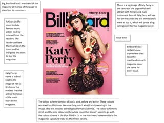
- 1. Big, bold and black masthead of the magazine at the top of the page to stand out to customers. There is a big image of Katy Perry in the centre of the page which will attract both female and male customers. Fans of Katy Perry will see her on the cover and will immediately want to buy it, which will prove a big selling point for this magazine cover. Articles on the cover include famous music artists to draw interest from the readers. The readers will see their names on the cover and be intrigued and want to buy the magazine. Katy Perry’s name is in bold next to the image of her so it informs the readers that she will be the focus of the main story in the magazine. Issue date. The colour scheme consists of black, pink, yellow and white. These colours work well on this cover because they match what Katy is wearing in the image. This will attract a stereotypical female audience. The colour scheme is strict, and the only colour on the whole cover that doesn’t seem to go with the colour scheme is the blue filled in ‘a’ in the masthead, however this is the magazines signature trade on their front covers. Billboard has a certain house style where they keep the masthead on each magazine cover the same for every issue.
- 2. The masthead is bold yet unique, as it is made of different sized stars to make it up. In result of it being unique, it means that no other magazine have the same kind of masthead and it stands out. On the front cover in the centre of the page is a close up image of Taylor Momsen which will attract customers as fans of her will want to buy this magazine as she is on the cover. Like most magazine covers, the colour scheme matches what the model in the centre of the page is wearing. The dark and silver tones match her outfit and make-up which brings and order to the magazine. Surprisingly, this colour scheme isn’t stereotypically female which you would expect from a magazine with a female on the cover. Barcode. Issue date. List of celebrities that will appeal to customers for them to buy.
- 3. There is a big bold masthead at the top of the page to make readers aware of the page they are reading. The ‘NME’ part is highlighted which makes it stands out as the red and white contrast. Issue date. The article titles and page numbers are listed down the side for readers to easily find an article that they wanted to read without flicking through the pages. It is also useful for people in the shop who want to see what articles are included so they can decide whether to buy it or not. Offers to entice customers. The colour scheme sticks to black, white and red.
- 4. The title of this page is unique as the word isn’t in a straight line, this makes it different to other magazines and makes it stand out. The image is of Kanye West looking strong and powerful which will immediately draw the readers attention. There are two completely different fonts used on this page. This differs the masthead from the titles, then to the text. It creates uniqueness for the different parts of the magazine. The background is very strict, consisting of light and dark grey tones and black. This has connotations of class and style. The fact that Kanye is also wearing a shirt and blazer adds to the connotations.
- 5. Like most magazine articles, this is a double page spread. However, this particular article seems to contain two different bits of content as they have put two interviews all on one page. This limits how much there can be for each article, however it means that readers can read two interviews without having to flick over the page; it is convenient for them. The colour scheme for this article seems to be using dark tones which matches what the article on the left is relating to as it seems more of a negative article. It also seems to match with the green and blue tones in the models clothing, which creates an organisation to the page. Like most magazines, there seems to be several different fonts used across the double page spread. This shows the readers different parts of the pages and different sections. It also makes the different pieces of text and makes them stand out. For example, at the top of the page there are two different fonts on top of each other in different colours, which makes both parts stand out as they contrast against each other. As there is a white circle behind the blue writing, it makes it stands out which will draw the reader’s attention.
- 6. The colour scheme is stereotypically feminine which means that it is typically aimed at women. This is due to the different tones of pink used across the page, as they are typically feminine. The main image on this page is of Nicki Minaj, which automatically tells readers that the article is based on her. The image of her is strong and powerful, and as she is looking directly at the camera it will make readers feel like she is looking right at them. This will draw their attention to the article immediately as they are flicking through the pages of the magazine and they will read it. The outfit that she is wearing contrasts with the pink background, but also matches the black writing. However, in the image she is also wearing a pink lipstick which ties in with the pink theme on this page. There are several different types of fonts used on this page. This makes certain pieces of text stand out to the reader in an attempt to draw their attention. The contrasts with the font on ‘The Gospel According To’ and ‘Nicki Minaj’ will make both pieces of writing stand out even though it is supposed to be the same sentence. It brings a uniqueness to the page and as the two parts of the sentence are in different colours, this also helps it stand out. This is a double page spread which implicates that she is an important figure, as she has a big article.