
Recommended
More Related Content
What's hot
What's hot (20)
Similar to Contents analysis
Similar to Contents analysis (20)
Recently uploaded
Recently uploaded (20)
Contents analysis
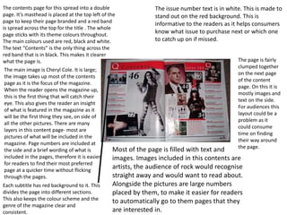
- 1. The contents page for this spread into a double page. It’s masthead is placed at the top left of the page to keep their page branded and a red band is spread across the top for the title . The whole page sticks with its theme colours throughout. The main colours used are red, black and white. The text “Contents” is the only thing across the red band that is in black. This makes it clearer what the page is. The main image is Cheryl Cole. It is large; the image takes up most of the contents page as it is the focus of the magazine. When the reader opens the magazine up, this is the first thing that will catch their eye. This also gives the reader an insight of what is featured in the magazine as it will be the first thing they see, on side of all the other pictures. There are many layers in this content page- most are pictures of what will be included in the magazine. Page numbers are included at the side and a brief wording of what is included in the pages, therefore it is easier for readers to find their most preferred page at a quicker time without flicking through the pages. The issue number text is in white. This is made to stand out on the red background. This is informative to the readers as it helps consumers know what issue to purchase next or which one to catch up on if missed. Each subtitle has red background to it. This divides the page into different sections. This also keeps the colour scheme and the genre of the magazine clear and consistent. Most of the page is filled with text and images. Images included in this contents are artists, the audience of rock would recognise straight away and would want to read about. Alongside the pictures are large numbers placed by them, to make it easier for readers to automatically go to them pages that they are interested in. The page is fairly clumped together on the next page of the content page. On this it is mostly images and text on the side. For audiences this layout could be a problem as it could consume time on finding their way around the page.
- 2. The masthead covers the majority of the page. However it is one of the bottom layers of the cover. Most of the magazine is at a dull blue shade. The masthead is the darkest blue shade. This is made to stand out. The main image is on top of the masthead. The model on the image is Kanye West who is a well known pop artist. He is on the top layer of the masthead as audience would most likely be interested in Kanye West therefore he is the focus of the magazine. This then increases the chances of sale because of his popularity. Contents is set out at a horizontal way. It is set out in a different way but in a way the reader will find pleasing when looking at it at first glance. This is one of things that stand out the most within the page. The colour theme is very strict as it sticks between different shades of blue and grey. This makes it neat and professional. This is supported by the costume choice of the model, in a shirt and a blazer which stays very professional. The colour theme is broken by the red towards the model’s heart which could indicate the theme of the magazine. The sub heading is a different font to the rest of the text on the page. The sub headings are also bold. This helps the reader find what they want faster and efficiently under clear headings.
- 3. The content page of this billboard is mostly filled with the music chart. This being the purpose of the magazine as it is the audience’s main interest. This is what the audience would see or look at first on this content page. The chart has been categorised into Albums, singles etc. The reader of the magazine is likely to look at these subtitles before reading the rest of the page. Each number at the side stands out as it has bright colours. The colours that are used are used within the masthead and this whole section sticks to the theme. Because the colours come out to be vibrant it puts more of a mood to the section as it mostly grey and dull. There are 4 images included in this page. On this side of the page. Readers are likely to firstly look at this after the music chart. The editor may have done this on purpose to draw their attention to what the magazine features. This is supported by the numbers placed beside them so the reader are informative on where to find the information about the particular artists at the top of the page. Below them images is another picture which contracts to the images at the bottom as they are all serious images and the image at the bottom is lively. This is done to suit different audiences meaning that the magazine is available to not just pop but other genres and most types of ages than just young or old. The image at the bottom is larger than the rest of the images above. This meaning that he is the main feature of the magazine and the content page. Along with this, the text is also written around her. The masthead is a different font to the rest of the rest of page. This is so it stands out to the audience amongst all the texts and images included in there as they can get lost and confused within the page. The colours used throughout are blue, black and white. This is kept quite professional but the blue makes it more suitable for the genre. The texts are given headings that are in black and clear. The texts given are a written insight of what to expect in the magazine and are used to persuade consumers to purchase them through their interests.