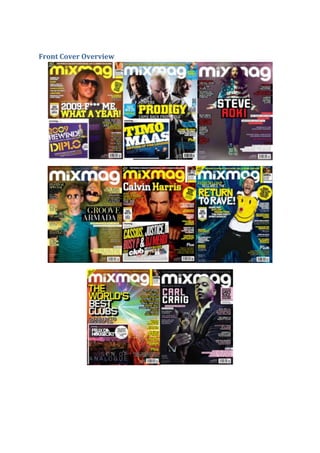
2. All of the front covers on the first page are from the front cover of Mixmag magazine and so they
have all been designed with the intention of attracting fans of the electronic dance music genre.
Through carrying out an investigation of them and by comparing them to each other, it is possible to
identify shared features within them and to find repeated patterns that scour across the Mixmag
magazine front covers.
The eight front covers all feature typical magazine front cover conventions. We see expected general
and layout conventions, such as the inclusion of a main image that dominates the front cover, selllines that surround the main image, feature article photographs that relate to content inside and a
masthead designed in an appropriate font.
In addition to this, we see other repeated patterns. Each of the front covers features an artist or at
some times, a band as the main image. Obviously, we expect to see some kind of music artist on the
front of a music magazine, but the consistent appearance of a solo individual on Mixmag indicates
that groups are rare in the genre of Electronic Dance Music. That solo individual would be a wellknown music producer who would collaborate with famous singers, such as for example, David
Guetta, who appears on the first magazine cover on the top page. He has a long line of famous hits
that feature the likes of Kelly Rowland and Rihanna. This will of course reel the reader in to read on
about if they want to know about the music producer’s new and upcoming hits, and to see what’s in
store for them in the near future. Most of the artists that do feature on the front page of Mixmag
are male, however there a few exceptions with some of them also being that of an image of a club
scene taking place or of a festival of some sort.
We can see other similarities in the mise-en-scene elements that are presented on each front cover,
such as the main image is very contrast to the background and contain vibrant colours, which set the
scene while adding some sort of nightclub feel to it. In terms of costume, the artists are united by
the fact that they are all wearing bold and standing out colours, along with costume that is fairly
giving off a smart casual appeal to the audience. This is a look that is fairly synonymous with bands
within the genre of Electronic dance music.
On each front cover, the Mixmag’s signature masthead appears in exactly the same curled font and
in exactly the same place at the top of the magazines. Each time, the masthead is either in a white or
yellow colour, establishing a vibrant and happy-go-lucky mood. In general and in most of the
magazine covers of Mixmag, the head of the artist is placed on top of the masthead so that it is not
fully visible for everyone to see. This suggests the success and popularity that Mixmag has achieved
as a publication, as it would be too much of an unwise move if the magazine was new, not
recognisable or did not have a loyal and high circulation for the particular music magazine. Another
repeated feature comes in the form of a strapline that always sits directly across the entire Mixmag
masthead. Each time, this is used to draw attention to the fact the Mixmag is ‘the world’s biggest
dance music and clubbing magazine’, which is used to draw the audience in and acknowledge this
fact when picking the magazine up to read or scan through.
Also with the colour, Mixmag tends to stick to a similar colour scheme in each issue. A consistency of
vibrant colours like yellow and white feature most consistently and these two colours are
accompanied by either red, blue and, in the case of one front cover, purple. Being primary colours,
these will appeal to an any gender based readership, while the use of other colours conveys the
variety and vibrancy of the world of electronic dance music.
3. Layout is consistent across the eight front covers too. As mentioned earlier, the placement of the
bands featured is similar in each. In most of the eight of the visible front covers, the main sell-line is
placed more to the top left of the frame, across the main image. The remaining front covers, feature
the main sell-line in the middle, or to the right. Either way, this is a key area of the front cover where
the audience’s eye will automatically go. Other sell lines, meanwhile, are generally placed at the
right, where they will not cover the main image or main sell-line, but where they can be seen next by
the audience. They will no doubt be substantial in persuading the audience to buy the magazine.
Having carried out this overview, it is understandable that Mixmag has its own brand identity and
signature look that can be easily recognized by its target audience. This is maintained through the
repetition of stylistic and layout features from issue to issue and is a wonderful way of helping the
magazine to sell and succeed.