FULL ENJOY - 9953040155 Call Girls in Moti Nagar | Delhi
Double page spread analysis
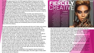
1. This double page spread from the RnB magazine billboard features well known
music icon Beyoncé. Billboard have wisely considered to use Beyoncé as a main
feature article at this time because of her huge recognition in the music industry
after being honoured Billboard’s ‘woman of the year’. Billboard effectively choose
to talk about other aspects of their company including their award ceremonies to
represent themselves a widely popular institution. The singer also reflects the
genre of the music magazine and they know someone like Beyoncé is so influential
therefore more people would want to read this article about her success in order to
be up to date with celebrity current affairs.
The headline uses two different fonts but both are bold, eye catching and are
associated with the actual words. For example, the word ‘fiercely’ is presented it
in bold white typography and reflect this strong independent image relating to the
female domination of the music industry. the theme of power is clearly portrayed
through the close up image of the singer herself. The direct address reflects the
serious tone and gives a sense of formality. Beyoncé is clearly being glorified with
the dramatic, flawless makeup and immediately shows her power and achieved
status within the industry.
The text is quite formal apart from the interview with the icon’s father as he shares
an anecdote relating to his daughter’s growing success from a young age. The
article is full of praise for the artist as they discuss why Beyoncé has earned this
award. It also glorifies Billboard as an institution by insinuating that a n artist as
huge as Beyoncé has earned an award by them which is a very honourable
achievement. You wouldn’t need to know too much about the singer to be able to
understand the article as the editor does explain everything in brief detail
including the ‘Sasha Fierce’ alter ego mentioned at the beginning as well as various
events in the singer’s life, including her career in Destiny’s Child. Due to its
formality, the article does not use any taboo language which also tells us that their
readers are part of a mass audience- the use of taboo language would make it
niche. There are no direct words from the artist as the speech is mainly reported
however it does include quotes from her father as he reminisces on his daughter’s
younger years and how she discovered her alter ego. He article also does use a
specific semantic field it all refers to the alter ego and how this may have led to
her achieving her status in music today.
In terms of layout, the article is presented in two separate columns however is
presented on the left hand side of the double page s the other page is simply taken
up by a studio shot of Beyoncé.
The amount of text is equal to the enlargement of the picture. The first
three words of the article are in bold white typography which is done to
draws the attention of the readers. It states ‘fans are still…’, this straight
away will attract readers as they are likely to be fans of the singer so it
makes that personal connection immediately.
The article isn’t too long and heavy as the magazine knows that too much
text would more their audience and more visual effect would draw their
attention. Readers would only want a brief description of the story behind
the image and headline. A small caption can be seen in the top right hand
corner of the image as an almost title for the singer that has been earned
and this is also done to anchor the image.
The purple and white colour theme for the double page spread represents
femininity, strength as well as sophistication. The dark tone of purple is
quite mysterious which reflects the image being perceived of the artist as
well as creating this ‘fierce’ tone to the page relevant to the article. It
also contrasts the grey and dim lighting of the studio shot which makes it
stand out more and defines the picture.
2. Vibe magazine designed a double page spread based on the
American rapper Wiz Khalifa. Just from the image, it is evident that
Vibe’s target audience is young adults as Khalifa is photographed
smoking which portrays him as antagonistic and anti- establishment.
The magazine is essentially glorifying the rapper’s habit and
showing it as socially acceptable because it is part of his individual
image. The headline is very simple yet effective as it is the initials
of the rapper’s name. It also is displayed in both black and yellow
typography relevant to the artist’s hit song ‘black and yellow’. This
is similar to the whole article as well as the hat Khalifa is wearing
in the studio shot. The way the initials are presented in the
headline replicates some sort of logo, with the letters being
conjoined, to indicate the artists is established and representative.
The subheading that states ‘how high?’ holds multiple meanings
which would be understood by vibe’s target audience therefore has
effectively been done. ‘How high’ refers to the feeling you get after
smoking cannabis which can be visualised in the image, however it
also refers to how high on the ladder of fame Khalifa is at.
The article’s layout is very simplistic, spacious and minimal. This
indicates a way in which Vibe want their readers to feel comforted
and relaxed with their magazine and it makes it more appealing if it
easy to read. The article itself is the last thing seen on the double
page spread and the small print indicates it is not as significant as the
picture or the title. It follows the same colour scheme of black and
yellow to maintain consistency and to stray away from looking
disorganised and hectic. That would contradict the relaxed, easy
atmosphere Vibe are trying to create.
Furthermore, Wiz Khalifa’s facial expression in the studio shot is
quite relaxed and careless however the serious direct address reflects
this sense of passive confrontation. This is how he relates to his fans
by expressing how they would be feeling most of the time and making
an emotional connection with them. The black background has been
done effectively to make the smoke draw the attention o f the
readers as well as creating this sense of mystery and darkness.
3. This NME double page spread featuring Mark Ronson is very engaging, bold
and effective. Immediately, the large masthead spelling out the artists name
is the first thing you can see when you open the page. The lettering down
the side of the page also creates this retro style to the layout and is
alternative, like the artist himself. The layout of the masthead is also done
to almost outline the studio shot image of Ronson to indicate he is the
centric focus on the page. The black and white colour scheme on the spread
reflects sophistication and gives an almost classic newspaper look and helps
highlight the most significant parts of the page.
Image: The enlarged studio shot of Ronson that is visualised to spread across
both pages is very captivating. The artist is seen to be wearing black attire
with sunglasses that emphasises his retro image that Ronson tries to portray.
His cross legged and slouched body position shows his very casual
appearance and infers the artist is laid back and relaxed which is more
relatable for NME’s readers. The hammer in his hands relates to the
masthead of ‘the revenge’ which simply visualises the contents of the
article. The fact that the well-known musician is seen to be smashing up a
musical instrument would draw the readers closer into the story as they
would be intrigues to know what is behind the image.
Looking at the article itself, the overall typography is in small print to
insinuate that the text is not as significant as the overall display of the
page and the main studio image of the artist. NME are aware hat
paragraphs of text would bore their audience and make it less intriguing
to look at. Being aware of this, the magazine effectively has extracted
the most significant quote used by Ronson and enlarged it making it
easier to read more than anything else. This has been done to give the
readers an important insight into the overall story of the magazine
without them having to read it all. The use of taboo language being used
in the quote is another effective tool that would entice the readers as
well as adding comedic value. Enlarging a specific quote as a way of
persuading readers is a popular convention of double page spreads.
However the masthead being laid out vertically across the page does
break these conventions of DPS.
The overall layout is very simplistic and the monotone colour scheme
shows that the magazine isn’t aimed at a particular gender defining its
mass audience.