
Recommended
More Related Content
What's hot
What's hot (20)
Viewers also liked
Viewers also liked (17)
Similar to Preliminary Planning and Research Task
Similar to Preliminary Planning and Research Task (20)
More from tj_salango
More from tj_salango (15)
Recently uploaded
Recently uploaded (20)
Preliminary Planning and Research Task
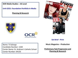
- 1. OCR Media Studies – AS Level Unit G321: Foundation Portfolio in Media Planning & Research Name: TJ Salango Candidate Number: 1220 Center Name: St. Andrew’s Catholic School Center Number: 64135 Set Brief - Print Music Magazine – Production Preliminary Task Progression and Planning & Research
- 2. Section 1) – Preliminary Task
- 3. Preliminary Task Progression– Evidence Front Cover Step-by-step
- 4. Step 1 I used the gridlines to guide where I would put my future conventions as well as keeping a boundary; I used the gradient tool on a blank canvas to create the initial background. To apply these lines you hold down ‘alt’ and ‘;’ at the same time.
- 5. Step 2 For my next step I created the STA* masthead using the text tool, I added a stroke effect and shadow to define it. I used the rectangle tool to create the shapes to form the header at the top of the page, using the St Andrews primary colors of dark blue and yellow to suit my theme.
- 6. Step 3 I took a photograph of my classmate, Lucas, and used him as my model for my main image. I cropped out the background to better suit him on my front cover giving the overall appearance a crisp and clean look. You can see that I removed the guides so that you can get a clearer view of my front cover. The hair was an issue however as it was very messy making it difficult to work with.
- 7. Step 4 After adding my main image I decided to add a main headline, using the text tool and the warp effect to create a curved main headline. I put a shadow and stroke effect again to define it. I also added the barcode, using a rectangle tool to create the initial shape, text to create the issue information, price and date; I placed a barcode to use as well as social media icons to further improve it.
- 8. Step 5 As well as a main headline, I needed a few cover lines. I just used the text box and pen tool to shape where I would want my cover lines to be; I didn’t want it to overlap my main image. I downloaded some fonts from DaFont which I thought were suitable and better looking than some of the stock fonts. Again I used a stroke effect and shadow effect to define the cover lines. I took inspiration from some of my friends as they had interesting stories I could mention.
- 9. Step 6 Now I’ve added a puff promotion convention; to do this, I used the ellipse tool to create a white circular background, using a stroke effect to make it bold. Next I found images of an iPad mini and an Xbox 360 which I placed on the front cover; fortunately their backgrounds were transparent so all I had to do was add a stroke and shadow effect to highlight them. Finally, I used the text tool to create the promotion text, this time using a white stroke effect to contrast the dark blue words.
- 10. Step 7 To finish off my front cover I added a few small details to add to the overall professional appearance; the masthead was duplicated and made smaller so that I could put it in my barcode area, I added a simple strapline under the masthead, using a white font on top of a blue background as it stood out well, no need for any effects. I also added a cartoon paintbrush and a cartoon clock next to the cover lines on the front cover, just so that the reader could get an image of what the stories were about. The St Andrews logo was placed on the top right to identify my front cover as an official St Andrews magazine.
- 11. FINAL PRELIMINARY FRONT COVER On the left is my final preliminary front cover; I saved the file as a jpeg so that it is easier to view. I have all of the necessary conventions present on the page and I feel that overall it is striking and vibrant, whilst at the same time neat, crisp and presentable. I have followed all of the steps to achieve a professional outcome.
- 12. Preliminary Task Progression– Evidence Contents Page Step-by-step
- 13. Step 1 Like I did for the first step on my front cover, I used the gradient tool on a white canvas to create the initial background. I used the rectangle tool to create shapes to form the header and the footer, then using the text tool to display the page number and magazine website in the bottom right corner. Notice how I used the main St Andrews primary colors to follow the same color scheme as not only our school but my front cover too. Again grid lines were used to guide my convention placement. To apply these lines you hold down ‘alt’ and ‘;’ at the same time.
- 14. Step 2 I duplicated the masthead from my front covers that I could include it on my contents page. I created a contents title using the text tool and adding a stroke and shadow effect. The St Andrews logo is also evident next to the contents title. I then moved on to my editorial, I used a photo of me which I thought was suitable for the magazine. For the drop capital I simply enlarged a letter; typed the editorial on a Word documents first to check for spelling mistakes and copied and pasted it onto the contents page, using a pen tool to guide where I wanted the text to go as I dint want it to overlap anything. I duplicated the social media icons from my front cover on to here to make life easier. I wrote my signature on a piece of paper, scanned it and used the magic wand tool to get rid of the background, I colored it white to contrast against the dark blue background.
- 15. Step 3 I used the text tool to create the category titles, adding a stroke effect to highlight them. I created the contents by first creating a story and duplicating it then editing it, which was easier than creating a new text layer over and over again. The titles of the stories use a different size and style font to the sub lines, which was intentionally done so that the reader knows that they are the story headlines. For the individual story numbers, I used the text box to create a tall but thin base and just typed numbers inside in a yellow font and added a stroke effect to finish it off. What I had to be careful of was making sure that the page numbers didn't’t intervene with each other or weren't incorrect, for example, if on my front cover it said that Sixth Form Fashion was page 1 but on the contents page it said it was on page 2, it would be unprofessional.
- 16. Step 4 Next, I added 3 background shapes for the headings to highlight the white font and make it clearer to read, also it helps to categorise the different sections of the magazine. I added pictures which suited the topics I mentioned to fill in the empty spaces. I also added an advertisement to win an Xbox or an iPad. All of the images were given a stroke effect which contrasted against the background colour to add emphasis on focus of the pictures. The quality of the images was important in giving the contents page a more genuine look, blurry pictures would ruin the page’s professionalism and unrelated images would not be suitable.
- 17. Step 5 To finish off the contents page, I added page numbers to the images so that the reader would find it easier to identify which picture related to which story. The page numbers were also a small convention which made a big difference to the overall appearance of the page. I added text to the iPad/ Xbox advert to explain it. I included all these small details to complete the page.
- 18. FINAL PRELIMINARY CONTENTS PAGE On the left is my final preliminary contents page; again, similar to the front cover, I saved the file as a jpeg so that it is easier to view. Completing this page gave me the opportunity to understand page structure so that I would carry out my main task to a higher standard. All conventions needed were included despite the fact the pictures were not taken by myself, it still meant that I knew what kind of pictures I’d need in the future. I remained loyal to the St Andrew’s colour scheme, the same bold and vibrant colours used on the front cover to keep the house style. Overall I feel that I ended up with a professionally presented preliminary contents page.
- 19. Section 2) – Log Book
- 20. Music Magazine – Genre research According to Statista, the graph on the left shows the top results for the “Leading music genres according to consumers in the United States as of May 2014”, as you can see, hip hop isn't as popular as rock or pop. On the table produced by BPI it is evident that up to 2013, hip hop has always remained to be not as popular as ggg rock, pop and R&B.
- 21. Established Magazine for my Research Masthead: the Q masthead is simple yet unique and easily recognizable Cover Lines Main Headline: the language on the main headline is often intriguing as its purpose is to lure the consumer into reading the magazine, it is vague and reveals very little of the main story. Barcode/ Price/ Issue, Date Strapline: the verbal code of the strapline connotes the magazine’s success and reputation throughout the entire UK, emphasizing its quality and exclusivity. Main Image: this particular non verbal code is an example of Star Appeal (Richard Dyer) because of the fact Michael Jackson is such a popular and controversial figure in music history.
- 22. Target Audience – Katz, Maslow, Hartley and/or socio-economic needs Michael Jackson fans, people who listen to music and like to keep themselves updated on mainstream media, also frequent readers of the Q magazines; more exclusively in the UK as the strapline suggests that this is a UK based music magazine. Q magazine is a very well established brand which charges high prices for each issue; more affordable for the upper class. Q magazine includes people from a range of ethnicities on their covers, this appeals to a very large audience range. According to Bauer media the readership of Q fits into the A,B,C1 section of the socio-economic needs table with a majority of 71.8%; this information was found on www.bauermedia.co.uk/uploads/Q.pdf . What is the USP of this magazine? From the research completed into this media product, I think the USP is the magazine’s use of ‘Star Appeal’ (Richard Dyer) as one of the world’s most famous and easily recognizable celebrities, Michael Jackson, occupies the majority of the front cover. Thanks to Micghael Jackson’s fame he is a very iconic character in the whole of music history, being referred to as the king of pop, meaning that plenty of potential consumers will purchase the magazine. This attracts viewers and draws their attention to the smaller details on the page such as other significant cover stories featuring lesser known artists or possible promotions.
- 23. Publisher research • Q magazine’s slogan, “Discover great music”, connotes that their magazine is not just a regular music magazine but one that offers a different perspective on music, emphasising the magazine’s superior taste in music due to the adjective ‘great’. It is short and simple, easy to memorise and recognise, making it an ideal slogan. • Q magazine’s target audience is aimed towards 30-40 year old males who are interested in alternative music and purchasing CD’s and albums. According to the Bauer Media Magazines website, 83.8% of readers are between the age of 15 and 44. 66.2% are male and the other, female. By featuring popular artists such as Adele and classic artists such as John Lennon and Madonna, Q reaches out to a very wide audience.
- 24. Conventions of a Music Magazine Masthead: NME’s masthead is very bold and uses a simple font, yet it is easily recognizable and easy to read. Cover Lines Main Headline: the overall language in this main headline is very intriguing, using exaggerated language to invite the consumer into reading the magazine; the use of a quote emphasises the authenticity of the headline, adding to the suspense of the story. Main Image: like the Q magazine, this edition of VIBE also shows evident Star Appeal (Richard Dyer), using Eminem, a popular artist in the rap genre of music, having been referred to as one of the world’s best rappers making him an icon for many consumers. Barcode/ Price/ Issue, Date Strap line
- 25. Target Audience – Katz, Maslow, Hartley and/or socio-economic needs Judging from the famous celebrities used in the main image of the front cover, I can safely assume that the target audience for VIBE magazine can be denoted as survivors, keeping themselves updated on the most recent news on those featured on the magazines. Studies have shown that education does not really matter as only 50.7% of Vibes audience never went to college. Which means only 19% study at college or higher education. Therefore, their magazine content is not aimed at educated people, hence why slang is very evident throughout. Furthermore, studies also show that that 71.3% of the audience is African Americans; this means that the magazine should be relatable to them by including their interests and culture. What is the USP of this magazine? From the research completed into this media product, I think the USP of VIBE is based around the main image, specifically the Star Appeal (Richard Dyer) as plenty of their magazines advertise well known stars who cover up a slight fraction of the masthead to prioritize the image. In this particular issue Eminem represents the main story. VIBE also has names of famous rappers/ singers written in a bright bold font on their cover to attract those people who are interested in not only the person used in the main image but in the cover stories too. Words such as ‘exclusive’, ‘hottest’ and ‘best’ emphasize that the magazine really is something special, persuading the public to buy it and read it. The logo of the magazine SHOULD be placed on this slide neatly somewhere
- 26. Publisher Research • Although VIBE Magazine doesn’t have a slogan, but their website says ‘redefining hip hop’. This implies that their magazines are unique, innovative and updated on the most recent news. This gives their readers the idea that they aren’t reading the typical news but that what they’re reading is original and from a whole new different perspective. • On the VIBE Magazine website it displays readership figures from 2011, displayed below.