
Recommended
More Related Content
What's hot
What's hot (20)
Viewers also liked
Viewers also liked (15)
Similar to Preliminary task and planning & research
Similar to Preliminary task and planning & research (20)
More from MaximilianStainer3138
More from MaximilianStainer3138 (20)
Recently uploaded
Recently uploaded (20)
Preliminary task and planning & research
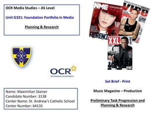
- 1. OCR Media Studies – AS Level Unit G321: Foundation Portfolio in Media Planning & Research Name: Maximilian Stainer Candidate Number: 3138 Center Name: St. Andrew’s Catholic School Center Number: 64135 Set Brief - Print Music Magazine – Production Preliminary Task Progression and Planning & Research
- 2. Section 1) – Preliminary Task
- 3. Preliminary Task Progression– Evidence Front Cover Step-by-step
- 4. I have achieved this background colour by adding the primary royal blue colour of St. Andrews and then I have used the secondary colour as the gold used in the banner to have the consistent and same effect throughout the front cover. Then I used the gradient tool and created a centre gradient to be behind the main image to act as a glow behind the image to make the model stand out to the audience.
- 5. To make the barcode I firstly used a shape of a square/ rectangle to outline where all my features of the barcode would be placed in. then I downloaded and placed a barcode and sharpened it to make it look clearer in a smaller image. Then I downloaded social media icons to make the magazine barcode seem more realistic as it follows what other magazines do. I then used the text tool to add in the date, issue, price and website link to further make this magazine look more professional.
- 6. Here I firstly got an image off Google images stating ‘sticker shapes’ which I saved to my files. Then I placed it in and then filled the colour with the pain bucket tool the same colour as the gold on the banner. I then added text box tool and added in the persuasive fonts. This was also applied to the Excetra promotion at the bottom right of the front cover. I designed the font by going on to Dafont.com and downloaded and placed the font with the original fonts on Photoshop. Then I added the colour of the banner to make the masthead stand out from the blue background along with the black stroke. On the banner I introduced my strapline by just adding the text tool in line with each other and I used a suitable font to make the strapline stand out.
- 7. The main image took a lot of time to do as I had to firstly use the magic wand tool and remove the background. Then after this I had to remove the white outline of the image by using the ‘q’ tool where black conceals white reveals which made the image much clearer and made the front cover look more realistic and smarter. I then finished the image by using the rubber tool to sync any white outlines of the image into the background. As well as this I constructed the main headline by finding a very bold font and then installed from Dafont.com which then allowed me to use this by using the text tool.
- 8. To make the cover lines I used multiple text tools and applied the same font downloaded from Dafont.com. I then applied a black stroke to make them stand out to the audience. I also highlighted the main words in a bright gold to imply the importance of the cover lines. I also made the font of the ‘WIN’ bigger to appeal to the reader’s attention. I also included images such as the beats logo, canteen logo and the CGP logo. This makes clear references to the cover lines. I also used the ruler tool to make sure that the cover lines are all in line with each other to make it look neater.
- 9. Preliminary Task Progression– Evidence Contents Page Step-by-step
- 10. The shape and structure of the contents page was constructed with simple rectangle shapes which I fitted to look professional and it matched with the colour scheme of the gold of the St. Andrews colour. The font of the contents page title is the same font as the front cover masthead but spaced out more to cover more of the outline to look more appealing to the reader.
- 11. Here I then improved the structure of the contents page on the right hand side where all the sub-lines were going to be placed. Here I split the sub-lines into sections, features and exclusives which are used to categorize the contents within my magazine to make it look neat and easier to navigate through. I then added more gold rectangular tools to further make the headings stand out with the use of the bucket tool done in the distinctive gold. I also used the pen tool for my editorial column where I added points for where I will wrap the text around the picture of myself. I also placed in my signature by scanning it to my computer.
- 12. After I have structured my contents page I have then just filled it in with the necessary magazine conventions that you will typically find in a contents page. I have added in images to fit cover lines and have cropped the to fit the frame around and then I applied a text box for each one to pull the reader in. Effective e logos such as the FROG logo I adapted it and changed the colour via the paint bucket tool and then I used the same colour as the frames to follow the house theme.
- 13. Section 2) – Log Book
- 14. Music Magazine – Genre research With evidence from Statista, the graph below reveals the most popular genres in the United States of America as of May 2014. From this graph we can recall that Hip hop is not as popular as rock, oldies or pop although is listened more than Christian & Gospel. This is mainly because in the Hip hop is a much younger genre than rock or country which has been around for longer periods of time. https://www.statista.com
- 15. Established Magazine for my Research Masthead to state the magazine’s company is big, bright and bold to make it an icon to the public. alongside this it is efficient because it is at the top left corner which will be seen from a magazine stand point of view so putting the masthead there will allow people to recognise the magazine. Main headline of the magazine front cover relating to the main image to identify the reader what the subject is about. Barcode, issue, date and price to identify the issue of the magazine and the price it is at. Cover lines of different stories within magazine to allow the reader to diverse and immerse themselves within the issue. This also contains multiple stories that will attract a lot of followers of that particular subject/ artist involved. Close shot/ mid-shot Main image of the controversial and popular figure of the hip hop/ rap genre. JAYZ as the main image will attract the reader to buy this issue because of the ‘star appeal’(Richard Dyer) as JAYZ is a successful artist and obviously has a wide range of followers who would be interested to buy this magazine. Strapline identifies the magazine brand itself by establishing how popular the magazine is. This is used as a selling point to attract more new readers.
- 16. Target Audience – Katz, Maslow, Hartley and/or socio-economic needs This Q magazine will mainly attract many JAYZ fans and music fans who follow rap due to the ‘star appeal’ (Richard Dyer) method. From the Katz theory we can justify that the magazine’s purpose is used for diversion to allow the reader immerse in the content of the story about JAYZ or into any of the cover lines displayed on the front cover. According to the Hartley’s theory we highlight that most of the audience will be at ages 18-25 as many of this age group would prefer to listen JAYZ’s rap music and he was a main figure during this time period. Gender of the audience would likely be male as they would follow JAYZ mainly because he is a popular rap artist in the music industry as well as this there are many cover lines that will interest mainly men such as the Plan B exclusive. In terms of class we can illustrate that more higher class/ well-off people will buy this magazine because Q magazine is a very big and well established brand which will in turn have higher prices for its magazine and therefore make it more affordable for the higher class. From Bauer media the readership of Q fits into the A,B,C1 section of the socio-economic needs table with a majority of 71.8%. What is the USP of this magazine? The main USP of the magazine will be the ‘star appeal’ (Richard Dyer) because the use of JAYZ as the star and main headline will be the attraction and USP because of the popularity of the artist on the front cover. As a famous music artist covering most of the page it will draw the viewer’s attention and buy the magazine.
- 17. Publisher research Bauer Media’s slogan “We think popular” highlights the originality of the magazine and how they exaggerate there point on their view on music which is “popular”. The adjective “popular” stands out to the reader clarifying that this magazine is the best magazine for the reader to buy. The slogan is effective as it is short and sweet making it iconic for the reader to remember. The target audience for Q magazine are the older generation such as people in their 30’s and 40’s who are looking for a different mode of address, more sophisticated and just want to know more about the music itself not the materialistic point of view. This is supported by the statistic that 83.8% of readers are between the age of 15 and 44 and 66.2% are male. It doesn’t appeal to many women although the magazine will be attracted to A,B and maybe C1 on the socio-economic needs spectrum. On Great Magazines you can purchase a subscription to Q magazine for £26 a year and receive a free £20 gift card. You can also purchase the magazine in either print or digital depending on your opinion. I have got this information from the Q Magazine website http://www.qthemusic.com
- 18. Conventions of a Music Magazine Bright and bold masthead which is unique and recognisable. Placed in the top left corner to be clearly seen from a magazine stall which will be known as brand identity. Main images uses ‘star appeal’ by using a famous artist from rap as the splash on the cover of the magazine. This is effective as this is an aspired artist in rap and a figure in music. This will allow more followers of Drake to buy this magazine just because of the artist himself. Main headline and the font and size is big revealing the importance of its content within the magazine. The bold headline is vague which forces the reader to buy and read more in the magazine Barcode to identify the price, issue and the date Cover lines to provide more stories for the reader and to diverse in and also attracts followers of that subject or the star involved in the cover line Black and white color scheme identifies the classic / momentous occasion this is for the magazine brand as it is the 150th issue.
- 19. Target Audience – Katz, Maslow, Hartley and/or socio-economic needs According to Katz Uses and Gratifications theory the purpose of the this issue of the magazine is to personal identify the reader about the main headline that is Drake as he appears to also be the ‘star-appeal’ (Richard Dyer) of the front cover. Alongside this the purpose would also be used for diversion to allow the reader to immerse themselves in the content which is depicted by the cover lines. In terms of Maslow’s Hierarchy of needs, the audience of XXL magazines will fall under survivors or social climbers as the reader will want to be kept updated by the latest news and they will also want to be materialistically driven by the artists’ clothing. In general the target audience of for XXL magazine will be around ages 16-25 and mainly male. This is due to the amount of hip hop/ rap artists the magazine focuses on which is mainly listened to young adults. The general target audience for XXL magazine is 78% male readers, with the median age of 27, and 44.7% college buyers which reveals that the magazine brand reaches out to C2, D and E of the socio- economic spectrum. http://alexyatesmedia.blogspot.co.uk/2012/10/audience-research-reader-profile-of-xxl.html What is the USP of this magazine? YOU MUST refer to specific conventions/stories from you research Through the research of this magazine, the USP of XXL in this issue is the main headline designed as a ‘star appeal’ (Richard Dyer) as this specific issue has a cover of Drake who at this moment in time is one of the most successful artists in hip hop therefore it will catch the reader’s attention and force them to buy the magazine. Alongside this the cover lines of the magazines mentions a variety of other famous artists that will also attract the reader. Also XXL advertise this magazine as their ‘150th issue’ which makes the reader buy the magazine as it is a special occasion for the brand.
- 20. Publisher research XXL magazine is published by Townsquare Media. Townsqaure Media is a diversified media, entertainment and digital marketing services company that owns and operates market leading radio, digital and live event properties across the US. Townsquare Media don’t have a slogan although they cover a wide base of platforms. Their magazine attracts mainly C2, D and E as it easily affordable and also the magazine also focuses on materialistic features as well which will attract social climbers at ages .15- 30. Townsquare Media have also published KING and Antenna. XXL can also be found in various retail outlets such as Barnes and Noble and online on your devices as it is also available on ITunes. In terms of pricing the cost for a magazine costs $5.99 for two months which infers that the magazine is relatively cheap. http://www.xxlmag.com