
Recommended
More Related Content
What's hot
What's hot (19)
Viewers also liked
Viewers also liked (20)
Similar to Preliminary Task and Planning
Similar to Preliminary Task and Planning (20)
More from zeyanmirza
Recently uploaded
Recently uploaded (20)
Preliminary Task and Planning
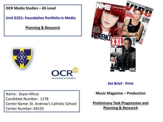
- 1. OCR Media Studies – AS Level Unit G321: Foundation Portfolio in Media Planning & Research Name: Zeyan Mirza Candidate Number: 1178 Center Name: St. Andrew’s Catholic School Center Number: 64135 Set Brief - Print Music Magazine – Production Preliminary Task Progression and Planning & Research
- 2. Section 1) – Preliminary Task
- 3. Preliminary Task Progression– Evidence Front Cover Step-by-step Step 1 The first thing I done when making my preliminary front cover was make the background the colour and tint I wanted it to be, I wanted it to be yellow fading into a much more mellow yellow and I done this by using the gradient tool. I already had the template with the bold stripes in St Andrews house colours at the top of the document, along with the St Andrews badge. I then inserted the web address for my magazine. Step 2 Secondly I used the ruler tool to align everything and make sure when inserting conventions onto my front cover I know where to put them. This makes it a lot easier to make the front cover as I know where I need to put everything so It enabled me to work faster. Step 3 The third thing I done was use Photoshop to remove the background from the image, after this I inserted in onto my front cover by placing the file into the document. The reason I made sure I placed the image on before I done anything else, such as the text, was so I would know how all the other conventions would look around it. Step 4 I then inserted the masthead, it did not take long for me to pick the font as I knew that I wanted something simple. After this I put the magazine slogan in, under the ‘Andy's” aligned using the ruler tool with the bottom of the ‘y’. Step 5 On a separate document I done my barcode, I got an image of the barcode of the internet and placed it into a white box with a black outline. I then put the barcode onto the front cover document and added the three social media signs and using a text box, inserted the issue number, price and date. Step 6 The next thing I done was make my puff promotion, I done this by using the shape tool to make a circle I then filled it with blue and put a bold yellow outline around the circle. After this I inserted the image of the amazon kindle, and lastly used the text tool to write win and placed into into the puff promotion.
- 4. Step 7 The next thing I done was insert the cover story headline, I wanted to stick with the house colours therefore I made the text yellow and gave it a thick blue outline. I believe this helps make the cover story stand out more. Step 8 I then inserted my sub story's, I done this using the text tool and again decided to stick with the house colours, I chose blue instead of yellow because yellow would be the same colour as the background. I then realized I was going to have space on the left hand side of the page so inserted a main sub story, this time using yellow text and gave it a black outline. Step 9 To make the sub story's look better, I decided to add the St Andrews logo, these acted as bullet points for each story, and helped emphasize to the reader what magazine they are reading as well as it looking more aesthetically pleasing. Step 10 Lastly I inserted an image of a student over piled with work and books, this links with my sub story's. Preliminary Task Progression– Evidence Front Cover Step-by-step
- 5. Preliminary Task Progression– Evidence Contents Page Step-by-step Step 1 The first thing I done was use the text tool to put in my contents, I wanted the contents writing to be the in my house colours therefore they had to be the same colours as the St Andrews badge, I used blue text with a bold yellow outline and then incorporated this into the St Andrews banner which I had already made. Step 2 I then inserted my masthead logo into my contents page, I done this so the reader knows what magazine they are reading. I copied and pasted the masthead from my front cover, made it smaller and placed it into the St Andrews banner. Step 3 After this I inserted the magazines issue number, date and the web address, this was done using the text tool. Step 4 The next thing I done was use the ruler tool to determine where I wanted my text. I inserted the editorial I previously created on word, after inserting the text I decided I wanted the ‘Andy's Stars’ in my editorial to be in my masthead font style. So I used the Andy's Stars I used in the banner, made it smaller wand put it where I wanted it in the text. I then inserted my signature which I had written on a piece of paper, and taken a picture off, I used the magic wand tool to remove the white background, then sharpened the signature. Step 5 I then inserted my images into my contents page, these included the editor photo, social media logos, Christmas quiz photo and photos taken In St Andrews. I done this by placing the images into the Photoshop file. Step 6 I then inserted my sub dividers, I made a rectangle using the shape tool the filled it in St Andrews blue, I then using the text tool wrote my text and made this St Andrews blue and gave it a yellow outline, to emphasize the magazine they are reading I added the St Andrews badge. Step 7 I then inserted my articles using the text tool
- 6. Section 2) – Log Book
- 7. Music Magazine – Genre research Firstly you must set the date of publication (When the magazine will be published to the general public). You then also make sure there is enough space to eradicate any mistakes, before the magazine is actually published. After this you decide what is going to be in the magazine content wise and how to acquire what was needed. You then then check the quality and accuracy of the facts to make sure all the content is correct. Then using powerful software like InDesign you create the page layout. After all of the following is done you send the magazine off for printing and then get them ready for distribution to the general public. • Vibe has a circulation of 300,943 of which 202,439 was paid and 98,504 was non paid • Q magazine has a circulation of 52,781 as of December 2013
- 8. Established Magazine for my Research] Masthead- Name of the magazine Cover lines- Gives reader an insight into articles. House Colors- Enables reader to clearly associate this magazine Puff promotion- Giving the reader freebies, which will encourage them to buy the magazine every week Slogan- A term associated with the magazine Cover star/ Main Image- Tinie Tempah gives the magazine star appeal Barcode Pull Quote- Makes the reader want to open the magazine and read the article Main cover line- Bold and bigger then other text, indicating it’s the main story Border
- 9. The target audience for Q magazine appeals to all classes and genders. Q magazine is published every month and costs 3.50 per issue. According to socio economic needs, students are placed in the class E section. 3.50 a month is a fair and affordable price for teenagers as well as others. Q magazine have purposely not targeted any specific class or gender so their magazine appeals to all different types of people. People most probably red Q magazine for ‘diversion’ and to be ‘informed and educated’ (Katz) The USP of Q magazine is that it is an exclusive, collectors addition magazine. People would be more tempted to buy the version of Q that I have analyzed because it is a one off 25th anniversary addition. The front cover also looks as if it has Tinie Tempah’s signature at the front. Tinie Tempah is one of the biggest artists in the UK therefore he brings ‘star appeal’ (Richard Dyer). This magazine is one of a kind as it is a special edition so will almost definitely tempt readers into buying it.
- 10. Publisher research The connotations behind the slogan “We think popular” indicates that Bauer magazine is a magazine that strives to be the best. Q’s content mainly focuses on rock and roll and their target readership is those aged between 15-25. Because of Bauer media Q has a total of 48, 353 copies of their magazine and has a total readership of 339,000. Bauer reaches over 22 million people in the UK, and has many magazines on its roster making it one of the most popular publishing companies in the UK. Bauer magazines are made available in retail outlets such as WH Smith, Sainsbury and Tesco, meaning if my magazine is published by Bauer, the magazine will be easily accessible.
- 11. Established Magazine for my Research The masthead is red going into black and this helps it to stand out on the white background. This will help it to stand out on the shelves of a store. This cover of Vibe has cover lines with separate artists that are set to feature in the magazine. If Eminem does not appeal to the readers, there are most definitely other rappers featuring in the magazine that might. The web address for Vibe is placed in the bottom left hand corner and encourages readers to go online. Has a question often asked by raps fans, will encourage reader to have their say. Eminem is one of the biggest artists in the world and by including him on the front cover you are making the magazine an attractive proposition to buy, Eminem adds ‘star appeal’ to the magazine. By having the word rap on the cover, you are immediately telling someone who does not know about the magazine what it is about
- 12. The target audience for Vibe magazine is mainly targeted at males rather than females (Hartley). This mainly male audience would all share a common interest in Hip Hop/Rap. The majority of the people that buy this magazine would most probably be in their late teens. The cost of the magazine is 5.00 which is again very affordable for the class E (Socio economic needs). I don’t think that vibe has been specifically made to target a specific race or gender because rap is predominately black genre, yet Eminem is on the front cover of this magazine (Hartley). The readers of Vibe magazine are most likely ‘survivors’ or ‘explorers’ (Maslow) and probably read it because they want ‘diversion’ (Katz). From the research completed into this media product, I think the USP is the gradient in the masthead. I especially like how the color changes from red to black and I feel these two colours represent rap. This masthead is slick therefore will stand out on the shelves in store. Another USP of this magazine would be that it features ‘The best rapper ever, you decide’ this gives readers a way to Interact with the editor in the magazine, and will most definitely excite the readers as it is a frequently asked question and they get to have their say.
- 13. Publisher research Vibe magazine was founded by Quincy Jones and is published by spin media, located in new York. Their main content is Rap and RnB. Vibe’s target readership would be people aged between 18-34 (Hartley). According to recent statistics Vibe has a circulation of around 300,943 copies;. Vibe used to publish both printed and online copies, there were small differences in the content provided in each version. Because the online version is online, it had more information. However as of 2014 Vibe only publishes online copies and no longer has printed copies that were distributed to places such as WH Smith and Sainsbury’s.