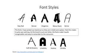
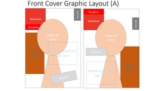
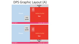
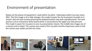
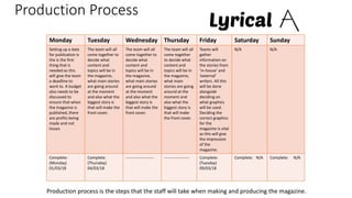
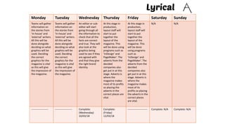
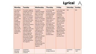
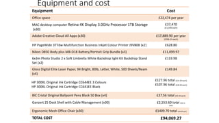
Unit 14
Producing a Print Based Media
Product
Zoe Toulson
Centre Number: 64135
Rough Sketches
Barcode: Originally, I had the barcode
placed in the top right hand corner.
However I have changed this when editing
as I decided that it looked nicer down in
the bottom left corner but also because it
is out of the way of the main image and
the cover lines.
Cover lines: The cover lines originally were
going to be on the right hand side however
I moved them to under the masthead on
the left hand side. This means that they
are still visible while not covering the main
image. There will also be a puff promotion
Main image: The main image will be in the center of my
magazine as this is the first thing that the readers are
going to see and it will draw them in. it will also let the
reader know who the main interview is about.
Masthead: The masthead will be in the top
left hand corner so that it can be easily
seen and recognized by the reader.
Main Headline: The main headline will
be placed just off center so that it does
not cover up the main image but it can
still be seen and catch the readers eye. I
have however moved the headline over
to the right hand side as it fitted better
with my image.
Strapline: Originally I had placed the
strapline above the masthead however I
changed this when editing as it looks
more ascetically pleasing below the
masthead.
Rough Sketches (continued)
Headline: I planned the headline to be at the bottom of the
page however when I was editing and making my DPS this
quickly changed. The headline is now at the top of the page
as it is more eye-catching to the readers and they will know
what the article is about straight away
Drop Capital: The drop capital will be at the start of the QnA
with the artist as this will grab the readers attention and let
them know where the article starts.
Photo: I chose to only have one photo and for it to take up
the whole of a page. I did this to not only grab the readers
attention even more but so that the reader will straight away
know who the article is about. A Pull Quote will also be
placed on top of the main image however when editing I
moved it from the top right down to the bottom right.
Other: At the bottom of each page, in the corners, there will
be page numbers, a logo and the issue date. This is so that
the readers can keep up to date on the issue that they are on
and obviously the page that they are on. I decided to put
these into the corners as it is a bit out the way however they
can still be seen.
Final Sketches
For my final front cover sketch I chose
this one, pictured below, because of
the layout, colour scheme and the
placement of all the key features such
as the masthead, main image and the
cover lines. I personally felt like this was
the most aesthetically pleasing front
cover as I feel the colours really
compliment each other as well as the
layout.
For my final DPS sketch I chose this
one, pictured below, again because of
the layout and because it matched my
magazine of inspiration. I also liked the
colours I edited into the picture as well
as the overall colours.
House style (A)
Colour scheme
The denotation of the colour scheme for the magazine front cover will be simple yet exciting. It will
show that my magazine is worth the read and that readers will not be disappointed. I have chosen to
have the masthead white backing onto a blush filled coloured box, similar to what Q magazine have
done. The background will be a photo of an artist covering the whole page with a background of a grey
gradient, I am not to sure yet. The colour blush connotes happiness, love and youth. This then connotes
to the reader that the artists featured in my magazine have these qualities and that people aspire to be
just like them, therefore this would make readers want to read about them. Blush also connotes love,
this connoting to audience members that they will love my magazine.
Font style
My magazines masthead font is ‘Café & Brewery’. This is because it is quite easy to read while also being
visible. As the masthead is just one letter, it becomes quite recognizable and easy to remember to the
consumer. For the rest of my magazine, my font will be ‘Verdana’ this is because it is is a font that is
quite spaced out and easy to read. It is also quite laid back which could connote that there is no
pressure within my magazine and without making the text size to big, the font is originally fairly big
which again makes it easier to read.
Social media
A would be in synergy with social media as this would then appeal to more customers and get my
magazine to be more known. I would use social medias such as Snapchat, Facebook and Instagram etc. I
would use these to keep readers updated as to what was happening within the magazine. There would
also be exclusive interviews, videos and competitions. There would be versions of my magazine
available on the magazine website and Facebook, this is an example of technological convergence.
Font Styles
Stay Rad Bonzai Diogenes Mona Shark
Source: https://www.dafont.com/theme.php?cat=501&page=4
The fonts I have picked out stand out as they are in bold and capital, I feel this makes
it quite eye catching. As the brand is just one letter, the fonts make it quite
recognizable and easy to remember to the consumer.
Aerioz
Café & Brewery Unability Aubrey Otrebla
Masthead Ideas
A - Standing for ambitious.
Ambitious means that a great
amount of effort and skill is needed
for a task to be achieved. This could
connote to the reader that a lot of
time, effort and hard work has gone
into this magazine.
Melody - A melody is
when musical sounds all
sound good together. A
reader might think the
articles in the magazine
would all go good together.
Lyrical - If something is
lyrical it is full of emotion. A
name like this would make
the audience want to read to
magazine as they would want
to relate to the emotion.
Images of Influence
Above are some images that have influenced me when making my magazine. I like
the layouts of these magazines and how the pictures are posed. The main image that
I will be looking at is the Ed Sheeran one, mainly because I want my magazine to have
a guitar on the front as then it is obvious that it is a music magazine. I also really like
how the cover lines fit around Ed.
Mood Board
Draft Article
Front Cover Graphic Layout (A)
Cover
Stories
Masthead
Strapline
Barcode
Photo of
artist
Headline/Anchor
age Text
Cover
Stories
Masthead
Barcode
Photo of
artist
Quote
Headline/Anchor
age Text
Strapline
DPS Graphic Layout (A)
Picture
Text
Logo Page no.
Headline
Title
Issue date Page no. Logo
Pull
quote
Drop
capital
Initial of artist
Picture
Text
Logo Page no.
Headline
Title
Issue date Page no. Logo
Pull
quote
Drop
capital Initial of artist
Photo shoot plan
Test Photography
Environment of presentation
Below are the pieces of equipment I used within my pitch. I took place within my class room,
MS1. The first image is of a slide changer, this made it easier for me to present my pitch as it
meant I did not have to keep pressing the keyboard which may look unprofessional. The next
picture is of an interactive white board which is connected to the apple mac (last picture).
This made it easier for my peers to see my presentation clearly. The middle two images are of
a camera and a tripod. The camera was used to film my pitch and the tripod was used so that
the camera was stable and did not move.
Production Process
Monday Tuesday Wednesday Thursday Friday Saturday Sunday
Setting up a date
for publication is
the is the first
thing that is
needed as this
will give the team
a deadline to
work to. A budget
also needs to be
discussed to
ensure that when
the magazine is
published, there
are profits being
made and not
losses
The team will all
come together to
decide what
content and
topics will be in
the magazine,
what main stories
are going around
at the moment
and also what the
biggest story is
that will make the
front cover.
The team will all
come together to
decide what
content and
topics will be in
the magazine,
what main stories
are going around
at the moment
and also what the
biggest story is
that will make the
front cover.
The team will all
come together
to decide what
content and
topics will be in
the magazine,
what main
stories are going
around at the
moment and
also what the
biggest story is
that will make
the front cover.
Teams will
gather
information on
the stories from
‘in-house’ and
‘external’
writers. All this
will be done
alongside
deciding on
what graphics
will be used.
Deciding the
correct graphics
for the
magazine is vital
as this will give
the impression
of the
magazine.
N/A N/A
Complete:
(Monday)
01/03/18
Complete:
(Thursday)
04/03/18
--------------------- ------------------- Complete:
(Tuesday)
09/03/18
Complete: N/A Complete: N/A
Production process is the steps that the staff will take when making and producing the magazine.
Monday Tuesday Wednesday Thursday Friday Saturday Sunday
Teams will gather
information on
the stories from
‘in-house’ and
‘external’ writers.
All this will be
done alongside
deciding on what
graphics will be
used. Deciding
the correct
graphics for the
magazine is vital
as this will give
the impression of
the magazine.
Teams will gather
information on
the stories from
‘in-house’ and
‘external’ writers.
All this will be
done alongside
deciding on what
graphics will be
used. Deciding
the correct
graphics for the
magazine is vital
as this will give
the impression of
the magazine.
An editor or sub-
editor will start
going through all
the information to
check that all the
facts are correct
and true. They will
also look at the
graphics being
used to see if they
are agreed with
and that they give
the right brand
identity.
At this stage in
production,
layout staff will
start to put
together the
layout of the
magazine. This
will be done using
programs such as
‘InDesign’ and
PageMaker’. The
adverts from the
decided
companies also
get put in at this
stage. Adverts is
where the
magazine makes
most of its profits
so placing the
adverts in the
correct places are
vital.
At this stage in
production,
layout staff will
start to put
together the
layout of the
magazine. This
will be done
using programs
such as
‘InDesign’ and
PageMaker’. The
adverts from the
decided
companies also
get put in at this
stage. Adverts is
where the
magazine makes
most of its
profits so placing
the adverts in the
correct places
are vital.
N/A N/A
-------------------- -------------------- Complete:
(Wednesday)
10/03/18
Complete:
(Friday)
12/03/18
----------------------- Complete: N/A Complete: N/A
Monday Tuesday Wednesday Thursday Friday Saturday Sunday
The editorial
team now
print out a
hard copy of
the magazine
to enable
them to read
through
checking for
any sorts of
mistakes. It
also allows
them to see
how it look in
a hard copy
compared to
digitally.
The whole magazine
now gets sent to the
printer. After it has
been printed, it is
pre-pressed which is
where it is checked
again for any errors
and that all the texts
and pictures have
been correctly
printed out as well as
the rest of the
magazine. A few
copies get sent to the
publication editor
and if the whole
team is happy and
satisfied with the
prints then the other
thousands of copies
can get printed to
meet the demand of
the magazine
The whole
magazine now gets
sent to the printer.
After it has been
printed, it is pre-
pressed which is
where it is checked
again for any errors
and that all the
texts and pictures
have been correctly
printed out as well
as the rest of the
magazine. A few
copies get sent to
the publication
editor and if the
whole team is
happy and satisfied
with the prints
then the other
thousands of
copies can get
printed to meet the
demand of the
magazine
In this final stage
the printing
company would of
finished printing
the magazines
and would of
packed them up in
boxes ready to
send to the
warehouse. Once
the magazines
have reached the
warehouse they
get distributed to
different stores
where the public
are able to
purchase them.
In this final stage
the printing
company would
of finished
printing the
magazines and
would of packed
them up in boxes
ready to send to
the warehouse.
Once the
magazines have
reached the
warehouse they
get distributed to
different stores
where the public
are able to
purchase them.
N/A N/A
Completed:
(Monday)
15/03/18
Completed:
(Wednesday)
17/03/18
Completed:
(Friday) 19/03/18
Completed:
N/A
Completed
: N/A
Equipment and cost
Equipment Cost
Office space £22,474 per year
MAC desktop computer Retina 4K Display 3.0GHz Processor 1TB Storage
(x30)
£37,470
(£1,249 each)
Adobe Creative Cloud All Apps (x30) £17,889.90 per year
(£596.33 each)
HP PageWide 377dw Multifunction Business Inkjet Colour Printer J9V80B (x2) £628.80
Nikon D850 Body plus MB-D18 Battery/Portrait Grip Bundle (x3) £11,099.97
6x3m Photo Studio 2 x Soft Umbrella White Backdrop light Kit Backdrop Stand
Set (x2)
£119.98
Gloss Digital Elite Laser Paper, 94 Bright, 80lb, Letter, White, 500 Sheets/Ream
(x4)
£149.84
HP 300XL Original Ink Cartridge CC644EE 3 Colours
HP 300XL Original Ink Cartridge CC641EE Black
£127.96 total (£31.99 each)
£107.96 total (£26.99 each)
BIC Cristal Original Ballpoint Pens Black 50 Box (x4) £37.56 total (£9.39 each)
Ganzert 25 Desk Shell with Cable Management (x30) £2,553.60 total (£85.12
each)
Ergonomic Mesh Office Chair (x30) £1409.70 total (£46.99 each)
TOTAL COST £94,069.27
Equipment and cost (continued)
Sources:
(office) - https://propertylink.estatesgazette.com/property-details/6208177-third-floor-manor-house-
church-street-leatherhead-kt22-8dh
(MACS) - https://www.apple.com/imac/
(Adobe) – https://www.adobe.com/uk/creativecloud/plans.html?promoid=P3KMQYMW&mv=other
(Printer) - http://store.hp.com/UKStore/Merch/Product.aspx?id=J9V80B&opt=A80&sel=PRN (Cameras) -
https://www.lcegroup.co.uk/New/nikon-d850-body-plus-mb-d18-batteryportrait-grip-bundle_17966.html
(Lighting equipment) -
https://www.ebay.co.uk/i/292473139716?chn=ps&dispItem=1&adgroupid=51701849453&rlsatarget=pla-
413070009328&abcId=1133946&adtype=pla&merchantid=119445473&poi=&googleloc=1006861&device=c
&campaignid=1058609649&crdt=0
(Paper) - https://www.amazon.co.uk/Gloss-Digital-Bright-Letter-Sheets/dp/B000RTKKE0
(Printer Ink) - http://www.viking-direct.co.uk/a/bb/HP-Ink-Cartridges/N=2+1291785/?cm_mmc=Google-_-
INK_VEN_CARTRIDGES_hp-ink_HP-FUNDED-_-HP+Ink_m-_-
%2Bhp+%2Bink&gclid=EAIaIQobChMIurzwrs6O2gIV6J3tCh37rQ0rEAAYAiAAEgIrYvD_BwE&gclsrc=aw.ds
(Pens) - https://www.amazon.co.uk/Cristal-Original-Ballpoint-Pens-
Black/dp/B000I5ZK2U/ref=sr_1_5?s=officeproduct&ie=UTF8&qid=1522227973&sr=1-
5&keywords=ballpoint+pens
(Desks) - https://www.wayfair.co.uk/furniture/pdp/home-haus-ganzert-25-desk-shell-with-cable-
management-idn1000.html?piid=3377142%2C3377147
(Chair) - https://www.wayfair.co.uk/furniture/pdp/symple-stuff-ergonomic-mesh-office-chair-
syms2561.html
Conclusion
During LO1 I was required to put together slides that would cover all
aspects of my pitch. I made some rough sketches, by hand and
graphical, so that I could look at the layout of my front cover and DPS.
It also makes it easier for the people viewing my pitch to see my ideas
when I was planning the magazine. I have also created a photoshoot
plan which states not only how I am going to take my images, but what
lighting, props and clothing I will use. Finally I put together a
production plan which highlights to the staff what will get done on
each day and when I am expecting them to complete it by. This is done
so that the magazine can be released for its fist issue on time which I
have set as the 19th of March 2018.

Unit 14 - LO1

  • 1.
    Unit 14 Producing aPrint Based Media Product Zoe Toulson Centre Number: 64135
  • 3.
    Rough Sketches Barcode: Originally,I had the barcode placed in the top right hand corner. However I have changed this when editing as I decided that it looked nicer down in the bottom left corner but also because it is out of the way of the main image and the cover lines. Cover lines: The cover lines originally were going to be on the right hand side however I moved them to under the masthead on the left hand side. This means that they are still visible while not covering the main image. There will also be a puff promotion Main image: The main image will be in the center of my magazine as this is the first thing that the readers are going to see and it will draw them in. it will also let the reader know who the main interview is about. Masthead: The masthead will be in the top left hand corner so that it can be easily seen and recognized by the reader. Main Headline: The main headline will be placed just off center so that it does not cover up the main image but it can still be seen and catch the readers eye. I have however moved the headline over to the right hand side as it fitted better with my image. Strapline: Originally I had placed the strapline above the masthead however I changed this when editing as it looks more ascetically pleasing below the masthead.
  • 4.
    Rough Sketches (continued) Headline:I planned the headline to be at the bottom of the page however when I was editing and making my DPS this quickly changed. The headline is now at the top of the page as it is more eye-catching to the readers and they will know what the article is about straight away Drop Capital: The drop capital will be at the start of the QnA with the artist as this will grab the readers attention and let them know where the article starts. Photo: I chose to only have one photo and for it to take up the whole of a page. I did this to not only grab the readers attention even more but so that the reader will straight away know who the article is about. A Pull Quote will also be placed on top of the main image however when editing I moved it from the top right down to the bottom right. Other: At the bottom of each page, in the corners, there will be page numbers, a logo and the issue date. This is so that the readers can keep up to date on the issue that they are on and obviously the page that they are on. I decided to put these into the corners as it is a bit out the way however they can still be seen.
  • 5.
    Final Sketches For myfinal front cover sketch I chose this one, pictured below, because of the layout, colour scheme and the placement of all the key features such as the masthead, main image and the cover lines. I personally felt like this was the most aesthetically pleasing front cover as I feel the colours really compliment each other as well as the layout. For my final DPS sketch I chose this one, pictured below, again because of the layout and because it matched my magazine of inspiration. I also liked the colours I edited into the picture as well as the overall colours.
  • 6.
    House style (A) Colourscheme The denotation of the colour scheme for the magazine front cover will be simple yet exciting. It will show that my magazine is worth the read and that readers will not be disappointed. I have chosen to have the masthead white backing onto a blush filled coloured box, similar to what Q magazine have done. The background will be a photo of an artist covering the whole page with a background of a grey gradient, I am not to sure yet. The colour blush connotes happiness, love and youth. This then connotes to the reader that the artists featured in my magazine have these qualities and that people aspire to be just like them, therefore this would make readers want to read about them. Blush also connotes love, this connoting to audience members that they will love my magazine. Font style My magazines masthead font is ‘Café & Brewery’. This is because it is quite easy to read while also being visible. As the masthead is just one letter, it becomes quite recognizable and easy to remember to the consumer. For the rest of my magazine, my font will be ‘Verdana’ this is because it is is a font that is quite spaced out and easy to read. It is also quite laid back which could connote that there is no pressure within my magazine and without making the text size to big, the font is originally fairly big which again makes it easier to read. Social media A would be in synergy with social media as this would then appeal to more customers and get my magazine to be more known. I would use social medias such as Snapchat, Facebook and Instagram etc. I would use these to keep readers updated as to what was happening within the magazine. There would also be exclusive interviews, videos and competitions. There would be versions of my magazine available on the magazine website and Facebook, this is an example of technological convergence.
  • 7.
    Font Styles Stay RadBonzai Diogenes Mona Shark Source: https://www.dafont.com/theme.php?cat=501&page=4 The fonts I have picked out stand out as they are in bold and capital, I feel this makes it quite eye catching. As the brand is just one letter, the fonts make it quite recognizable and easy to remember to the consumer. Aerioz Café & Brewery Unability Aubrey Otrebla
  • 8.
    Masthead Ideas A -Standing for ambitious. Ambitious means that a great amount of effort and skill is needed for a task to be achieved. This could connote to the reader that a lot of time, effort and hard work has gone into this magazine. Melody - A melody is when musical sounds all sound good together. A reader might think the articles in the magazine would all go good together. Lyrical - If something is lyrical it is full of emotion. A name like this would make the audience want to read to magazine as they would want to relate to the emotion.
  • 9.
    Images of Influence Aboveare some images that have influenced me when making my magazine. I like the layouts of these magazines and how the pictures are posed. The main image that I will be looking at is the Ed Sheeran one, mainly because I want my magazine to have a guitar on the front as then it is obvious that it is a music magazine. I also really like how the cover lines fit around Ed.
  • 10.
  • 11.
  • 12.
    Front Cover GraphicLayout (A) Cover Stories Masthead Strapline Barcode Photo of artist Headline/Anchor age Text Cover Stories Masthead Barcode Photo of artist Quote Headline/Anchor age Text Strapline
  • 13.
    DPS Graphic Layout(A) Picture Text Logo Page no. Headline Title Issue date Page no. Logo Pull quote Drop capital Initial of artist Picture Text Logo Page no. Headline Title Issue date Page no. Logo Pull quote Drop capital Initial of artist
  • 14.
  • 16.
  • 17.
    Environment of presentation Beloware the pieces of equipment I used within my pitch. I took place within my class room, MS1. The first image is of a slide changer, this made it easier for me to present my pitch as it meant I did not have to keep pressing the keyboard which may look unprofessional. The next picture is of an interactive white board which is connected to the apple mac (last picture). This made it easier for my peers to see my presentation clearly. The middle two images are of a camera and a tripod. The camera was used to film my pitch and the tripod was used so that the camera was stable and did not move.
  • 18.
    Production Process Monday TuesdayWednesday Thursday Friday Saturday Sunday Setting up a date for publication is the is the first thing that is needed as this will give the team a deadline to work to. A budget also needs to be discussed to ensure that when the magazine is published, there are profits being made and not losses The team will all come together to decide what content and topics will be in the magazine, what main stories are going around at the moment and also what the biggest story is that will make the front cover. The team will all come together to decide what content and topics will be in the magazine, what main stories are going around at the moment and also what the biggest story is that will make the front cover. The team will all come together to decide what content and topics will be in the magazine, what main stories are going around at the moment and also what the biggest story is that will make the front cover. Teams will gather information on the stories from ‘in-house’ and ‘external’ writers. All this will be done alongside deciding on what graphics will be used. Deciding the correct graphics for the magazine is vital as this will give the impression of the magazine. N/A N/A Complete: (Monday) 01/03/18 Complete: (Thursday) 04/03/18 --------------------- ------------------- Complete: (Tuesday) 09/03/18 Complete: N/A Complete: N/A Production process is the steps that the staff will take when making and producing the magazine.
  • 19.
    Monday Tuesday WednesdayThursday Friday Saturday Sunday Teams will gather information on the stories from ‘in-house’ and ‘external’ writers. All this will be done alongside deciding on what graphics will be used. Deciding the correct graphics for the magazine is vital as this will give the impression of the magazine. Teams will gather information on the stories from ‘in-house’ and ‘external’ writers. All this will be done alongside deciding on what graphics will be used. Deciding the correct graphics for the magazine is vital as this will give the impression of the magazine. An editor or sub- editor will start going through all the information to check that all the facts are correct and true. They will also look at the graphics being used to see if they are agreed with and that they give the right brand identity. At this stage in production, layout staff will start to put together the layout of the magazine. This will be done using programs such as ‘InDesign’ and PageMaker’. The adverts from the decided companies also get put in at this stage. Adverts is where the magazine makes most of its profits so placing the adverts in the correct places are vital. At this stage in production, layout staff will start to put together the layout of the magazine. This will be done using programs such as ‘InDesign’ and PageMaker’. The adverts from the decided companies also get put in at this stage. Adverts is where the magazine makes most of its profits so placing the adverts in the correct places are vital. N/A N/A -------------------- -------------------- Complete: (Wednesday) 10/03/18 Complete: (Friday) 12/03/18 ----------------------- Complete: N/A Complete: N/A
  • 20.
    Monday Tuesday WednesdayThursday Friday Saturday Sunday The editorial team now print out a hard copy of the magazine to enable them to read through checking for any sorts of mistakes. It also allows them to see how it look in a hard copy compared to digitally. The whole magazine now gets sent to the printer. After it has been printed, it is pre-pressed which is where it is checked again for any errors and that all the texts and pictures have been correctly printed out as well as the rest of the magazine. A few copies get sent to the publication editor and if the whole team is happy and satisfied with the prints then the other thousands of copies can get printed to meet the demand of the magazine The whole magazine now gets sent to the printer. After it has been printed, it is pre- pressed which is where it is checked again for any errors and that all the texts and pictures have been correctly printed out as well as the rest of the magazine. A few copies get sent to the publication editor and if the whole team is happy and satisfied with the prints then the other thousands of copies can get printed to meet the demand of the magazine In this final stage the printing company would of finished printing the magazines and would of packed them up in boxes ready to send to the warehouse. Once the magazines have reached the warehouse they get distributed to different stores where the public are able to purchase them. In this final stage the printing company would of finished printing the magazines and would of packed them up in boxes ready to send to the warehouse. Once the magazines have reached the warehouse they get distributed to different stores where the public are able to purchase them. N/A N/A Completed: (Monday) 15/03/18 Completed: (Wednesday) 17/03/18 Completed: (Friday) 19/03/18 Completed: N/A Completed : N/A
  • 21.
    Equipment and cost EquipmentCost Office space £22,474 per year MAC desktop computer Retina 4K Display 3.0GHz Processor 1TB Storage (x30) £37,470 (£1,249 each) Adobe Creative Cloud All Apps (x30) £17,889.90 per year (£596.33 each) HP PageWide 377dw Multifunction Business Inkjet Colour Printer J9V80B (x2) £628.80 Nikon D850 Body plus MB-D18 Battery/Portrait Grip Bundle (x3) £11,099.97 6x3m Photo Studio 2 x Soft Umbrella White Backdrop light Kit Backdrop Stand Set (x2) £119.98 Gloss Digital Elite Laser Paper, 94 Bright, 80lb, Letter, White, 500 Sheets/Ream (x4) £149.84 HP 300XL Original Ink Cartridge CC644EE 3 Colours HP 300XL Original Ink Cartridge CC641EE Black £127.96 total (£31.99 each) £107.96 total (£26.99 each) BIC Cristal Original Ballpoint Pens Black 50 Box (x4) £37.56 total (£9.39 each) Ganzert 25 Desk Shell with Cable Management (x30) £2,553.60 total (£85.12 each) Ergonomic Mesh Office Chair (x30) £1409.70 total (£46.99 each) TOTAL COST £94,069.27
  • 22.
    Equipment and cost(continued) Sources: (office) - https://propertylink.estatesgazette.com/property-details/6208177-third-floor-manor-house- church-street-leatherhead-kt22-8dh (MACS) - https://www.apple.com/imac/ (Adobe) – https://www.adobe.com/uk/creativecloud/plans.html?promoid=P3KMQYMW&mv=other (Printer) - http://store.hp.com/UKStore/Merch/Product.aspx?id=J9V80B&opt=A80&sel=PRN (Cameras) - https://www.lcegroup.co.uk/New/nikon-d850-body-plus-mb-d18-batteryportrait-grip-bundle_17966.html (Lighting equipment) - https://www.ebay.co.uk/i/292473139716?chn=ps&dispItem=1&adgroupid=51701849453&rlsatarget=pla- 413070009328&abcId=1133946&adtype=pla&merchantid=119445473&poi=&googleloc=1006861&device=c &campaignid=1058609649&crdt=0 (Paper) - https://www.amazon.co.uk/Gloss-Digital-Bright-Letter-Sheets/dp/B000RTKKE0 (Printer Ink) - http://www.viking-direct.co.uk/a/bb/HP-Ink-Cartridges/N=2+1291785/?cm_mmc=Google-_- INK_VEN_CARTRIDGES_hp-ink_HP-FUNDED-_-HP+Ink_m-_- %2Bhp+%2Bink&gclid=EAIaIQobChMIurzwrs6O2gIV6J3tCh37rQ0rEAAYAiAAEgIrYvD_BwE&gclsrc=aw.ds (Pens) - https://www.amazon.co.uk/Cristal-Original-Ballpoint-Pens- Black/dp/B000I5ZK2U/ref=sr_1_5?s=officeproduct&ie=UTF8&qid=1522227973&sr=1- 5&keywords=ballpoint+pens (Desks) - https://www.wayfair.co.uk/furniture/pdp/home-haus-ganzert-25-desk-shell-with-cable- management-idn1000.html?piid=3377142%2C3377147 (Chair) - https://www.wayfair.co.uk/furniture/pdp/symple-stuff-ergonomic-mesh-office-chair- syms2561.html
  • 23.
    Conclusion During LO1 Iwas required to put together slides that would cover all aspects of my pitch. I made some rough sketches, by hand and graphical, so that I could look at the layout of my front cover and DPS. It also makes it easier for the people viewing my pitch to see my ideas when I was planning the magazine. I have also created a photoshoot plan which states not only how I am going to take my images, but what lighting, props and clothing I will use. Finally I put together a production plan which highlights to the staff what will get done on each day and when I am expecting them to complete it by. This is done so that the magazine can be released for its fist issue on time which I have set as the 19th of March 2018.