
Recommended
More Related Content
What's hot
What's hot (20)
Viewers also liked
Viewers also liked (20)
Similar to Music Mag Layout Analysis
Similar to Music Mag Layout Analysis (20)
Recently uploaded
Recently uploaded (20)
Music Mag Layout Analysis
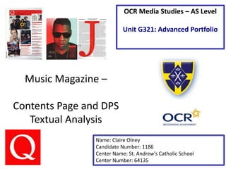
- 1. Music Magazine – Contents Page and DPS Textual Analysis Name: Claire Olney Candidate Number: 1186 Center Name: St. Andrew’s Catholic School Center Number: 64135 OCR Media Studies – AS Level Unit G321: Advanced Portfolio
- 2. Issue details Page number Sub Headings Subline Content Title Main Image The sub headings are like a small title for the article in the magazine which gives reader an idea about what the theme of the article is or who it is about. Here, it is in all capitals and bold writing to stand out against the subline. The sublines are an overview of the content within each article on the pages without giving too much information away. It is in smaller writing that isn’t bold so that the sub headings can stand out. This simply just informs the reader on what issue this particular magazine is. This is written in a white coloured font which is quite spread out in each letter, and it is clearly legible on the red background without standing out too much. The page numbers basically tell the reader what page each article is on. On all of the pictures, the page number is very bold and large, to match the pictures and to also stand out over them. The page numbers next to the article overviews are small, yet bold, so they don’t overpower the importance of the writing about the articles. The main image is a way of having an overview of an article without writing, so the image is enough to inform the reader what the article is about. These images are most likely of artists or bands featured in the magazine. It is a good idea to do this because it doesn’t give away what the article is actually about. The content title is just the title for the contents page, it is different for every magazine. For Q magazine, their title for the contents page isn’t very creative, it is simplistic which fits in with the theme of the magazine.
- 3. When I create my own eclectic music magazine, I intend to repeat (Steve Neale – 1980) the simplicity of the title for the contents page. This is because I don’t believe that it really needs to be very creative and I think it will be a good way to compete with Q magazine. When I create my own eclectic music magazine, I intend to repeat (Steve Neale – 1980) how the page numbers are bold over the images and they don’t stand out too much next to the article overviews. This is because I think it is a very effective and good idea to use in general, and it will again, also help me compete with Q magazine with their simple, yet effective ideas. When I create my own eclectic music magazine, I intent to repeat (Steve Neale – 1980) the way that they have a mixture of images and article overviews in order to inform the reader of what each article includes or is based on. I am going to do this because I think it is a creative idea and it doesn’t leave the page looking too boring. Also, it keeps the page simple, but it still helps the reader engage with both images and writing. If I included this, it would again help me to compete with Q magazine’s layout. I want to repeat the formal and simple layout, which still has a very big impact on the reader.
- 4. Pull Quote The pull quote provides an insight into the interview/article to attract people to read it. The pull quote is most likely going to be something interesting or outrageous to encourage people to read/buy the magazine. In this case, the pull quote is quite interesting and inspiring by Jay Z which will make readers want to know what he is talking about. Main Image The main image is split slightly into two sides: red and neutral. The red side could relate to Q’s brand identity because the colour red it famously associated with Q in this magazine. The red also links to the name they referred to this type of interview ‘Rap Radar’ because radars are normally red, so they must have edited the picture especially for that purpose. For most Q magazines, the main image for the DPS normally takes up a whole page and the other page focuses purely on the interview/article itself. Jay Z is wearing sunglasses in the image which could either convey his image that he wants to give off to people as a rapper, or that he wants to be genuine by wearing what he likes to wear normally, and this idea is supported by the fact that he is also only wearing a t-shirt. Drop Capital There are 2 normal drop capitals in the interview on the DPS, however, Q magazine always seem to do the initial of the artist/band very large in red covering the entire single page. They do tend to fade it out a bit so you can read the writing behind it though. I think it is a very original and interesting way to lay out their page and it makes it stand out more instead of there just being a bit of writing. Masthead The masthead is very small at the top so it doesn’t take over the page. It doesn’t need to be very big because it is easy to identify who the artist that the interview is based on by the large image taking up the left page. ‘Jay-Z’ is written in red which again is brand identity for the magazine and most of the time, the most important heading is written in red which symbolizes how this double page spread is all focused on Jay-Z. Page Number The page number is put into a little black box to make it stand out more, and it links in with the front cover masthead of ‘Q’ in a box, so it is brand identity in a way. It is unique in the sense that it has its page numbers with 3 digits e.g. 052 or 001 etc. Content The content itself is an interview with Jay-Z in this case, but the interview is more embedded into the text compared with most other music magazines where the questions and answers are more evidently placed on the page so it is clear to tell. However, the fact that the questions and answers are quite subtly placed into the writing conveys how in depth they do write about the artist/band they are interviewing. Stand First I’m not completely sure that there is an actual stand first in this particular DPS. There is an introduction of some sort, informing the reader of Jay-Z’s achievements and past appearances etc. They also talk about the image of him that they have used and how it is quite a signature look, but they tend to let the reader know more about him through the actual interview itself. ‘Q’ Masthead Website Link
- 5. For the double page spread, when I create my own eclectic music magazine, I intend to repeat (Steve Neale – 1980) the way that Q Magazine take up one page with an image. I want to do this because I think that it draws equal attention to both the article and the photograph of the person itself and it is a good way of showcasing a clear image. I think that if I do this, it will be a good way to compete with Q magazine. For the double page spread, when I create my own eclectic music magazine, I intend to repeat (Steve Neale – 1980) the large faded letter in the background of the article to symbolise the person’s name. I want to repeat this because I think it is a very original and creative idea which I have never seen another magazine do before. Therefore, I want to use this for my own and maybe change it slightly according to however my colour scheme and font will be, in order to compete with Q magazine. For the double page spread, when I create my own eclectic music magazine, I intend to repeat (Steve Neale – 1980 the way that Q magazine have put the person’s name in the header of the magazine page. I like this idea because again, it is unique and creative and I think it would look very good on my own magazine too. I also would potentially like to make the name in red for brand identity, and it stands out but not too much that it stands out over the entire page.