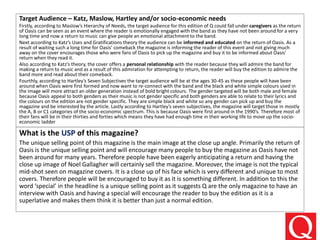
Incoming and Outgoing Shipments in 1 STEP Using Odoo 17
Â
Preliminary task and planning and research
1. OCR Media Studies â AS Level
Unit G321: Foundation Portfolio in Media
Planning & Research
Name: Giacomo Pisa
Candidate Number: 3111
Center Name: St. Andrewâs Catholic School
Center Number: 64135
Set Brief - Print
Music Magazine â Production
Preliminary Task Progression and
Planning & Research
3. Preliminary Task Progressionâ Evidence
Front Cover
Step-by-step
The first step of completing my preliminary front
cover was to insert a barcode area to put my
barcode into. I did this by simply inserting a
rectangle and then pasting in an image of a
barcode inside it to the relevant size. Following
this I added in relevant social media images such
as Twitter an Facebook above the barcode as well
as the issue number date and price underneath
the barcode to inform the reader what issue
number and price of the magazine is as well as he
date. I added in the social media images by pasting
them in and then resizing correctly by holding
down shift when resizing the image so it did not
become distorted and then line them up using the
ruler tool and bleeds. I added in the issue number,
date and price by simply using the text tool and
adding a textbox to write in. Then I also use the
ruler tool and bleeds to align the textbox under
the barcode an in line with the social media links.
4. Preliminary Task Progressionâ Evidence
Front Cover
Step-by-step
The next step that I completed for my
preliminary front cover was to insert my
masthead. This compromised of downloading
my chosen font off dafont.com which was called
âShaka Pow Hollowâ Then I made it the right size
on Photoshop and positioned it correctly using
bleeds as well as the ruler tool. I then used the
paint bucket tool and stroke effect for the
yellow inside and thick black edges. As well as
this I added an inner bevel for a better effect to
make the masthead look better and added a bot
of variety instead of simply plain text. By this
time I already had my blue background as seen
in this image which I used the gradient tool to
achieve two different shades of blue.
5. Preliminary Task Progressionâ Evidence
Front Cover
Step-by-step
The third step was to create my
main headline for the front cover.
The process for this was exactly the
same as that for the masthead. I
selected my desired font and used
the textbox tool to make a textbox
to write it in. Following this I resized
the writing underneath and then
filled it in yellow with the paint
bucket and used the black stroke
tool. Additionally, I added in a drop
shadow on the layer for a small
shadow effect under the writing.
6. For my main image I pasted in the
whole image from my desktop,
resized it while using shift to my
desired size and then used the quick
selection tool to get rid of the
background. I also used the refine
edge tool when editing the photo to
ensure that the photo was of the
good quality and no remaining
background from the original photo
is visible. Therefore the edited main
image blends well into the blue
background without any white areas
from the original photo. Moreover
my background can be seen more
clearly in this screenshot, in
particular the gradient effect I have
used where the colour transitions
halfway across the page.
Preliminary Task Progressionâ Evidence
Front Cover
Step-by-step
7. Preliminary Task Progressionâ Evidence
Front Cover
Step-by-step
The following step was to add in my cover
lines on the left side of my magazine front
cover. Again I used the text box tool by
pressing âTâ on the keyboard. Then I
dragged the correct size textbox, selected
my font and wrote the cover lines. I
alternated between white and yellow on
each line and used a stroke and drop
shadow on every line. Then to go with the
cover lines I chose images off the internet
and pasted them in, resized them and
rearranged the layers so they are under
the writing. In addition to this I made sure
that I was consistently using the ruler tool
to ensure that the cover lines all lined up
correctly for a more professional
appearance.
8. Preliminary Task Progressionâ
Evidence
Contents Page
Step-by-step
The first step in creating my preliminary
contents page was to create a main headline. I
used the same font and effects such as stroke,
drop shadow and in inner bevel because this is
the effects I used on my main headline on the
front cover. In addition to this I used the paint
bucket tool to fill in the writing the correct
colour. I ensured that all the effects, the colour
and the font was the same as my main
headline on the front cover because it is vital
to keep the house style consistent for a more
professional looking magazine. Moreover next
to the main title I added in a small screenshot
of my front cover on the contents page to
enhance my brand identity.
9. Preliminary Task Progressionâ
Evidence
Contents Page
Step-by-step
The next step in creating my front cover was
to make an editorial. I started this by using a
separate text box with a larger font size to
create a drop capital which I then made a
different colour to the rest of my text to
make sure that it stood out by being larger
and a different colour as the rest of the text.
I made this letter the same colour and used
the same effects as the headline for a
consistent house style Then to create the
rest of the editorial where the writing
wrapped around the image of myself, the
editor I used the pen tool which created my
work points which to write in.
10. Preliminary Task Progressionâ
Evidence
Contents Page
Step-by-step
The third step that I completed for the preliminary contents
page was to create my sub-headings and sub-lines which
matched the cover lines from the front cover. I also added in
the relevant page numbers and added in a background gradient
so the page was not so basic. To create the sub-headings and
sub-lines as well as the page numbers I simply created text
boxes which is done by simply pressing âtâ on the keyboard,
and wrote in the relevant stories in the same font style as used
on the front cover for a consistent house style, as well as the
same effects such as a stroke, drop shadow and inner bevel. I
also made the sub-headings a slightly bigger font so they stood
out more. Then I used the ruler tool tool to align all the page
numbers and sub-headings/sub-lines. Following this I alternated
the colour of the stories again for more variety so it did not
appear plain and basic. The background again involved simply
selecting the colours I wanted and implementing the gradient
tool to the desired effect.
11. Preliminary Task Progressionâ
Evidence
Contents Page
Step-by-step
The following step on the contents page was to add in a variety of
images to make the page more appealing to look at for the reader.
In addition to this adding in images breaks up the writing on the
page and means the page is not full of writing which will make it
difficult and boring for the reader. The first step was to create a
rectangle shape which is done by selecting this tool from the tools
on the left hand side of Photoshop and making it yellow to match
my house style for the rest of the magazine. Then I added in the
photos and placed them over the shapes. The first image I got off
the internet so no editing was required however I took the second
image so I needed to use the quick selection tool to eliminate any
background. In addition to this I inserted a pull quote next to the
image indicating what the student said. I used the text box tool to
insert the pull quote and I did it because a pull quote is a vital
convention of a magazine.
12. Preliminary Task Progressionâ
Evidence
Contents Page
Step-by-step
The last step for my preliminary contents page was
to insert the page number and web address. To do
this I again pressed âtâ on my keyboard to create a
textbox in the bottom right hand corner of the
page where the web address and page number are
placed in most magazines.
14. Music Magazine â Genre research
In todayâs world, thanks to the huge advancements in internet technology the number of magazine readers has
been reduced by a drastic amount proven in the following quote from âThe Guardianâ.
âQ saw its circulation fall 12.1% year on year, to 77,522.â- Source the Guardian
This following picture displays the genre of music that most people âtweetâ about in different coiuntries
suggesting less time is spent reading magazines and more time online. The UK and Europe primarily tweet
about Rap and Latin Music with the USA being mainly rap with a mix of Latin and Country whereas South
America, Brazil in particular, is almost exclusively Latin related tweets.
15. Music Magazine â Genre research
⢠Despite these worrying statistics, many people do still read music magazines in the UK. This is
proven in the following data in a survey conducted by the NRS (national readership survey) it
was found that per week:
an estimated 356,000 adults read Kerrang!
an estimated 253,000 adults read NME (new musical express)
an estimated 476,000 adults read Q
an estimated 248,000 adults read Mojo
an estimated 150,000 adults read Top of the Pops
These statistics all added together prove that nearly 1.5 million people in the UK still read a music
magazine every week with Q being the most popular magazine in the UK with almost half a
million readers a week. This is because Q covers a variety of music genres and therefore covers
the biggest target audience meaning that they will sell the most copies of the magazine.
These results were gathered from www.mediauk.com
16. Established Magazine for my Research
Barcode/Price- Informs
the reader of the price of
he magazine and barcode
used to scan the
magazine so the
customer can purchase
it.
Headline- makes the
customer want to buy the
magazine as Oasis have made
a comeback and is a big story.
In addition the word special
denotes that it is not available
in any other magazine
attracting the customer to buy
this magazine.
Masthead- Large
and bold, the
person looking
immediately knows
which magazine it
is. Colours work
well together
making the letter
âQâ stand out.
Cover lines/ secondary
story- Informs the
reader on what the rest
of the content within
the magazine is. Fits in
with colour scheme as
writing is a mix of silver
and black.
Strapline- informing
the reader of the
success of the
magazine making them
want to buy it. Makes
other magazines look
inferior encouraging
the customer to buy
this magazine.
Main image- taking up
most of cover as is a
close-up image. Gives the
magazine a star appeal
attracting people to read
the magazine as the
image is unmissable.
Therefore the company
selling the magazine will
make a larger profit.
17. Target Audience â Katz, Maslow, Hartley and/or socio-economic needs
Firstly, according to Maslowâs Hierarchy of Needs, the target audience for this edition of Q could fall under caregivers as the return
of Oasis can be seen as an event where the reader is emotionally engaged with the band as they have not been around for a very
long time and now a return to music can give people an emotional attachment to the band.
Next according to Katzâs Uses and Gratifications theory the audience can be informed and educated on the return of Oasis. As a
result of waiting such a long time for Oasisâ comeback the magazine is informing the reader of this event and not giving much
away on the cover encourages those who were fans of Oasis to pick up the magazine and buy it to be informed about Oasisâ
return when they read it.
Also according to Katzâs theory, the cover offers a personal relationship with the reader because they will admire the band for
making a return to music and as a result of this admiration for attempting to return, the reader will buy the edition to admire the
band more and read about their comeback.
Fourthly, according to Hartleyâs Seven Subjectives the target audience will be at the ages 30-45 as these people will have been
around when Oasis were first formed and now want to re-connect with the band and the black and white simple colours used in
the image will more attract an older generation instead of bold bright colours. The gender targeted will be both male and female
because Oasis appeal to both genders as their music is not gender specific and both genders are able to relate to their lyrics and
the colours on the edition are not gender specific. They are simple black and white so any gender can pick up and buy the
magazine and be interested by the article. Lastly according to Hartleyâs seven subjectives, the magazine will target those in mostly
the A, B or C1 categories of the socio-economic spectrum. This is because Oasis were first around in the 1990âs. Therefore most of
their fans will be in their thirties and forties which means they have had enough time in their working life to move up the socio-
economic ladder
What is the USP of this magazine?
The unique selling point of this magazine is the main image at the close up angle. Primarily the return of
Oasis is the unique selling point and will encourage many people to buy the magazine as Oasis have not
been around for many years. Therefore people have been eagerly anticipating a return and having the
close up image of Noel Gallagher will certainly sell the magazine. Moreover, the image is not the typical
mid-shot seen on magazine covers. It is a close up of his face which is very different and unique to most
covers. Therefore people will be encouraged to buy it as it is something different. In addition to this the
word âspecialâ in the headline is a unique selling point as it suggests Q are the only magazine to have an
interview with Oasis and having a special will encourage the reader to buy the edition as it is a
superlative and makes them think it is better than just a normal edition.
18. Publisher research
The publisher of âQâ magazine is the Bauer media group who have the âwe think popularâ
slogan. This could connote how Bauer target the most popular things to write about and
they do this through the 89 different magazines that they publish. Moreover according to
the Bauer website âThe Q Awards is the most unique awards ceremony in music. No
other event brings together such a variety of big-name musical talent under one roof.
Glamorous and irreverent, itâs the awards show the stars love to be at. Every year sees
rock ânâ roll icons such as The Rolling Stones, Paul McCartney, Elton John and Oasis rub
shoulders with the best breakthrough talentâ This shows how âQâ attract the most
popular bands in the industry meaning a greater audience to read the magazine.
The readership audience for Q magazine is primarily those between the ages of 30 and
50 who are in categories A, B and C1 categories on the socio economic ladder with the
aim of targeting these people who wish to read mature and practical stories as these
people will be in the higher categories as they are in more sophisticated jobs. This is
evident with the statistic from Bauerâs website that 83.8% of readers are between the
ages of 15 and 44, with 66.2% being males.
Q magazine from the Bauer media group is available in both digital and hard copy. A
subscription to the magazine will cost ÂŁ26 a year or the editions can be purchased
separately on release with these being priced at ÂŁ4.50 in most Supermarkets and stores
such as WHSmith.
19. Conventions of a Music Magazine
Main image
Masthead
Headline/strapline
Cover lines
Barcode/price/issue
20. Conventions of a music magazine
â Masthead: Big, colourful and bold, enticing the reader into finding out whatâs inside. Also
instantly recognisable logo so the reader is aware of who they are buying from and if the
content is good they will always spot the XXL logo when they are buying magazines, and
always buy their edition.
â Main image: It is a medium close-up wearing fashionable clothing attracting the reader to buy
the product as they want to be like the artist on the front. In addition to this fans of Kendrick
Lamar will buy the magazine solely because he is on he front no matter what the content is,
meaning ore copies will be sold.
â Cover story: On the cover, smaller than the headline which inform the reader of other stories
that will be in the magazine in the event of them wanting to read something different. They
also contain star appeal with the likes of Bryson Tiller and Rick Ross as well as matching the
colour scheme of he rest of the cover.
â Headline/strapline: Big and bold, attracts the person to choose this magazine as they want to
discover the whole story behind the headline. This headline is particularly effective in the
cover I chose in the previous slide as the term âchosen oneâ is very elaborate and dramatic
and makes the reader want to read the story as it connotes that this is a special story.
â Barcode/price/issue: The price of the magazine is $5.99 which equates to ÂŁ4.50 at the current
exchange rate. This is quite a significant amount to pay especially for a magazine which is
primarily targeting the lower end of the socio-economic ladder such as people in the D and E
categories. However XXL is a bimonthly magazine meaning only paying ÂŁ4.50 every two
months is not too much of a problem, however if it was ÂŁ4.50 a week, people would be put off
from buying the magazine.
21. Target Audience â Katz, Maslow, Hartley and socio-economic needs
The target audience for XXL magazine can be denoted as offering âdiversionâ according to Katzâs Uses and Gratifications theory because the
magazine offers young people (the target audience), a chance to become immersed within the magazine because of the star appeal (Kendrick
Lamar) on the cover and forget about stress that they are inevitably having as a student with exam stress as they will be relating to Kendrick
Lamarâs lifestyle. As well as this according to Katzâs theory XXL creates a personal relationship with the reader as they would like to discover
why Kendrick Lamar is âthe chosen oneâ and when they discover this they would feel closer to him as they have found out more about him.
âThe chosen oneâ on the cover also implies that there is only one so therefore the reader will feel forced to purchase the magazine because
they canât read this story anywhere else.
The target audience will be categorised as social climbers as they want to be like Kendrick Lamar on the cover. This is because he is wearing a
âchampionâ hoodie which is a well known and relatively expensive brand as well as a pair of âNikeâ shoes on which is also an expensive brand
and is also associated with those listening to rap stereotypically as it is a hoodie and many rappers and their fans are associated with wearing
hoodies.
Next, according to Hartleyâs Uses and Gratifications theory the target audience will be those in their upper teens to mid twenties as only
ÂŁ4.50 every two months is not too expensive so those in their teens can afford it and Kendrick Lamarâs music is aimed at these sort of ages as
this age listens to the rap/hip genre. Also according to Hartley the target audience will be primarily males as Kendrick Lamar is a male so the
male audience can easily relate to him and his rap/hip hop style is more widely listened to by males.
Lastly according to Hartley the class that the magazine is aimed at is the D and E category of the socio-economic ladder because it is targeting
young people who listen to Kendrickâs Lamarâs music and these people are typically students and semi skilled workers in the D and E
categories.
What is the USP of this magazine?
The USP of this magazine is the star appeal of the main image which is rap/hip hop artist
Kendrick Lamar, who is widely listened to and one of the biggest artists currently on the rap
scene. Therefore many people will be interested in buying this copy to also copy the stylish and
current clothes he is wearing (Champion and Nike being very established brands) meaning
Kendrick Lamar will have generated a lot of profit from this edition for XXL.
22. Publisher research
XXL magazine is published by Townsquare media since they took over XXL from Harrisâ
publications in 2014. They also took over âKingâ and âAntennaâ at the same time. Townsquare do
not have a slogan as such but on their Facebook page they describe themselves as âa diversified
media, entertainment and digital marketing services companyâ This description could connote
that the company cover a wide variety of platforms selling their products, focusing on media
products and as a result of covering many platforms, the company is selling their products to
more people, generating a higher profit.
The main readership ages of XXL magazine would be those between the age of 15-30 who are C2,
D and E categories on socio economic ladder because the magazine covers are often
compromised of many colours and young artists feature in the magazines, attracting a younger
audience such as students and recently employed who are in groups D and E. In addition to this
most readers will be younger because the magazine is only ÂŁ4.50 every 2 months which means it
is an affordable product for those in these groups.
An edition of XXL magazine can be purchased from most large supermarkets however on the XXL
magazine website a subscription is no longer available. Despite this the app has an XXL official
store offering XXL merchandise such as t shirts and hoodies. This is a unique selling point to
teenagers and young adults because XXL have designed clothes mostly worn by teenagers (e.g
hoodies) and decided to sell them to make more profit, as well as offering products that other
magazines do not.
This information was gathered from townsquaremedia.com