
Recommended
Recommended
More Related Content
What's hot
What's hot (20)
Viewers also liked
Viewers also liked (19)
Similar to Contents DPS And Analysis
Similar to Contents DPS And Analysis (20)
More from zeyanmirza
Recently uploaded
Recently uploaded (20)
Contents DPS And Analysis
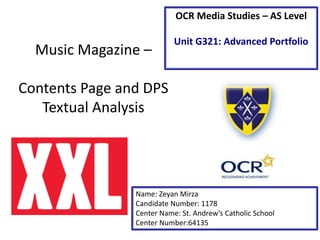
- 1. Music Magazine – Contents Page and DPS Textual Analysis Name: Zeyan Mirza Candidate Number: 1178 Center Name: St. Andrew’s Catholic School Center Number:64135 OCR Media Studies – AS Level Unit G321: Advanced Portfolio
- 2. This logo is written in drop capitals and the font itself is bold, this helps the logo to stand out on the page. The white font on the red background makes the logo bright and this also helps it to stand out on the page. The fact that the font is white and the background red, and normally the background is white, perhaps indicates that the magazine is out of the ordinary.
- 3. SUBHEADING A title or a heading of subdivision PAGE NUMBERS Help the reader navigate around the magazine. CROSSHEADING Gives the reader an insight into the article. Contents page title Lets the reader know they are on the contents page. XXL’s IDENT Emphasises the name of the magazine again to the reader, white on red helps it to stand out on the page, its also bigger then the majority of the font on the page, helping it to stand out. The use of the colour red could connote passion and anger within the rap genre. PULL QUOTE This also gives an insight into the main article and encourages the reader to buy the magazine. WEB ADDRESS This allows the reader to know the name of the magazine DATE Know how up to date the magazine is and what issue they are reading PAGE NUMBER Enables reader to navigate around the magazine easier MAIN IMAGE The inclusion of rap artists such as 50 cent and Souldja Boy denotes some evidence of XXL’s desire to include star appeal (Richard Dyer) this is important because it means readers are attracted to the magazine, when its on shelf its more likely to stand up.
- 4. 2 4 3 5 6
- 5. Analysis 1.The large and bold display font of the headline makes it stand out, and makes it stand out he reader the bold letters stick to the brand and identity of the magazine. 2.This double page spread some layout conventions of the hip hop magazine genre , the main artist is on the left of the page and the text on the right. The main headline is a quote from the artist and the body copy below is explaining the quote, the page number features in the bottom right of the page. 3.The black font and white background make the page easy to read, the image matches the colour of the text, plain colours put more emphasis on the rappers jewellery. 4.The artists have typically angry expressions on their face to keep with the conventions, 50 cent has his hands in his pocket and Souldja boys his hands in his pockets to give the impression they are relaxed. A low angle shot is used to make the artists look big and bold, Souldja boy has his arms up to make him look bigger and both are wearing chains, which match the conations off the rap genre 5. The pull quote is big, bold and black and this helps it to stand out on a page with a white background, the pull quote itself takes up the majority of the page and takes up more space then the article, this shows the importance of the pull quote for the article and gives us a summary of what the article is about. 6.The fact that the the pull quote is written in drop capitals again highlights the importance of the quote for the article, the quote itself is very aggressive and contains many expletives and perhaps the the capital letters are used to get the aggression across to the reader.
- 6. Conclusion I intend to ‘repeat’ (Steve Neale – 1980) the subhead as it makes the page look bold, and l will also include my logo to reiterate what magazine the reader is reading. I will ‘repeat’ the crosshead so people can navigate easily around my magazine and easily locate the main articles. Will ‘repeat’ the pull quote so people are encouraged to read on. PULL QUOTE