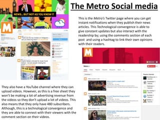
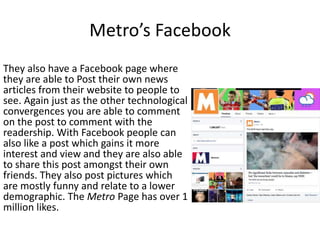
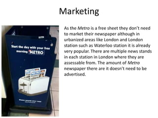
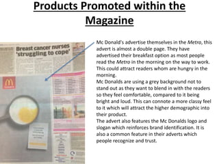
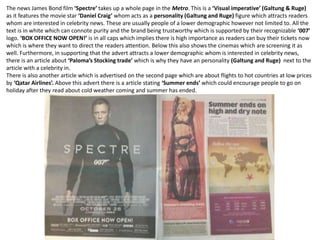
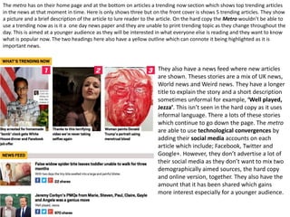
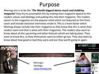
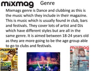
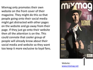
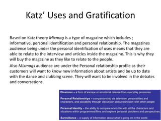
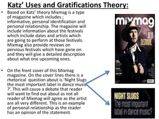
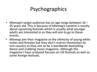
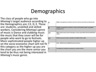
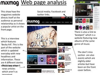
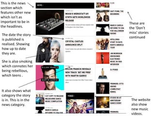
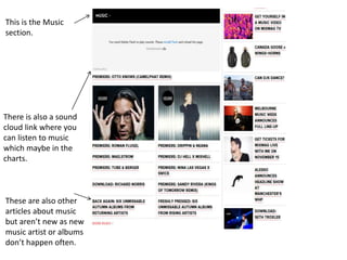
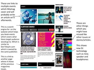
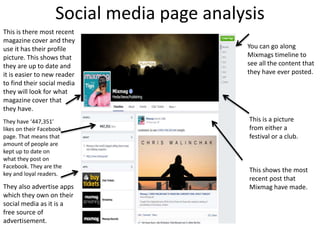
Development Hell Limited publishes several media products, including Mixmag magazine, websites, apps, TV, and events. Mixmag aims to be the world's biggest dance music and clubbing magazine by appealing to readers' values and interests, such as featuring popular artists. Development Hell also owns DontStayIn.com, a social network and search engine for nightlife events. The company aims to constantly update its products to meet customers' needs in the club and music industry.
This document summarizes and analyzes the content and layout of multiple pages from a music magazine. Key points discussed include the magazine having a predominantly male target audience based on the cover art and artists featured. However, some interior pages feature female artists like Paloma Faith and aim to attract more female readers. The layouts of pages like the contents page and two-page spreads are also analyzed in terms of design, use of images and text, and how effectively they showcase the content. Overall strategies like creative designs, competitions, and promotions are discussed as effective ways the magazine engages and markets to its audience.
The document provides details about three case studies of magazines:
1) Festival Magazine was founded in 1978 and moved online-only in 2014. It targets young/middle-aged women and features celebrities.
2) Glamour magazine was founded in 1939 in the US and is owned by Conde Nast. It reaches over 14 million across social media and believes in empowering women.
3) Vogue is one of the world's most popular fashion magazines with over 220,000 in circulation. It covers fashion, beauty, culture and lifestyle. The covers often feature celebrities.
The document discusses the design elements of a magazine called Yoyo aimed at young male readers interested in hip hop, fashion, and social media. It uses a red, black, and white color scheme and images of well-dressed male models to appeal to its target demographic. The magazine includes free music and contests to incentivize purchases. Stories cover topics like crime and wealth that readers aspire to and can connect with the artists as down-to-earth.
My magazine follows conventions of rock magazines through its dark color scheme, masthead design, and page layout. The contents page lists sections commonly found in magazines and uses a color scheme atypical of magazines to stand out. A double page spread features a large main image on the left with a smaller image below, and an interview in the right column. The magazine aims to represent rock fans aged 15-22 in a positive light through well-dressed role models while maintaining the genre's dark aesthetic. It would be distributed by IPC, which publishes the successful rock magazine NME, through newsagents, supermarkets, and a website for online and subscription orders.
AS Media Research Assignment- Research for Music MagazinesSundasBostan
The document discusses the codes and conventions of music magazines. It provides details on common elements found in music magazines such as the masthead, main image, strapline, coverlines, and barcode/dateline. It also discusses two major music magazine publishers - Bauer Media and IPC Media. Finally, it analyzes the front covers and contents pages of the magazines Q, NME, and Kerrang, highlighting their styles, target audiences, and other key aspects.
The document provides details about planning and pitching a print-based music magazine called "We Love Pop". Key points:
- The magazine is a monthly publication targeted at teenage girls aged 13-16. It covers pop music artists, interviews, fashion, and beauty.
- It was launched in 2011 by publisher Egmont to fill a gap in the market after another teen magazine closed. The first issue sold over 100,000 copies.
- Each issue is 68 pages long and costs £2.99. It aims to be affordable and packed with interesting content to engage its young readership.
- The magazine uses bright colors, bold designs, and photos of popular artists on the cover to stand out and
This magazine focuses on alternative music and targets older teenage boys. It features mostly male artists and includes Rihanna to sexualize the magazine and appeal to its male audience. The contents pages include a mix of pictures and text to make them more visually interesting. An article about Paloma Faith's house contradicts the magazine's main target audience by featuring a female artist and domestic setting. The magazine helps promote lesser-known artists and upcoming music releases.
This document analyzes a magazine called "Melody" that the author created. It discusses how the magazine targets independent women ages 21-45 interested in chart music and their image. Key conventions from real music magazines like Billboard were used, such as featuring popular artists. The magazine was meant to have a positive representation of successful career-driven women. It focuses on attracting readers through their shared music tastes, careers, and interest in appearance.
This document contains a student's media studies coursework portfolio submission. It includes responses to questions about the target audience, representation of social groups, distribution, and conventions of their proposed music and fashion magazine. For the target audience, the student aims the magazine at teenagers aged 13-19, as they influence trends. They will take inspiration from magazines like NME and Q but include more social commentary. The student represents particular social groups through their choice of Liam Gallagher as a cover star, showing his different public personas. They suggest the magazine could be distributed through mainstream outlets like supermarkets and newsagents, as well as online. The student draws from conventions of existing magazines in their designs.
The document is a student magazine project evaluation. It provides details about how the student designed their magazine to target a young audience aged 10-16, including using bright colors, bold fonts, celebrity interviews, and a low price point. Feedback was collected from peers aged 12-16, who felt the magazine was generally well designed for its target audience but suggested some changes, like altering the color scheme and using a more widely known cover artist.
The document provides feedback from three teenagers, aged 12-16, on a mock magazine designed for a younger audience. They felt the magazine was appropriately designed for its target age group in terms of topics and design. However, they suggested changing the color scheme and font to better appeal to teenagers. They rated different aspects positively, particularly the layout, language, and resemblance to real magazines. Some improvements mentioned were using a more famous cover artist and varying the font style.
The cover features Rihanna, whose provocative image stands out against a dark background. Text around the edges promotes articles inside and a barcode and details allow the issue to be sold. Rihanna's sexualized appearance and the quote appealing to both genders are intended to encourage purchases. Billboard targets music industry professionals and fans in the U.S. and U.K., with the goal of providing information about music business and appealing covers like this one featuring Rihanna.
This document provides a case study of the fashion magazine Vogue. It details the magazine's origins in 1892 in the United States and its evolution into a global publication focusing on high fashion. Vogue is now considered the number one fashion magazine in the world and shapes global trends. It targets an audience of 38 year olds and higher due to its expensive and luxurious content. The magazine makes $2 million annually due to partnerships with famous celebrities that increase its audience.
The document evaluates the ways in which the author's media product, an R&B music magazine called "Sparkz", uses, develops, and challenges conventions of real music magazines. It discusses how the magazine mimics real magazines' color schemes, language use, artist appearances, and layouts based on research, but also challenges conventions with softer colors, a London-based artist, and lower price point. The target audience is described as 15-21 year olds, especially female fans of R&B/hip hop music and tattoos. Distribution through a company like IPC is proposed to reach the intended audience globally through both print and digital formats.
The document outlines a media studies candidate's proposed music magazine aimed at teenagers aged 13-19 that would combine coverage of indie music and fashion trends. The candidate describes taking inspiration from existing magazines like NME and Q but aiming to provide more social commentary than just music content. Key elements of the proposed magazine outlined include the target demographic, genres covered, and use of images and design conventions from real magazines.
George Hunt is submitting a media studies portfolio that includes a magazine concept targeting teenagers aged 13-19 with content focusing on indie music, fashion influenced by musicians, and reviews of gigs and bands. The magazine would combine music and fashion coverage to fill a gap in the market, using conventions from magazines like NME and Q but with more social commentary. Key elements of the magazine include interviews with musicians, competitions to engage readers, and blending of colors and fonts to appeal to both male and female readers.
The document provides information on the key demographics and readership statistics of various music magazines.
It then analyzes the cover designs of different magazines, noting things like masthead placement and style, photo choices, text usage and layouts. Common techniques included using provocative photos to appeal to target audiences, minimal text to entice reading, and stylistic choices to reflect the magazine's brand image.
The summaries show how magazine covers are deliberately designed to attract certain readers through visual cues and content choices that align with the publication's goals and readership profile. Elements like mastheads, photos, text and colors aim to clearly identify the magazine and draw in the intended subscriber base.
The front cover uses direct eye contact and a seductive gaze from the model to engage the audience. Celebrity endorsement of well-known singers is used to attract fans and indicate the genre of music covered in the magazine. Limited colors are strategically used to draw attention to key elements and convey the sophistication or excitement of the magazine.
Bauer media is a large UK-based media company founded in 1875 that publishes over 570 magazines and has 300 digital products and 50 radio and TV stations. It reaches 25 million consumers in the UK and operates in 20 countries. Some of its key magazine brands include Heat (celebrity news), Empire (film), Closer (TV and celebrity gossip), and Grazia (women's weekly magazine). Mojo is Bauer's music magazine that covers various genres but focuses on artists like The Smiths, Nirvana, Joy Division, and The Beatles. BBC Worldwide invests profits back into content creation and supports new writers. It publishes magazines on various topics like gardening, football, motoring, and music.
The document describes a student's evaluation of their media studies coursework in which they created a music magazine called "Non-Stop Pop". The student reflects on how they effectively used conventions of real pop magazines in their three created pieces - a front cover, contents page, and double page spread. They used bright colors, images of a young girl band, and informal language to target their audience of 12-16 year old girls. The student also represents typical social groups featured in pop magazines such as female artists and bands.
The document describes a student's evaluation of their media studies coursework in which they created a music magazine called "Non-Stop Pop". The student followed conventions of real pop magazines in their front cover, contents page, and double page spread. They used bright colors, images of a girl band, and informal language to target teenage girls. The student represented typical social groups featured in pop magazines and included content they believed would attract their intended audience.
The survey results showed that the target audience for the music magazine is mainly female teenagers aged 16-18 who enjoy classic rock and heavy metal music. Most respondents said they do not currently read music magazines but enjoy Kerrang magazine. To appeal to this audience, the magazine should feature modern rock music content, have an appealing design with good images, and be affordable for teenagers. It will aim to emulate Kerrang magazine's success at attracting this demographic while exploring a wider range of rock music genres.
This document provides details on a proposed dance and clubbing magazine called "Jump". It aims to target 16-21 year old students interested in festivals and clubs. Key points include:
- The name "Jump" is meant to convey the atmosphere of a festival.
- Content will include artist profiles, festival reviews and interviews.
- Major competitors are Mixmag and Tilllate magazines.
- The first year budget projects a £13,388 loss but hopes to gain popularity and reduce costs over time.
- Promotion will use websites, posters, social media and email marketing.
This document contains a student's evidence submission for a media studies coursework assignment on planning and pitching a print-based media product. The submission includes analysis of Mixmag magazine, a print and online magazine focused on dance music and club culture. The analysis covers Mixmag's publisher, purpose, content, target audience, and production process. Examples from magazine issues are provided to examine features like cover design, articles, and interviews. Relevant media theories are also applied to understand Mixmag's approach.
The document outlines the schedule and tasks for an advertising campaign over 3 weeks in June. It includes planning meetings, designing logos, layouts and storyboards, hiring photographers, scheduling photoshoots, editing photos, designing magazine and video ads, recording music, setting budgets, approvals from editors, and launching the final materials. The tasks are documented by date with notes on the activities and milestones to be completed each day.
This document outlines the steps taken to set up equipment, conduct a photoshoot, and create content for a magazine in Adobe Photoshop. It discusses checking camera equipment, taking test photos, following a production process of acquiring, editing, and laying out content, and then proofreading. Specific steps taken in Photoshop are outlined, like adding images, text, and styles to create a front cover and double page article spread.
This document provides an overview of research conducted for Mixmag magazine. It discusses Mixmag's target audience including demographics (ages 16-25, C2DE socioeconomic class), psychographics (interests in dance/club music and festivals), and uses and gratifications basis. Primary research findings through surveys showed that the target audience is majority male, ages 18-24, and most value the magazine cover image. Secondary research of reviews showed positive feedback on Mixmag's relevant content but also some complaints about the mobile app version's advertisements and page loading speeds.
The document outlines the content of a presentation on print-based advertisements for a music festival. It includes mood boards, mind maps, and draft designs for a magazine advertisement and poster. For the magazine advert, hand-drawn drafts show a large festival name header, areas for artist names, and details like dates and contact information. For the poster, a hand-drawn draft depicts palm trees, colorful backgrounds, and shadows of a crowd to set a summer music festival mood. Both drafts aim to attract the target audiences of students aged 18-25 by conveying a sense of freedom and escapism.
Avon Fundraising is easy and FUN! Use one or more of the flyers to bring money in for your organization or cause.
www.youravon.com/meganhull
dingdongmegancalling@yahoo.com
This document provides an overview of the content and research conducted for Mixmag magazine. It includes information on the target audience (students aged 16-25), uses and gratifications theory to explain why the audience reads the magazine, psychographic and demographic profiles of readers, and primary/secondary research findings. The primary research found that most readers are male, aged 18-24, and value cover images and artist interviews. Secondary research revealed positive reviews of content quality and price but a negative review of the mobile app due to ads and slow loading.
This document provides an overview of the contents of a presentation. It summarizes feedback received and improvements made to the presentation, including adding a production plan slide, improving the front cover design, and enhancing a main image. The document also discusses receiving additional feedback from the presenter's mother and making improvements to the presentation delivery, such as speaking louder and using more hand gestures. Finally, it outlines several legal and ethical issues related to publishing a magazine.
This document outlines the production plan for creating promotional materials for a music festival, including a poster, magazine advertisement, and audio-visual advertisement. It includes a schedule spanning several weeks in June 2016, with tasks such as planning photo shoots, designing layouts, and reviewing drafts. The production plan aims to carefully coordinate the various elements needed to complete the promotional campaign on time and on budget.
This document provides details for 30 slides related to the development of a magazine proposal. It includes sections on the presentation environment, personal presentation, two magazine proposals ("Jump" and "BASS"), promotion strategies, website and production costs, budgets, distribution plans, target audiences, and example slides. The document gives an overview of the content and considerations for launching a new dance and clubbing magazine.
Morgan Pearson submitted evidence for their Level 3 Cambridge Introductory Diploma in Media unit on planning and pitching a print-based media product. The document analyzed Mixmag magazine, a clubbing and dance music publication. It described Mixmag's target audience as being 16-25 year olds, its content which focuses on music festivals and artists, and its form and style using professional photography. Hartley's 7 subjectivities and Katz' Uses and Gratifications Theory were applied to understand how Mixmag appeals to its readers' values and needs.
The document summarizes the content of a magazine production project. It includes sections on meeting deadlines, using Photoshop for post-production skills like editing photos, following safe working practices when editing images, maintaining consistent colors and fonts, and making changes to improve the front cover, masthead, and double page spread. The conclusion restates the key elements covered in creating the magazine within the deadlines.
The document outlines plans for three proposed social media products - Peoples Politics, The Gamers Community, and Our News.
Peoples Politics is intended as a forum for younger people to discuss UK politics and current affairs. The Gamers Community is focused on gaming news, game development updates, and user discussions.
Our News is envisioned as a platform where people can report on and discuss world news and events in real time, and share their opinions. Sketches of prototype home, signup, and profile pages are presented for Our News and The Gamers Community.
Details are provided on inspiration sources, target audiences, features, color schemes, slogans, and logos for each proposed site. Copyright information and
This document contains planning and pitch materials for a print-based music magazine called "Jump". Ideas generated include using bright pink, blue, and white colors to convey a summery, relaxed feel. The target audience is identified as males and females ages 18-25 in socioeconomic categories E, D, and C2. Mood boards and mind maps visualize the brand identity and magazine concepts, showing imagery of lights, pools, and explosions to represent club and festival atmospheres. Fonts like "Digital Anarchy" and layouts with the word "Hyperspace" featured are considered to make the magazine stand out visually. The magazine will release monthly to compete with similar titles and feature a thoughtful model looking into the distance on
This document provides an analysis of Mixmag magazine conducted by a student. It includes summaries of Mixmag's target audience, content, form and style, and how it aligns with various communication theories. Mixmag targets 16-25 year olds interested in dance and club music. It covers upcoming festivals, reviews, interviews, charts and smaller artists. The magazine has a glossy paperback format of around 130 pages. It aims to inform and engage readers based on their interests in music and nightlife.
The document provides an overview of various legal and ethical considerations for producing a magazine. It discusses obtaining permission and assessing risks for photo shoots [Location Permission, Risk Assessment]. It also covers health and safety laws and regulations [HSE, Health and Safety at Work Act], standards for privacy, accuracy and harassment [IPSO, Privacy], and requirements for attributing sources and gaining consent [Copyright, Intellectual Property]. The document aims to ensure the magazine's content and production process meet legal and ethical guidelines.
The document outlines the slides from a presentation on producing a magazine. It includes slides on feedback received, improvements made to the front cover and main image, presentation improvements, the production process, launch date, estimated costs and budget, magazine pricing, ethical and legal issues, copyright, and concluding remarks. The document provides details on the content and organization of the presentation.
This document provides information about the social media platform Facebook. It discusses Facebook's purpose of allowing users to share content and connect with friends and family. It describes Facebook's features such as the news feed, messaging capabilities, and ability for businesses to create pages. The document also covers Facebook's target demographics including its large number of worldwide active users, most of whom are aged 25-34, and discusses several theories for how and why users engage with Facebook.
Mixmag is a print and online music magazine focused on electronic dance music. Its target audience is young adults aged 16-25 interested in music festivals, DJs, and club culture. The magazine covers news, interviews, reviews and promotions related to electronic music genres and the club scene. It aims to inform readers about upcoming music events and releases while promoting an exploration of electronic music trends.
Preliminary task and planning and researchlkirkland123
This document contains Lucas Kirkland's planning and research for a music magazine front cover preliminary task. It includes details of the design process for the front cover, with explanations of the tools and techniques used. It also contains research on established music magazines, including their target audiences, genres, and conventions. The publisher of Rolling Stone magazine, Wenner Media, is analyzed.
NME is a music magazine published by IPC Media. It reaches over 1 million music fans each week and covers both new and classic rock artists. Kerrang is another music magazine focused on rock music. It is published by Bauer Media and aims to appeal to both teenage and adult male audiences who enjoy rock. Billboard is a music industry-focused magazine that reaches a wider audience from teens to age 26 due to covering multiple music genres. It aims to keep readers informed of the latest music trends.
Preliminary task and planning and researchlkirkland123
This document provides information about Lucas Kirkland's music magazine project for his OCR Media Studies AS Level course. It includes details of Lucas' preliminary front cover design process, using various Photoshop tools, and receiving feedback from teachers. It also includes Lucas' research on established music magazines, including their target audiences, genres, and publishing companies. Lucas analyzed conventions of music magazine covers, such as layout, mastheads, and positioning of images. He also researched the target audiences and unique selling points of the magazines he reviewed.
Preliminary task and planning & research lkirkland123
This document provides details on Lucas Kirkland's planning and research for a music magazine front cover project. It includes step-by-step descriptions and images of Lucas' process for designing the front cover, including adding graphics, images, and text. It also includes research Lucas conducted on music magazine genres, established magazines, target audiences, and publisher Bauer Media. The document serves to outline Lucas' preliminary work and planning for his music magazine cover portfolio piece.
The document discusses the history and operations of DMC and Mixmag, two UK-based media publishers in the electronic music industry. DMC started in 1983 releasing cassette tapes and vinyl records, and later began hosting annual DJ competitions. Mixmag launched over 15 years ago as a monthly print magazine with over 150,000 copies sold. It became known as the "Bible" for electronic music fans. While print sales have declined, Mixmag has adapted by publishing content online and on smartphones to maintain revenue and readership. Both publishers have kept a consistent simplistic style across their branding to appeal to electronic music fans.
This document summarizes Hannah Thomas's evaluation of her music magazine project. She discusses how her magazine uses conventions from real music magazines in its front cover, contents page, double page spread, representation of social groups, potential distribution, target audience, and technologies used. For the front cover, she models conventions like the magazine title, artist name, and featured articles from magazines like Q and NME. Her contents page similarly follows typical sectioning and formatting. She learned skills in Photoshop like layers, opacity, and text effects to make the magazine appealing. Her target audience is 15-20 year old girls interested in country music.
This document summarizes a student's media studies foundation portfolio for their music magazine called "Going Underground". The student chose the print option for their coursework and had to create a front page, contents page, and feature article. They wanted the magazine to feel like an authentic indie/rock magazine aimed at teenagers. They drew inspiration from both Q Magazine and Top of the Pops magazine in their design. Audience feedback indicated the magazine's target audience was perceived to be 12-18 year olds interested in indie/rock music.
This document summarizes the contents of a student's evidence portfolio for a media studies course. The portfolio analyzes two British music magazines, Q and Mojo, evaluating their layout, design, target audiences, and more. The document provides details on Katz's uses and gratifications theory and how the magazines aim to inform and educate readers. It also discusses the magazines' psychographic profiles, concluding Q readers are likely "mainstreamers" seeking security in its routine publication. The portfolio examines the magazines' covers, mastheads, images, and contents to understand how they effectively communicate with audiences.
This document analyzes different techniques used in magazine contents pages and double page spreads. For contents pages, the analysis found that most use mastheads, images, varied fonts and colors to attract readers. Images entertain readers and show what's inside, while clear fonts make the page accessible. Double page spreads usually feature large central images of artists to attract attention. Layout, images and writing style aim to entertain readers and sell the magazine's content.
This document provides information about planning and pitching a print-based media product for a music magazine called Vibe. It includes a deconstruction of Vibe's front cover and double page spread layout. It discusses Vibe's genre, frequency, content, purpose, target audience, form and style. It also provides details about Vibe's production process from setting a publication date to distribution. Similarly, it analyzes the front cover and layout of music magazine Q and discusses its genre, purpose, target audience and production process. The document aims to comprehensively analyze and plan for a print-based music magazine.
The document provides information about Q magazine, a popular music magazine published monthly in the UK. It was founded in 1986 and is currently owned by Bauer Media Group. The magazine specializes in rock, indie and alternative music genres. It aims to inform its target audience of 15-34 year olds about new music, albums, artists and trends. The production process for Q magazine involves setting a publication date, managing a schedule to ensure deadlines are met, and coordinating content such as articles, images and advertisements.
The document provides details about planning and pitching a print-based media product for rock magazines Q and Mojo. It analyzes features of the magazines like fonts, layouts, and headings to understand how they communicate with audiences. It also discusses the target demographics, content, and production process for Q magazine, which is published monthly and aims to inform and educate readers about various music genres and industry updates.
My media product uses, develops, and challenges conventions of real music magazines. It uses a female artist on the cover to appeal to both genders. The layout mixes elements from Q and Billboard magazines. It challenges conventions by having a box around the long title and using a gradient background.
The magazine represents various social groups including teens through fashionable images, people in their 20s through more stylish modeling, and aims to be inclusive of all sexual orientations and genders. It depicts the artists and models as having achieved status and social media influence to appeal to its target audience.
The target audience is 15-20 year olds interested in popular music. The magazine would be best distributed by IPC Media, based
1) The document evaluates the author's pop music magazine by analyzing how it uses, develops, and challenges conventions of real music magazines.
2) Key conventions included on the magazine cover are an eye-catching masthead, popular artist names, solo female artist image, and straplines. The contents page layout is inspired by Billboard but more complex.
3) The target audience is portrayed as interested in latest trends and pop music, represented through bright colors, packed layout, and promotion of young successful artists.
1) The document analyzes and evaluates the student's magazine project covering conventions used, representation of social groups, distribution opportunities, target audience, and technologies learned.
2) Key aspects of the student's magazine included representing the pop music genre through bright colors and packed layout, focusing on promoting young artists, and distributing through an established music publisher to reach the intended 13-30 year old audience interested in latest music trends.
3) Through the project, the student learned about magazine design conventions, improving photography and editing skills, and constructing a more complex layout using layers in Photoshop.
This document lists pros and cons of both print and digital magazines. For print magazines, pros include not needing an internet connection and being portable, while cons are lack of eco-friendliness and risk of loss or damage. Pros of digital magazines are lower costs, worldwide reach, and interactive features, while cons include needing internet access and preference for tangible formats. The summary provides an overview of the key advantages and disadvantages of each format discussed in the document.
The document outlines plans for a new music magazine called "Remix" that will cover pop, indie rock, R&B, and country music genres and be aimed at 14-20 year old teenage girls. It discusses the magazine's content such as quizzes, fashion tips, interviews, and competitions, as well as draft designs for the front cover, contents page, and double page spread that incorporate bright colors and popular artists to appeal to the target demographic. Feedback is solicited on aspects like representation of women, color scheme, and ways to potentially improve the magazine.
MixMag is a dance music magazine launched in 1983 that focuses on club culture. It began with a focus on disco and dance music but expanded to cover clubbing as that genre grew in popularity. While branching out, the magazine has stayed true to electronic music genres over its 30-year history. It maintains a consistent brand identity across issues through elements like a recurring skyline on the cover, a cover mount CD, and vibrant color schemes. The target audience is typically younger people between 16-30 interested in dance music and clubbing.
This document outlines the content of a presentation for a festival marketing campaign. It includes 59 slides covering various aspects of the campaign such as the proposal, target audience analysis using different theories, mood boards, mind maps, draft designs, and production plans for magazine advertisements, posters, and other promotional materials. It also includes slides on the proposed location, risk assessment, budget, and legal/regulatory considerations. The presentation provides a comprehensive overview and planning of the marketing campaign across multiple channels and touchpoints.
The document outlines the content and structure of a presentation related to planning a music festival and corresponding marketing materials. It includes 43 slides covering topics such as mood boards, mind maps, draft designs, and production plans for a magazine advertisement, festival poster, and audiovisual advertisement. Regulatory considerations that may impact the campaign are also discussed in several slides. The presentation aims to provide thorough information to propose and plan marketing initiatives for a music festival event.
- The document outlines the production process and plans for creating magazine, poster and audio-visual advertisements for a music festival.
- It includes witness statements, draft layouts, production schedules, photos used, equipment lists, standards compliance, risk assessments, and feedback received.
- The production process involved designing logos, layouts and color schemes, scheduling photo shoots, editing photos, creating templates, and launching the final advertisements.
This document provides an overview of a unit on print-based advertising for a Cambridge Introductory Diploma in Media course. It outlines the content covered in the unit, which includes topics like aims and objectives, sponsorship, target audiences using various theories, campaign messages, print advertisements, copyright and intellectual property, and legal and ethical issues. It also describes slides for a poster and audio-visual advertisement campaign for an Ultra Music Festival. The campaign aims to promote the music festival through awareness of the event, dates, location, artists, and experience. Legal and ethical considerations for the advertisements are discussed.
This witness statement summarizes Morgan Pearson's presentation of print-based advertisement ideas for a music festival or tour to a publisher client. The statement describes how Morgan presented an overview of their proposal, pre-production materials, target audience, budget breakdown, and production plan within a 10 minute time limit. It also includes a checklist completed by the witness, Miss J Oliver, a media studies teacher, evaluating Morgan's presentation across several criteria like discussing aims and objectives, providing draft designs, addressing legal and ethical issues, and leaving time for feedback. The teacher provided positive feedback, praising the detailed and confident pitch that covered expected areas sufficiently with creative pre-production samples and advertisements.
The document provides details of the content included in a presentation. It outlines 25 slides that cover topics such as a witness statement, draft layouts, a production plan, photos used, equipment, advertising standards, a risk assessment, safe working practices, and changes made based on feedback. It also includes the content and conclusions of the production plan and final versions of the advertisements.
The document outlines the content of 60 slides for a presentation. It includes slides on the proposal, target audience analysis using theories like Maslow's hierarchy of needs and Katz's uses and gratification theory. Other slides cover mood boards, mind maps, draft designs, and regulations for a festival magazine advertisement and poster. The presentation also includes slides on the photo shoot plan, logo design, production plan, budget, and conducting a survey to gather feedback.
The document outlines the content of a presentation on print-based advertisements for a music festival. It includes mood boards, mind maps, and draft designs for a magazine advertisement and poster. For the magazine advert, hand-drawn drafts show a purple banner, artist names, date, and website/phone number. For the poster, hand-drawn drafts feature a colorful background, palm trees, dates, a large flowing header, slogan, and shadow of a crowd to convey the summer feel and nighttime music. Both designs aim to attract 18-25 year old students and promote the festival's dates, location, and cost.
This document contains a proposal for an advertising campaign for a new music festival sponsored by Redbull. The festival will feature various artists and take place in the summer of 2016. The goals are to encourage festival attendance and make it an annual event through promotional print advertisements. The target audience is 18+ year old social climbers and students who want to escape reality and bond with friends over music. The campaign message is that the festival will be an unforgettable and affordable summer experience. Advertisements will take the form of posters and magazine ads using gender-neutral colors to appeal to both male and female attendees.
The photographer will take photos for a Jump Festival advertisement, including close-ups of hands, extreme long shots of the sunset, and full-body shots of someone jumping from an eye-level angle. The sunset and jumping photos will be heavily edited to be black shadows. A female model between 16-25 years old with long hair will be used to appeal to younger people and females. Wardrobe will be casual shorts and shirt to portray a normal festival attendee. Makeup is unnecessary as the face won't be visible. The photoshoot will take place on April 20th at the photographer's house.
The document discusses the photo shoot requirements for an advertisement. It requires photos of a sunset landscape in an extreme long shot, to be taken around 8pm on a clear day using a Canon 1200D DSLR. It also requires close-up photos of hands against a wall, which can be taken at any time and edited to appear black and white. Permission must be obtained to take the sunset photos at Epsom Downs, the closest suitable location.
This document provides an overview of a unit on print-based advertising for a Cambridge Introductory Diploma in Media course. It outlines the content covered in the unit, which includes topics like target audiences, representation, campaign messages, legal and ethical issues, and regulatory bodies. Specifically, it analyzes an advertising campaign for the Ultra Music Festival including posters, audio-visual ads, and how they address topics such as representation, unique selling points, and consideration of intellectual property laws.
This document outlines the features and design of a proposed social media website called Our News. It includes mockups and descriptions of the home page, sign up page, profile page, third party advertisements, commented pages, and about us page. It also discusses how the Web Standards Project and W3C guidelines will impact the development of the social media product to ensure it is accessible and compatible across different devices and browsers.
This document outlines a social media product proposal for a news-focused social media site called "Our News". It includes details on the content, layout, target audience, and business plan. The site will feature articles on current news events that users can comment on and vote up or down. The document discusses considerations like colors schemes, revenue streams from advertising, financial backing options, and legal/ethical issues around copyright and user privacy. The overall goal is to launch the site by January 2017 with 50,000 users and 30,000 daily visitors.
This document contains notes and ideas from a student for planning and pitching a print-based music magazine. It includes summaries of ideas, proposed masthead names, font choices, target audience analysis using Hartley's 7 subjectivities, Katz' theory of uses and gratification, and Maslow's hierarchy of needs. Mood boards and mind maps are presented showing visual inspirations focusing on club and festival atmospheres. Color schemes, magazine release dates, and sample cover designs are proposed.
Unit 01:Analysing Media Products and AudiencesMorgan Pearson
The document appears to be an analysis of a music magazine called Mixmag produced by Development Hell Ltd. Some key details summarized in 3 sentences:
Development Hell Ltd is an independent media company based in London that owns Mixmag, a monthly magazine focused on dance music and club culture. Mixmag covers topics like music festivals, artist interviews, music charts and reviews. The purpose of Mixmag is to be the world's largest dance music magazine by appealing to its readers' values of popular artists, upcoming music events, and being a source for opinions within social groups.
The document outlines the production process for a magazine, including:
1) Managers from all departments will create a pre-production plan with timelines and deadlines. Budgets for staff pay, office rent, marketing, website costs, and printing are allocated.
2) An editorial board will create a content plan deciding topics and items for the new issue. Authors are given budgets for reporting and assigned photographers and equipment.
3) Stories and articles are written, photographs taken, and content added to pages by graphic designers using software like Photoshop and InDesign. Sub-editing checks facts and style. Layout staff use InDesign to typeset pages.
Unit 1 - Analysing Media Products and AudiencesMorgan Pearson
This document provides information about a media project completed by Morgan Pearson for their Cambridge Introductory Diploma in Media. It includes a slide presentation analyzing various aspects of the music magazine Mixmag and its publisher Development Hell Ltd. The summary covers the publisher and flagship product Mixmag, the ownership structure of Development Hell Ltd, Mixmag's brand ideology and ethos, its market position and competitors. The document serves as evidence for Morgan Pearson's media analysis project on Mixmag.
This document summarizes the contents of a presentation about producing a magazine. It includes slides on feedback received, improvements made to the front cover and main image, presentation skills, a detailed production plan, estimated costs and budgets, ethical and legal issues to consider, copyright and intellectual property. The production plan outlines timelines, content planning, story details, design and editing processes, costs for printing and distributing issues of the magazine.
This room is suitable for presenting in as it has features that enhance performance, such as space to move around and an interactive whiteboard. The presenter can use the projector, slide changer remote, and Prezi software to deliver an engaging presentation while maintaining eye contact with the audience. The presenter will wear a suit and present proposals for a dance and clubbing magazine called "Jump" with a loud font. The magazine will compete with Mixmag and include festival and artist news/reviews/interviews with photos. Promotion will include websites, posters on campuses and trains, and social media. The budget covers staff, production costs, and office renting, with revenue from advertisements. The target demographic is students interested
The simplified electron and muon model, Oscillating Spacetime: The Foundation...RitikBhardwaj56
Discover the Simplified Electron and Muon Model: A New Wave-Based Approach to Understanding Particles delves into a groundbreaking theory that presents electrons and muons as rotating soliton waves within oscillating spacetime. Geared towards students, researchers, and science buffs, this book breaks down complex ideas into simple explanations. It covers topics such as electron waves, temporal dynamics, and the implications of this model on particle physics. With clear illustrations and easy-to-follow explanations, readers will gain a new outlook on the universe's fundamental nature.
हिंदी वर्णमाला पीपीटी, hindi alphabet PPT presentation, hindi varnamala PPT, Hindi Varnamala pdf, हिंदी स्वर, हिंदी व्यंजन, sikhiye hindi varnmala, dr. mulla adam ali, hindi language and literature, hindi alphabet with drawing, hindi alphabet pdf, hindi varnamala for childrens, hindi language, hindi varnamala practice for kids, https://www.drmullaadamali.com
Exploiting Artificial Intelligence for Empowering Researchers and Faculty, In...Dr. Vinod Kumar Kanvaria
Exploiting Artificial Intelligence for Empowering Researchers and Faculty,
International FDP on Fundamentals of Research in Social Sciences
at Integral University, Lucknow, 06.06.2024
By Dr. Vinod Kumar Kanvaria
This presentation was provided by Steph Pollock of The American Psychological Association’s Journals Program, and Damita Snow, of The American Society of Civil Engineers (ASCE), for the initial session of NISO's 2024 Training Series "DEIA in the Scholarly Landscape." Session One: 'Setting Expectations: a DEIA Primer,' was held June 6, 2024.
This presentation includes basic of PCOS their pathology and treatment and also Ayurveda correlation of PCOS and Ayurvedic line of treatment mentioned in classics.
This slide is special for master students (MIBS & MIFB) in UUM. Also useful for readers who are interested in the topic of contemporary Islamic banking.
How to Add Chatter in the odoo 17 ERP ModuleCeline George
In Odoo, the chatter is like a chat tool that helps you work together on records. You can leave notes and track things, making it easier to talk with your team and partners. Inside chatter, all communication history, activity, and changes will be displayed.
it describes the bony anatomy including the femoral head , acetabulum, labrum . also discusses the capsule , ligaments . muscle that act on the hip joint and the range of motion are outlined. factors affecting hip joint stability and weight transmission through the joint are summarized.
How to Setup Warehouse & Location in Odoo 17 InventoryCeline George
In this slide, we'll explore how to set up warehouses and locations in Odoo 17 Inventory. This will help us manage our stock effectively, track inventory levels, and streamline warehouse operations.
বাংলাদেশের অর্থনৈতিক সমীক্ষা ২০২৪ [Bangladesh Economic Review 2024 Bangla.pdf] কম্পিউটার , ট্যাব ও স্মার্ট ফোন ভার্সন সহ সম্পূর্ণ বাংলা ই-বুক বা pdf বই " সুচিপত্র ...বুকমার্ক মেনু 🔖 ও হাইপার লিংক মেনু 📝👆 যুক্ত ..
আমাদের সবার জন্য খুব খুব গুরুত্বপূর্ণ একটি বই ..বিসিএস, ব্যাংক, ইউনিভার্সিটি ভর্তি ও যে কোন প্রতিযোগিতা মূলক পরীক্ষার জন্য এর খুব ইম্পরট্যান্ট একটি বিষয় ...তাছাড়া বাংলাদেশের সাম্প্রতিক যে কোন ডাটা বা তথ্য এই বইতে পাবেন ...
তাই একজন নাগরিক হিসাবে এই তথ্য গুলো আপনার জানা প্রয়োজন ...।
বিসিএস ও ব্যাংক এর লিখিত পরীক্ষা ...+এছাড়া মাধ্যমিক ও উচ্চমাধ্যমিকের স্টুডেন্টদের জন্য অনেক কাজে আসবে ...
ISO/IEC 27001, ISO/IEC 42001, and GDPR: Best Practices for Implementation and...PECB
Denis is a dynamic and results-driven Chief Information Officer (CIO) with a distinguished career spanning information systems analysis and technical project management. With a proven track record of spearheading the design and delivery of cutting-edge Information Management solutions, he has consistently elevated business operations, streamlined reporting functions, and maximized process efficiency.
Certified as an ISO/IEC 27001: Information Security Management Systems (ISMS) Lead Implementer, Data Protection Officer, and Cyber Risks Analyst, Denis brings a heightened focus on data security, privacy, and cyber resilience to every endeavor.
His expertise extends across a diverse spectrum of reporting, database, and web development applications, underpinned by an exceptional grasp of data storage and virtualization technologies. His proficiency in application testing, database administration, and data cleansing ensures seamless execution of complex projects.
What sets Denis apart is his comprehensive understanding of Business and Systems Analysis technologies, honed through involvement in all phases of the Software Development Lifecycle (SDLC). From meticulous requirements gathering to precise analysis, innovative design, rigorous development, thorough testing, and successful implementation, he has consistently delivered exceptional results.
Throughout his career, he has taken on multifaceted roles, from leading technical project management teams to owning solutions that drive operational excellence. His conscientious and proactive approach is unwavering, whether he is working independently or collaboratively within a team. His ability to connect with colleagues on a personal level underscores his commitment to fostering a harmonious and productive workplace environment.
Date: May 29, 2024
Tags: Information Security, ISO/IEC 27001, ISO/IEC 42001, Artificial Intelligence, GDPR
-------------------------------------------------------------------------------
Find out more about ISO training and certification services
Training: ISO/IEC 27001 Information Security Management System - EN | PECB
ISO/IEC 42001 Artificial Intelligence Management System - EN | PECB
General Data Protection Regulation (GDPR) - Training Courses - EN | PECB
Webinars: https://pecb.com/webinars
Article: https://pecb.com/article
-------------------------------------------------------------------------------
For more information about PECB:
Website: https://pecb.com/
LinkedIn: https://www.linkedin.com/company/pecb/
Facebook: https://www.facebook.com/PECBInternational/
Slideshare: http://www.slideshare.net/PECBCERTIFICATION
1. OCR
Level 3 Cambridge Introductory Diploma in
Media
Unit 30:
UK Media Publishing
St. Andrew’s Catholic School
Unit 30 – UK Publishing Media
Morgan Pearson - 2110
Centre Number: 64135
4. Publisher – Development Hell Limited
Development hell limited publishes Mixmag magazine but also along with
Mixmag iPad app, mixmag.net, Mixmag TV and Mixmag events.
They also publish the magazine ‘Dontstayin.com’ which are the world’s biggest
clubbing social network. This is a website which organises lots of events like
clubs and parties which are in big cities such as; London and Manchester.
Source: From an E-mail received from the director at Development hell Limited
DontStayIn.com have over a million visitors
per month and they send out weekly emails
detailing events in there local area.
Mixmag magazine have: 246,000 sales for the
actual magazine, 100,000 digital downloads
and 1.2 million unique web users per month.
Their social media includes; Facebook,
soundcloud, twitter and google+ which has
reach 3.1 million users and their YouTube
channel has 260,000 subscribers.
5. Other Products from development hell
limited
Development hell limited are also
involved with a recently acquired
website called ‘DontStayIn.com’. This
is a popular social network site which I
based around clubbing. It covers
158,000 clubs and has over 430,000
members.
They also published The Word
magazine which was first published
2003. However, this is no longer being
published today.
6. Development hell ltd also own a online magazine called Don’tStayIn.com. This
website is a search engine for clubs, bars and parties. All you have to do is
enter in your location into the search bar and they will find any near nightlife
activity near you.
The complain was founded in 2003 and is described as ‘ the granddaddy of the
night life sector’. With over 2.5 million registered users worldwide and over 11
years it has constantly changed to uphold its customers and their market
position. In may 2013 Don’t stay in was rebranded, re-designed and re-built
which gave it a completely new make over.
The Website also has a app where you can view the nearest night life activities
on your phone.
7. Purpose
Mixmag aim is to be the ‘The Worlds biggest dance music and clubbing
magazine’ they try to accomplish this by making their magazine appeal to the
readers values and ideology and putting this into their magazine. The readers
value’s in the magazine are the popular artist which are featured on the front
cover and include exclusive interviews inside it. This is a main factor which
Mixmag always include into their magazine as they know that this is what their
readers want and that is what sells their magazines. The readers also want to
know about all the upcoming and other festivals which are taking place. They
want to know this, as they themselves want to either go too. They also want to
know about how good or bad they were and are they worth going to again.
Mixmag’s
ideology:
www.mixmag.net
8. Genre
Mixmags genre is Dance and clubbing as this is
the music which they include in their magazine.
This is music which is usually found in club, bars
and festivals. They cover lots of artist and DJs
which have different styles but are all in the
same genre. It is aimed between 18-24 years old
as they are more going to be the age group able
to go to clubs and festivals.
9. Masthead :The denotation
of the magazine masthead is
‘Mixmag’ the large white
master head has a pop art font
which gains the readers
attention as the white
contrasts well the dark
background making it stand
out more to the reader. The
White could also signifies that
Mixmag is new and fresh
which would be appealing to
their target audience as that is
what they want be seen as.
The verbal code ‘Mixmag’
could imply a mix tape which
would be a collection of all
your favourite song in one
place.
Strapline: Mixmag describes
itself as the ‘The world’s biggest
dance music and clubbing
magazine’ This is at the top of the
page which connotes the
importance of their reputation
and that they value it and are
proud. This is included in the
same place on every issue of the
magazine and will always follow
the colour scheme of that
particular magazine. This also
implies that their slogan is part of
them and never changes.
Main Headline: Mixmag
haven’t chosen a headline. They
have done this to try and make
their reader want to find out
more about what’s inside the
magazine. This makes the
magazine more controversial
compared to other magazines in
the dance and clubbing music
genre. This could connotes a
higher respect for the artist ‘Julio
Bashmore’ as more of his picture
has been shown and he hasn’t
been covered by other topics in
the magazine.
Barcode
Date, price and country: September 2014 and UK £4.95
This magazine is published monthly. There website is also here.
Promotion: This Mixmag
magazine offers a free CD of
‘Julio Bashmore’ which could
attract more readers to
purchase their Magazine as
there is a free sample.
Front cover Analysis
10. Story separators: Once again Mixmag
have been controversial as not to
include story separators. This connotes
that their magazine isn’t like their other
competitors and they are unique,
original and rebellious which also
coincides with their stereotyped
audience of young adults male and
female.
Cover lines: There is a question in the cover
story about are ‘ Night Slugs the most
important label in dance music?’ Mixmag
magazine have a wide audience which includes
many popular artists, not just Night Slugs. Thus
a debate has been present so more reader will
want to buy this magazine too see Mixmag’s
opinion. The majority of the target audience
will want to know more as they are young 16 –
25 year olds who will be interested into going
to these events so want to know what it is like
and can compare it to other festivals.
11. Mixmag only promotes their own
website on the front cover of their
magazine. They might do this so that
people going onto their social media
might get distracted with other pages
on the website and go away from their
page. If they just go onto their website
then all the attention is on the. This
could connote that cooler group of
people will already know about their
social media and website so they want
too keep it more exclusive to loyal fans.
Website:
www.mixmag.net
12. Picture 2: Carl Cox has
been given a whole
page to a picture of him.
As Carl cox has been the
Dance music for three
decades Mixmag have
given him a black and
white photo to denote
his age but also a
picture of him smiling to
show that he is
respected.
Mixmag have chosen
this particular picture to
demonstration the age
of Carl Cox with his t-
shirt saying ‘Disco’
which is the language
that reader wouldn’t
use as it would seem
old or uncool. Although
as the readers will find
out he is more of an
legend than old timer.
Text: The font used is
used to show Carl cox
as being older and his
name is in bold to
imply his importance as
an artist.
The red is chosen as it
stands out to the reader
and grabs their
attention. The colour
red ‘signifies’ (De
Saussure) the
importance of the artist
as red can also be
related as ‘Code red’ so
being very important
and an emergency. It is
also position at the
beginning of the article
to almost force the
reader to start reading.
Picture 1: This picture of
Heidi is in the middle of the
page. Thus it must be
significant enough to be the
centre of attention.
Mixmag have chosen to use
a circle for Heidi’s picture.
This could connote that she
is perfect with no sharp
edges like other people.
Double page spread
13. Double page spread This picture cover
the whole of a page
much like the other
one. This signifies
how Mixmag
respect this artist
and is also
respected by their
readers. This
picture is also taken
from behind him,
this could connote
that this interview
on the other page is
behind the scenes.
The top of the page
has as consistent
black and pink line
which goes across
both pages. This
could connote a
wrist band which
you would wear at a
festival.
This highlights the
artists name which
is being interview
so it is clearer to
see who the
interview is about.
This is the same as
the other page.
The interview is
split up from
questions with a
bold text and the
answers in normal
font. A lot like the
other Double page
spread.
There is a quote
from artist. This is
also done in the
other magazines
which means they
follow the same
process for each
interview in other
magazines.
This denotes what is on the page.
14. House styles
Mixmag always have their Masthead the
colour white which can connote that the
magazine is pure and perfect as it has good
quality and is reliable.
Mixmag have used a dark purple and black
on their front cover this is too connote that
there is more to the star appeal ‘Julio
Bashmore’ as the readers cannot see
everything about him as it is hidden in the
darkness. This is further shown as the
background and the artist blend together at
the bottom of the page.
The dark purple could be the light which is
going through the dark, as it is near the
masthead it could signify that Mixmag
where able to get close to the artist who is
usually in the dark and not seen.
15. Content
Mixmag covers a wide variety of content which is aimed at their target audience’s values and ideology in a
magazine. The magazine cover mostly Festivals and other gigs which take part monthly in the UK and across the
world. Mixmag include these festival dates and location within their magazine, usually near the front. These
advertised festivals follow a trend of either having a dark background with bright colours. These colour are seen
as brighter as they contrast the background. These colour could signifies the festival atmosphere at night were
lights are the only thing you can see which links in with the dance and clubbing genre as this is what their music
gigs are like.
Exclusive stories: Mixmag mostly cover small exclusive stories. This is too keep their magazine popular as there
wouldn’t be that information anywhere else and their readers will be able to get that information first. These
stories are usually only one page long, for example ‘Toy Stories’ also Mixmag’s own opinion on subject’s in the
dance and clubbing genre. They are only meant for a quick read.
Reviews: The magazine continues they get into the more detailed stories about different festivals which include
bigger picture and more text. These articles are designed for those who are more interested in festivals and want
at description on what it was like with Mixmag opinion. An example of this would be the ‘Big Three’ page were
Mixmag review the top three night clubs of the month.
Charts: Mixmag also a dedicated four page to showcase the charts list and interview with some of those artist on
the charts. The charts cover the top 10 DJs of all time and tracks sold. These page include a one page spread of
the Top selling genre by year where it show which sub genres are more popular this year compared to others.
These include; Dubstep, Breaks, DNB, Trance, Progressive house, electro, House, Techno, Tech – house and Deep
house.
16. Content continued
Interviews: Mixmag have a eight page to their exclusive interview who is on the front
cover to their magazine. These eight pages cover multiple question and answer which
go in and out of their personal life with lots of details of; past experiences, like or
dislikes, their future. This is popular for readers as they idolise this exclusive
knowledge.
Fashion: Mixmag also cover fashion which suits there genre. Although there fashion is
half normal with t-shirts and jeans the other is the more controversial fashion of
piercing and other clothing.
Smaller Artists: This magazine also covers ‘Tunes’ which includes the months more
niece artists and bands with new songs and albums on the way or already out.
Dates :Towards the end of the magazine at the back they include the months best
photos of some festivals and all the dates to the upcoming festivals.
17. Mixmag Promotion
Mixmag also are on twitter: https://twitter.com/Mixmag
This is where they will give out their latest information about
there magazine and what other events they do. Also other
people can tweet them to discuss further debates which they
write about in their magazine and the reader can talk to other
people. They also have a Facebook page.
18. Products promoted in the magazine.
In there magazine they
advertise albums with a
date of release and where
it is available.
They advertise DJ
equipment and
software. As some of
the readership will
be DJ’s
Mixmag advertise a lot of festivals in their magazine
as it is one main reason people buy the magazine. The
red header connotes that this information is
important as it is also used for the days of the week
when different people are performing.
They also advertise
their own app.
19. Katz’ Uses and Gratification
Based on Katz theory Mixmag is a type of magazine which includes ;
informative, personal identification and personal relationship. The magazines
audience being under the personal identification of uses means that they are
able to relate to the interview and articles inside the magazine. This is why they
will buy the magazine as they like to relate to the people.
Also Mixmags audience are under the Personal relationship profile as their
customers will want to know new information about artists and be up to date
with the dance and clubbing scene. They will want to be involved in the debates
and conversations.
20. Katz’ Uses and Gratifications Theory:
• Based on Katz’ theory Mixmag is a type
of magazine which includes ;
informative, personal identification and
personal relationship. The magazine will
include information about the festivals
which include dates and artists which
are going to perform at those festivals.
Mixmag also provide reviews on
pervious festivals which have gone on
and they will give a detailed description
about what one upcoming ones.
• On the front cover of this Mixmag
magazine. On the cover lines there is a
rhetorical question about is ‘Night Slugs
the most important label in dance music
?’. This will cause a debate that reader
will want to find out about as not all
reader of Mixmag will agree as the artist
are all very different. This is an example
of personal relationship as the reader
has an opinion of the statement.
21. Psychographics
• Mixmag’s target audience has an age range between 16 –
25 years old. This is because of Mixmag’s content is mostly
about upcoming festivals which is usually what younger
adults are interested in as they will aim to go to these
events .
• Mixmag aim their magazine at the ethnicity of young white
males and females but they don’t restrict themselves to
one country as they aim to be a worldwide bestselling
dance and clubbing music magazine. Although the
magazine I have analysed focuses on UK festivals as well as
some foreign festivals.
22. Demographics
The class of people who go into
Mixmag's target audience according to
the Demographics are; C2, D, E. These
are: students, unskilled and skilled
workers. Considering Mixmag's genre
of music is Dance and clubbing music
the music that they cover will be for
people who want to go to festivals.
More sophisticated people higher up
on the socio-economic chart will not fit
this category as the higher up you are
the chart you are the more senior you
tend to be thus not being interested in
Mixmag’s music genre.
23. Maslow’s Hierarchy of Needs:
• According to this hierarchy Mixmag’s target audience are
‘explorers’ and ‘social climbers’. An explorer would be
people who are influenced by social change. This is
Mixmag’s target audience as their magazine covers popular
festivals and see if they were good or not. They also have a
page which is focused subject either being ‘ Guest list or
Black list’ which we say their opinion about current events,
fashion or styles.
• Maslow’s Hierarchy also tells us that the target audience
are social climbers who want too see what new things
people have and they are materialistically driven in their
values. What they will want in the magazine is what
festivals were good and new products or technology.
24. Mixmag’s target audience
Hartley’s 7 subjectivities :
According to Hartley's 7 subjectivities, Mixmag’s
target audience has an age range between 16 –
25 years old. This is because of Mixmag’s
content is mostly about upcoming festivals
which is usually what younger adults are
interested in as they will aim to go to these
events.
The class of people who go into Mixmag's target
audience according to the socio-economics are;
C2, D, E. Considering Mixmag's genre of music is
Dance and clubbing music the music that they
cover will be for people who want to go to
festivals. More sophisticated people higher up
on the socio-economic chart will not fit this
category as the higher up you are the chart you
are the more senior you tend to be thus not
being interested in Mixmag’s music genre. This
will also mean that their spending power is a lot
less as students don’t have a lot of money
especially to spend on magazines .
Ecstasy article – aimed a
younger people who are
more interested and have a
strong opinion on the affects
of drugs. Compared to those
higher on the socio-
economic scale.
25. Mixmag aim their magazine at the ethnicity of
young white males and females but they don’t
restrict themselves to just them or even to one
country as they aim to be a worldwide best selling
dance and clubbing music magazine. They also have
magazines in countries such as; USA, Germany,
France , Brazil and the UK. The magazine I have
decided to analyse is focused on the UK festivals as
well as some foreign festivals which are included
inside the UK issue of the magazine.
26. Target Audience
According to ‘Mixmag’s Media Kit’ their main consumers
are 24 males who live in cities and are single. Although
they don’t include that they are generally white males
who like clubbing and go to bars.
There are also females which are interested in mixmag
but they only make up ‘28%’, according to mixmag media
kit, of their readership.
The media kit also states that ‘the majority live in cities
and are single’. This will be because most clubs are in the
city and the people who live there what to go there and
one of the best ways to know learn about this is via the
Mixmag magazine.
The pie chart also states that most of the readers are
single. They will also want to know what clubs to go to
meet other people.
27. Frequency of Products sold
• Mixmag's sell their magazine monthly.
• They also sell their magazine in different countries like; USA, France and
Germany each country has a different edition. They sell mixmag in a lot of
countries which is shown on the pie chart.
• According to the pie chart from Mixmag Media Kit there most popular
audience is in the UK and in the USA. This will because Mixmag sell their
product more in these two countries than anywhere else.
• In each country Mixmag cover all the festivals and clubs in that country.
This is because the reader is Germany for example don’t want just want to
read about clubs in America. They want something that they have the
possibility of going to.
28. Processes in production of the product
At first in the production of a magazine you should agree with all
department on a deadline for different stories, design
schedules, time to proof read, time to print and distribute.
After each department will go and brain storm together on what
their content is going to be about.
When that is finished the head of each department will go and
read over what content has been written and make sure that it
makes it; sense, has no spelling mistakes and in good enough to
put into their magazine.
Now that all the content is done a content creator will work on
the way the magazine is laid out and what it looks like. This is
when they make the front cover look nice and make the text
colourful to make it more appealing for readers.
The magazine will now be printed and produced after it is
checked then it’ll be distributed. It will go to different shops
ready to be sold.
29. Retail Outlets
Evidence – Here is mixmag on the shelves in WH Smiths,
where it is sold in one of its retailers.
Here is a subscription of the magazine also from WH Smiths
on there website where readers are able to purchase a
monthly subscription.
30. Distribution
Mixmag can be found in WHSmiths, Sainsbury's
and general corner shops within the UK which
sell the magazine.
They also sold on the via their own app on apple
and android phones which costs £2.49. They
also offer a subscriptions.
http://www.mixmag.net/read/apps-for-apple-and-android-
31. Web page analysis
Social media; Facebook and
twitter links.
There is also a link to
‘beatport’ which is a
website featuring new
albums of the same
genre of music.
This is a interview
which features
‘Becky hill’. This is the
part of the website
which is updated
everyday with new
headlines and
information. These
are 4 different stories
which loop around.
The don’t miss
section are also
events which are
slightly older
articles but have
been on the front
cover before.
These are other
news articles
which aren’t as
This show how the
magazines website
directs itself at the
audience as personal
relationship as it shows
a popular artist on the
front page.
32. This is the news
section which
features other new
which isn’t as
important to be in
the headlines.
The date the story
is published is
realised. Showing
how up to date
they are.
These are
the ‘Don’t
miss’ stories
continued
The website
also show
new music
videos.
It also shows what
category the story
is in. This is in the
news category.
She is also smoking
which connotes her
being rebellious,
which teens .
33. This is the Music
section.
There is also a sound
cloud link where you
can listen to music
which maybe in the
charts.
These are also other
articles about music
but aren’t new as new
music artist or albums
don’t happen often.
34. These are links to
multiple events
which Mixmag
cover and will
probably write
an article on it
afterwards.
This is a search
engine for on the
website which helps
you book events
which covers what
there target audience
would go to. Which is
similar to
Don’tStayIn.com
which is owned by
the same publisher.
This is a link to
another page
where it shows
all the previous
magazines
issues.
This shows
new DJ
technology
such as new;
speaker and
headphones
These are
other things
which you
might have
missed like
other issues or
stories/articles.
35. Social media page analysis
This is there most recent
magazine cover and they
use it has their profile
picture. This shows that
they are up to date and
it is easier to new reader
to find their social media
they will look for what
magazine cover that
they have.
They have ‘447,351’
likes on their Facebook
page. That means that
amount of people are
kept up to date on
what they post on
Facebook. They are the
key and loyal readers.
They also advertise apps
which they own on their
social media as it is a
free source of
advertisement.
You can go along
Mixmags timeline to
see all the content that
they have ever posted.
This shows the most
recent post that
Mixmag have made.
This is a picture
from either a
festival or a club.
37. Free sheet
This is a free newspaper which is distributed. They
are able to make revenue with the large amount of
adverts they have. These types of newspapers are
found in Urbanised areas where they can be
distributed to a large amount of people. It can be
distributed by hand but most likely on a stall,
especially in train stations in London. The Metro is
the world’s largest free newspaper and the third
biggest in the UK. It was founded in 16th March 1999
and is in the same media group as he Daily Mail and
The Mail on Sunday. It is now available in 50 UK cities
and has over 1.3 million copies distributed. Making it
the third biggest newspaper in the UK.
http://metro.co.uk/about/
38. Red Top Tabloid
These newspapers are known for
their Red masthead. Tabloid
newspapers are 30cm X 40cm making
it smaller than a broadsheet being
almost half the size and 5 columns
wide. They usually cover popular
topics such as; crime, celebrity and
sport. Although in the past it has been
known that not everything published
is true. These newspapers are
cheaper due to the amount of adverts
they include.
http://www.thefreedictionary.com/tabloid
http://dictionary.reference.com/browse/tabloid
39. Broadsheet
These newspaper are named after their large size,
they are daily newspapers which include higher
quality news stories. These have six columns
compared to the 5 in tabloids .
Readers of broadsheets have connotations of being
more intellectual and having more of a in depth
coverage of the current situations. They will also
only contain serious and important stories whereas
free sheets and tabloids focus more pages on
smaller news which a typical broadsheet reader
wouldn’t be interested in.
Broadsheets were created in the Britain in the 18th
century they became known by this name because
known by this name because of a rise in taxes based
on how many pages meant they were cheaper to
print.
http://journalism.about.com/od/trends/fl/Whats-the-Difference-Between-Broadsheet-and-
Tabloid-Newspapers.htm
40. Metro Publisher
The Metro has always been a free newspaper since 1999
when they published their first colour newspaper in March. In
the beginning it was only available in London but now
branches over 50 UK cities where 1.3 million copies are
distributed making it the world’s largest free newspaper and
the third biggest newspaper in the world.
The Metro cover national and international news around local
information. They make these stories small and manageable
so readers can quickly have the key facts and they are not
politically bias. They also include less important and national
stories, they provide funny and odd stories as well as celebrity
gossip, Film, TV and music.
There website has over 8.2 million unique visitors a month
and 4.2 million are from the UK.
http://metro.co.uk/about/
41. The Metro Readership
The Metro Distribute around 761,713 newspapers a day,
with 2,013,000 people reading their newspaper.
1,230,000 of those are men and 783,000 are women.
The Metro’s average readership age range is between 18-
44 which makes 1,259,000 of the readership. So this
could suggest that it is for more mature audiences as
1,342,000 of readers are in full time employment.
Although that still leaves 671,000 people not in full time
employment thus they will be in a lower demographic
and this could be why they include celebrity and lighter
news.
http://www.metroclassified.co.uk/productsandaudiences/readdistribution
42. Content
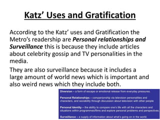
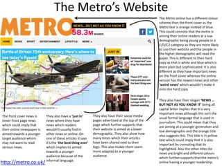
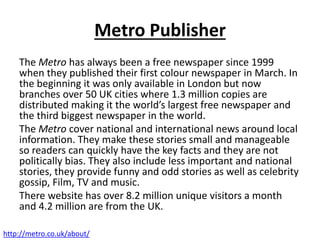
According to the Metros website they cover a ‘perfect mix of national and international news wrapped
around local information’ they also claim to have no political views so readers are able to just get the
content and make there own decision.
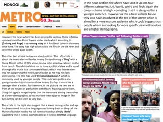
There are also descriptions world news on that particular day, depending on what is the biggest story of
that day it may been on the front cover of the paper and have multiple pages dedicated to the story.
This should attract those in the higher demographic as they will want less lighter news and more serious
news. This is also very popular news which will interest most people as they will have an opinion on the
subject and will be important as it may possibly effect them. The stories which are advertised on the
front cover are in more depth further into the newspaper where usually two more pages are dedicated
to that particular story.
In the Metro there are commonly stories featuring celebrity news. This news is about what is new in
there life that being what they are doing, who they are with and how they feel about certain topics.
These will be aimed at the lower demographic of the readership whom may not be employed as they
stereotypically like to reader about celebrities and aren’t as focused on mainstream news. These stories
can either have one page for themselves for one story if they are important but for smaller stories they
have 4 pages covered in multiple celebrities with a paragraph for each as it is less important. A popular
story can make it to the second page such as Jenifer Aniston’s marriage status [insert picture].
The Metro also covers news which is a rarity and unpredictability, such as a camera found in a travel
lodge shower room [insert picture]. This news had made it to the third page of the Metro as there is an
interest in the story and a common view about it.
43. Content continued
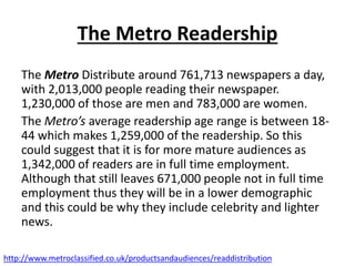
Half way through the Metro they have a Fashion section which takes over 10 pages.
These pages are designed mostly for women readers as they contain women's clothing
and articles about marriage written by women. It also covers information about
children and some times celebrities.
Towards the end of the newspaper there are two pages for television which contains a
large image of actors and presenters of The Top 10 TV shows. They contain a small and
brief description who is in it and what it is.
They also include holiday destinations which are aimed at the higher demographic as
they are expensive such as going to Australia [insert image]. This is amongst other
luxury destinations.
At the end of the magazine it is full of small and whole page adverts. These includes
houses, jobs, religions, insurance and holidays.
At the very end is the sport section which is 7 pages and covers most sports and one
story usually about a big achievement or a scandal takes up a page.
44. Spending power: As the Metro is a free
newspaper anyone is able to read it that is why
they have lots of adverts. Also their content
covers a variety of different topics to try meet
the needs of everyone.
Demographic: The demographic of the Metro
covers all types of people as it is A,B,C1,C2,D,E
as over 671,000 of people are unemployed thus
being in E and as the newspaper is distributed
across heavily urbanized areas, especially in
cities where all types of peoples in the
demographic chart live and work.
http://www.metroclassified.co.uk/productsandaudiences/readdistribution
45. Maslow’s hierarchy of needs
The metro’s readership according to Maslow’s
hierarchy are social climbers as they are
interested in promoting their social status as
they are interested in celebrities and improving
their knowledge in this subject.
They can also be classed as Caregivers as they
can sympathies with who they are reading about
specially when it is bad/negative news.
46. NRS research
According to the NRS research in September the
average amount of individuals aged between 15-34
who were readers of the metro were 1,646,000
individuals. Those aged 35+ was averaged at
1,605,000 which is slightly less. This could be
because the newspapers are distributed in London
and there are less elderly people commuting into
London on a baily basis.
There are around 1,825,000 people in the
demographic ABC1 and around 1,426,000 people in
the C2DE demographic which is slightly less.
http://www.nrs.co.uk/latest-results/nrs-print-results/newspapers-nrsprintresults/
47. Socio-economics
The metro’s readership is very large with over a million
people reading their newspaper daily. This is why there
socio-economic group is very diverse. According the NRS
research there are around 1,825,000 people in the
demographic ABC1 and around 1,426,000 people in the
C2DE demographic which is slightly less.
There readership covers all the different socio-economic
groups and between the higher and lower 3 groups there
are very similar. With only around 400,000 difference in
the top 3 groups.
48. Katz’ Uses and Gratification
According to the Katz’ uses and Gratification the
Metro’s readership are Personal relationships and
Surveillance this is because they include articles
about celebrity gossip and TV personalities in the
media.
They are also surveillance because it includes a
large amount of world news which is important and
also weird news which they include both.
49. Psychographics
76% of readers are able to get to the top of their career and work long hours
which can go up to 2/3 working 40 hours a week and 1/3 working 45 hours.
1/10 work 12 hours a day.
23% of urbanites got promoted in the last 12 months. They regulary go to the
gym and more to pubs and bars. They enjoy shopping and long-haul holidays.
The majority give to charity 87% currently donate, 76% give more than £20 a
year. They are also concerned about the environment. Apparently, they are
not interested in politics.
The metro describes their readers as:
• Often on the move
• Mentally never still
• Continually doing more than most
• Always creating
• Always connected
http://www.theguardian.com/media/2002/oct/28/mondaymediasection2
http://metro.co.uk/2013/10/15/metros-audience-4164994/
50. Hartley’s 7 subjectivities
The Metros average readership is age 29 and
60% are male. These readers are mostly white-
collar workers. Readers are aged between 18-44
and more than half are based in or around
London. As there are so many readers there is a
diverse range of ethnicities.
51. Front Cover
Masthead: The
denotation of the
masthead is the
newspaper is usually read
on the train also called the
‘Metro’. The white on the
masthead connotes that it
is a serious newspaper as
the white can be a symbol
of purity so the metro only
publishes the truth on a
royal blue implying pride
and trust.
Lead Story: The denotation
of the lead story ‘Europe
couldn’t save him’ implies
that the power of all the
European countries
weren’t able to save this
boy refugee. This is the
simple headline about the
current refugee crisis
which is easy to
understand. It may also
connote that Europe is
finding it difficult to
manage the situation of
the amount of refugees
crossing boarders.
Thursday 3rd September
52. Front CoverThe red connotes that the
news is important but
more so that it is free
which makes it better.
They are referencing
another part of the
newspaper but it only
small showing the
connotations of the main
story taking up the whole
cover.
The main image cover the
whole of the front page as
it connotes the refugee
crisis is a very big problem
is important and serious
enough to have the whole
front cover. The image is
able to tell a story and
cover what the current
crisis is about, that is why
there isn’t a lot of writing
as the image is able to
connect to almost
everyone. Thursday 3rd September
There is also a paragraph
description of the story as
the newspaper is designed
for a quick read so some
readers may not be able to
read the whole story.
53. News Values – ‘Galtung and Ruge’ Lead Story: This headline
shows the recency time which
the Metro has as this is news
which has happened on that
day. It is also important as it is a
story of huge magnitude
because there are thousands of
migrants risking their lives to
get to Europe. This can effect
us at home the proximity of the
migrants are far away although
lots of them are heading to
England which will have
consequences for the readers if
the UK decides to let them stay
in this country. Which could
lead to negativity. Although this
has happened before it was
unpredicted that all these
refugees would leave together.
The Metro is trying to show
Europe needs to help those by
showing a dead child.
Thursday 3rd September
Lead story: This has
been a running story
over the past three
days and can create
conflict between
readers whom believe
we should or shouldn’t
help the refugees and
it also has a mass
appeal to the whole
population.
This is also a rare story
as never have there
been this many
refugees trying escape.
This story particularly
has a visual imperative
as it connects strongly
to readers especially if
they have children.
54. Double Page Spread
This picture of a happy Refugee boy
whom has arrived safely in Europe
has a news value of (Galtung &
Ruge) ‘Human interest’ as the
picture is an visual imperative
which emotionally connects to
readers. It shows a young boys
which has survive and is happy to
be alive. The picture is captioned
‘Delight’ which is usually
associated to a child’s response to
having a treat whereas for this boy
it is associated with surviving and
for the readers can image the
magnitude of the story.
This is one of the three articles about the refugee crisis. The Metro
split up their main story usually advertised on the front cover into
three articles. They are small and readable which fits the need of
the readership whom need a fast read. This article shows the happy
and positive response they are getting from the public in Germany.
The article does end that Germany is expecting 800,000 refugees
and there are still refugees trying to find their way across from
Greece. This illustrates that there are still more refugees which are
in need and that Germany cannot deal with all of them and other
EU countries need to help. This could try and encourage their
readers to support refugees being allowed into the UK.
The second article is continued from the front page about how
the government has decided to use money from the foreign aid
budget to help support local councils with the Syrian refugees.
This article is continued onto page 5. Where it has another
headline about comments from the Pope which is in the same
article. The Metro may have done this to save space. However,
they include a picture of the Pope making the speech which may
encourage religious readers to read the article as it has an
important figure in it. Other newspaper may not have
commented in this which will make the metro stand out.
The Metro also keep their house styles throughout the magazine being blue. It
also shows the page number helping reader move to the page if it has been
referenced somewhere else in the magazine such as on the front page.
55. Double Page Spread
The large Virgin media advert suggest
that there will be people whom are
reading this story which want better
internet providers. The Metro have big
adverts like this as this is their
advertisement revenue as the
newspaper is free.
The metro also have a section in the news paper
where you can email you opinions of popular news.
This is a ‘Technological convergence’ where they can
connect to their readership.
This is the third story about the refugee crisis
which has a proximity effect (Galtung and
Ruge) as it describes to the readers that
refugees only wanted a life like theirs. The
article starts with ‘DEFIANT’ which implies
that the European leaders are going to be
tighter on boarder control. This is the last
section of the double page spread which
shows the darker side of the refugee crisis
and that there are still lots of people whom
are seeking a better life. The picture which
relates to the article is an visual imperative as
it shows refugees sleeping rail tracks . This is
ironic as this is how refugees are trying to get
into countries like they have done to Germany
although there are still many more on the
journey. Furthermore, the rail track is
dangerous as if was in action a train could kill
them which connotes the danger and risk
they are putting themselves in to cross the
boarders
They also include 5 lines about how
charities and normal people have been
helping with the crisis. The two articles
shows good things which are
happening to the refugees.
This image of the ‘Europe’s refugee crisis’ also featured
on the front cover. This is an example of (Galtung and
Ruge) continuity running story as it has been the third
day that the Metros main story is about the refugee
crisis. Having this title connotes that it is Europe’s
responsibility to deal with the problem.
The advert for Sainsbury’s pet insurance could be placed here next to the news
of the refugees as the story has a high human interest (Galtung and Ruge), it
may try a get people whom are emotional after reading the story to take
sympathy and want to protect what they have as they may feel lucky to have
such luxuries compared to the refugees whom have left everything behind them
for a better life.
56. The Metro Social media
This is the Metro’s Twitter page where you can get
instant notifications when they publish their news
articles. This Technological convergence is able to
give constant updates but also interact with the
readership by; using the comments section of each
post and using a hashtag to link their own opinions
with their readers.
They also have a YouTube channel where they can
upload videos. However, as this is a free sheet they
won’t be making a lot of advertising revenue from
the videos so they don’t upload a lot of videos. This
also means that they only have 480 subscribers.
Although, this is a technological convergence and
they are able to connect with their viewers with the
comment section on their videos.
57. Metro’s Facebook
They also have a Facebook page where
they are able to Post their own news
articles from their website to people to
see. Again just as the other technological
convergences you are able to comment
on the post to comment with the
readership. With Facebook people can
also like a post which gains it more
interest and view and they are also able
to share this post amongst their own
friends. They also post pictures which
are mostly funny and relate to a lower
demographic. The Metro Page has over 1
million likes.
58. Marketing
As the Metro is a free sheet they don’t need
to market their newspaper although in
urbanized areas like London and London
station such as Waterloo station it is already
very popular. There are multiple news stands
in each station in London where they are
assessable from. The amount of Metro
newspaper there are it doesn’t need to be
advertised.
59. Products Promoted within the
Magazine
Mc Donald's advertise themselves in the Metro, this
advert is almost a double page. They have
advertised their breakfast option as most people
read the Metro in the morning on the way to work.
This could attract readers whom are hungry in the
morning.
Mc Donalds are using a grey background not to
stand out as they want to blend in with the readers
so they feel comfortable, compared to it being
bright and loud. This can connote a more classy feel
to it which will attract the higher demographic into
their product.
The advert also features the Mc Donalds logo and
slogan which reinforces brand identification. It is
also a common feature in their adverts which
people recognize and trust.
60. The news James Bond film ‘Spectre’ takes up a whole page in the Metro. This is a ‘Visual imperative’ (Galtung & Ruge)
as it features the movie star ‘Daniel Craig’ whom acts as a personality (Galtung and Ruge) figure which attracts readers
whom are interested in celebrity news. These are usually people of a lower demographic however not limited to. All the
text is in white which can connote purity and the brand being trustworthy which is supported by their recognizable ‘007’
logo. ‘BOX OFFICE NOW OPEN!’ is in all caps which implies there is high importance as readers can buy their tickets now
which is where they want to direct the readers attention. Below this also shows the cinemas which are screening it as
well. Furthermore, in supporting that the advert attracts a lower demographic whom is interested in celebrity news,
there is an article about ‘Paloma’s Stocking trade’ which is why they have an personality (Galtung and Ruge) next to the
article with a celebrity in.
There is also another article which is advertised on the second page which are about flights to hot countries at low prices
by ‘Qatar Airlines’. Above this advert there is a article stating ‘Summer ends’ which could encourage people to go on
holiday after they read about cold weather coming and summer has ended.
61. Here there is a double page spread which has to adverts on either side. This is the pre-dominantly women's section of the
Metro as it is about women’s fashion. The advert on the right is to promote Transport for London’s twitter profile as they
will tweet travel alerts and disruptions. They have used the twitter logo instead of the blue line through the red circle. This
is promoting that transport for London are integrated into twitter as connoted by the twitter logo inside their own logos red
circle. They also have the real logo in the bottom right corner to further push their brand. The advert also uses the word
‘(OMG)’ as this is commonly used by females when they are talking to each other and that is why it has been used in the
women’s fashion section of the magazine.
The other advert on the right is showing cheap flights to Ireland by ‘Aer Lingus’. The advert has a lot of green in it which
connotes the feeling in Ireland as the country is very green. At the top of the page it has a two tick boxes one with ‘A few
Flights a day’ the other with ‘Phew. 60 Flights a day’ This is connotes and shows that there are a lot of flights everyday. For
the readers they will want to have a relaxing holiday and this meets their needs. They also show their website in the advert
which shows they have used their technological convergences.
62. The Metro’s Website
http://metro.co.uk/
The Metro online has a different colour
scheme than the front cover as the
Metro text is orange instead of blue.
This could connote that the metro is
aiming their online readers at a low
demographic being young people in a
E/D/C2 category as they are more likely
to use their website and the people in
the higher demographic will read the
paper. This is different to their hard
copy as that is white and blue which is
more plain but sophisticated. It is also
different as they have important news
on the front cover whereas the online
version has the newest news and other
‘weird news’ which wouldn’t make it
onto the hard copy.
They also have their social media
pages advertised at the top of the
page which further supports that
their website is aimed at a lower
demographic. They also show how
many times which their articles
have been shared next to their
logo. This also makes them seem
more adapted to a younger
audience.
The front cover news is
never front page news
which could imply that
their online newspaper is
aimed towards a younger
target audience whom
may not want to read
serious news.
They also have a ‘just in’
news where they have
news which readers
wouldn’t usually find in
other news or online. On
one of these articles it says
it’s the ‘the best thing ever’
which implies its aimed
towards a younger
audience because of the
informal language.
They also have their slogan ‘NEWS …
BUT NOT AS YOU KNOW IT’ being all
capital letter implies that it is very
important news although this isn’t the
usual formal language that is used in
journalism. This could mean that they
are aiming at a younger generation and
low demographic and the orange title
also suggests this. This title is in yellow
text which could imply that it is also
important by connoting that its
highlighted. Also the other titles for
news are bright and different colours
which further supports that the metro’s
online having a younger readership.
63. In the news section the Metro have split it up into four
different categories; UK, World, Weird and Tech. Again the
colour scheme is bright connoting that it is designed for a
younger audience. However as this a free website to use
they also have an advert at the top of the screen which is
aimed for a more mature audience which could suggest that
people whom are looking for more specific new will be older
and a higher demographic.
However, the news which has been covered is serious. There is follow
up news from the Alton Towers smiler crash which according to
(Galtung and Ruge) is a running story as it has been cover in the news
since June. The story has high value as it is the first in the UK news and
cover the whole page width.
The other two stories below are about politics. The Left article is
about the newly elected leader Jeremy Corbyn having a ‘fling’ with a
Diana Abbott in the 1970’s whom is now in his shadow cabinet, on the
front bench. The Metro claims not to have a political view and is equal
although this article is a controversial topic which may lean readers
into not supporting the new Labour leader as he may not look
professional. The title has used ‘#relationshipGoals?’ which is
commonly used by younger people. This could aim politics at a
younger readership or connote how Jeremy Corbyn is more like a
teenager then a leader. Furthermore, in the picture the two are in
front of the houses of parliament with Hearts floating above them.
Using this type is image implies that the metro are aiming themselves
at a lower demographic as you may see these type of image in The
Sun as they can be seen as very bias.
The article to the right also suggest that a lower demographic and age
has been aimed for as the language used is very basic as they call the
Mayor of London not by his full name or title but simply ‘Boris’
suggesting that it is less sophisticated as it is less informal language.
64. They also have a news feed where new articles
are shown. Theses stories are a mix of UK news,
World news and Weird news. They have a longer
title to explain the story and a short description
sometimes unformal for example, ‘Well played,
Jezza’. This isn’t seen in the hard copy as it uses
informal language. There a lots of these stories
which continue to go down the page. The metro
are able to use technological convergences by
adding their social media accounts on each
article which include; Facebook, Twitter and
Google+. However, they don’t advertise a lot of
their social media as they don’t want to mix two
demographically aimed sources, the hard copy
and online version, together. They also have the
amount that it has been shared which gains
more interest especially for a younger audience.
The metro has on their home page and at the bottom on articles a trending now section which shows top trending articles
in the news at that moment in time. Here is only shows three but on the front cover is shows 5 trending articles. They show
a picture and a brief description of the article to lure reader to the article. On the hard copy the Metro wouldn’t be able to
use a trending now as is it a one day news paper and they are unable to print trending topic as they change throughout the
day. This is aimed at a younger audience as they will be interested in what everyone else is reading and they want to know
what is popular now. The two headings here also have a yellow outline which can connote it being highlighted as it is
important news.
65. The website also has a public vote where the readers are able to vote together on
popular questions. They are able to see the what everyone else voted as a
percentage. They are also able to share these results on Facebook and Twitter which
shows the integration of their technological convergences. In the hard copy of the
newspaper they also have a similar system where readers are able to express their
opinion on the sections MetroTalks. The reader either email or text in what they
want to say about current news and it can get published into the paper. This is a
similar way the online version and hard copy are similar in how they are able to
connect with their readership.