Vibe Magazine Research
By Emily Hopwood
History of the magazine brand
Vibe magazine launched in 1993 with the publisher ‘Time.inc’ This was then bought by Millar
Publishing in 1996, this company also bought the magazine Spin that had a wider genre range
and covered different types of music. The magazine was then sold to a private equity firm in
2006, The Wick’s Group. In 2009 it was announced that the magazine was shutting down
completely with immediate effect. InterMedia Partners then bought Vibe magazine after it had
shut down and merged it with ‘Blackbook’, a biannual magazine. in 2012. In 2013 it was
announced that Vibe Magazine along with Vibe.com and VibeVixen.com had been sold to Spin
Media. They wanted to make the magazine available digitally so that the magazine was still able
to be worked on. They cut the magazine to publish quarterly as well. The magazine also
published a spin-off magazine called ‘Vibe Vixen’ Aimed at Vibe's female multicultural
demographic. Vibe Vixen included features on beauty, fashion, and female entertainers. R&B
star Ciara appeared on the inaugural issue's cover.
Expanding the brand
In addition to magazines, Vibe also publishes Hip-hop culture books. Other ways the
Vibe brand are promoted is through the use of an online based magazine called VIBE
Online. The magazine also has something called VIBE On Demand, an on-demand
network that is available to the magazine's audience more frequently. VLN TV is an
online video channel that is also available to the audience. There is also a section to
the magazine from VIBE Film; MVibe, a wireless content provider for hand-held
devices as well as CD and DVD lines distributed under the same name. The Vibe
Music Mixer is an app created by the magazine is available for iPhone and iPad.
There were also vibe awards that Vibe hosted in 2003- 2007 there were issues
surrounding the awards as incidents occurred with performers and guests. There are
also events called ‘Best Rapper Alive Tournaments’.
Logo and header analysis on the website
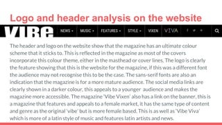
The header and logo on the website show that the magazine has an ultimate colour
scheme that it sticks to. This is reflected in the magazine as most of the covers
incorporate this colour theme, either in the masthead or cover lines. The logo is clearly
the feature showing that this is the website for the magazine, if this was a different font
the audience may not recognise this to be the case. The sans-serif fonts are also an
indication that the magazine is for a more mature audience. The social media links are
clearly shown in a darker colour, this appeals to a younger audience and makes the
magazine more accessible. The magazine ‘Vibe Vixen’ also has a link on the banner, this is
a magazine that features and appeals to a female market, it has the same type of content
and genre as the original ‘vibe’ but is more female based. This is as well as ‘Vibe Viva’
which is more of a latin style of music and features latin artists and news.
Website features
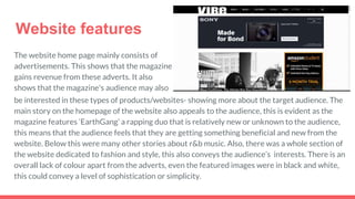
The website home page mainly consists of
advertisements. This shows that the magazine
gains revenue from these adverts. It also
shows that the magazine's audience may also
be interested in these types of products/websites- showing more about the target audience. The
main story on the homepage of the website also appeals to the audience, this is evident as the
magazine features ‘EarthGang’ a rapping duo that is relatively new or unknown to the audience,
this means that the audience feels that they are getting something beneficial and new from the
website. Below this were many other stories about r&b music. Also, there was a whole section of
the website dedicated to fashion and style, this also conveys the audience’s interests. There is an
overall lack of colour apart from the adverts, even the featured images were in black and white,
this could convey a level of sophistication or simplicity.
Videos
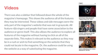
There was also a sidebar that followed down the whole of the
magazine’s homepage. This shows the audience all of the features
they may be interested. These videos and side messages were the
only part of the magazine's website that was not in grayscale. All
feature r&b singers and people that have some association to the
audience or genre itself. This also allows the audience to explore all
features of the magazine without having to click on all of the
separate links. This makes it relevant to the audience as they may
be in a rush or wish to find something on the website that they
could not locate in the magazine. Or, the audience could be using
the website as a way of substituting the magazine.
Magazine information
Vibe magazine was originally founded by famous music producer Quincy Jones, the
magazine specializes in rap and commercial music. Vibe magazine has a circulation
of 300,943. 98,504 was non-paid. The magazine costs £2.50 and can be purchased
in a wide variety of shops from news agents to stationary shops. This low price is due
to the type of audience the magazine is trying to attract. Vibe magazine’s target
audience is 12-24 year olds, it is aimed at young and urban audiences who follow hip
hop when first launched. This information is somewhat out of date as the magazine
has developed and changed since this time. In 2012 the magazine became to involve
more commercial music so that the magazine could attract a wider variety of people
interested in hip hop/rap music. In 2015, the magazine uses both rap stars and also
features actors and comedians and overall has a wider audience range.
AnalysisofVibe
cover
Masthead and Strapline
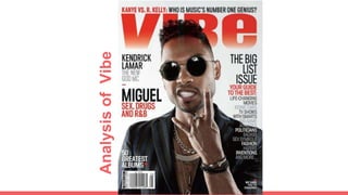
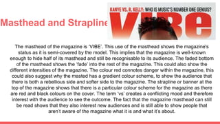
The masthead of the magazine is ‘VIBE’. This use of the masthead shows the magazine's
status as it is semi-covered by the model. This implies that the magazine is well-known
enough to hide half of its masthead and still be recognisable to its audience. The faded bottom
of the masthead shows the ‘fade’ into the rest of the magazine. This could also show the
different intensities of the magazine. The colour red connotes danger within the magazine, this
could also suggest why the masted has a gradient colour scheme, to show the audience that
there is both a rebellious side and softer side to the magazine. The strapline or banner at the
top of the magazine shows that there is a particular colour scheme for the magazine as there
are red and black colours on the cover. The term ‘vs’ creates a conflicting mood and therefore
interest with the audience to see the outcome. The fact that the magazine masthead can still
be read shows that they also interest new audiences and is still able to show people that
aren’t aware of the magazine what it is and what it’s about.
Main Image
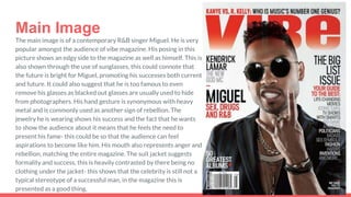
The main image is of a contemporary R&B singer Miguel. He is very
popular amongst the audience of vibe magazine. His posing in this
picture shows an edgy side to the magazine as well as himself. This is
also shown through the use of sunglasses, this could connote that
the future is bright for Miguel, promoting his successes both current
and future. It could also suggest that he is too famous to even
remove his glasses as blacked out glasses are usually used to hide
from photographers. His hand gesture is synonymous with heavy
metal and is commonly used as another sign of rebellion. The
jewelry he is wearing shows his success and the fact that he wants
to show the audience about it means that he feels the need to
present his fame- this could be so that the audience can feel
aspirations to become like him. His mouth also represents anger and
rebellion, matching the entire magazine. The suit jacket suggests
formality and success, this is heavily contrasted by there being no
clothing under the jacket- this shows that the celebrity is still not a
typical stereotype of a successful man, in the magazine this is
presented as a good thing.
Anchorage Text
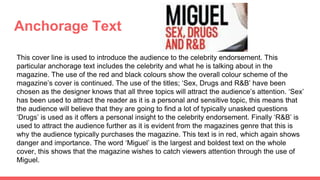
This cover line is used to introduce the audience to the celebrity endorsement. This
particular anchorage text includes the celebrity and what he is talking about in the
magazine. The use of the red and black colours show the overall colour scheme of the
magazine’s cover is continued. The use of the titles; ‘Sex, Drugs and R&B’ have been
chosen as the designer knows that all three topics will attract the audience’s attention. ‘Sex’
has been used to attract the reader as it is a personal and sensitive topic, this means that
the audience will believe that they are going to find a lot of typically unasked questions
‘Drugs’ is used as it offers a personal insight to the celebrity endorsement. Finally ‘R&B’ is
used to attract the audience further as it is evident from the magazines genre that this is
why the audience typically purchases the magazine. This text is in red, which again shows
danger and importance. The word ‘Miguel’ is the largest and boldest text on the whole
cover, this shows that the magazine wishes to catch viewers attention through the use of
Miguel.
Plugs
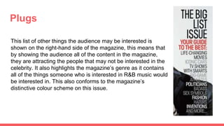
This list of other things the audience may be interested is
shown on the right-hand side of the magazine, this means that
by showing the audience all of the content in the magazine,
they are attracting the people that may not be interested in the
celebrity. It also highlights the magazine’s genre as it contains
all of the things someone who is interested in R&B music would
be interested in. This also conforms to the magazine’s
distinctive colour scheme on this issue.

Magazine website research

  • 1.
  • 2.
    History of themagazine brand Vibe magazine launched in 1993 with the publisher ‘Time.inc’ This was then bought by Millar Publishing in 1996, this company also bought the magazine Spin that had a wider genre range and covered different types of music. The magazine was then sold to a private equity firm in 2006, The Wick’s Group. In 2009 it was announced that the magazine was shutting down completely with immediate effect. InterMedia Partners then bought Vibe magazine after it had shut down and merged it with ‘Blackbook’, a biannual magazine. in 2012. In 2013 it was announced that Vibe Magazine along with Vibe.com and VibeVixen.com had been sold to Spin Media. They wanted to make the magazine available digitally so that the magazine was still able to be worked on. They cut the magazine to publish quarterly as well. The magazine also published a spin-off magazine called ‘Vibe Vixen’ Aimed at Vibe's female multicultural demographic. Vibe Vixen included features on beauty, fashion, and female entertainers. R&B star Ciara appeared on the inaugural issue's cover.
  • 3.
    Expanding the brand Inaddition to magazines, Vibe also publishes Hip-hop culture books. Other ways the Vibe brand are promoted is through the use of an online based magazine called VIBE Online. The magazine also has something called VIBE On Demand, an on-demand network that is available to the magazine's audience more frequently. VLN TV is an online video channel that is also available to the audience. There is also a section to the magazine from VIBE Film; MVibe, a wireless content provider for hand-held devices as well as CD and DVD lines distributed under the same name. The Vibe Music Mixer is an app created by the magazine is available for iPhone and iPad. There were also vibe awards that Vibe hosted in 2003- 2007 there were issues surrounding the awards as incidents occurred with performers and guests. There are also events called ‘Best Rapper Alive Tournaments’.
  • 4.
    Logo and headeranalysis on the website The header and logo on the website show that the magazine has an ultimate colour scheme that it sticks to. This is reflected in the magazine as most of the covers incorporate this colour theme, either in the masthead or cover lines. The logo is clearly the feature showing that this is the website for the magazine, if this was a different font the audience may not recognise this to be the case. The sans-serif fonts are also an indication that the magazine is for a more mature audience. The social media links are clearly shown in a darker colour, this appeals to a younger audience and makes the magazine more accessible. The magazine ‘Vibe Vixen’ also has a link on the banner, this is a magazine that features and appeals to a female market, it has the same type of content and genre as the original ‘vibe’ but is more female based. This is as well as ‘Vibe Viva’ which is more of a latin style of music and features latin artists and news.
  • 5.
    Website features The websitehome page mainly consists of advertisements. This shows that the magazine gains revenue from these adverts. It also shows that the magazine's audience may also be interested in these types of products/websites- showing more about the target audience. The main story on the homepage of the website also appeals to the audience, this is evident as the magazine features ‘EarthGang’ a rapping duo that is relatively new or unknown to the audience, this means that the audience feels that they are getting something beneficial and new from the website. Below this were many other stories about r&b music. Also, there was a whole section of the website dedicated to fashion and style, this also conveys the audience’s interests. There is an overall lack of colour apart from the adverts, even the featured images were in black and white, this could convey a level of sophistication or simplicity.
  • 6.
    Videos There was alsoa sidebar that followed down the whole of the magazine’s homepage. This shows the audience all of the features they may be interested. These videos and side messages were the only part of the magazine's website that was not in grayscale. All feature r&b singers and people that have some association to the audience or genre itself. This also allows the audience to explore all features of the magazine without having to click on all of the separate links. This makes it relevant to the audience as they may be in a rush or wish to find something on the website that they could not locate in the magazine. Or, the audience could be using the website as a way of substituting the magazine.
  • 7.
    Magazine information Vibe magazinewas originally founded by famous music producer Quincy Jones, the magazine specializes in rap and commercial music. Vibe magazine has a circulation of 300,943. 98,504 was non-paid. The magazine costs £2.50 and can be purchased in a wide variety of shops from news agents to stationary shops. This low price is due to the type of audience the magazine is trying to attract. Vibe magazine’s target audience is 12-24 year olds, it is aimed at young and urban audiences who follow hip hop when first launched. This information is somewhat out of date as the magazine has developed and changed since this time. In 2012 the magazine became to involve more commercial music so that the magazine could attract a wider variety of people interested in hip hop/rap music. In 2015, the magazine uses both rap stars and also features actors and comedians and overall has a wider audience range.
  • 8.
  • 9.
    Masthead and Strapline Themasthead of the magazine is ‘VIBE’. This use of the masthead shows the magazine's status as it is semi-covered by the model. This implies that the magazine is well-known enough to hide half of its masthead and still be recognisable to its audience. The faded bottom of the masthead shows the ‘fade’ into the rest of the magazine. This could also show the different intensities of the magazine. The colour red connotes danger within the magazine, this could also suggest why the masted has a gradient colour scheme, to show the audience that there is both a rebellious side and softer side to the magazine. The strapline or banner at the top of the magazine shows that there is a particular colour scheme for the magazine as there are red and black colours on the cover. The term ‘vs’ creates a conflicting mood and therefore interest with the audience to see the outcome. The fact that the magazine masthead can still be read shows that they also interest new audiences and is still able to show people that aren’t aware of the magazine what it is and what it’s about.
  • 10.
    Main Image The mainimage is of a contemporary R&B singer Miguel. He is very popular amongst the audience of vibe magazine. His posing in this picture shows an edgy side to the magazine as well as himself. This is also shown through the use of sunglasses, this could connote that the future is bright for Miguel, promoting his successes both current and future. It could also suggest that he is too famous to even remove his glasses as blacked out glasses are usually used to hide from photographers. His hand gesture is synonymous with heavy metal and is commonly used as another sign of rebellion. The jewelry he is wearing shows his success and the fact that he wants to show the audience about it means that he feels the need to present his fame- this could be so that the audience can feel aspirations to become like him. His mouth also represents anger and rebellion, matching the entire magazine. The suit jacket suggests formality and success, this is heavily contrasted by there being no clothing under the jacket- this shows that the celebrity is still not a typical stereotype of a successful man, in the magazine this is presented as a good thing.
  • 11.
    Anchorage Text This coverline is used to introduce the audience to the celebrity endorsement. This particular anchorage text includes the celebrity and what he is talking about in the magazine. The use of the red and black colours show the overall colour scheme of the magazine’s cover is continued. The use of the titles; ‘Sex, Drugs and R&B’ have been chosen as the designer knows that all three topics will attract the audience’s attention. ‘Sex’ has been used to attract the reader as it is a personal and sensitive topic, this means that the audience will believe that they are going to find a lot of typically unasked questions ‘Drugs’ is used as it offers a personal insight to the celebrity endorsement. Finally ‘R&B’ is used to attract the audience further as it is evident from the magazines genre that this is why the audience typically purchases the magazine. This text is in red, which again shows danger and importance. The word ‘Miguel’ is the largest and boldest text on the whole cover, this shows that the magazine wishes to catch viewers attention through the use of Miguel.
  • 12.
    Plugs This list ofother things the audience may be interested is shown on the right-hand side of the magazine, this means that by showing the audience all of the content in the magazine, they are attracting the people that may not be interested in the celebrity. It also highlights the magazine’s genre as it contains all of the things someone who is interested in R&B music would be interested in. This also conforms to the magazine’s distinctive colour scheme on this issue.