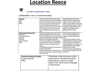
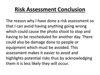
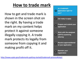
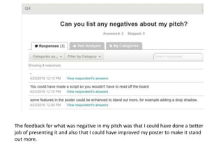
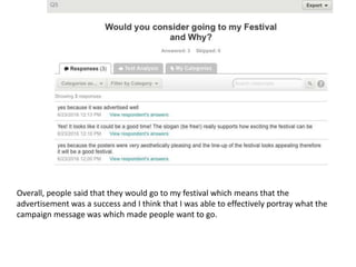
3. Pitch Environment/ Room Layout
These are the materials which I used when I was presenting my pitch. The photos
below are the projector, clicker, Mac, Whiteboard and the room in which I did the
presentation. I used the projector to display my Prezi on a large scale so that
everyone in the room could see what was written clearly. I used the clicker to go
through each slide with out having to use a keyboard giving me more freedom to
move when speaking. I used the Mac to make the Prezi as well as using it to show
my prezi as it was linked to the projector. The whiteboard was a the surface which
the projector projected the prezi onto and it was a hard surface so the Prezi could
be seen easily.
6. Connotations of my Slogan
My Festival Slogan is ‘!Be Free!’.
This is to connote the the freedom of a long
summer holiday will give people to socialize and
do what they want. My festival gives them the
freedom of staying for three days at the festival.
It also connotes of leaving worries and stress
away and by going to the festival they are ‘Free’
from all their troubles and are able to escape
the real world for a little while.
7. Proposal Conclusion
The reason why I have made a proposal is so I
can clearly outline and see what my aims,
objectives, target audience, campaign message,
style, approach and content are. This also means
that I can reference this document later when I
am making and creating my festival to get
inspiration from it and remember what
everything needs to be like. I can also show
other people this so that they can get an idea to
what my festival is going like.
8. Target Audience – Maslow’s Hierarchy of
Needs
It could be argued that the target audience according
to Maslow would be ‘Social Climbers’. By going to this
event it will increase their social status as they are
able to say they have seen multiple famous artists
perform. They will also have experienced going to a 3
day long festival which the average youth of society
will not having experienced thus improving their
status.
The audience can also be seen as ‘Explores’ as they
are driven by social change which could happen at a
festivals where new trends are created which could go
viral as festivals at the time are the biggest events for
this genre of music.
9. Target Audience – Katz Uses and
Gratification theory
The audience according to Katz Uses and Gratification
Theory can a be categorized into ‘Diversion’ the audience
can escape from reality and immerse themselves in the
festival and music. As this is a three day event participants
can fully immerse themselves in the party atmosphere and
can constantly experience the party like mood.
Furthermore, as this is happening over 3 days they can
distance themselves from reality and enough themselves
without thinking of the ‘outside world’ to enjoy a break.
They are also able to build a ‘Personal Relationship’ as they
can form a close bond with the artists as they have seen
them perform thus the experience together forms a bond.
10. Target Audience – Hartley's Seven
Subjectivities
The age range of this festival is for young adults around 18-25.
The clubbing and dance music is popular with this age range.
Also as the audience has to stay over night it is unlikely there will
be under 18s. This poster is quite basic so it may appeal to a
older audiences as there isn’t lots of bright colours.
The Gender is split evenly between male and females. As the
people who enjoy this is usuallay a split between males and
females as seen at previous festivals which are similar to mind.
There is a variety of classes and ethnicities which attend but
stereotypically it is usually white middle class people who
attend. This is because that White males usually listen to this
particular music and want to attend this tours and also, from
previous events this is the main type of person who would
attend this even. Furthermore, this is the most common
ethnicity in England where the festival is being hosted.
11. Target Audience – Socio-Economic needs
The average attendee of my festival will be
between the C2, D and E category. This is because
the festival is mostly in a student age range or
younger people. The categories above (A,B and
C1) are usually for older adults who have
developed a career which takes time so they are
older.
The lifestyle these people have are very student
like where they like to go clubbing and partying.
They like to socialize and trying new experiences
due to them becoming mature adults.
12. Target Audience – Spending Power
As the audience is lower in the demographic
range (E,D,C2) and more student like the
spending power is likely to be very low as
students are known for not having a lot of
money. Although, this festival is expensive as it is
likely that despite the audiences low spending
power they will send a long time saving money to
attend this festival.
13. Target Audience – Psychographics
People who go similar festivals to mine can be put
into multiple psychographics for example ‘Aspirers’.
These are people who seek status. They can be
described as being materialistic, orientated about
their image appearance and persona. These are
qualities of lots of younger people.
They can also be described as ‘Explorers’ because by
going to the festival they want to discover something
new. They have lots of energy, individualistic and
value differences. This psychographic is seen in
students and that is a large section of the audience
which go to this event.
15. Mood Board Conclusion
I have chosen this photo as this is a typical of what to expect
at a festival especially in England. It shows a group of friends
probably in the summer with their camping gear getting ready
for a weekend festival in somewhere like Glastonbury. Despite
the wellington boots they are still wearing shorts which shows
they are expecting sun. This sets the mood for my magazine
poster as it is very traditional.
16. Mind Map Magazine Advert
Ideas
Colour Scheme:
The target audience for this Advert is going to
be for students over 18. This is because the
music is generally for those over 18 and I
don’t want them to be put off going if they
think lots of children (14-16) are going. Also
some of the music contains explicit language
and it is safer for only adults to go.
Name: JUMP Festival
The connotations of Jump
is the feeling of listening to
music at a festival and
having the urge to jump
and dance to the
Music.
This will be a yearly
festival. It will be in the
same location each year
and last for three days.
Slogan: “BE FREE”
The connotations behind this is
that people who attend can
have a feeling of freedom and
escapism.
This advert is going to be put into multiple
magazines. Most of these are going to be
paper based magazines such as Mixmag
and DJ times. However, they will also
feature in online magazines.
The connotations of purple are power
and luxury which I want to relate to my
festival as being powerful in creating a
social status which should encourage my
audience to buy tickets. Purple also
connotes independence and mystery. As
my audience is young I want to promote
independence as they are at the age
where they can be independent. Also,
mystery links to the unknown of what
their summer is going to bring them.
Blue connotes masculinity and as
this is a large portion of my
audience which I want to attract
to the festival.
Yellow connotes sunshine,
happiness and energy. This is what
I want my audience to see my
festival as.
17. Magazine Advert Hand Drawn Draft
This is the header which is the
festivals name. It takes up
almost half of the page so
that it attracts the audiences
attention to read it. This
should be the first thing they
read so that it boost brand
knowledge. The colour is also
purple so it has a nice
distinctive contrast between
the text.
This is where all of the artists
names will go. They will be in
different fonts which
represent the type of artist
they are. This is the most
important part of the
magazine advert as this will
convince people the most to
go.
This shows the date of the
event which is important for
people who want to go. This
is why it is in-between the
header and the artist
names. So when people look
closer they may read this.
This is the festivals website where people can
buy tickets. It fits nicely at the bottom and this
is also where the telephone number is.
The background is going
to be a sunset which
heavily connotes the
summer theme of the
festival.
This is someone jumping.
This connotes to the
festival header. They are a
shadow as the audience
can imagine themselves as
the person.
This is a pug
promotion so that the
audience can clearly
see the price of tickets
18. Hand drawn Magazine advert
Conclusion
The have made a hand drawn draft so that I can
visualize what I am going to make and when I
am making it I can base it off something making
it quicker as it will be a guide. There shouldn’t
be a lot which changes with maybe the
positioning changing of some of the text.
However, this is a basis of what the final product
will look like in Photoshop.
19. Artists Person’s
shadow
Graphic Layout – Magazine Layout
Jump Masthead
“Festival”The
Sponsor
The date and location
Puff
Promotion
More artists
Website and Phone Number
The have decided to
use most of the
magazine advert space
to be filled with artists
names as this can
create star appeal as
most people will
probably go to the
festival to see certain
artists perform. I have
taken this idea from my
mood board where
advert of inspiration
has just focuses on
covering the whole
page in artists names
as people can search
for the people they like
and it will visualise the
vast amount of people
which are performing.
The smaller
artists are at the
bottom as to not
distract the
attention away
from the bigger
artists. There is
also more room if
they are a
smaller size so I
can fit more in.
These artists will
appeal to people
who like smaller
and more
unknown artists.
20. Analysis of Print Advertisement
Inspiration
Truck Festival is
sponsored by ‘DIY’
There are two
‘Pug’ promotions,
one is for a Free
tickets for under
12s and the other
showing the price
for normal tickets.
This is there website
where users can
preorder tickets.
Colour Scheme:
The connotations of
the monster in the
background could
be for individuals to
release their inner
monster and to stop
hiding their inner
feelings.
This is probably aimed
towards adults as the
colours are plain and
simple. Also the font isn’t
flashy. The price is also
aimed at adults as its £69
and under 12s go free.
22. Mood Board Conclusion
I have chosen this photo as it shows the crowd at a festival. I like
this photo as it is mostly younger people in the crowd. This is
similar to the type of audience my festival is aiming for. It also
shows the festival at dusk which is going into will probably go
into the night.
23. Mind Map Festival Poster
Ideas
Colour Scheme:
The target audience for this poster is going to be for
students. This will be in the age range of 18-25. As this is the
student range which is interested in going to festivals and
other social status improving events in the summer.
Name: JUMP Festival
The connotations of Jump is the
feeling of listening to music at a
festival and having the urge to
jump and dance to the
Music.
This Poster is going to distributed around
the local area where the festival is going
to be. It is also going to be put around
universities and town centers. This way
more young people are able to see them.
This will be a yearly
festival. It will be in the
same location and last
for three days.
Green connotes nature which is
related to summer being fields.
This will portray in my advert
the feeling of summer.
Blue connotes masculinity as
this is most common gender
which will attend my festival I
want to make sure that I can
attract them to buy tickets.
Yellow connotes sunshine and
happiness which I want to make
my festival look like.
Red connotes passion and desire
which is what I want my
audience to feel about my
advert.
24. Festival Poster Hand Drawn Draft
The Palm trees connote the
summer feeling so that the
audience associate my
festival with summer.
The dates can be
clearly see so that
the audience
knows the dates of
the festival.
The header for this is big
and also contrasts will with
the background it shows
catch the eyes of the
audience boosting brand
identity. It is also flowing
which links to the music
genre.
This is the slogan of
the festival which
should show to the
audience what the
festival aims to
provide.
The background is very
colourful and connotes
multiple feelings of
summer. It also looks like a
fancy cocktail which are
only seen on holiday and
usually in the summer
This is a pug promotion
to show the audience
how much the festival
will cost which will
decided mostly if they
can go or not.
This is the shadow of the crowd which
connotes that they are raising their
hands to the music and that they are
also in the dark meaning the festival is
going on into the night.
The festivals website is at
the bottom where people
can buy tickets to the
festival.
25. Hand Drawn draft Poster Conclusion
This hand drawn draft will act as a guide when I
am making the Photoshop version. The Header
should be the main center of attention and then
the price should. The hands in the air are just
going to be shadows thus not being attention
seeking. There is minimal other text of pictures
so it doesn't’t divert the attention away from
the header and important information.
26. Graphic Layout - Poster
Jump Masthead
“Festival”
Slogan
Puff
Promotion
Website
Picture of Hands as a
crowd
I have taken the idea
of having the header
and slogan being the
biggest part of the
advert from one of
my posters of
inspiration as there is
only one thing to
focus on and some
one looking at this
cannot be distracted
by anything else as
there is nothing else
to look at.
The website is at
the bottom of the
page as is doesn’t
distract from
anything and if
someone is
interested in the
festival they can see
this information
without it taking
away from the
attention of the rest
of the poster.
27. Analysis Print Advertisement of
Inspiration
Colour Scheme:
This a picture to
connote summer and
the holiday time as they
are palm trees.
The hands connotes
the atmosphere of the
crowd and it being a
popular festival where
people are very
engaged in it due to
their hands being
raised.
The target audience for
this poster is probably
aimed towards a
younger audience as the
colours are very bright
and interactive which
would catch their eye.
Also, the connotations
of summer appeals to
younger people more as
they have no work to do
and look for activities to
do with their friends.
This is there slogan. ‘Live
Music, Dance and Drink’.
This also appeals more to
younger people.
28. Fonts Styles
I have chosen a range of fonts which I think are suitable for the magazine advert and
poster.
For the magazine advert I used Poplar Std as this font is very bold and takes up a lot
space on the advert. This makes it more eye catching and will draw peoples attention
which will then mean they learn what the festival is called.
I have also used this for the other fonts on the poster but in a different size and not as
bold. I wanted to keep the style of the page.
I also considered using the font Funk Machine as this is similar to Poplar Std as it is
very thick and bold however, I didn’t chose it as the spacing between each letter was
too close together and it was too thick as I though it could make some of the text hard
to read as a result.
I considered the Rockin record font as this again is a thick and bold font which will
attract more people to look at it. However, I didn’t think this font was appropriate
enough as the edges were too rounded and made it look too immature for the
audience which I was aiming for.
29. House Styles
• One house style which is going to be repeated (Steven Neale 1980) is the
header style for ‘JUMP festival’. This will keep the same font and colour, so
that it is recognizable. I am close keeping the Purple outline and shadow
effects to it.
• The colour purple connotes luxury and sophistication which people who
see the advert may think that this festival is fancy which could encourage
them go compared to muddy Edinburgh fields. It also a feminine colour
which could interest more women in going to my concert as they may be
put off by there being too may males going. Also, purple connotes
romance which could make the audience think of having a stereotypical
summer romance which could be started at my festival.
• I am using the colour yellow a lot as I want to connotations of that (for
example summer and happiness) to be related to my festival. That it is
why it appears a lot.
• I also have shadows in both of my adverts which is a more discrete house
styles as it connotes that the person viewing it could be that person in the
advert.
http://www.infoplease.com/spot/colors1.html
32. Photo Shoot plan conclusion
The reason for the photo shoot plan was to have
an idea of what my method was of taking all of
the photos for the magazine. It was all planned
so it wouldn’t waste time and that I was able to
get the images I needed the first time without
having to do another photo shoot. The plan also
highlights all the requirements which needed to
be met for the pictures to be taken.
33. Draft Logo design
This is the logo which I have created for the
magazine advert. As this music festival is sponsored
from Mixmag music magazine I used the same font
style as them. The font is bold and colour. It is a
very dominate feature on the advert. I made the
outline of the letters big to draw more attention to
it.
34. Production Plan for the Poster, advert and
Audio-visual advert
Week beginning the 1st June 2016
Monday Tuesday Wednesday Thursday Friday Saturday Sunday
I am going to
have a meeting
where I am
going to decide
all of the dates
for future
briefings.
I am going to
make layouts
and designs
plans with an
hired art
designer. I am
also going to
have to make a
story board for
what the audio-
visual advert is
going to look
like.
I am going to
design a logo and
I am also going to
decide a colour
scheme with an
designer and
editor. This will
also need to be
decided for the
audio-visual
advert.
I am going to make
some graphic layouts to
see if it looks nice and
appropriate with the
colour scheme. I am
going to listen to the
music and look at the
chosen colour scheme
for the audio-visual
advert and see if they
go well together with
the colour scheme well
representing the music
genre.
I am going to
have a
meeting with
all of my staff
to get their
opinion and
see what
needs to be
changed or
the poster
and audio-
visual advert
Completed by: Completed by: Completed by: Completed by: Completed
by:
Completed
by:
Completed
by:
Date 1st June Date 2nd June Date 3rd June Date 4th June Date 5th June Date 6th June Date 7th
June
35. Week beginning the 8th June 2016
Monday Tuesday Wednesday Thursday Friday Saturday Sunday
From the
changes made
from the
meeting on
Friday they
need to be put
into place
The new layout
and designs will
have to be
completed
today. The
audio-visual
advert will also
need to have
the colour
scheme
finalised
The final layout
needs to be
approved with the
colour scheme
and design. The
video will need to
be approved by
the editor before
anything else can
be changed.
I need to have a
photographer.
Today there will
be a meeting
with them
about what is
going to
happen in the
photoshoot.
The model
which I am
going to use for
the magazine
adverts needs
to be contacted
and told all of
the information
about the
photoshoot.
Completed by: Completed by: Completed by: Completed by: Completed by: Completed by: Completed by:
Date 8th June Date 9th June Date 10th June Date 11th June Date 12th June Date 13th June Date 14th June
36. Week beginning the 15th June 2016
Monday Tuesday Wednesday Thursday Friday Saturday Sunday
The model and
photographer
will take the
pictures at the
location which
has already
been decided
(by the editor).
The music will
need to be
recorded for
the audio-visual
advert
The photoshoot
template needs
to be
completed and
presented for
the approval for
the meeting.
The template
for the audio-
visual advert
will also need
to be finished.
I will have to
select the best
photos from the
photoshoot which
are going to be
use in the
magazine advert. I
will need approval
from the editor
for the picture
which I have
chosen. Timings
for the audio-
visual advert need
to be decided by
today.
The photos will
be edited and
placed onto a
template of the
magazine
advert. This will
be done on
Photoshop.
Testing needs
to be done to
see if the
timings
between the
text and music
flow nicely.
The edited
picture will
need to be
approved again.
Continue to
add the text to
the audio-visual
advert.
Completed by: Completed by: Completed by: Completed by: Completed by: Completed by: Completed by:
Date 15th June Date 16th June Date 17th June Date 18th June Date 19th June Date 20th June Date 21th June
37. Week beginning the 25th June 2016
Monday Tuesday Wednesday Thursday Friday Saturday Sunday
There needs to
be a budget
summary for all
of the printing
costs today. The
footage will
need to be
finalised.
When the
advert is
created it there
will be a plan
where it is
advertised, this
is the same for
the audio-visual
advert as it
needs to be
decided where
it will be
shown.
The advert needs
to be proof read
The budget plan
will determine
how many times
it can be used in
other magazines.
The video will
need to be proof
watched and read
before being
published.
The final advert
will need to be
approved by
the editor and
then the
magazine which
it is going to be
put in will be
chosen. The
videos will be
ready to be
released on
social media
sites.
All of the
advert will be
launched today.
Completed by: Completed by: Completed by: Completed by: Completed by: Completed by: Completed by:
Date 22th June Date 23th June Date 24th June Date 25th June Date 26th June Date 27th June Date 28st June
38. Conclusion to Production Plan
The reason why I have made a production plan is so that I can clearly
see what I need to do on a day to day basis to be able to complete and
make my adverts and this highlights how I am sticking to a deadline.
By planning this I am able to create a deadline where I know what date
I am going to be finished by. Also, this plan will allow me to visualize
every stage which needs to be done and I can see if there is anything
missing. Overall, it makes me a lot more organized by planning and
arranging what is going to happen, thus making the creation of the
adverts very efficient.
The have chosen for all of the adverts to be released on the same day
as this makes it easier to know when they are going to be released. If
they were all on different day it would be harder to keep track when
they were going to be released. Also with all of these adverts being
released at the same time I think it will be more effective as with
multiple ways in which it can reach people they will be exposed to it
more as they are 3 adverts being released rather than 1 at a time
which people could forget about or more easily ignore.
39. Launch Slide
I am going to launch my advertisement on the
26th June. This is because it is the day after the
official start of summer and is the perfect time
to release an advert which is orientated around
having the best summer experience. People will
be less concerned about work and school due to
the improved weather and holidays coming
closer. People will also be think about what they
want to do in the summer and they consider
going to a festival. The summer also gives them
more time to socialize.
41. Location Reece – Potential hazards
and risks
A potential hazards for the photographer is that that when taking pictures of the sunset on the Epsom
Downs this is near a road which could be dangerous and a night this is not seen as being a safe place on
your own. To over come this my photographer will wait until the roads near aren’t very busy and also be
accompanied by one or two people for safety reasons. It is also very sunny for the photographer who is
looking at the sun might get eye strain. So a pair of sun glasses will be needed and he will be told that
he can take breaks if his eyes hurt.
The person in the pictures may be have a potential risk as due to them jumping off something the will
need something to jump onto or to avoid jumping they can just pose as if they were jumping.
Due to taking all of the pictures outside there can be a risk of their being bad weather which would ruin
all of the pictures and they would have to be taken on a different day. To help prevent this I will check
the weather forecast to make sure it is a sunny day and there is little chance of rain. Also, if it does start
to rain there will be potential slipping hazards. To help prevent this I will advise people to wear
appropriate footwear which has enough grip to stop themselves from falling over. I will also take an
umbrella as if it does rain then I can protect the camera gear from getting wet and potentially breaking.
Some of the main people which are part of helping with the photoshoot apart from the photographer
and model may be ill or absent which could stop the photoshoot from happening. To reduce this risk I
will have replacement people who can be called to do the job of the person which is ill or absent.
I have also given the model a release form where the model will be aware of what they are doing and of
any risks which they are putting themselves in. This include what they will be doing on the day of the
photoshoot and how they are legally protected as they will know what the images are going to be used
for so cannot sue or try and stop the images from being used as they have given their consent for the
pictures of them to be used.
42. Location Reece Conclusion
The reason why I have done a location Reece is
that is to make sure that I have planned for
everything which is going to happened a
location Reece will help as it will show me
clearly if I am missing out anything which I am
need to add in.
I can also send this off to other people who are
part of the photoshoot to help them what is
going on and this will help with organising them
to do what I need them to do.
44. Risk Assessment Conclusion
The reason why I have done a risk assessment so
that I can avoid having anything going wrong
which could cause the photo shoot to stop and
having to be rescheduled for another day. There
could also be damage done to people or
equipment which must be avoided. This
assessment makes it easier to avoid and
highlights potential risks thus by acknowledging
them it is less likely they will occur.
45. Poster Information/ Draft Article
The type of information which I am going to use on
my poster will be the date of the event to tell people
when it is.
I will also tell them the location of the event.
The Magazine advert will have all of the artists which
are going to be performing at the event.
There will also be the JUMP festival website
information on it and there will be their telephone
number as well.
The price of the tickets will also be displayed.
46. Equipment
I used a DSLR 1200D canon camera to take the all of the
pictures (£257). I also used an IPhone 4s (£193) to take
some test photos to make sure the setting as it was
quicker to do this on the phone while setting up the
camera. I also used a tripod (£9.03) for the camera to
reduce the amount of movement of the camera which
reduces the amount of blurred pictures as well as it is
easier to get the same positioning of the photos.
https://www.amazon.co.uk/Canon-1200D-Digital-Camera-3-5-5-
6/dp/B00IE3UR08
https://www.amazon.co.uk/Apple-16GB-iPhone-Free-
Smartphone/dp/B0062ZFSCM/ref=sr_1_7?s=electronics&ie=UTF8&qid=1466
584538&sr=1-7&keywords=iphone+4s
https://www.amazon.co.uk/Konig-Traveller-Camera-Camcorder-
Tripod/dp/B0017PEBZW/ref=sr_1_9?s=electronics&ie=UTF8&qid=146
6584700&sr=1-9&keywords=tripod
47. Budget, summary, resources and Personnel
• The magazine advertising rates to have my magazine advert placed into a music magazine as a
whole page spread in colour will cost around £2,940. The magazine which it will go into are Mixmag
and Dj times.
• I will need to have staff to help campaign to create the advert and poster. A professional
photographer will cost roughly £200 per hour during the photo shoot which will be 2 hours long.
• A content editor will cost around £50 per hour they will help quality check the products and be
telling the graphic designers what they need to be making.
• A graphic designer will cost around £25 per hour. They will build the actual adverts in Photoshop
with the editor tells them to make.
• There were no writers needed due to there being very little written content on the advertisement.
• All of the equipment which I am going to be using are my own so it won’t cost anything to buy or
use. This includes the computer and software such as Photoshop.
• The office space will cost around £1000 per month. This will cost £12,000 for a year. This will be for
1-4 people.
• Overall, this will cost in total £5,715
http://www.quirks.com/advertise/print/adrates.aspx
http://petapixel.com/2016/02/26/much-photographers-charge-2016/
http://work.chron.com/much-graphic-designer-make-year-3629.html
http://jae-fiction.com/writing-tips/editing/what-does-editing-cost/
https://hubblehq.com/office-space/2574/bow-exchange-business-park/3997?officeId=3997
48. Cost of producing the poster
• For the posters I want to print them in full A4
size and in colour which should cost me
around £35 for 100 copies. This is a large
amount of poster and is cheap. This is also
including the fee for delivery.
http://www.alocalprinter.co.uk/a4-and-a3-posters
49. Location for Advertisement
As one of my adverts is going to be inside a magazine I am going to have to
decide which magazine it will go into and where it will be replaced.
I am going to choose Mixmag to put my advert inside of as they are known for
being one of the most popular magazine in the dance and clubbing genre.
This will only be the UK issue as the festival is only in the UK.
For where the advert is going to be placed in the magazine I am going to try
and get it as close to the front as possible. Other festivals have advertised in
the first pages. This is due to when people are first looking through the
magazine or just flipping through it, it’ll be one of the first things they see. So,
more people are more likely to see it making it a more effective placement.
For the posters I am going and try and advertise them near universities in
London e.g. UCL as there will be a lot of students here going on their summer
holidays and wanting to do something with there friends and also in London
in tube stations as lots of people go onto London tube stations everyday so
this advertisement will reach a lot of people due to the vast number of
people which go travel in London. These will be released on the 26th June as
this is when summer starts and when I have finished making them.
50. (M2) Regulatory codes of conduct and
regulations effecting plan campaign
I must consider and follow the code of Non-
broadcasting Advertising as if these are not
followed then my adverts may be removed
and have to be amended. In section 3 I
need to make sure that my advertising is
not misleading which so prices must be
correct on the posters and magazine advert.
Also, the dates must also be correct.
I will also need to abide by section 4 (Harm
and offence). This ensures that my advert
doesn’t contain harmful or serious
widespread offence. This includes the rules
of shock tactics and unsafe practices. This
means that my advert can’t be offensive to
anyone otherwise the advert will have to
face the consequences of being taken down
and then it will have to be amended.
https://www.cap.org.uk/Advertising-Codes/Non-Broadcast.aspx
51. Copyright
When I am making the advertisement I will need to
make sure that all of the content included isn’t
breaching any copyright laws where legal action
could be taken against me. When making the
adverts I will ask permission or buy the right to use
fonts or pictures I am going to use if I do. To get
around this most of the content which I am creating
I am going to make myself and copyright what I
make so there is no way which I will break any
copyright laws as I will only use content I make.
52. Intellectual Property
The best way to protect my content is getting
Intellectual Property which is getting a patent
which is a legal document where no one else can
use my information/product for their own profit.
This means that my adverts will be protected and
no one else can copy it for their own profit. If
someone did want to use it they would either
have to pay a sum to use it with permission from
me or face legal actions against them for
unlawfully using their content to make profit for
themselves.
53. Slander/Libel
Libel means publishing a false statement that is
damaging to a person’s reputation, usually in
written defamation.
This means that in my posters I cannot be bias
towards any artists as they may see this as
defamation against them. I will make sure when
making my adverts I will not be bias and represent
all the artist equally. I must also make sure that
everything which I print is 100% accurate and
nothing is wrong for example wrong dates or price.
54. Royalties
Royalties is a sum paid to a patentee for the use
of their content/product for each copy of their
content or product used. When I am making my
adverts I will have to pay a small amount for
using content which other people own as they
will charge me for using their content which
they have made. However, again I am going to
try and make everything myself so that I don’t
have to pay anything out.
55. Violence and Offensive Language
I will not be using violent or offensive language
on any of my adverts as they may offend people
as they will be in the public. This means that
language like this could be deemed as
inappropriate to be in the public eye and I don’t
want to offend anyone who could then complain
giving my festival a bad name. By not using
language like this I am unlikely to offend anyone.
56. Public Interest
The advertisements will need to appeal to the
publics interest and welfare. By doing this I will
improve my reputation with the public as they
will like what me are offering thus, they will
associate JUMP Festival with offering that they
want to see. By doing this through promotion
and adverts I will spread a positive image to
what the public is interested in.
57. Advertising Standards Authority (ASA)
The ASA are a organization where they have to
responsibility to regulate adverts and respond to
complaints about them. People will complain if they are
offended and the ASA will check to see if they break any
codes.
This means that my adverts cannot be inappropriate so
that it doesn’t offend anyone and I must stay within the
ASA codes. The images and written material which I use
cannot be inappropriate. The advert must be ethically
sound to not to offend. Otherwise I will have to suffer the
consequences which would mean that my advert would
be removed and I will have to change it and re-distribute
it. This is an un-necessary cost which I wish to avoid.
https://www.asa.org.uk/About-ASA.aspx
58. How to trade mark
How to get and trade mark is
shown in the screen shot on
the right. By having a trade
mark on my content helps
protect it against someone
illegally copying it. A trade
mark protects its legally from
someone from copying it and
making profit off it.
http://www.uspto.gov/trademarks-getting-started/trademark-process#step1
62. Survey Monkey Feedback
d
The result from what people people thought of my pitch was overall very positive as it
was stated as being “presented Well” and “Fantastic!”.
63. Everyone who watched my pitch said that it was
very good and that it went into a lot of detail
with my ideas being well explained.
64. The feedback for what was negative in my pitch was that I could have done a better
job of presenting it and also that I could have improved my poster to make it stand
out more.
65. Overall, people said that they would go to my festival which means that the
advertisement was a success and I think that I was able to effectively portray what the
campaign message was which made people want to go.
66. Unit 15 Witness Statement
This is my witness
statement that was
given to me after I has
completed my pitch
from Miss Oliver. This
was to provide
feedback from my
pitch. It state good
features and some
which could be
improved. Tasks were
highlighted and ticked
to confirm that I had
done the tasks.
67.
68.
69. Conclusion
After I had completed my pitch I was given some
feedback for how well it went. It is important for
me to address these issues as soon as possible
through my Witness statement and Survey
monkey. By making the corrections to the
magazine advert and poster it will make it more
professional and appealing to look at and will
better portray the campaign message.