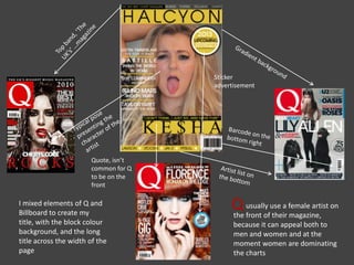
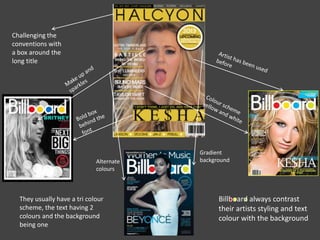
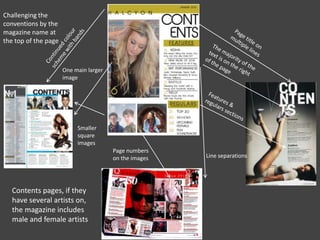
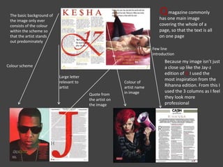
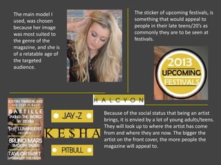
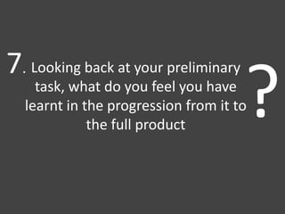
My media product uses, develops, and challenges conventions of real music magazines. It uses a female artist on the cover to appeal to both genders. The layout mixes elements from Q and Billboard magazines. It challenges conventions by having a box around the long title and using a gradient background.
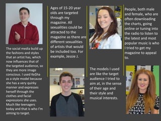
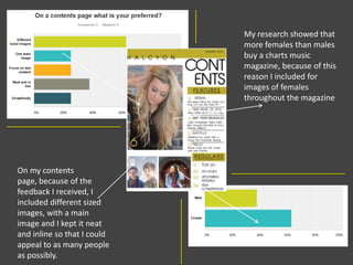
The magazine represents various social groups including teens through fashionable images, people in their 20s through more stylish modeling, and aims to be inclusive of all sexual orientations and genders. It depicts the artists and models as having achieved status and social media influence to appeal to its target audience.
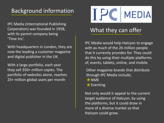
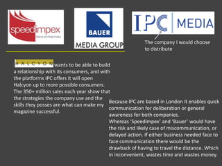
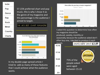
The target audience is 15-20 year olds interested in popular music. The magazine would be best distributed by IPC Media, based