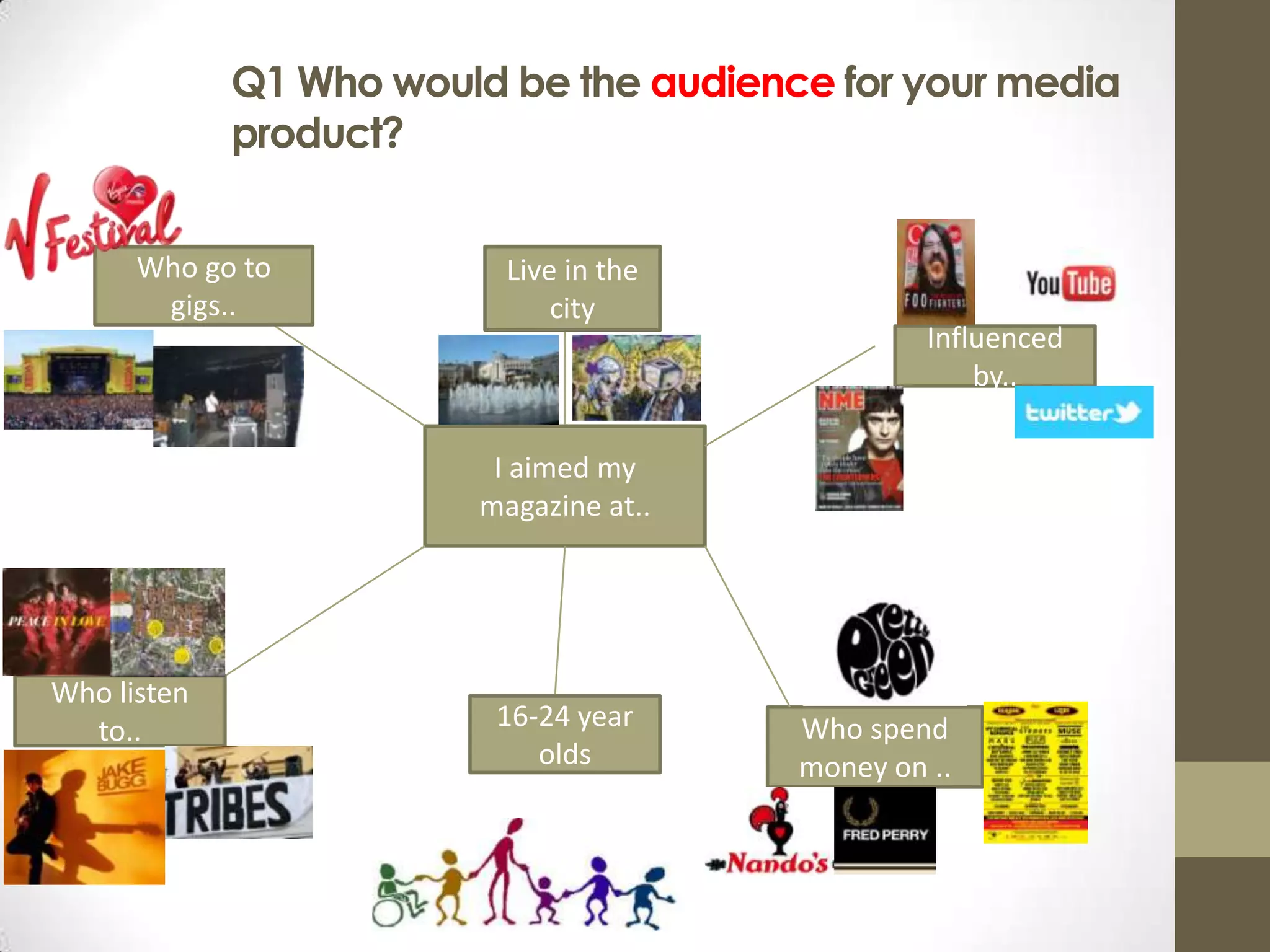
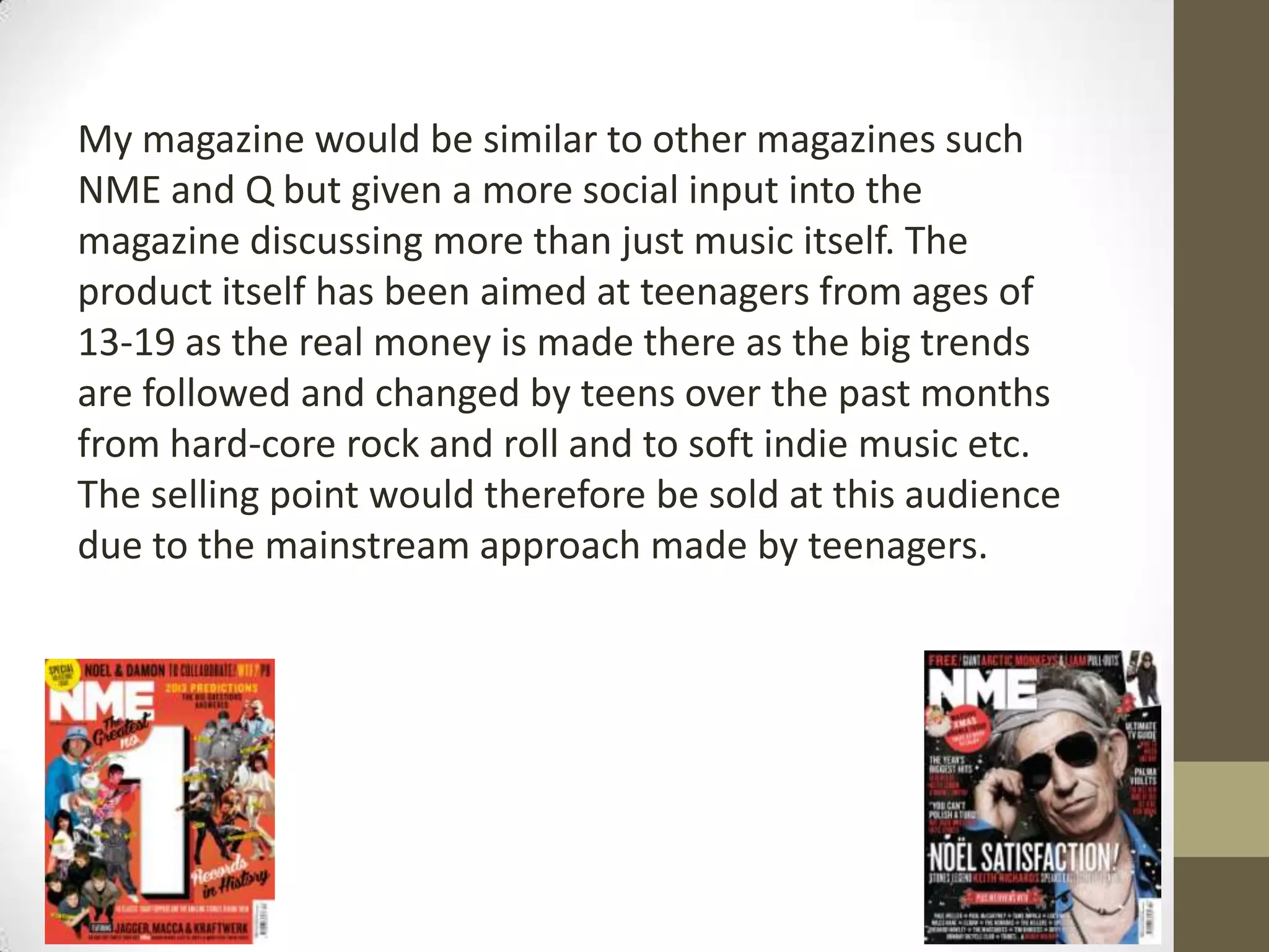
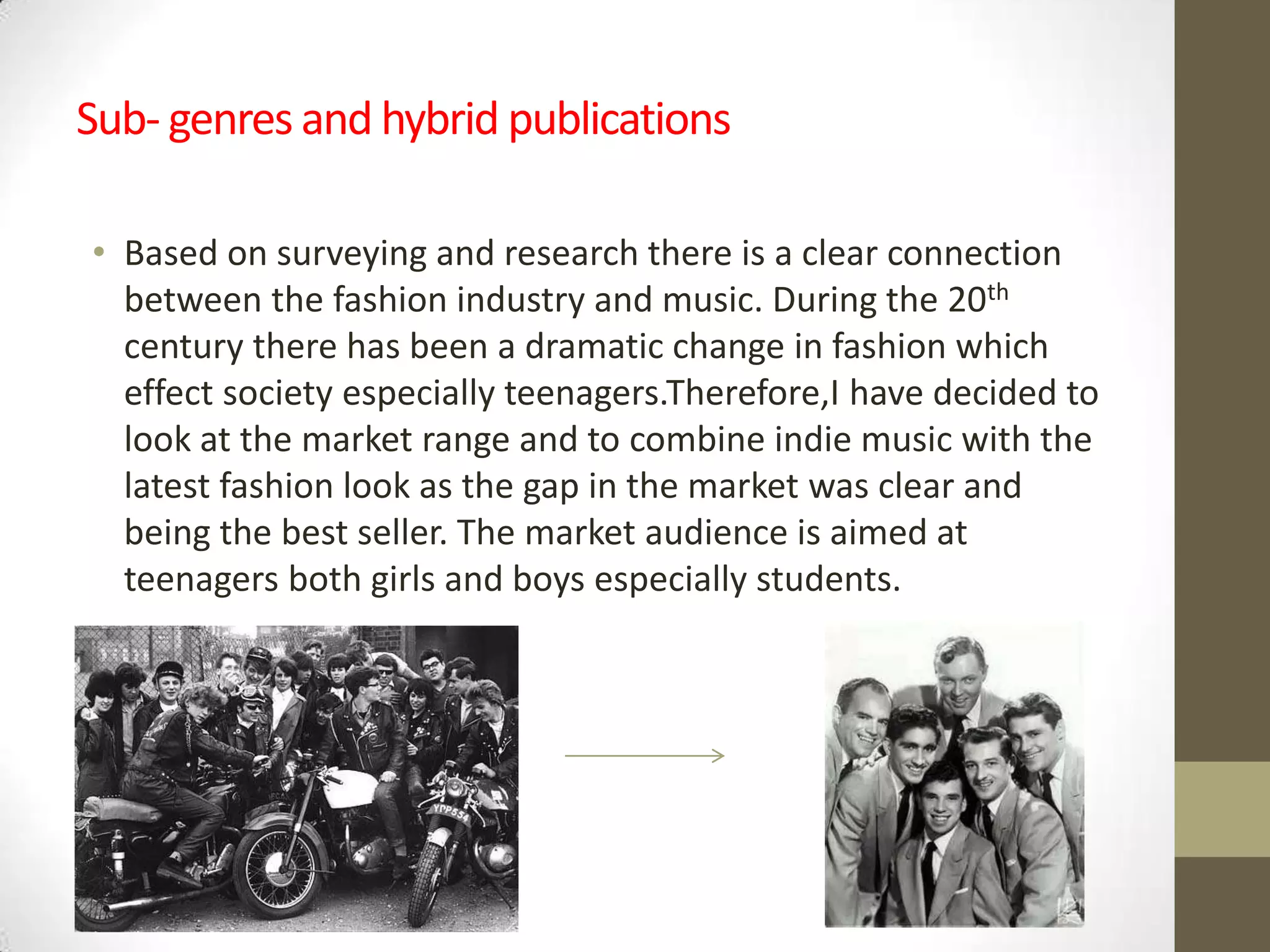
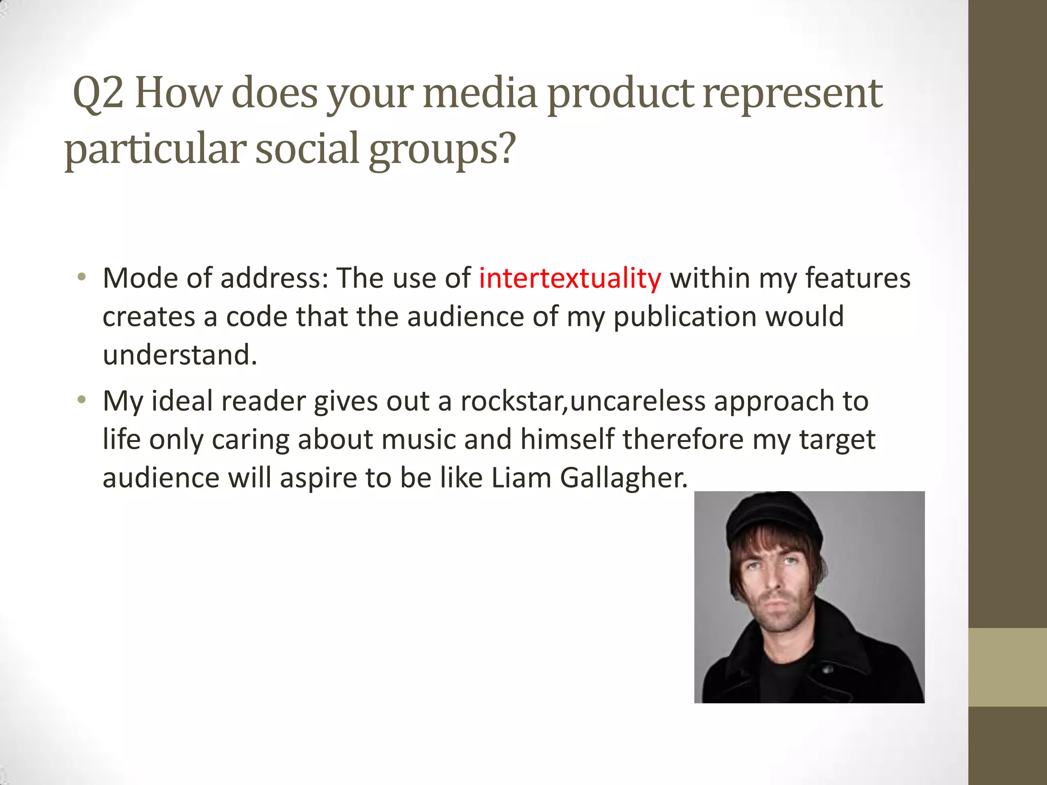
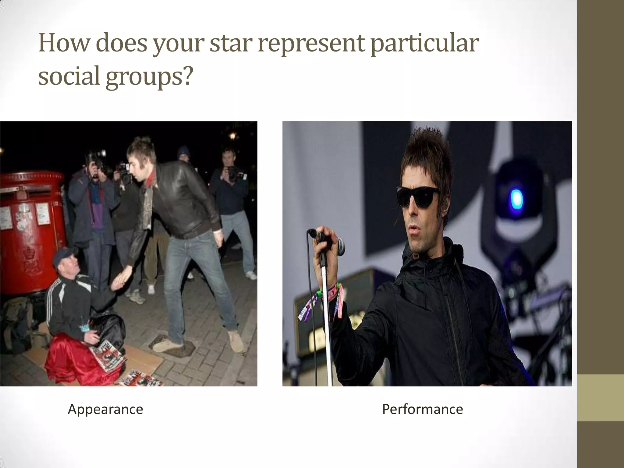
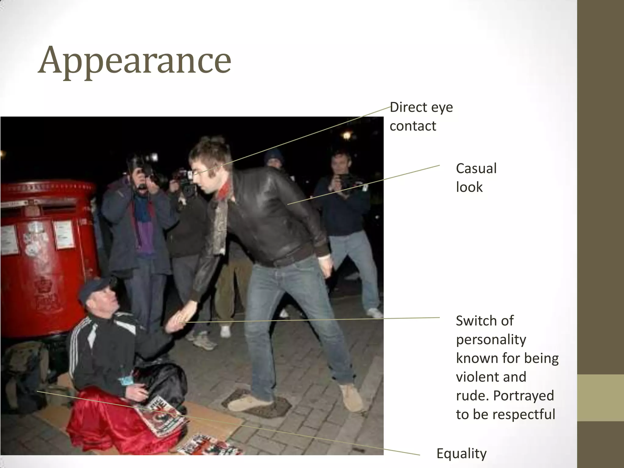
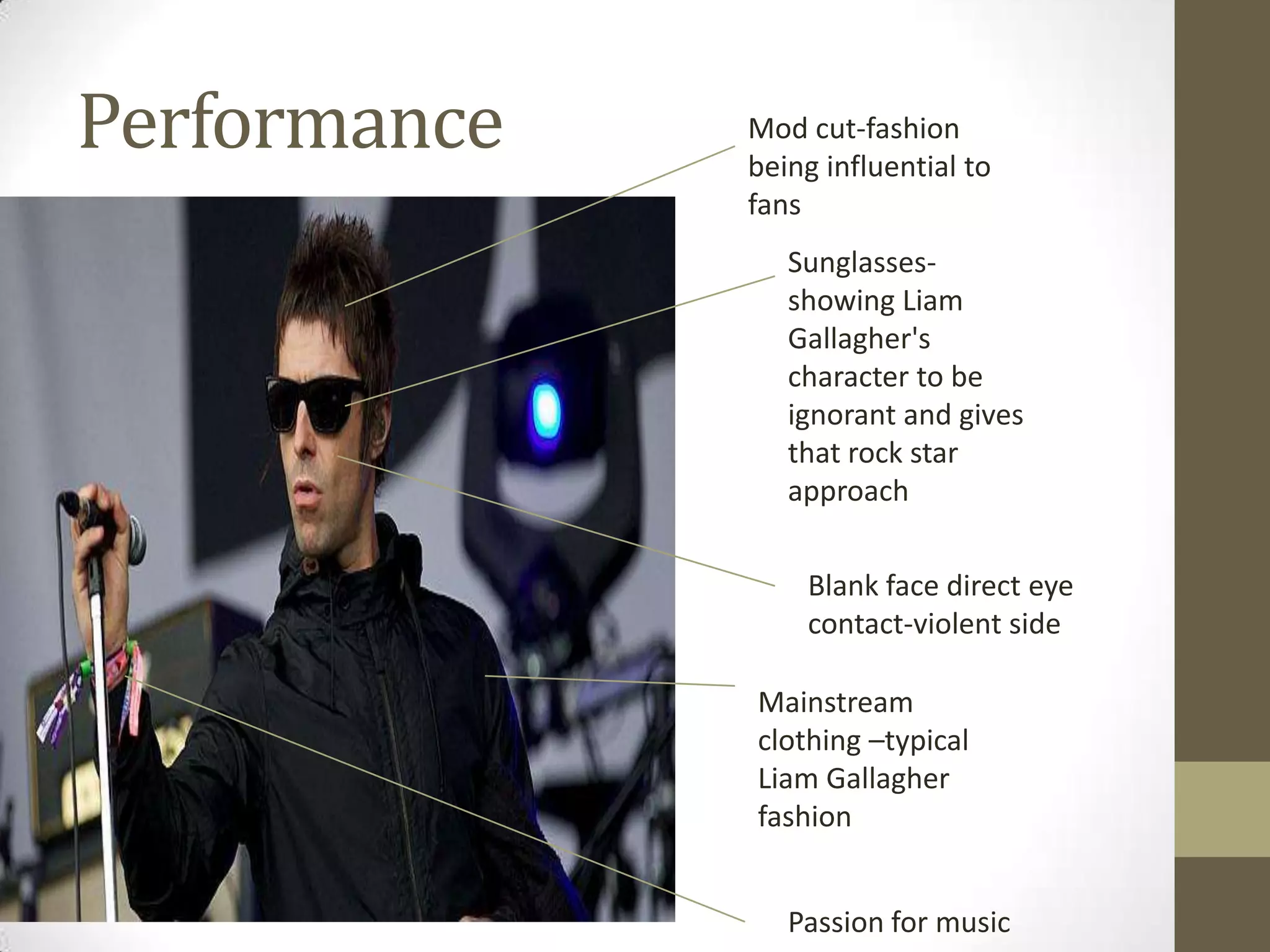
SlideShare a Scribd company logo
Name: George Hunt
Candidate Number:2513
As Media Studies
OCR G321: Foundation Portfolio
Q1 Who would be the audience for your media
product?
Who go to
gigs..

Live in the
city

Influenced
by..

I aimed my
magazine at..

Who listen
to..

16-24 year
olds

Who spend
money on ..
My magazine would be similar to other magazines such
NME and Q but given a more social input into the
magazine discussing more than just music itself. The
product itself has been aimed at teenagers from ages of
13-19 as the real money is made there as the big trends
are followed and changed by teens over the past months
from hard-core rock and roll and to soft indie music etc.
The selling point would therefore be sold at this audience
due to the mainstream approach made by teenagers.
Sub- genres and hybrid publications
• Based on surveying and research there is a clear connection
between the fashion industry and music. During the 20th
century there has been a dramatic change in fashion which
effect society especially teenagers.Therefore,I have decided to
look at the market range and to combine indie music with the
latest fashion look as the gap in the market was clear and
being the best seller. The market audience is aimed at
teenagers both girls and boys especially students.
Current audience
• Current audiences enjoy using NME and Q publications as it
gives you a variety of different in formation to explore giving
you the latest features and fashion ideas. In my product I will
be taking ideas from a variety of different magazines to create
a new different type. I will be using layout forms such as NMES
front cover as it influences the audience to buy being the
biggest seller. Also taking different ideas from each by having
pages on not just music but the fashion side to things which
will persuade the ethic.Overall,a creation of different ideas
from each magazine will be taken to create a bright new music
magazine based around teenagers.
The variation of colours from the
darker colours of black to the
feminine colours of purple can
indicate the variation of audience
both girls and boys this also links to
my magazine as it is a combined
mixtures of both teenagers. By using
a mixture of colours this may
highlight out a way persuading
viewers to buy or read the magazine.
Due to NMES primary audience being
a combination of the both this
suggests that a combination of
colours will be used during the
making of my magazine with a
difference in font.
Primary Audience
The primary audience are teenagers
interested in indie music and into the latest
fashion.Therefore,the hybrid genre
magazine will be a combination of artists
and the clothing they wear which has a big
effect on the audience. This may also
effect adults and older aged people who
are interested in music as this is my
secondary audience the aim is to influence
as many people as possible. The age range
is young but this is partially due to the big
influence these stars have on teenagers
changing their personality and their way of
living on the whole. The young teenage
audience take big interest into cultured
music and enjoy it therefore this will be my
primary audience.
Secondary audience
• My secondary audience would be older
ethics or people who would take
interest in cultured music and fashion.
People may read this may also be
interested in the variety of different
indie artists to the up and coming new
bands. The magazine being made aims
for the audience to aspire to be like the
stars or to get a new eye in fashion to
see the different types of fashion that
happen in music e.g. Paul Weller- being
a mod which will has a big
influence.Overall,my secondary
audience are people who usually
wouldn’t read the magazine thoroughly
but would be interested in a certain
part such as the fashion side to it.
Demographic
• The demographic will be
people who have an
inspiration and real interest
for music. This hopefully
having a big effect on the
fashion industry proceeding
to be like their stars. The
magazine having an influence
on the indie scene should
create a sense that the demo
graph will have interest and
shop in shops such as: Fred
Perry, pretty green, bionic
seven, vintage shops etc.
Products
• My magazine would be similar to
the magazine brand NME as the
type of indie look of music is
displayed.NME is a large brand in
the UK selling thousands each
week.therefore,this will be my
target aim to be as successful and
achievable as this magazine
brand.Overall,my magazine will be
sold and issued in Britain as it is all
to do the British music and
fashion.
Audience idols
• As been researching English artists and stars
that I can recreate in my own product of
indie genre. The huge worldwide stars vary
from old idols to new up and coming artists
such as: Jim Morrison – Jake Bugg. I
researched many other stars like Liam
Gallagher and Miles Kane as they have a real
influence on fashion especially Liam
Gallagher having his own clothing brand
pretty green.However,Miles Kane is known
for his iconic suits and looking up towards
the mod way of life. From this research it
allows the hybrid genres to link and work
together.However,pop artists will not be
included as they're not suitable for the
target audience.
Ideal reader
• The ideal reader will be
somebody who has a real
interest in the fashion side of
music and the real meaning
to music rather than copying
everyone else and following
the crowd. Therefore the
ideal reader will have a real
influence on the whole music
scene constantly keeping up
to date with recent gigs and
news etc.
Q2 How does your media product represent
particular social groups?
• Mode of address: The use of intertextuality within my features
creates a code that the audience of my publication would
understand.
• My ideal reader gives out a rockstar,uncareless approach to
life only caring about music and himself therefore my target
audience will aspire to be like Liam Gallagher.
How does your media product represent
particular social groups?
• The star will have to be the idealised version of the reader.
This will be made clear by the star having a rock star approach
of life being quite threatening and modest to portray the indie
type of look. However the character links up by having a
switch of personality when it comes to music as during the
next couple of slides you will see the change is character of
Liam Gallagher outside of music and inside music.Overall,this
will filter his performance and appearance.
How does your star represent particular
social groups?

Appearance

Performance
Appearance
Direct eye
contact
Casual
look

Switch of
personality
known for being
violent and
rude. Portrayed
to be respectful
Equality
Performance

Mod cut-fashion
being influential to
fans
Sunglassesshowing Liam
Gallagher's
character to be
ignorant and gives
that rock star
approach
Blank face direct eye
contact-violent side
Mainstream
clothing –typical
Liam Gallagher
fashion
Passion for music
Liam Gallagher is here
casually walking down
the street therefore his
normal lifestyle is here
not having an effect
from music

COSTUME: On the
left a casual look
has been
approached
looking smart and
suitable as on the
right sunglasses
have been worn
to show his love
for music and
rock and roll.
Therefore a
switch of
personality/side
of Liam Gallagher
has been changed
due to music.

Liam Gallagher is here
promoting his clothing
brand and his rock star
look influencing many of
his music fans.
Q2. How does your media product
represent particular social groups?
During the making of my magazine I decided to go for a theme allowing each member
to be on one page of the magazine to promote the band and making it look
interesting and different. This would attract the target audience as they're teenagers,
young and interesting being able to create a band at such a young age. The images
also represent the different type of personality what comes across people when it
comes to music.
Q3 What kind of media institution might
distribute your media product and why?
This shows the demo graph
the latest new stories
throughout the

My brand logo is large
and bold being so it is
recognised on the page

My website has its own
subscription link that
shows you the latest
magazines

Issued magazine that’s on
sales at the moment
therefore this is promoting
and describing the new
magazine

Here is the latest music,
gigs and fashion as it is
guiding people to what's
happening in the future.

Image showing the
band and the latest
live music.

This allows people to have their
own opinion and vote on the
music my website provides
Merchandise
Technology
Song bird festival,worldwide
Q4 In what ways does you media product use,
develop or challenge forms and conventions
of real media products?
The product I have produced uses many conventions and ideas from indie/rock magazines. The use of the image and house style are two very
important features I have used having a greater idea from magazines such as kerrang and NME.During the making of making of magazine I have
used a large sharp masthead being very clear and understanding in top left of the page to express the importance and posture of the magazine as
Nme have used indicating professionalism. The font size is also larger than the other pieces of text around the page to highlight out the importance
of the brand and logo. The house style of my magazine include the colours: black, gold and white. This was used due to question aired research
where as it is what the audience thought would look best. Not only this but it creates a sense of feeling of a more classic, formal and retro
magazine. Where as Kerrang change the style and display of the Front cover depending on the type of band on it such as: the foo fighters being
more of a classic rock band. The pug being the only black thing links in with the retro effect of the style expressing the importance's of the
audiences chance of winning a prize giving a sense that the magazine cares about the audiences views and opinions.
In my magazine I used a midshot angle in the main image allowing all the band to be shown in more detail showing facial expressions and emotion,
developing by doing different types of stances where as during the magazine kerrang the facial features and body shape seem to be dull and
straight therefore I have developed this idea into my own. By also editing the photo making it look clearer and eye catching giving it a dark effect it
links with the colours also giving it that retro and important effect where as The Nme front page spread doesn’t have that. The secondary
masthead/images main title has been used and preserved as very sharp and powerful to show its clearness over the image expressing out the name
of the band as they are the main feature on display using a similar idea to the foo fighters image and secondary title on the bottom left. The
secondary images being placed towards the bottom of the page make the page layout look spacious and neat as it advertises for reading and Leeds.
This is an original feature as images are usually spaced around the page slanted rather than being still and organised. I think this effect overall
creates the page having a different effects to the average indie magazine as instead the neatness creates a different type of approach the page
wants to show. The tagline used under the secondary masthead “back for more” gives a sense as if the band are talking to you and advertising their
love for music at the same time. It also makes the audience want carry on reading as they will want to find out why they're back for more therefore
it gives out a message.
Overall I think my magazine has used some similar ideas and features towards Nme and Kerrang but also different and new creative ideas. The other
real media products have give me help in approaching my magazine, giving it that different edge in making it become better being improved each
time when comparing.
In what ways does you media product
use, develop or challenge forms and
conventions of real media products?
During my contents page I went for the similar style Nme and Q both do which is contuning on using the same
house style and fonts which allow the overall magazine to look more interesting and different. Using the same
house style once again shows off the use of the retro approach the magazine wants to show. The same font
has been kept the same during the contents page being visible and clear allowing the text to be clear and
visible so the page can be easily approachable and easy to use. The style I have used is similar to the contents
page on the bottom Q use as I wanted to make it as simplistic as possible having one important key feature
and a simple list of the things available in the magazine with a mixture of secondary images. Although the text
has been placed on the right hand side this allows the images on the left hand side to be key as the audience
have the chance to get new posters as the audience are the most important thing when making the magazine
features.Therefore,this is easier for them. The numbers have been boxed off being larger than the text to show
the different types of pages that the magazine actually produced. The font once again stays the same size to
give that professional edge used.
The main Image has a member of the band from the front cover to advertise and suggest listening to them. It
also indicates to the audience that they're the key feature of the magazine promoting it with new music etc.
The style of the images have been kept the same way of in which Nme use which is neat as each secondary
image is boxed off allowing the page not to be too cramped up look un professional and harder to read.
Therefore, my media product uses the simplistic touches of each contents on the bottom right and left of the
screen allowing the audiences navigation around the page to be easier and more successful throughout.
Another message is also created as the main image of the band member clinching his knuckles links towards
the contents page number 4+5 “the rollers fight back” therefore there is a link in between the contents page
number and main image. The main image also creates a of sense of fear and hunger for success as for the
other two images are just of bands either playing or coming together therefore there is no real message they
display. But with a different variety of images it shows that the page is easy to be navigated around as the
image are placed out neatly.
In what ways does you media product use,
develop or challenge forms and conventions
of real media products?
•

•

•

During my double page I kept everything as basic and simple as possible allowing the information to be
the real feature rather than the colours and images.However,the house style was kept the same to
continue that vintage look having the gold lining around the text to separate the sections of text from
each other. The image is large, bold and plain to give a real effect on the way I wanted it to be presented
which is the retro image of the band as they're are all presented in an entirely different way.
The bolder parts of the writing are the more important parts of the text. The page is split up into two
sections as the picture is one page and the text is on the other this allows the audience to receive a free
poster and to draw them in on the page. No secondary images have been involved to allow the page to
be as clear as possible as I wanted to produce a simple style.
Overall the page is clear and effective to show the expression of one of the band members and the
controversy and experiences that he faced with the band. This double page spread allows the audience
to build a relationship with the band wanting to read on and continue with the magazine.
Question 5
Masthead
Unique
selling point
Main
image

Anchored
text

Features

Cover band
Secondary
images
Genre: The genre of my magazine is indie
rock and roll, introducing the latest fashion,
all the latest gig bands and reviews and
surprising news.
Age: My target audience are 13-19 year
olds as the cover band can link to the
reader being a similar age to that.

Gender: The gender of my band are
a mixture of males and females who
are interested in music and the
fashion display my magazine
promotes.
The song bird logo is very bold and
original giving off a look many other
magazines don’t have. The way it is set
out is completely different to many
magazines I've seen before.

The use of using competition
in the magazine will
persuade the audience to
carry on reading and buy
them next week to have a
chance of winning something

The main cover line stands
out having a sharp and
effective font that completely
draws you into the band and
what they're called

The repetition of using
Leeds twice gives the
audience a chance to
have a look about Leeds
before joining the
competition
Front cover
Extra Artists :The use of using extra artists allow
the audience to have a large mixture of different
bands to what they enjoy and listen to. Therefore a
mixture of different images of bands have been
displayed on the bottom of the front cover.

Colour: The colour usage of gold
stands out with the white giving a
classic effect/look as white and gold
compliment each other making the
magazine look successful and
different. The complimenting colours
maybe persuade target audiences to
buy then magazine do to its
aesthetically pleasing approach. The
colour scheme of the image is also
black and white which will stand out
from the other two colours involved
therefore the two colours allow this
black and white image to be a main
feature involved. The colour scheme
works as the limited edition Beatles
magazine by Q has been a great
success selling thousands of copies.
Therefore my magazine idea was
based on this

The main feature: The main
feature of the band being back for
more stands out due to the
effectiveness of the sharpness of
colours placed on the image ‘the
rollers’ which stands out
Contents
The using the same house style gives
out a different style than other
magazines do as it creates a unique
selling point looking very unique
and professional

Using an image of the member of the
band on the main cover line
expressing the importance of the
band giving the feeling that the band
must be good due to being on a
various amount of different pages
allowing the audience to give them a
listen and get an idea of the type of
music this magazine provides.

Including the band ‘the rollers’
again gives you another reminder
of the importance of them on this
magazine being a big hit and that
they should be listened to.
The white text also links in with
the house style effect looking
very attractive being also very
visible
Double page spread
Q6 Photoshopping image

Here is the final image that
has been edited with the black
and white effect

Here is the original image without any
editing taking place

Here is the different choices you have on editing
your image as I chose black and white
Photoshop-font
I selected my font style and size changing
the colour of my text into gold to
compliment my house style
Firstly I selected the text
tool on the side of the
screen selecting the
horizontal type tool to
create the logo of my
magazine

I typed in my logo brand
name in originally without
any font or effect

My final product was created
having my white text over the
other complimenting colour
Photoshop-border
I then used the eye drop tool to take the
selected gold background and used paint
to fill in the rectangle in

When designing my
border I selected the
rectangle tool and
carefully drawn out a
large rectangle.

I then resized the
shape allowing it to
look attractive and
to fit my page
Photoshop-Pug

I selected the tool ‘ellipse
tool’ allowing the circular
shape to be drawn

I then draw out the
circular shape the size I
wanted it to be. I then
clicked on the paint
accessory button
allowing black paint to
be added

I then added the text I wanted to
put into the shape to make the
pug.I then dragged the text box
into the shape.
Q7

More Related Content

What's hot

Audience research[1]
Audience research[1]Audience research[1]
Audience research[1]
111093er
 
Media studies as
Media studies asMedia studies as
Media studies as
abbietaylor
 
Key concepts
Key conceptsKey concepts
Key concepts
nic0lelol
 
Pop music magazines
Pop music magazines Pop music magazines
Pop music magazines
gozdetezcan
 
Question 1
Question 1Question 1
Question 1
tomngai_17
 
Magazine evaluation
Magazine evaluationMagazine evaluation
Magazine evaluation
iloveralf
 
Music magazine evaluation
Music magazine evaluationMusic magazine evaluation
Music magazine evaluation
abipeake
 
Double page spread [autosaved]
Double page spread  [autosaved]Double page spread  [autosaved]
Double page spread [autosaved]
Emma Leslie
 
Media billboardmagazine
Media billboardmagazineMedia billboardmagazine
Media billboardmagazine
gozdetezcan
 
Proposal
ProposalProposal
Proposal
arnellgrace
 
Media Evaluation
Media EvaluationMedia Evaluation
Media Evaluation
annakings
 
Unit 13 LO1
Unit 13 LO1Unit 13 LO1
Unit 13 LO1
zsimps19
 
AS Media Evaulation
AS Media EvaulationAS Media Evaulation
AS Media Evaulation
siobhangilmoreasmedia
 
Magazine planning lorida
Magazine planning loridaMagazine planning lorida
Magazine planning lorida
Trobson2
 
Media Evaluation
Media EvaluationMedia Evaluation
Media Evaluation
vickyrowlands
 

What's hot (15)

Audience research[1]
Audience research[1]Audience research[1]
Audience research[1]
 
Media studies as
Media studies asMedia studies as
Media studies as
 
Key concepts
Key conceptsKey concepts
Key concepts
 
Pop music magazines
Pop music magazines Pop music magazines
Pop music magazines
 
Question 1
Question 1Question 1
Question 1
 
Magazine evaluation
Magazine evaluationMagazine evaluation
Magazine evaluation
 
Music magazine evaluation
Music magazine evaluationMusic magazine evaluation
Music magazine evaluation
 
Double page spread [autosaved]
Double page spread  [autosaved]Double page spread  [autosaved]
Double page spread [autosaved]
 
Media billboardmagazine
Media billboardmagazineMedia billboardmagazine
Media billboardmagazine
 
Proposal
ProposalProposal
Proposal
 
Media Evaluation
Media EvaluationMedia Evaluation
Media Evaluation
 
Unit 13 LO1
Unit 13 LO1Unit 13 LO1
Unit 13 LO1
 
AS Media Evaulation
AS Media EvaulationAS Media Evaulation
AS Media Evaulation
 
Magazine planning lorida
Magazine planning loridaMagazine planning lorida
Magazine planning lorida
 
Media Evaluation
Media EvaluationMedia Evaluation
Media Evaluation
 

Viewers also liked

Etykiety techniczne wypukle 3d
Etykiety techniczne wypukle 3dEtykiety techniczne wypukle 3d
Etykiety techniczne wypukle 3d
POLINAL : Producent oznakowań
 
Läänemeri sander
Läänemeri sanderLäänemeri sander
Läänemeri sanderSander Lepla
 
Naklejki wypukle 3d z otworem polinal
Naklejki wypukle 3d z otworem polinalNaklejki wypukle 3d z otworem polinal
Naklejki wypukle 3d z otworem polinal
POLINAL : Producent oznakowań
 
Decathlon +Plus
Decathlon +PlusDecathlon +Plus
Decathlon +Plus
Jessica Forlani
 
Chris norminton your business pitch
Chris norminton your business pitchChris norminton your business pitch
Chris norminton your business pitch
Chris Norminton
 
Who would be the audience for your media
Who would be the audience for your mediaWho would be the audience for your media
Who would be the audience for your media
HollieSmith24
 
OK> GUESS WHERE TO VISIT CAMODIA?
OK> GUESS WHERE TO VISIT CAMODIA? OK> GUESS WHERE TO VISIT CAMODIA?
OK> GUESS WHERE TO VISIT CAMODIA?
limhaychhum
 
Juku naljad
Juku naljadJuku naljad
Juku naljad
Sander Lepla
 
Progetto di Ergonomia Cognitiva: Decathlon +Plus
Progetto di Ergonomia Cognitiva: Decathlon +PlusProgetto di Ergonomia Cognitiva: Decathlon +Plus
Progetto di Ergonomia Cognitiva: Decathlon +Plus
Jessica Forlani
 
types and instruments in music
types and instruments in musictypes and instruments in music
types and instruments in music
alabastrokim
 
College Graduation Rates: Learning From High-Performing and Fast-Gaining Inst...
College Graduation Rates: Learning From High-Performing and Fast-Gaining Inst...College Graduation Rates: Learning From High-Performing and Fast-Gaining Inst...
College Graduation Rates: Learning From High-Performing and Fast-Gaining Inst...
Education Trust
 
Hotel Front Office Department
Hotel Front Office DepartmentHotel Front Office Department
Hotel Front Office Department
Saurabh Bharti
 
Hotel Reservation
Hotel Reservation Hotel Reservation
Hotel Reservation
Saurabh Bharti
 
Tourism Foundation Basics
Tourism Foundation BasicsTourism Foundation Basics
Tourism Foundation Basics
Saurabh Bharti
 
Technology in tourism
Technology in tourismTechnology in tourism
Technology in tourism
Saurabh Bharti
 

Viewers also liked (15)

Etykiety techniczne wypukle 3d
Etykiety techniczne wypukle 3dEtykiety techniczne wypukle 3d
Etykiety techniczne wypukle 3d
 
Läänemeri sander
Läänemeri sanderLäänemeri sander
Läänemeri sander
 
Naklejki wypukle 3d z otworem polinal
Naklejki wypukle 3d z otworem polinalNaklejki wypukle 3d z otworem polinal
Naklejki wypukle 3d z otworem polinal
 
Decathlon +Plus
Decathlon +PlusDecathlon +Plus
Decathlon +Plus
 
Chris norminton your business pitch
Chris norminton your business pitchChris norminton your business pitch
Chris norminton your business pitch
 
Who would be the audience for your media
Who would be the audience for your mediaWho would be the audience for your media
Who would be the audience for your media
 
OK> GUESS WHERE TO VISIT CAMODIA?
OK> GUESS WHERE TO VISIT CAMODIA? OK> GUESS WHERE TO VISIT CAMODIA?
OK> GUESS WHERE TO VISIT CAMODIA?
 
Juku naljad
Juku naljadJuku naljad
Juku naljad
 
Progetto di Ergonomia Cognitiva: Decathlon +Plus
Progetto di Ergonomia Cognitiva: Decathlon +PlusProgetto di Ergonomia Cognitiva: Decathlon +Plus
Progetto di Ergonomia Cognitiva: Decathlon +Plus
 
types and instruments in music
types and instruments in musictypes and instruments in music
types and instruments in music
 
College Graduation Rates: Learning From High-Performing and Fast-Gaining Inst...
College Graduation Rates: Learning From High-Performing and Fast-Gaining Inst...College Graduation Rates: Learning From High-Performing and Fast-Gaining Inst...
College Graduation Rates: Learning From High-Performing and Fast-Gaining Inst...
 
Hotel Front Office Department
Hotel Front Office DepartmentHotel Front Office Department
Hotel Front Office Department
 
Hotel Reservation
Hotel Reservation Hotel Reservation
Hotel Reservation
 
Tourism Foundation Basics
Tourism Foundation BasicsTourism Foundation Basics
Tourism Foundation Basics
 
Technology in tourism
Technology in tourismTechnology in tourism
Technology in tourism
 

Similar to Media complete when get home

Magazine evaluation 2
Magazine evaluation 2Magazine evaluation 2
Magazine evaluation 2
Tom Jenkins
 
Magazine evaluation -
Magazine evaluation -Magazine evaluation -
Magazine evaluation -
Tom Jenkins
 
Magazine evaluation 2
Magazine evaluation 2Magazine evaluation 2
Magazine evaluation 2
Tom Jenkins
 
Magazine evaluation 2 FINISHED
Magazine evaluation 2 FINISHEDMagazine evaluation 2 FINISHED
Magazine evaluation 2 FINISHED
Tom Jenkins
 
Magazine evaluation
Magazine evaluationMagazine evaluation
Magazine evaluation
iloveralf
 
Audience research[1]
Audience research[1]Audience research[1]
Audience research[1]
111093er
 
Music magazine evaluation
Music magazine evaluationMusic magazine evaluation
Music magazine evaluation
Tom Jenkins
 
Evaluation questions
Evaluation questionsEvaluation questions
Evaluation questions
AlexanderMetcalfe97
 
As media evaluation liamdenton
As media evaluation liamdentonAs media evaluation liamdenton
As media evaluation liamdenton
liamdenton
 
Evaluation questions Jack Thompson
Evaluation questions Jack ThompsonEvaluation questions Jack Thompson
Evaluation questions Jack Thompson
jackthompson10
 
Media evaluation coursework
Media evaluation courseworkMedia evaluation coursework
Media evaluation coursework
PhilWhitehead
 
Media evaluation coursework
Media evaluation courseworkMedia evaluation coursework
Media evaluation coursework
PhilWhitehead97
 
Magazine Evaluation
Magazine EvaluationMagazine Evaluation
Magazine Evaluation
annakings
 
Magazine Evaluation
Magazine EvaluationMagazine Evaluation
Magazine Evaluation
annakings
 
Media evaluation 2
Media evaluation 2Media evaluation 2
Media evaluation 2
LauraShannon1997
 
Evaluation questions
Evaluation questionsEvaluation questions
Evaluation questions
AlexanderMetcalfe97
 
Formal evaluation
Formal evaluationFormal evaluation
Formal evaluation
Jenny McNulty
 
Formal evaluation
Formal evaluationFormal evaluation
Formal evaluation
Jenny McNulty
 
Evaluation
EvaluationEvaluation
Evaluation
nadia_eman
 
Media Evaluation Q 1&2
Media Evaluation Q 1&2Media Evaluation Q 1&2
Media Evaluation Q 1&2
Ella Brown
 

Similar to Media complete when get home (20)

Magazine evaluation 2
Magazine evaluation 2Magazine evaluation 2
Magazine evaluation 2
 
Magazine evaluation -
Magazine evaluation -Magazine evaluation -
Magazine evaluation -
 
Magazine evaluation 2
Magazine evaluation 2Magazine evaluation 2
Magazine evaluation 2
 
Magazine evaluation 2 FINISHED
Magazine evaluation 2 FINISHEDMagazine evaluation 2 FINISHED
Magazine evaluation 2 FINISHED
 
Magazine evaluation
Magazine evaluationMagazine evaluation
Magazine evaluation
 
Audience research[1]
Audience research[1]Audience research[1]
Audience research[1]
 
Music magazine evaluation
Music magazine evaluationMusic magazine evaluation
Music magazine evaluation
 
Evaluation questions
Evaluation questionsEvaluation questions
Evaluation questions
 
As media evaluation liamdenton
As media evaluation liamdentonAs media evaluation liamdenton
As media evaluation liamdenton
 
Evaluation questions Jack Thompson
Evaluation questions Jack ThompsonEvaluation questions Jack Thompson
Evaluation questions Jack Thompson
 
Media evaluation coursework
Media evaluation courseworkMedia evaluation coursework
Media evaluation coursework
 
Media evaluation coursework
Media evaluation courseworkMedia evaluation coursework
Media evaluation coursework
 
Magazine Evaluation
Magazine EvaluationMagazine Evaluation
Magazine Evaluation
 
Magazine Evaluation
Magazine EvaluationMagazine Evaluation
Magazine Evaluation
 
Media evaluation 2
Media evaluation 2Media evaluation 2
Media evaluation 2
 
Evaluation questions
Evaluation questionsEvaluation questions
Evaluation questions
 
Formal evaluation
Formal evaluationFormal evaluation
Formal evaluation
 
Formal evaluation
Formal evaluationFormal evaluation
Formal evaluation
 
Evaluation
EvaluationEvaluation
Evaluation
 
Media Evaluation Q 1&2
Media Evaluation Q 1&2Media Evaluation Q 1&2
Media Evaluation Q 1&2
 

Recently uploaded

BÀI TẬP BỔ TRỢ TIẾNG ANH LỚP 9 CẢ NĂM - GLOBAL SUCCESS - NĂM HỌC 2024-2025 - ...
BÀI TẬP BỔ TRỢ TIẾNG ANH LỚP 9 CẢ NĂM - GLOBAL SUCCESS - NĂM HỌC 2024-2025 - ...BÀI TẬP BỔ TRỢ TIẾNG ANH LỚP 9 CẢ NĂM - GLOBAL SUCCESS - NĂM HỌC 2024-2025 - ...
BÀI TẬP BỔ TRỢ TIẾNG ANH LỚP 9 CẢ NĂM - GLOBAL SUCCESS - NĂM HỌC 2024-2025 - ...
Nguyen Thanh Tu Collection
 
C1 Rubenstein AP HuG xxxxxxxxxxxxxx.pptx
C1 Rubenstein AP HuG xxxxxxxxxxxxxx.pptxC1 Rubenstein AP HuG xxxxxxxxxxxxxx.pptx
C1 Rubenstein AP HuG xxxxxxxxxxxxxx.pptx
mulvey2
 
Your Skill Boost Masterclass: Strategies for Effective Upskilling
Your Skill Boost Masterclass: Strategies for Effective UpskillingYour Skill Boost Masterclass: Strategies for Effective Upskilling
Your Skill Boost Masterclass: Strategies for Effective Upskilling
Excellence Foundation for South Sudan
 
Pengantar Penggunaan Flutter - Dart programming language1.pptx
Pengantar Penggunaan Flutter - Dart programming language1.pptxPengantar Penggunaan Flutter - Dart programming language1.pptx
Pengantar Penggunaan Flutter - Dart programming language1.pptx
Fajar Baskoro
 
How to Create a More Engaging and Human Online Learning Experience
How to Create a More Engaging and Human Online Learning Experience How to Create a More Engaging and Human Online Learning Experience
How to Create a More Engaging and Human Online Learning Experience
Wahiba Chair Training & Consulting
 
Reimagining Your Library Space: How to Increase the Vibes in Your Library No ...
Reimagining Your Library Space: How to Increase the Vibes in Your Library No ...Reimagining Your Library Space: How to Increase the Vibes in Your Library No ...
Reimagining Your Library Space: How to Increase the Vibes in Your Library No ...
Diana Rendina
 
Chapter 4 - Islamic Financial Institutions in Malaysia.pptx
Chapter 4 - Islamic Financial Institutions in Malaysia.pptxChapter 4 - Islamic Financial Institutions in Malaysia.pptx
Chapter 4 - Islamic Financial Institutions in Malaysia.pptx
Mohd Adib Abd Muin, Senior Lecturer at Universiti Utara Malaysia
 
RHEOLOGY Physical pharmaceutics-II notes for B.pharm 4th sem students
RHEOLOGY Physical pharmaceutics-II notes for B.pharm 4th sem studentsRHEOLOGY Physical pharmaceutics-II notes for B.pharm 4th sem students
RHEOLOGY Physical pharmaceutics-II notes for B.pharm 4th sem students
Himanshu Rai
 
Leveraging Generative AI to Drive Nonprofit Innovation
Leveraging Generative AI to Drive Nonprofit InnovationLeveraging Generative AI to Drive Nonprofit Innovation
Leveraging Generative AI to Drive Nonprofit Innovation
TechSoup
 
Film vocab for eal 3 students: Australia the movie
Film vocab for eal 3 students: Australia the movieFilm vocab for eal 3 students: Australia the movie
Film vocab for eal 3 students: Australia the movie
Nicholas Montgomery
 
Présentationvvvvvvvvvvvvvvvvvvvvvvvvvvvv2.pptx
Présentationvvvvvvvvvvvvvvvvvvvvvvvvvvvv2.pptxPrésentationvvvvvvvvvvvvvvvvvvvvvvvvvvvv2.pptx
Présentationvvvvvvvvvvvvvvvvvvvvvvvvvvvv2.pptx
siemaillard
 
ISO/IEC 27001, ISO/IEC 42001, and GDPR: Best Practices for Implementation and...
ISO/IEC 27001, ISO/IEC 42001, and GDPR: Best Practices for Implementation and...ISO/IEC 27001, ISO/IEC 42001, and GDPR: Best Practices for Implementation and...
ISO/IEC 27001, ISO/IEC 42001, and GDPR: Best Practices for Implementation and...
PECB
 
UGC NET Exam Paper 1- Unit 1:Teaching Aptitude
UGC NET Exam Paper 1- Unit 1:Teaching AptitudeUGC NET Exam Paper 1- Unit 1:Teaching Aptitude
UGC NET Exam Paper 1- Unit 1:Teaching Aptitude
S. Raj Kumar
 
Main Java[All of the Base Concepts}.docx
Main Java[All of the Base Concepts}.docxMain Java[All of the Base Concepts}.docx
Main Java[All of the Base Concepts}.docx
adhitya5119
 
A Independência da América Espanhola LAPBOOK.pdf
A Independência da América Espanhola LAPBOOK.pdfA Independência da América Espanhola LAPBOOK.pdf
A Independência da América Espanhola LAPBOOK.pdf
Jean Carlos Nunes Paixão
 
NEWSPAPERS - QUESTION 1 - REVISION POWERPOINT.pptx
NEWSPAPERS - QUESTION 1 - REVISION POWERPOINT.pptxNEWSPAPERS - QUESTION 1 - REVISION POWERPOINT.pptx
NEWSPAPERS - QUESTION 1 - REVISION POWERPOINT.pptx
iammrhaywood
 
South African Journal of Science: Writing with integrity workshop (2024)
South African Journal of Science: Writing with integrity workshop (2024)South African Journal of Science: Writing with integrity workshop (2024)
South African Journal of Science: Writing with integrity workshop (2024)
Academy of Science of South Africa
 
The basics of sentences session 6pptx.pptx
The basics of sentences session 6pptx.pptxThe basics of sentences session 6pptx.pptx
The basics of sentences session 6pptx.pptx
heathfieldcps1
 
ANATOMY AND BIOMECHANICS OF HIP JOINT.pdf
ANATOMY AND BIOMECHANICS OF HIP JOINT.pdfANATOMY AND BIOMECHANICS OF HIP JOINT.pdf
ANATOMY AND BIOMECHANICS OF HIP JOINT.pdf
Priyankaranawat4
 
Digital Artefact 1 - Tiny Home Environmental Design
Digital Artefact 1 - Tiny Home Environmental DesignDigital Artefact 1 - Tiny Home Environmental Design
Digital Artefact 1 - Tiny Home Environmental Design
amberjdewit93
 

Recently uploaded (20)

BÀI TẬP BỔ TRỢ TIẾNG ANH LỚP 9 CẢ NĂM - GLOBAL SUCCESS - NĂM HỌC 2024-2025 - ...
BÀI TẬP BỔ TRỢ TIẾNG ANH LỚP 9 CẢ NĂM - GLOBAL SUCCESS - NĂM HỌC 2024-2025 - ...BÀI TẬP BỔ TRỢ TIẾNG ANH LỚP 9 CẢ NĂM - GLOBAL SUCCESS - NĂM HỌC 2024-2025 - ...
BÀI TẬP BỔ TRỢ TIẾNG ANH LỚP 9 CẢ NĂM - GLOBAL SUCCESS - NĂM HỌC 2024-2025 - ...
 
C1 Rubenstein AP HuG xxxxxxxxxxxxxx.pptx
C1 Rubenstein AP HuG xxxxxxxxxxxxxx.pptxC1 Rubenstein AP HuG xxxxxxxxxxxxxx.pptx
C1 Rubenstein AP HuG xxxxxxxxxxxxxx.pptx
 
Your Skill Boost Masterclass: Strategies for Effective Upskilling
Your Skill Boost Masterclass: Strategies for Effective UpskillingYour Skill Boost Masterclass: Strategies for Effective Upskilling
Your Skill Boost Masterclass: Strategies for Effective Upskilling
 
Pengantar Penggunaan Flutter - Dart programming language1.pptx
Pengantar Penggunaan Flutter - Dart programming language1.pptxPengantar Penggunaan Flutter - Dart programming language1.pptx
Pengantar Penggunaan Flutter - Dart programming language1.pptx
 
How to Create a More Engaging and Human Online Learning Experience
How to Create a More Engaging and Human Online Learning Experience How to Create a More Engaging and Human Online Learning Experience
How to Create a More Engaging and Human Online Learning Experience
 
Reimagining Your Library Space: How to Increase the Vibes in Your Library No ...
Reimagining Your Library Space: How to Increase the Vibes in Your Library No ...Reimagining Your Library Space: How to Increase the Vibes in Your Library No ...
Reimagining Your Library Space: How to Increase the Vibes in Your Library No ...
 
Chapter 4 - Islamic Financial Institutions in Malaysia.pptx
Chapter 4 - Islamic Financial Institutions in Malaysia.pptxChapter 4 - Islamic Financial Institutions in Malaysia.pptx
Chapter 4 - Islamic Financial Institutions in Malaysia.pptx
 
RHEOLOGY Physical pharmaceutics-II notes for B.pharm 4th sem students
RHEOLOGY Physical pharmaceutics-II notes for B.pharm 4th sem studentsRHEOLOGY Physical pharmaceutics-II notes for B.pharm 4th sem students
RHEOLOGY Physical pharmaceutics-II notes for B.pharm 4th sem students
 
Leveraging Generative AI to Drive Nonprofit Innovation
Leveraging Generative AI to Drive Nonprofit InnovationLeveraging Generative AI to Drive Nonprofit Innovation
Leveraging Generative AI to Drive Nonprofit Innovation
 
Film vocab for eal 3 students: Australia the movie
Film vocab for eal 3 students: Australia the movieFilm vocab for eal 3 students: Australia the movie
Film vocab for eal 3 students: Australia the movie
 
Présentationvvvvvvvvvvvvvvvvvvvvvvvvvvvv2.pptx
Présentationvvvvvvvvvvvvvvvvvvvvvvvvvvvv2.pptxPrésentationvvvvvvvvvvvvvvvvvvvvvvvvvvvv2.pptx
Présentationvvvvvvvvvvvvvvvvvvvvvvvvvvvv2.pptx
 
ISO/IEC 27001, ISO/IEC 42001, and GDPR: Best Practices for Implementation and...
ISO/IEC 27001, ISO/IEC 42001, and GDPR: Best Practices for Implementation and...ISO/IEC 27001, ISO/IEC 42001, and GDPR: Best Practices for Implementation and...
ISO/IEC 27001, ISO/IEC 42001, and GDPR: Best Practices for Implementation and...
 
UGC NET Exam Paper 1- Unit 1:Teaching Aptitude
UGC NET Exam Paper 1- Unit 1:Teaching AptitudeUGC NET Exam Paper 1- Unit 1:Teaching Aptitude
UGC NET Exam Paper 1- Unit 1:Teaching Aptitude
 
Main Java[All of the Base Concepts}.docx
Main Java[All of the Base Concepts}.docxMain Java[All of the Base Concepts}.docx
Main Java[All of the Base Concepts}.docx
 
A Independência da América Espanhola LAPBOOK.pdf
A Independência da América Espanhola LAPBOOK.pdfA Independência da América Espanhola LAPBOOK.pdf
A Independência da América Espanhola LAPBOOK.pdf
 
NEWSPAPERS - QUESTION 1 - REVISION POWERPOINT.pptx
NEWSPAPERS - QUESTION 1 - REVISION POWERPOINT.pptxNEWSPAPERS - QUESTION 1 - REVISION POWERPOINT.pptx
NEWSPAPERS - QUESTION 1 - REVISION POWERPOINT.pptx
 
South African Journal of Science: Writing with integrity workshop (2024)
South African Journal of Science: Writing with integrity workshop (2024)South African Journal of Science: Writing with integrity workshop (2024)
South African Journal of Science: Writing with integrity workshop (2024)
 
The basics of sentences session 6pptx.pptx
The basics of sentences session 6pptx.pptxThe basics of sentences session 6pptx.pptx
The basics of sentences session 6pptx.pptx
 
ANATOMY AND BIOMECHANICS OF HIP JOINT.pdf
ANATOMY AND BIOMECHANICS OF HIP JOINT.pdfANATOMY AND BIOMECHANICS OF HIP JOINT.pdf
ANATOMY AND BIOMECHANICS OF HIP JOINT.pdf
 
Digital Artefact 1 - Tiny Home Environmental Design
Digital Artefact 1 - Tiny Home Environmental DesignDigital Artefact 1 - Tiny Home Environmental Design
Digital Artefact 1 - Tiny Home Environmental Design
 

Media complete when get home

  • 1. Name: George Hunt Candidate Number:2513 As Media Studies OCR G321: Foundation Portfolio
  • 2. Q1 Who would be the audience for your media product? Who go to gigs.. Live in the city Influenced by.. I aimed my magazine at.. Who listen to.. 16-24 year olds Who spend money on ..
  • 3. My magazine would be similar to other magazines such NME and Q but given a more social input into the magazine discussing more than just music itself. The product itself has been aimed at teenagers from ages of 13-19 as the real money is made there as the big trends are followed and changed by teens over the past months from hard-core rock and roll and to soft indie music etc. The selling point would therefore be sold at this audience due to the mainstream approach made by teenagers.
  • 4. Sub- genres and hybrid publications • Based on surveying and research there is a clear connection between the fashion industry and music. During the 20th century there has been a dramatic change in fashion which effect society especially teenagers.Therefore,I have decided to look at the market range and to combine indie music with the latest fashion look as the gap in the market was clear and being the best seller. The market audience is aimed at teenagers both girls and boys especially students.
  • 5. Current audience • Current audiences enjoy using NME and Q publications as it gives you a variety of different in formation to explore giving you the latest features and fashion ideas. In my product I will be taking ideas from a variety of different magazines to create a new different type. I will be using layout forms such as NMES front cover as it influences the audience to buy being the biggest seller. Also taking different ideas from each by having pages on not just music but the fashion side to things which will persuade the ethic.Overall,a creation of different ideas from each magazine will be taken to create a bright new music magazine based around teenagers.
  • 6. The variation of colours from the darker colours of black to the feminine colours of purple can indicate the variation of audience both girls and boys this also links to my magazine as it is a combined mixtures of both teenagers. By using a mixture of colours this may highlight out a way persuading viewers to buy or read the magazine. Due to NMES primary audience being a combination of the both this suggests that a combination of colours will be used during the making of my magazine with a difference in font.
  • 7. Primary Audience The primary audience are teenagers interested in indie music and into the latest fashion.Therefore,the hybrid genre magazine will be a combination of artists and the clothing they wear which has a big effect on the audience. This may also effect adults and older aged people who are interested in music as this is my secondary audience the aim is to influence as many people as possible. The age range is young but this is partially due to the big influence these stars have on teenagers changing their personality and their way of living on the whole. The young teenage audience take big interest into cultured music and enjoy it therefore this will be my primary audience.
  • 8. Secondary audience • My secondary audience would be older ethics or people who would take interest in cultured music and fashion. People may read this may also be interested in the variety of different indie artists to the up and coming new bands. The magazine being made aims for the audience to aspire to be like the stars or to get a new eye in fashion to see the different types of fashion that happen in music e.g. Paul Weller- being a mod which will has a big influence.Overall,my secondary audience are people who usually wouldn’t read the magazine thoroughly but would be interested in a certain part such as the fashion side to it.
  • 9. Demographic • The demographic will be people who have an inspiration and real interest for music. This hopefully having a big effect on the fashion industry proceeding to be like their stars. The magazine having an influence on the indie scene should create a sense that the demo graph will have interest and shop in shops such as: Fred Perry, pretty green, bionic seven, vintage shops etc.
  • 10. Products • My magazine would be similar to the magazine brand NME as the type of indie look of music is displayed.NME is a large brand in the UK selling thousands each week.therefore,this will be my target aim to be as successful and achievable as this magazine brand.Overall,my magazine will be sold and issued in Britain as it is all to do the British music and fashion.
  • 11. Audience idols • As been researching English artists and stars that I can recreate in my own product of indie genre. The huge worldwide stars vary from old idols to new up and coming artists such as: Jim Morrison – Jake Bugg. I researched many other stars like Liam Gallagher and Miles Kane as they have a real influence on fashion especially Liam Gallagher having his own clothing brand pretty green.However,Miles Kane is known for his iconic suits and looking up towards the mod way of life. From this research it allows the hybrid genres to link and work together.However,pop artists will not be included as they're not suitable for the target audience.
  • 12. Ideal reader • The ideal reader will be somebody who has a real interest in the fashion side of music and the real meaning to music rather than copying everyone else and following the crowd. Therefore the ideal reader will have a real influence on the whole music scene constantly keeping up to date with recent gigs and news etc.
  • 13. Q2 How does your media product represent particular social groups? • Mode of address: The use of intertextuality within my features creates a code that the audience of my publication would understand. • My ideal reader gives out a rockstar,uncareless approach to life only caring about music and himself therefore my target audience will aspire to be like Liam Gallagher.
  • 14. How does your media product represent particular social groups? • The star will have to be the idealised version of the reader. This will be made clear by the star having a rock star approach of life being quite threatening and modest to portray the indie type of look. However the character links up by having a switch of personality when it comes to music as during the next couple of slides you will see the change is character of Liam Gallagher outside of music and inside music.Overall,this will filter his performance and appearance.
  • 15. How does your star represent particular social groups? Appearance Performance
  • 16. Appearance Direct eye contact Casual look Switch of personality known for being violent and rude. Portrayed to be respectful Equality
  • 17. Performance Mod cut-fashion being influential to fans Sunglassesshowing Liam Gallagher's character to be ignorant and gives that rock star approach Blank face direct eye contact-violent side Mainstream clothing –typical Liam Gallagher fashion Passion for music
  • 18. Liam Gallagher is here casually walking down the street therefore his normal lifestyle is here not having an effect from music COSTUME: On the left a casual look has been approached looking smart and suitable as on the right sunglasses have been worn to show his love for music and rock and roll. Therefore a switch of personality/side of Liam Gallagher has been changed due to music. Liam Gallagher is here promoting his clothing brand and his rock star look influencing many of his music fans.
  • 19. Q2. How does your media product represent particular social groups? During the making of my magazine I decided to go for a theme allowing each member to be on one page of the magazine to promote the band and making it look interesting and different. This would attract the target audience as they're teenagers, young and interesting being able to create a band at such a young age. The images also represent the different type of personality what comes across people when it comes to music.
  • 20. Q3 What kind of media institution might distribute your media product and why? This shows the demo graph the latest new stories throughout the My brand logo is large and bold being so it is recognised on the page My website has its own subscription link that shows you the latest magazines Issued magazine that’s on sales at the moment therefore this is promoting and describing the new magazine Here is the latest music, gigs and fashion as it is guiding people to what's happening in the future. Image showing the band and the latest live music. This allows people to have their own opinion and vote on the music my website provides
  • 24. Q4 In what ways does you media product use, develop or challenge forms and conventions of real media products? The product I have produced uses many conventions and ideas from indie/rock magazines. The use of the image and house style are two very important features I have used having a greater idea from magazines such as kerrang and NME.During the making of making of magazine I have used a large sharp masthead being very clear and understanding in top left of the page to express the importance and posture of the magazine as Nme have used indicating professionalism. The font size is also larger than the other pieces of text around the page to highlight out the importance of the brand and logo. The house style of my magazine include the colours: black, gold and white. This was used due to question aired research where as it is what the audience thought would look best. Not only this but it creates a sense of feeling of a more classic, formal and retro magazine. Where as Kerrang change the style and display of the Front cover depending on the type of band on it such as: the foo fighters being more of a classic rock band. The pug being the only black thing links in with the retro effect of the style expressing the importance's of the audiences chance of winning a prize giving a sense that the magazine cares about the audiences views and opinions. In my magazine I used a midshot angle in the main image allowing all the band to be shown in more detail showing facial expressions and emotion, developing by doing different types of stances where as during the magazine kerrang the facial features and body shape seem to be dull and straight therefore I have developed this idea into my own. By also editing the photo making it look clearer and eye catching giving it a dark effect it links with the colours also giving it that retro and important effect where as The Nme front page spread doesn’t have that. The secondary masthead/images main title has been used and preserved as very sharp and powerful to show its clearness over the image expressing out the name of the band as they are the main feature on display using a similar idea to the foo fighters image and secondary title on the bottom left. The secondary images being placed towards the bottom of the page make the page layout look spacious and neat as it advertises for reading and Leeds. This is an original feature as images are usually spaced around the page slanted rather than being still and organised. I think this effect overall creates the page having a different effects to the average indie magazine as instead the neatness creates a different type of approach the page wants to show. The tagline used under the secondary masthead “back for more” gives a sense as if the band are talking to you and advertising their love for music at the same time. It also makes the audience want carry on reading as they will want to find out why they're back for more therefore it gives out a message. Overall I think my magazine has used some similar ideas and features towards Nme and Kerrang but also different and new creative ideas. The other real media products have give me help in approaching my magazine, giving it that different edge in making it become better being improved each time when comparing.
  • 25. In what ways does you media product use, develop or challenge forms and conventions of real media products? During my contents page I went for the similar style Nme and Q both do which is contuning on using the same house style and fonts which allow the overall magazine to look more interesting and different. Using the same house style once again shows off the use of the retro approach the magazine wants to show. The same font has been kept the same during the contents page being visible and clear allowing the text to be clear and visible so the page can be easily approachable and easy to use. The style I have used is similar to the contents page on the bottom Q use as I wanted to make it as simplistic as possible having one important key feature and a simple list of the things available in the magazine with a mixture of secondary images. Although the text has been placed on the right hand side this allows the images on the left hand side to be key as the audience have the chance to get new posters as the audience are the most important thing when making the magazine features.Therefore,this is easier for them. The numbers have been boxed off being larger than the text to show the different types of pages that the magazine actually produced. The font once again stays the same size to give that professional edge used. The main Image has a member of the band from the front cover to advertise and suggest listening to them. It also indicates to the audience that they're the key feature of the magazine promoting it with new music etc. The style of the images have been kept the same way of in which Nme use which is neat as each secondary image is boxed off allowing the page not to be too cramped up look un professional and harder to read. Therefore, my media product uses the simplistic touches of each contents on the bottom right and left of the screen allowing the audiences navigation around the page to be easier and more successful throughout. Another message is also created as the main image of the band member clinching his knuckles links towards the contents page number 4+5 “the rollers fight back” therefore there is a link in between the contents page number and main image. The main image also creates a of sense of fear and hunger for success as for the other two images are just of bands either playing or coming together therefore there is no real message they display. But with a different variety of images it shows that the page is easy to be navigated around as the image are placed out neatly.
  • 26. In what ways does you media product use, develop or challenge forms and conventions of real media products? • • • During my double page I kept everything as basic and simple as possible allowing the information to be the real feature rather than the colours and images.However,the house style was kept the same to continue that vintage look having the gold lining around the text to separate the sections of text from each other. The image is large, bold and plain to give a real effect on the way I wanted it to be presented which is the retro image of the band as they're are all presented in an entirely different way. The bolder parts of the writing are the more important parts of the text. The page is split up into two sections as the picture is one page and the text is on the other this allows the audience to receive a free poster and to draw them in on the page. No secondary images have been involved to allow the page to be as clear as possible as I wanted to produce a simple style. Overall the page is clear and effective to show the expression of one of the band members and the controversy and experiences that he faced with the band. This double page spread allows the audience to build a relationship with the band wanting to read on and continue with the magazine.
  • 28. Genre: The genre of my magazine is indie rock and roll, introducing the latest fashion, all the latest gig bands and reviews and surprising news. Age: My target audience are 13-19 year olds as the cover band can link to the reader being a similar age to that. Gender: The gender of my band are a mixture of males and females who are interested in music and the fashion display my magazine promotes.
  • 29. The song bird logo is very bold and original giving off a look many other magazines don’t have. The way it is set out is completely different to many magazines I've seen before. The use of using competition in the magazine will persuade the audience to carry on reading and buy them next week to have a chance of winning something The main cover line stands out having a sharp and effective font that completely draws you into the band and what they're called The repetition of using Leeds twice gives the audience a chance to have a look about Leeds before joining the competition
  • 30. Front cover Extra Artists :The use of using extra artists allow the audience to have a large mixture of different bands to what they enjoy and listen to. Therefore a mixture of different images of bands have been displayed on the bottom of the front cover. Colour: The colour usage of gold stands out with the white giving a classic effect/look as white and gold compliment each other making the magazine look successful and different. The complimenting colours maybe persuade target audiences to buy then magazine do to its aesthetically pleasing approach. The colour scheme of the image is also black and white which will stand out from the other two colours involved therefore the two colours allow this black and white image to be a main feature involved. The colour scheme works as the limited edition Beatles magazine by Q has been a great success selling thousands of copies. Therefore my magazine idea was based on this The main feature: The main feature of the band being back for more stands out due to the effectiveness of the sharpness of colours placed on the image ‘the rollers’ which stands out
  • 31. Contents The using the same house style gives out a different style than other magazines do as it creates a unique selling point looking very unique and professional Using an image of the member of the band on the main cover line expressing the importance of the band giving the feeling that the band must be good due to being on a various amount of different pages allowing the audience to give them a listen and get an idea of the type of music this magazine provides. Including the band ‘the rollers’ again gives you another reminder of the importance of them on this magazine being a big hit and that they should be listened to. The white text also links in with the house style effect looking very attractive being also very visible
  • 33. Q6 Photoshopping image Here is the final image that has been edited with the black and white effect Here is the original image without any editing taking place Here is the different choices you have on editing your image as I chose black and white
  • 34. Photoshop-font I selected my font style and size changing the colour of my text into gold to compliment my house style Firstly I selected the text tool on the side of the screen selecting the horizontal type tool to create the logo of my magazine I typed in my logo brand name in originally without any font or effect My final product was created having my white text over the other complimenting colour
  • 35. Photoshop-border I then used the eye drop tool to take the selected gold background and used paint to fill in the rectangle in When designing my border I selected the rectangle tool and carefully drawn out a large rectangle. I then resized the shape allowing it to look attractive and to fit my page
  • 36. Photoshop-Pug I selected the tool ‘ellipse tool’ allowing the circular shape to be drawn I then draw out the circular shape the size I wanted it to be. I then clicked on the paint accessory button allowing black paint to be added I then added the text I wanted to put into the shape to make the pug.I then dragged the text box into the shape.
  • 37. Q7