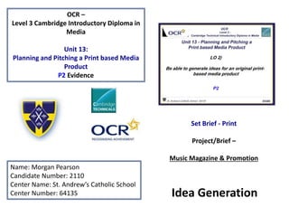
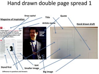
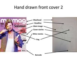
OCR –
Level 3 Cambridge Introductory Diploma in
Media
Unit 13:
Planning and Pitching a Print based Media
Product
P2 Evidence
Name: Morgan Pearson
Candidate Number: 2110
Center Name: St. Andrew’s Catholic School
Center Number: 64135
Set Brief - Print
Project/Brief –
Music Magazine & Promotion
Idea Generation
Content
• Slide 4 - Summary of Ideas
• Slide 5 – Masthead – name ideas
• Slide 6 – Font
• Slide 7 – target audience – Hartley’s 7
• Slide 8 – target audience – Katz’ theory
• Slide 9 – target audience – Maslow’s hierarchy
• Slide 10 – target audience continued
• Slide 11 – mood board 1
• Slide 12 – mood board 1 – conclusion
• Slide 13 – mind map 1
• Slide 14 – mood board 2
• Slide 15 – mood board 2 - conclusion
• Slide 16 - mind map 2
• Slide 17 - mind map conclusion
• Slide 18 – Hand Drawn front cover 1
• Slide 19 – Front cover analysis 1
• Slide 20 – Layout comparison
• Slide 21 – Graphic layout – front cover
• Slide 22 – Hand drawn double page spread
• Slide 23 – Double page spread 1
• Slide 24 – Hand drawn front cover 2
• Slide 25 – front cover analysis 2
• Slide 26 – Double page spread 2
• Slide 27 – Double page spread analysis 2
• Slide 28 – Graphic layout Double page spread
• Slide 29 – Conclusion
Summary of Ideas
Genre – The genre that my magazine is going to be is dance and
clubbing. The magazine will cover Music festivals and reviews from
artists much like Mixmag who have a section in every magazine which
is around 6 pages just for the artist on their front cover.
Format –The size of the magazine is going to be A4 which have the
dimensions of 210mm x 297mm. This is the sizing of a the common
magazine so I will be doing the same. The colours I will be using are
going to be a; a light pink, black and white as they all contrast with
each other and stand out well next to each other. These colour will
stand out a lot compared to other magazines but will not be over
powering. The Idea is for the colours are to connote relaxation and will
be less dark and intense like tillate magazine who usually use a dark
images with lots of bright lights.
Masthead – Names ideas
• House
• BASS
• Jump
• Lasers
• Beats
• Anarchy
• Techno
• Basic
• Neon
• Dark techno
• Wide awake
• Digital disorder
• Blackout
I am going to use bass and Jump as my temporary ideas to use
as a masthead.
Font
Masthead – I may to be using a similar font to ‘Cubic’ , from
http://www.dafont.com/cubic.font , for my masthead as it stands out a lot
compared to the normal block text. It looks like it is made out of hexagons,
which connotes my magazine as being controversial and unique.
I might also use the front ‘Hyperspace’, from
http://www.dafont.com/search.php?q=hyperspace , for a masthead or as a
strapline in the magazines front cover. This cover also has a more unique look
but also a more techno appearance which relates with my genre of music.
Another Font I may use for titles might be ‘ Digital anarchy’, from
http://www.dafont.com/search.php?q=digital+anarchy , which connotes a
night club scene. It also has a paint splat look to it which also gives the feeling
to it.
Target Audience – Hartley’s 7 subjectivities
My target audience based on Hartley’s 7 subjectivities will be on
an age range between 18 – 25. This is because the content will
contain information about clubs which only 18+ are allowed into.
So younger people shouldn’t be reading about this as they would
be too young to entre any of these clubs. However, it could be
seen as rebellious as to read these magazines as whoever
reading it will seem more adult and older as they want to keep
informed about clubs even though they won’t be allowed in.
The socio-economic needs of the audience are stereotypically
going to be C2, D and E because no one who is 18-25 will not
have a status high enough to be in the other categories as any
jobs/ careers after C2 are usually jobs which takes a lot of years
of work to get. Therefore these demographics are likely to be
“free spirited” and able to identify with the magazine.
Katz’ theory Uses and Gratification
According to Katz’ theory my magazine audience will want to be
informed and educated about what new information there is in
the dance and clubbing music genre which will include
information about festivals, top of the charts and artist
information. The audience will be able to personally identify with
issues being addresses in the magazine as my target audience
will have there own view and opinions about different topics as
they have a keen interest in the topics discussed. They can do
this by using social media like: Facebook and twitter to post their
own thoughts and concerns onto their front page for everyone
else who follows them can see. Also there are chatrooms on the
internet where people can talk to each other about the issues
mentioned in the magazine and debate with together. An
example of a website like this would be: reddit. This is what the
audience is looking for in content in my magazine.
Maslow’s hierarchy Of Needs
Also according to Maslow’s hierarchy of needs my
target audience are ‘social climbers’ and ‘explorers’.
As the ‘explorers’ are heavily influenced by social
change such as new celebrities in what they do and
what new trends there are and how can they get
involved for example in fashion. Also, so ‘social
climbers’ they are materialistically driven by what
other people have such as; money, cars and houses.
They want to see what other people have and they
actually want it for themselves.
Target audience continued
Although my target audience has a very low spending
power as they are according to demographics are in the E
categories which means they don’t earn a lot of money as
they are either unemployed or students who earn almost
nothing.
This means their life style choices are going to be for the
cheapest things and they can’t afford to but expensive
things as they are usually saving money. However, as
being a in the E demographics category especially
students will want to know a lot about clubs and festivals
as that is what they value and want to spend their money
on.
Mood Board 1
Mood Board - Conclusion
• The speakers are on my mood board because they
represent clubbing and they connote music especially
being loud as they are at clubs or festivals.
• The union jack and American flag are on my mood
board as they connote pride in something and as music
is a big part of my readerships lives I need to replicate
pride in my music genre some how.
• The two smiley faces on the mood board are to
connote and inspire my magazines to be happy but
also a bit rebellious at times shown my the face at the
top.
Mind map 1
Masthead
LOUD
Colour scheme
Release date
Target audience
Brand Identity
LOUD connotes the atmosphere
at a club or a festival. It also
signifies the magazine being in
your face and stands out. The
magazine will then be very
colourful so it will attract more
attention on the shelf.
The magazine will have a black and
green colour scheme. This is so it
can connote a clubs vide and also it
should also imitate the glowing in
the dark like glow sticks.
The magazine will released on the
Tuesday of every month so it
doesn’t have to compete with
other magazines in the same
genre.
The target audience for this
magazine will be between 16 – 23
males and females. This also
according to socio-economics they
are in the categories of E and C2.
Image to be taken
The main image I am going to take for
this front cover is going to be
someone who is looking at the
computer and is wearing big
headphones on. This is so they look
like they making music. The shot
type is going to be taken from behind
the model so that you can see what's
on the screen and it also looks like
you are just peaking into his personal
life.
This magazine cover will use the
font ‘Digital anarchy’ as its
headline. The editor of the
magazine will stay the same so
that the magazine stays
consistent.
Mood board 2
Mood Board - Conclusion
• The pink and blue stripes and swirls on the mood
board connote lights which can be similar to the
ones at night clubs or festival lights.
• The swimming pool is their represent the feeling
of summer. The water connotes the feeling of
weightlessness which is like being relaxed which
is what I want this magazine to connote.
• The paint splatters and explosion are their to
connote how bright the magazine is.
The front I am going to
use is called ‘Hyperspace’
this is going to be used for
the front cover and it will
also be next to the page
number on every page.
Also in the corners of the
page this is where the
logo will go onto its own.
The social media links will
only be on the front cover
near to the barcode and
only there so it doesn’t
get in the way.
Mind map 2
Ideas
Jump
The verbal code ‘Jump’ connotes a
party or clubbing like atmosphere and
vide. This will be a good masthead as it
directed to the target audience as
being some of their values in a
magazine. Also the masthead will be
the first thing people will reader a
attract the attentions of people who
like a party atmosphere.
The colour scheme I am going to use is
blue, white and pink. These colours are
supposed to connote summer and the
feeling of a long break to relax with
friends. Blue connotes the summer Sky
and the pink flower in a field which will
hopefully interest more female readers if
pink is also included, instead of excluding
them. Flowers are at festivals during the
summer so show also connote that vide
and feeling.
Colour Scheme
Masthead
Brand identity
Magazine release dates
Target audience
My magazine will be released on a
monthly bases to compete with
other similar magazine genres such
as; Mixmag, tillate and street cred
The target audience will
be young males and
females between the ages
of 18 – 25 and in the
socio-economics my
target audience will be in
the category of; E,D and
C2.
Main image
The main image on the front cover is
going to be someone with an
emotionless face looking into the
distance. This connotes how the
magazine is seen as cool as the model
on the front is thoughtful and not
interested in the camera
Final Mind Map
Ideas
Masthead names
LOUD
House
Jump
This could connote a festival. Club
or gigs vide which also relates to
the genre of music
House is a sub-genre in the
clubbing and dance music
genre. This would relate to a
more niece market.
This could connote the
feelings in a club or festival.
Colour scheme
Black and green colours
might make the magazine
look more like a festival
experience.
Pink, black and white.
This is similar to a
Mixmag magazine style.
Target Audience
The target audience will be between
16 – 25. So the magazines are aimed
to young adults who are likely to
want to know more about clubbing
and music festivals. Over all the
socio-economics will be in the range
of; E, C2 and C1.
Magazine
influences
Hand drawn front cover 1
Strapline
Masthead
Barcode
Cover stories
Other stories
Hand drawn Magazine of inspiration
Front cover analysis 1
Similarities Differences
Both magazines have a similar layout where the;
strapline, masthead and cover story are positioned
This is because in Mixmag magazine they have a
consistent layout which I want to replicate in my own
magazine. Also as my magazine is going to compete
with Mixmag I want to make my magazine similar to
theirs as they are already very popular and hopeful I
will take some of their readers
The barcode is in a different position as I personally
think it is better in the bottom left compared to the
bottom right. This is because it doesn’t over
complicate the other stories part of the page and
distract the reader from the important information
which could make them decide to purchase the
magazine.
The colour scheme for ‘Jump’ is also going to be
similar to the magazine of inspiration as they both
convey a light hearted mood as the colours used are
bright.
The persons figure and shot type is also slightly
different it is in the same place although the model is
going to have a different pose according to which
magazine it is and what the mood of the front cover is
trying to portray. Their clothing is also going to be
different as I want a more summer look and vide to
my magazine front cover so they will wear short and a
t-shirt.
The other stories section of the front cover are going
to be over the main image of the artist so when the
readers look at the main image they will also read the
information about the other stories.
My Font styles will be different as I want to establish
my own font and not copy the already well known
Mixmag font of being Bold. I am going to have thinner
font to make my magazine look more modern and
new compared to mix mag as they are a competitor.
Layout comparison
Strapline
Masthead
Image of artist
I am going to have the similar
positions of the strapline,
masthead and image.
Although the strapline and
masthead are going to be a
different font as they will be
thinner to look more modern
and new. The image will have a
different type of shot more to
the side of the person and
they will be wearing different
clothes like shorts and t-shirt.
The colour scheme is also
going to be similar as it is to
convey a more light hearted
and happy side.
Graphic layouts – Front Cover
Strapline
Julio
Bashmore
Plus
Cover
Stories
Barcode
Hand drawn double page spread 1
Artists name
Title
Big image
Smaller image
text
Hand drawn draft
Magazine of inspiration
Quote
Difference in questions and Answers
Stand first
Drop capital
Double page analysis 1
Similarities Differences
Both magazines have a large image covering up the
whole of the second page. This connotes the
importance of the artist and it is more interesting for
the reader to look at this compared to just blocks of
text.
Both magazine include the artist name and has a title
to the interview. Although the magazine of inspiration
has these two mixed together whereas in my draft I
have put them on their own and separate as it is
easier for the reader to know what the page is about
and who is included in its content. I think this is better
than merging the two into a sentence as a title.
Both of the magazines also have a quotes from the
artist which is exclusive to this magazine. They have
done this to interest the reader more into reading the
interview and they can also take something from their
word of inspiration.
Also the smaller image I have changed the position
compared to the magazine of inspiration as that
magazine has the image in the middle which I think
distracts the reader from the content. I have placed
my drafts smaller image on the bottom right as it is
away from the text but also near the bigger image so
when the reader looks at the page they will see both
images at once and won’t get distracted while
reading.
The titles font style in the magazine of inspiration is
all underlined and in italics. I don’t want this in my
magazine as it is too complex to look at and I want my
magazine to be simple and relaxing to read.
Hand drawn front cover 2
Masthead
Headline
Main image
Cover stories
Other stories
Barcode
Pug
Front cover analysis 2
Similarities Differences
Both magazines both have a very similar layout
with the positioning of the; masthead, headline,
image position, cover stories and barcode
although will have differences about them
including font and style.
Although my colour scheme is going to be
different as it is going to have a black or dark
background with a neon colour as the text colour
style.
I have also chosen for my artist to be on the left
side of the magazine as by taking up most of the
magazine front cove then it not only connotes his
importance but also is what the reader will see
the most of and first. So hopeful the reader
should see a popular artist on the shelves and
what to read it.
Also the pug which is on the front cover isn’t going
to be in the corner on its own but with the other
text so the reader is more likely to read it with the
other text. Also the promotion id going to be for a
free CD of the artist which is featured on the front
of the magazine so those who like his music will be
very tempted to purchase the magazine.
Also the cover stories are going to be in the same
position as if they are on the side of the magazine
they will not interrupt the main image by
overlapping it although they will be next to the
image so will get attention from the reader when
they see the main image.
I have also made the cover stories wider than the
magazine of inspiration as I can fit more text in
and it will be clearer and easier to read. I think
that the magazine of inspirations cover stories are
too thin and you can’t read them.
Double page spread 2
Big image
Three smaller images
Block of text
Quote
Smaller image
Drop capital
Stand First
Double page spread 2 analysis
Similarities Differences
I have chose to draft a similar page as the
magazine of inspiration. I have chose to have one
big image taking up half the page and three
smaller images filling up the rest of the space. I
have done this because not only is their more
images too look at but they can also tell a story
like a party or what the artist does in their spare
time.
I haven’t used a quote from the artist in my draft
as I think is spoils the images on the page by
blocking some of the image out.
I have also drafted the interview of the artist to
just be in a big block although as it is only a draft I
may change this to make it clearer where the
question and answers are.
I also haven’t include another smaller image
where the block of text is as I think that there are
already enough images on the two pages and I
just interrupts the interview with a distraction.
I have also used the same start to my interview as
the magazine of inspirations as the big text stands
out more and connotes the artist of being big,
popular and loud. Although if my artist isn’t like
this then I will chose another font style which
connotes their personality.
On my draft have haven't included a quote fro the
artist as I think the all of the information in the
interview already. Also this means that the quote
doesn’t overlap the images so the readers can see
more of the image of the artist.
Graphic Layout – Double Page spread
Carl
Coxs
Pull
quote
Section
Divider
Header
2nd
Photo
Conclusion
To conclude the two ideas for my magazine cover are either
going to be BASS or Jump. The two are going to be different as
Jump gives a more light hearted mood and isn’t as dark as BASS.
Jump has bright and light colours and gives off a light hearted
vide and it is more relaxed than BASS. BASS is going to be darker
in colour and is more active and interested in clubbing whereas
Jump is going to be more focused on artists and other festivals.

Unit 13 - LO2

  • 1.
    OCR – Level 3Cambridge Introductory Diploma in Media Unit 13: Planning and Pitching a Print based Media Product P2 Evidence Name: Morgan Pearson Candidate Number: 2110 Center Name: St. Andrew’s Catholic School Center Number: 64135 Set Brief - Print Project/Brief – Music Magazine & Promotion Idea Generation
  • 2.
    Content • Slide 4- Summary of Ideas • Slide 5 – Masthead – name ideas • Slide 6 – Font • Slide 7 – target audience – Hartley’s 7 • Slide 8 – target audience – Katz’ theory • Slide 9 – target audience – Maslow’s hierarchy • Slide 10 – target audience continued • Slide 11 – mood board 1 • Slide 12 – mood board 1 – conclusion • Slide 13 – mind map 1 • Slide 14 – mood board 2 • Slide 15 – mood board 2 - conclusion • Slide 16 - mind map 2 • Slide 17 - mind map conclusion • Slide 18 – Hand Drawn front cover 1 • Slide 19 – Front cover analysis 1 • Slide 20 – Layout comparison • Slide 21 – Graphic layout – front cover • Slide 22 – Hand drawn double page spread • Slide 23 – Double page spread 1 • Slide 24 – Hand drawn front cover 2 • Slide 25 – front cover analysis 2 • Slide 26 – Double page spread 2 • Slide 27 – Double page spread analysis 2 • Slide 28 – Graphic layout Double page spread • Slide 29 – Conclusion
  • 4.
    Summary of Ideas Genre– The genre that my magazine is going to be is dance and clubbing. The magazine will cover Music festivals and reviews from artists much like Mixmag who have a section in every magazine which is around 6 pages just for the artist on their front cover. Format –The size of the magazine is going to be A4 which have the dimensions of 210mm x 297mm. This is the sizing of a the common magazine so I will be doing the same. The colours I will be using are going to be a; a light pink, black and white as they all contrast with each other and stand out well next to each other. These colour will stand out a lot compared to other magazines but will not be over powering. The Idea is for the colours are to connote relaxation and will be less dark and intense like tillate magazine who usually use a dark images with lots of bright lights.
  • 5.
    Masthead – Namesideas • House • BASS • Jump • Lasers • Beats • Anarchy • Techno • Basic • Neon • Dark techno • Wide awake • Digital disorder • Blackout I am going to use bass and Jump as my temporary ideas to use as a masthead.
  • 6.
    Font Masthead – Imay to be using a similar font to ‘Cubic’ , from http://www.dafont.com/cubic.font , for my masthead as it stands out a lot compared to the normal block text. It looks like it is made out of hexagons, which connotes my magazine as being controversial and unique. I might also use the front ‘Hyperspace’, from http://www.dafont.com/search.php?q=hyperspace , for a masthead or as a strapline in the magazines front cover. This cover also has a more unique look but also a more techno appearance which relates with my genre of music. Another Font I may use for titles might be ‘ Digital anarchy’, from http://www.dafont.com/search.php?q=digital+anarchy , which connotes a night club scene. It also has a paint splat look to it which also gives the feeling to it.
  • 7.
    Target Audience –Hartley’s 7 subjectivities My target audience based on Hartley’s 7 subjectivities will be on an age range between 18 – 25. This is because the content will contain information about clubs which only 18+ are allowed into. So younger people shouldn’t be reading about this as they would be too young to entre any of these clubs. However, it could be seen as rebellious as to read these magazines as whoever reading it will seem more adult and older as they want to keep informed about clubs even though they won’t be allowed in. The socio-economic needs of the audience are stereotypically going to be C2, D and E because no one who is 18-25 will not have a status high enough to be in the other categories as any jobs/ careers after C2 are usually jobs which takes a lot of years of work to get. Therefore these demographics are likely to be “free spirited” and able to identify with the magazine.
  • 8.
    Katz’ theory Usesand Gratification According to Katz’ theory my magazine audience will want to be informed and educated about what new information there is in the dance and clubbing music genre which will include information about festivals, top of the charts and artist information. The audience will be able to personally identify with issues being addresses in the magazine as my target audience will have there own view and opinions about different topics as they have a keen interest in the topics discussed. They can do this by using social media like: Facebook and twitter to post their own thoughts and concerns onto their front page for everyone else who follows them can see. Also there are chatrooms on the internet where people can talk to each other about the issues mentioned in the magazine and debate with together. An example of a website like this would be: reddit. This is what the audience is looking for in content in my magazine.
  • 9.
    Maslow’s hierarchy OfNeeds Also according to Maslow’s hierarchy of needs my target audience are ‘social climbers’ and ‘explorers’. As the ‘explorers’ are heavily influenced by social change such as new celebrities in what they do and what new trends there are and how can they get involved for example in fashion. Also, so ‘social climbers’ they are materialistically driven by what other people have such as; money, cars and houses. They want to see what other people have and they actually want it for themselves.
  • 10.
    Target audience continued Althoughmy target audience has a very low spending power as they are according to demographics are in the E categories which means they don’t earn a lot of money as they are either unemployed or students who earn almost nothing. This means their life style choices are going to be for the cheapest things and they can’t afford to but expensive things as they are usually saving money. However, as being a in the E demographics category especially students will want to know a lot about clubs and festivals as that is what they value and want to spend their money on.
  • 11.
  • 12.
    Mood Board -Conclusion • The speakers are on my mood board because they represent clubbing and they connote music especially being loud as they are at clubs or festivals. • The union jack and American flag are on my mood board as they connote pride in something and as music is a big part of my readerships lives I need to replicate pride in my music genre some how. • The two smiley faces on the mood board are to connote and inspire my magazines to be happy but also a bit rebellious at times shown my the face at the top.
  • 13.
    Mind map 1 Masthead LOUD Colourscheme Release date Target audience Brand Identity LOUD connotes the atmosphere at a club or a festival. It also signifies the magazine being in your face and stands out. The magazine will then be very colourful so it will attract more attention on the shelf. The magazine will have a black and green colour scheme. This is so it can connote a clubs vide and also it should also imitate the glowing in the dark like glow sticks. The magazine will released on the Tuesday of every month so it doesn’t have to compete with other magazines in the same genre. The target audience for this magazine will be between 16 – 23 males and females. This also according to socio-economics they are in the categories of E and C2. Image to be taken The main image I am going to take for this front cover is going to be someone who is looking at the computer and is wearing big headphones on. This is so they look like they making music. The shot type is going to be taken from behind the model so that you can see what's on the screen and it also looks like you are just peaking into his personal life. This magazine cover will use the font ‘Digital anarchy’ as its headline. The editor of the magazine will stay the same so that the magazine stays consistent.
  • 14.
  • 15.
    Mood Board -Conclusion • The pink and blue stripes and swirls on the mood board connote lights which can be similar to the ones at night clubs or festival lights. • The swimming pool is their represent the feeling of summer. The water connotes the feeling of weightlessness which is like being relaxed which is what I want this magazine to connote. • The paint splatters and explosion are their to connote how bright the magazine is.
  • 16.
    The front Iam going to use is called ‘Hyperspace’ this is going to be used for the front cover and it will also be next to the page number on every page. Also in the corners of the page this is where the logo will go onto its own. The social media links will only be on the front cover near to the barcode and only there so it doesn’t get in the way. Mind map 2 Ideas Jump The verbal code ‘Jump’ connotes a party or clubbing like atmosphere and vide. This will be a good masthead as it directed to the target audience as being some of their values in a magazine. Also the masthead will be the first thing people will reader a attract the attentions of people who like a party atmosphere. The colour scheme I am going to use is blue, white and pink. These colours are supposed to connote summer and the feeling of a long break to relax with friends. Blue connotes the summer Sky and the pink flower in a field which will hopefully interest more female readers if pink is also included, instead of excluding them. Flowers are at festivals during the summer so show also connote that vide and feeling. Colour Scheme Masthead Brand identity Magazine release dates Target audience My magazine will be released on a monthly bases to compete with other similar magazine genres such as; Mixmag, tillate and street cred The target audience will be young males and females between the ages of 18 – 25 and in the socio-economics my target audience will be in the category of; E,D and C2. Main image The main image on the front cover is going to be someone with an emotionless face looking into the distance. This connotes how the magazine is seen as cool as the model on the front is thoughtful and not interested in the camera
  • 17.
    Final Mind Map Ideas Mastheadnames LOUD House Jump This could connote a festival. Club or gigs vide which also relates to the genre of music House is a sub-genre in the clubbing and dance music genre. This would relate to a more niece market. This could connote the feelings in a club or festival. Colour scheme Black and green colours might make the magazine look more like a festival experience. Pink, black and white. This is similar to a Mixmag magazine style. Target Audience The target audience will be between 16 – 25. So the magazines are aimed to young adults who are likely to want to know more about clubbing and music festivals. Over all the socio-economics will be in the range of; E, C2 and C1. Magazine influences
  • 18.
    Hand drawn frontcover 1 Strapline Masthead Barcode Cover stories Other stories Hand drawn Magazine of inspiration
  • 19.
    Front cover analysis1 Similarities Differences Both magazines have a similar layout where the; strapline, masthead and cover story are positioned This is because in Mixmag magazine they have a consistent layout which I want to replicate in my own magazine. Also as my magazine is going to compete with Mixmag I want to make my magazine similar to theirs as they are already very popular and hopeful I will take some of their readers The barcode is in a different position as I personally think it is better in the bottom left compared to the bottom right. This is because it doesn’t over complicate the other stories part of the page and distract the reader from the important information which could make them decide to purchase the magazine. The colour scheme for ‘Jump’ is also going to be similar to the magazine of inspiration as they both convey a light hearted mood as the colours used are bright. The persons figure and shot type is also slightly different it is in the same place although the model is going to have a different pose according to which magazine it is and what the mood of the front cover is trying to portray. Their clothing is also going to be different as I want a more summer look and vide to my magazine front cover so they will wear short and a t-shirt. The other stories section of the front cover are going to be over the main image of the artist so when the readers look at the main image they will also read the information about the other stories. My Font styles will be different as I want to establish my own font and not copy the already well known Mixmag font of being Bold. I am going to have thinner font to make my magazine look more modern and new compared to mix mag as they are a competitor.
  • 20.
    Layout comparison Strapline Masthead Image ofartist I am going to have the similar positions of the strapline, masthead and image. Although the strapline and masthead are going to be a different font as they will be thinner to look more modern and new. The image will have a different type of shot more to the side of the person and they will be wearing different clothes like shorts and t-shirt. The colour scheme is also going to be similar as it is to convey a more light hearted and happy side.
  • 21.
    Graphic layouts –Front Cover Strapline Julio Bashmore Plus Cover Stories Barcode
  • 22.
    Hand drawn doublepage spread 1 Artists name Title Big image Smaller image text Hand drawn draft Magazine of inspiration Quote Difference in questions and Answers Stand first Drop capital
  • 23.
    Double page analysis1 Similarities Differences Both magazines have a large image covering up the whole of the second page. This connotes the importance of the artist and it is more interesting for the reader to look at this compared to just blocks of text. Both magazine include the artist name and has a title to the interview. Although the magazine of inspiration has these two mixed together whereas in my draft I have put them on their own and separate as it is easier for the reader to know what the page is about and who is included in its content. I think this is better than merging the two into a sentence as a title. Both of the magazines also have a quotes from the artist which is exclusive to this magazine. They have done this to interest the reader more into reading the interview and they can also take something from their word of inspiration. Also the smaller image I have changed the position compared to the magazine of inspiration as that magazine has the image in the middle which I think distracts the reader from the content. I have placed my drafts smaller image on the bottom right as it is away from the text but also near the bigger image so when the reader looks at the page they will see both images at once and won’t get distracted while reading. The titles font style in the magazine of inspiration is all underlined and in italics. I don’t want this in my magazine as it is too complex to look at and I want my magazine to be simple and relaxing to read.
  • 24.
    Hand drawn frontcover 2 Masthead Headline Main image Cover stories Other stories Barcode Pug
  • 25.
    Front cover analysis2 Similarities Differences Both magazines both have a very similar layout with the positioning of the; masthead, headline, image position, cover stories and barcode although will have differences about them including font and style. Although my colour scheme is going to be different as it is going to have a black or dark background with a neon colour as the text colour style. I have also chosen for my artist to be on the left side of the magazine as by taking up most of the magazine front cove then it not only connotes his importance but also is what the reader will see the most of and first. So hopeful the reader should see a popular artist on the shelves and what to read it. Also the pug which is on the front cover isn’t going to be in the corner on its own but with the other text so the reader is more likely to read it with the other text. Also the promotion id going to be for a free CD of the artist which is featured on the front of the magazine so those who like his music will be very tempted to purchase the magazine. Also the cover stories are going to be in the same position as if they are on the side of the magazine they will not interrupt the main image by overlapping it although they will be next to the image so will get attention from the reader when they see the main image. I have also made the cover stories wider than the magazine of inspiration as I can fit more text in and it will be clearer and easier to read. I think that the magazine of inspirations cover stories are too thin and you can’t read them.
  • 26.
    Double page spread2 Big image Three smaller images Block of text Quote Smaller image Drop capital Stand First
  • 27.
    Double page spread2 analysis Similarities Differences I have chose to draft a similar page as the magazine of inspiration. I have chose to have one big image taking up half the page and three smaller images filling up the rest of the space. I have done this because not only is their more images too look at but they can also tell a story like a party or what the artist does in their spare time. I haven’t used a quote from the artist in my draft as I think is spoils the images on the page by blocking some of the image out. I have also drafted the interview of the artist to just be in a big block although as it is only a draft I may change this to make it clearer where the question and answers are. I also haven’t include another smaller image where the block of text is as I think that there are already enough images on the two pages and I just interrupts the interview with a distraction. I have also used the same start to my interview as the magazine of inspirations as the big text stands out more and connotes the artist of being big, popular and loud. Although if my artist isn’t like this then I will chose another font style which connotes their personality. On my draft have haven't included a quote fro the artist as I think the all of the information in the interview already. Also this means that the quote doesn’t overlap the images so the readers can see more of the image of the artist.
  • 28.
    Graphic Layout –Double Page spread Carl Coxs Pull quote Section Divider Header 2nd Photo
  • 29.
    Conclusion To conclude thetwo ideas for my magazine cover are either going to be BASS or Jump. The two are going to be different as Jump gives a more light hearted mood and isn’t as dark as BASS. Jump has bright and light colours and gives off a light hearted vide and it is more relaxed than BASS. BASS is going to be darker in colour and is more active and interested in clubbing whereas Jump is going to be more focused on artists and other festivals.