The document provides an overview of creating calculated fields in Tableau 2019.3.0, detailing various types such as numerical, date, aggregate, string, and logical fields using a life expectancy dataset. It includes step-by-step instructions for creating each field type and visualizations like bar graphs based on the calculated data. Additionally, it outlines the retention of original data while creating new fields for enhanced data visualization.


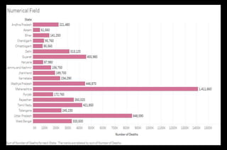
![Steps to create Numerical Field
● Click the drop down beside the ‘Dimensions’ section.
● Select ‘Create Calculated Field…’ and a dialogue box will
appear. Name it ‘Number of Deaths’ and write the formula:
([Death Rate]/100)*[Population Current] -> Apply -> Ok.
This will create a field under ‘Measures’ section which describes
the total number of deaths in every city.
● Create a Bar graph using ‘State’ and ‘Number of Deaths’.
Resulting graph has been put up on the next slide and is self
explanatory.](https://image.slidesharecdn.com/calculatedfieldsintableau-200809174818/85/Calculated-Fields-in-Tableau-9-320.jpg)

![Steps to create Date Field
● Select the drop down beside ‘Dimensions’ section.
● Select ‘Create Calculated Field…’ and a dialogue box will appear.
Name it ‘Years from Last Election’ and write formula: DATEDIFF(
'year' , [Last Election Date] , Today()) -> Apply -> Ok.
This will create a field under ‘Measures’ section which describes
number of years that have passed since the last election was held in
that City .
● Create a Bar graph using ‘State’, ‘City’ and ‘Years from Last
Election’.
Resulting graph (excluding few States) has been put up on the next
slide for reference and is self explanatory.](https://image.slidesharecdn.com/calculatedfieldsintableau-200809174818/85/Calculated-Fields-in-Tableau-12-320.jpg)


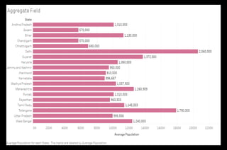
![Steps to create Aggregate Field
● Select the drop down beside ‘Dimensions’ section.
● Select ‘Create Calculated Field…’ and a dialogue box will
appear. Name it ‘Average Population’ and write formula:
AVG ([Population Current]) -> Apply -> Ok.
This will create a field under ‘Measures’ section which describes
the average population for every City.
● Create a Bar graph using ‘State’ and ‘Average Population’.
Resulting graph has been put up on the next slide for reference
and is self explanatory.](https://image.slidesharecdn.com/calculatedfieldsintableau-200809174818/85/Calculated-Fields-in-Tableau-15-320.jpg)


![Steps to create Logical Field
● Select the drop down beside ‘Dimensions’ section.
● Select ‘Create Calculated Field…’ and a dialogue box will appear.
Name it ‘Death Category’ and write formula:
IF [Death Rate] <= 10 then 'Low‘
ELSEIF [Death Rate] > 10 and [Death Rate] <= 15 then 'Mild'
ELSE 'High' END
● Click ‘Apply’ and then click ‘Ok’.
This will create a field under ‘Measures’ section which labels the each row
according to the above logic ‘Death Rate’.
● Create a Bar graph using ‘State’, ‘Death Rate’ and ‘Death Category’.
Resulting graph has been put up on the next slide for reference and is self
explanatory.](https://image.slidesharecdn.com/calculatedfieldsintableau-200809174818/85/Calculated-Fields-in-Tableau-22-320.jpg)