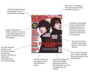
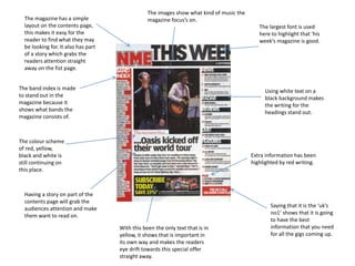
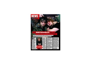
This document analyzes the layout and design of a music magazine. It discusses the use of color, fonts, sizing and positioning of images and text to draw attention to important information and stories. Red, white, black and yellow are the core color scheme. Larger, bold fonts are used for headlines and titles to make them stand out. White or yellow text is used against black backgrounds. Photos are positioned for balance. The layout aims to clearly present stories and content while grabbing readers' attention.


![Media magazine annotation [autosaved]](https://cdn.slidesharecdn.com/ss_thumbnails/mediamagazineannotationautosaved-131102154135-phpapp02-thumbnail.jpg?width=640&height=640&fit=bounds)


