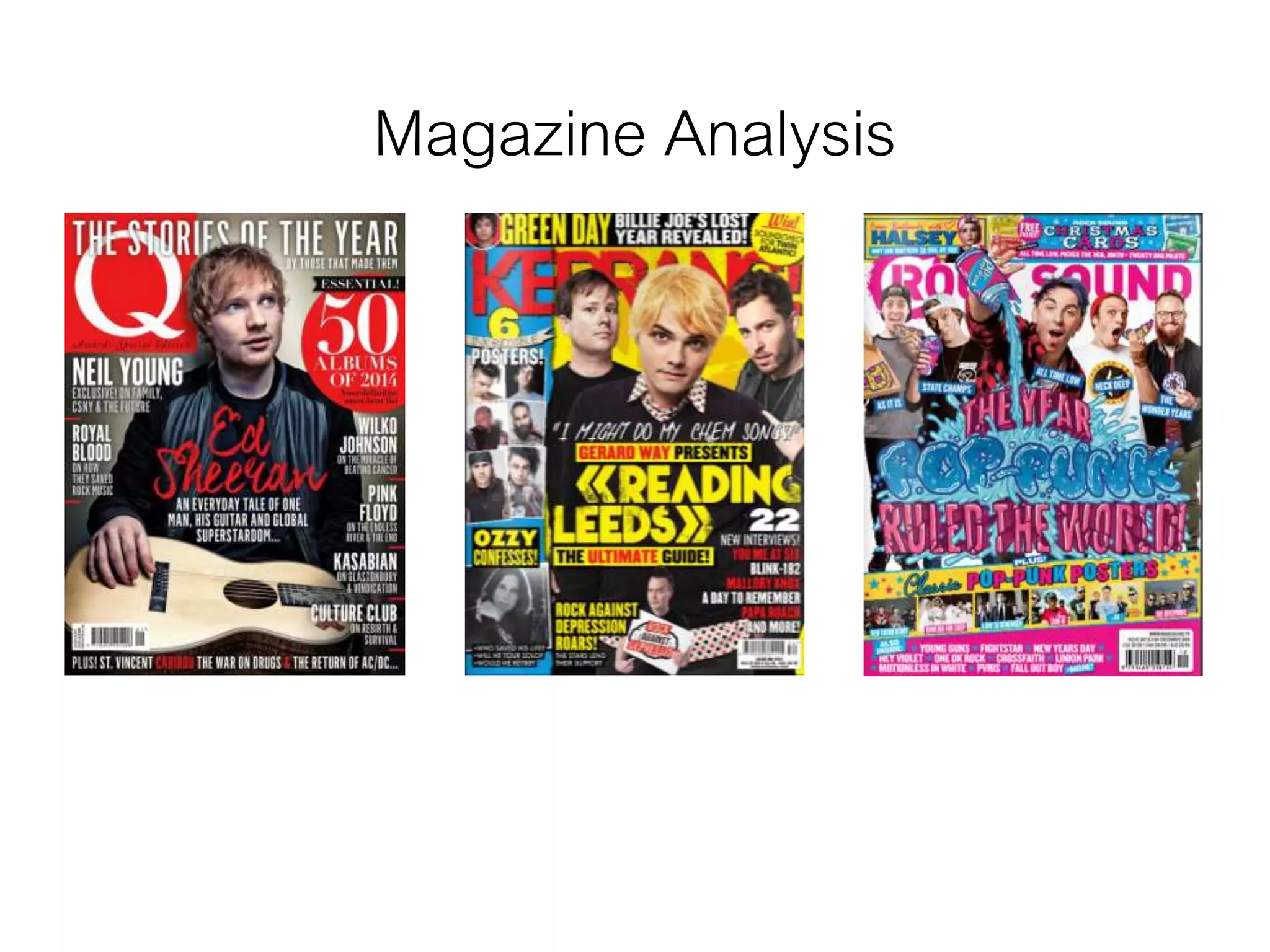
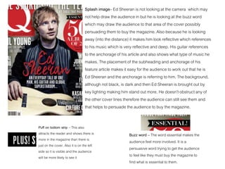
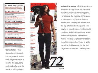
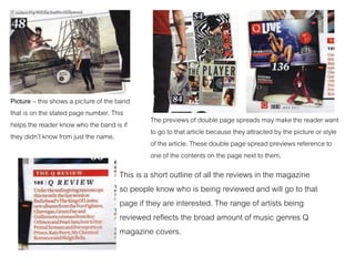
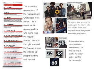
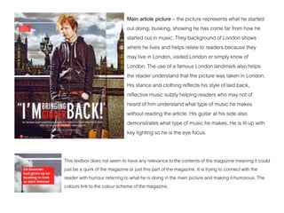
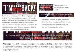
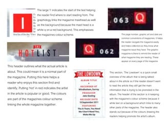
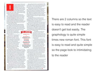
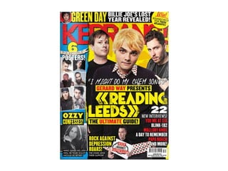
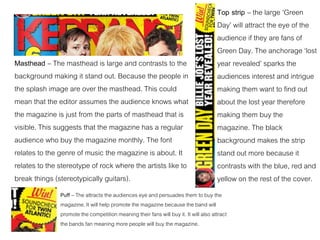
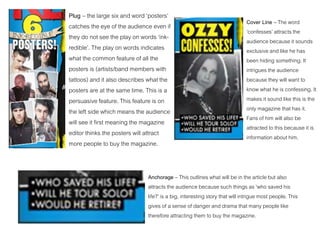
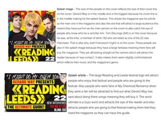
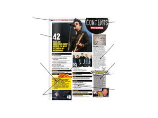
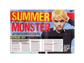
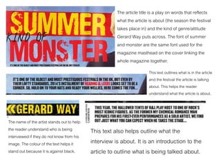
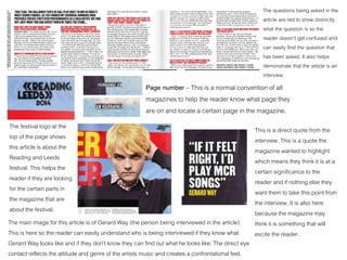
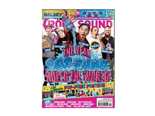
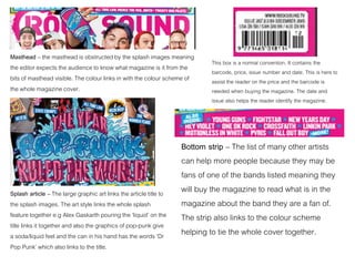
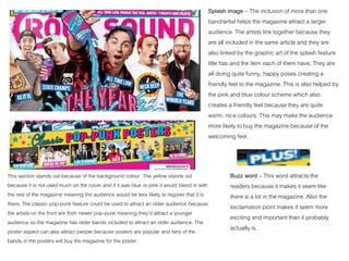
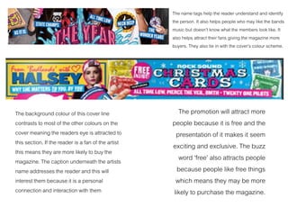
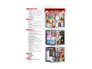
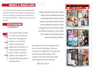
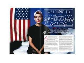
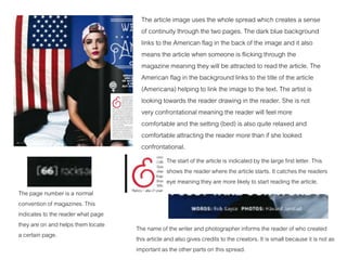
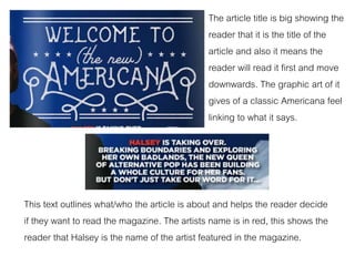
The document analyzes the design elements of a music magazine cover and interior pages.
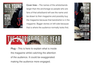
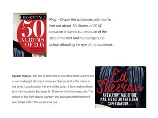
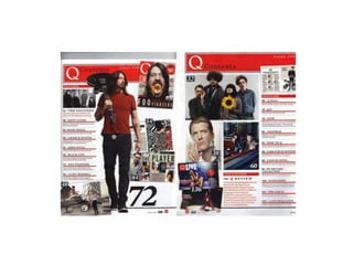
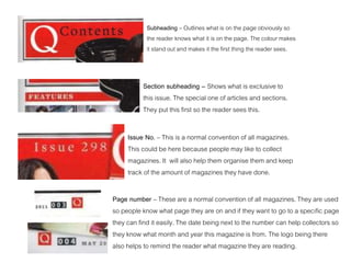
The cover uses various techniques to attract readers' attention and promote articles, including a prominent masthead in contrasting colors, splash images of featured artists, cover lines describing articles, and plugs highlighting special content. Interior pages similarly employ section headers, contents lists, prominent page numbers, and article previews to guide readers. Overall, the document examines how the magazine's layout strategically markets content to its audience.
Embracing GenAI - A Strategic ImperativePeter Windle
Artificial Intelligence (AI) technologies such as Generative AI, Image Generators and Large Language Models have had a dramatic impact on teaching, learning and assessment over the past 18 months. The most immediate threat AI posed was to Academic Integrity with Higher Education Institutes (HEIs) focusing their efforts on combating the use of GenAI in assessment. Guidelines were developed for staff and students, policies put in place too. Innovative educators have forged paths in the use of Generative AI for teaching, learning and assessments leading to pockets of transformation springing up across HEIs, often with little or no top-down guidance, support or direction.
This Gasta posits a strategic approach to integrating AI into HEIs to prepare staff, students and the curriculum for an evolving world and workplace. We will highlight the advantages of working with these technologies beyond the realm of teaching, learning and assessment by considering prompt engineering skills, industry impact, curriculum changes, and the need for staff upskilling. In contrast, not engaging strategically with Generative AI poses risks, including falling behind peers, missed opportunities and failing to ensure our graduates remain employable. The rapid evolution of AI technologies necessitates a proactive and strategic approach if we are to remain relevant.
Introduction to AI for Nonprofits with Tapp NetworkTechSoup
Dive into the world of AI! Experts Jon Hill and Tareq Monaur will guide you through AI's role in enhancing nonprofit websites and basic marketing strategies, making it easy to understand and apply.
Synthetic Fiber Construction in lab .pptxPavel ( NSTU)
Synthetic fiber production is a fascinating and complex field that blends chemistry, engineering, and environmental science. By understanding these aspects, students can gain a comprehensive view of synthetic fiber production, its impact on society and the environment, and the potential for future innovations. Synthetic fibers play a crucial role in modern society, impacting various aspects of daily life, industry, and the environment. ynthetic fibers are integral to modern life, offering a range of benefits from cost-effectiveness and versatility to innovative applications and performance characteristics. While they pose environmental challenges, ongoing research and development aim to create more sustainable and eco-friendly alternatives. Understanding the importance of synthetic fibers helps in appreciating their role in the economy, industry, and daily life, while also emphasizing the need for sustainable practices and innovation.
Macroeconomics- Movie Location
This will be used as part of your Personal Professional Portfolio once graded.
Objective:
Prepare a presentation or a paper using research, basic comparative analysis, data organization and application of economic information. You will make an informed assessment of an economic climate outside of the United States to accomplish an entertainment industry objective.
June 3, 2024 Anti-Semitism Letter Sent to MIT President Kornbluth and MIT Cor...Levi Shapiro
Letter from the Congress of the United States regarding Anti-Semitism sent June 3rd to MIT President Sally Kornbluth, MIT Corp Chair, Mark Gorenberg
Dear Dr. Kornbluth and Mr. Gorenberg,
The US House of Representatives is deeply concerned by ongoing and pervasive acts of antisemitic
harassment and intimidation at the Massachusetts Institute of Technology (MIT). Failing to act decisively to ensure a safe learning environment for all students would be a grave dereliction of your responsibilities as President of MIT and Chair of the MIT Corporation.
This Congress will not stand idly by and allow an environment hostile to Jewish students to persist. The House believes that your institution is in violation of Title VI of the Civil Rights Act, and the inability or
unwillingness to rectify this violation through action requires accountability.
Postsecondary education is a unique opportunity for students to learn and have their ideas and beliefs challenged. However, universities receiving hundreds of millions of federal funds annually have denied
students that opportunity and have been hijacked to become venues for the promotion of terrorism, antisemitic harassment and intimidation, unlawful encampments, and in some cases, assaults and riots.
The House of Representatives will not countenance the use of federal funds to indoctrinate students into hateful, antisemitic, anti-American supporters of terrorism. Investigations into campus antisemitism by the Committee on Education and the Workforce and the Committee on Ways and Means have been expanded into a Congress-wide probe across all relevant jurisdictions to address this national crisis. The undersigned Committees will conduct oversight into the use of federal funds at MIT and its learning environment under authorities granted to each Committee.
• The Committee on Education and the Workforce has been investigating your institution since December 7, 2023. The Committee has broad jurisdiction over postsecondary education, including its compliance with Title VI of the Civil Rights Act, campus safety concerns over disruptions to the learning environment, and the awarding of federal student aid under the Higher Education Act.
• The Committee on Oversight and Accountability is investigating the sources of funding and other support flowing to groups espousing pro-Hamas propaganda and engaged in antisemitic harassment and intimidation of students. The Committee on Oversight and Accountability is the principal oversight committee of the US House of Representatives and has broad authority to investigate “any matter” at “any time” under House Rule X.
• The Committee on Ways and Means has been investigating several universities since November 15, 2023, when the Committee held a hearing entitled From Ivory Towers to Dark Corners: Investigating the Nexus Between Antisemitism, Tax-Exempt Universities, and Terror Financing. The Committee followed the hearing with letters to those institutions on January 10, 202
Normal Labour/ Stages of Labour/ Mechanism of LabourWasim Ak
Normal labor is also termed spontaneous labor, defined as the natural physiological process through which the fetus, placenta, and membranes are expelled from the uterus through the birth canal at term (37 to 42 weeks
Acetabularia Information For Class 9 .docxvaibhavrinwa19
Acetabularia acetabulum is a single-celled green alga that in its vegetative state is morphologically differentiated into a basal rhizoid and an axially elongated stalk, which bears whorls of branching hairs. The single diploid nucleus resides in the rhizoid.
A Strategic Approach: GenAI in EducationPeter Windle
Artificial Intelligence (AI) technologies such as Generative AI, Image Generators and Large Language Models have had a dramatic impact on teaching, learning and assessment over the past 18 months. The most immediate threat AI posed was to Academic Integrity with Higher Education Institutes (HEIs) focusing their efforts on combating the use of GenAI in assessment. Guidelines were developed for staff and students, policies put in place too. Innovative educators have forged paths in the use of Generative AI for teaching, learning and assessments leading to pockets of transformation springing up across HEIs, often with little or no top-down guidance, support or direction.
This Gasta posits a strategic approach to integrating AI into HEIs to prepare staff, students and the curriculum for an evolving world and workplace. We will highlight the advantages of working with these technologies beyond the realm of teaching, learning and assessment by considering prompt engineering skills, industry impact, curriculum changes, and the need for staff upskilling. In contrast, not engaging strategically with Generative AI poses risks, including falling behind peers, missed opportunities and failing to ensure our graduates remain employable. The rapid evolution of AI technologies necessitates a proactive and strategic approach if we are to remain relevant.
2024.06.01 Introducing a competency framework for languag learning materials ...Sandy Millin
http://sandymillin.wordpress.com/iateflwebinar2024
Published classroom materials form the basis of syllabuses, drive teacher professional development, and have a potentially huge influence on learners, teachers and education systems. All teachers also create their own materials, whether a few sentences on a blackboard, a highly-structured fully-realised online course, or anything in between. Despite this, the knowledge and skills needed to create effective language learning materials are rarely part of teacher training, and are mostly learnt by trial and error.
Knowledge and skills frameworks, generally called competency frameworks, for ELT teachers, trainers and managers have existed for a few years now. However, until I created one for my MA dissertation, there wasn’t one drawing together what we need to know and do to be able to effectively produce language learning materials.
This webinar will introduce you to my framework, highlighting the key competencies I identified from my research. It will also show how anybody involved in language teaching (any language, not just English!), teacher training, managing schools or developing language learning materials can benefit from using the framework.
3. Masthead – Uses a large font
and bright background to draw
the audience’s eye to the
magazine. The white on red
helps the Q stand out making it
obvious what magazine it is.
Puff – This is used to outline which
issue the magazine is and to inform
the audience on what will be inside.
Splash feature – Shows the main story of the
magazine and explains who is on the front
cover. It also attracts his fans meaning they
will buy the magazine because an article on
him is inside. The red font links to the
masthead creating a colour scheme that
catches the audiences eye.
Barcode, price, date – this is a
convention of all magazines. It
is very small because the
publisher/editor does not want
the audience to focus on the
£3.99 price because this could
deter people from buying it.
Anchorage – This outlines the main point of the main article. It draws in the audience and make
them curious to what Ed Sheeran’s story is and what the article contains. The ellipsis indicates
that the story continues inside and suggests there is much more to the story also intriguing to
audience and making them want to purchase the magazine to read the article.
4. Splash image– Ed Sheeran is not looking at the camera which may
not help draw the audience in but he is looking at the buzz word
which may draw the audience to that area of the cover possibly
persuading them to buy the magazine. Also because he is looking
away (into the distance) it makes him look reflective which references
to his music which is very reflective and deep. His guitar references
to the anchorage of his article and also shows what type of music he
makes. The placement of the subheading and anchorage of his
feature article makes it easy for the audience to work out that he is
Ed Sheeran and the anchorage is referring to him. The background,
although not black, is dark and then Ed Sheeran is brought out by
key lighting making him stand out more. He doesn’t obstruct any of
the other cover lines therefore the audience can still see them and
that helps to persuade the audience to buy the magazine.
Puff on bottom strip – This also
attracts the reader and shows there is
more in the magazine than there is
just on the cover. Also it is on the left
side so it is visible and the audience
will be more likely to see it
Buzz word – The word essential makes the
audience feel more involved. It is a
persuasive word trying to get the audience
to feel like they must buy the magazine to
find what is essential to them.
5. Cover lines – The names of the artists/bands
larger than the anchorage so people who are
fans of that artist/band will see the name and
be drawn to then magazine and possibly buy
the magazine because that band/artist is in the
magazine. Bigger stories on left side because
that is where the audience normally looks first.
Plug – This is here to explain what is inside
the magazine whilst catching the attention
of the audience. It could be exaggerated
making the audience more engaged.
6. Plug – Draws the audiences attention to
find out about ‘50 albums of 2014’
because it stands out because of the
size of the font and the background
colour attracting the eye of the audience.
Splash feature– the font is different to the other fonts used of the
cover making it stand out more and because it is the name of
the artist it could catch the eye of the artist ‘s fans making them
buy the magazine because Ed Sheeran is in the magazine. The
colour of the font stands out from the background therefore it
also helps catch the audiences eye.
7.
8. Subheading – Outlines what is on the page obviously so
the reader knows what it is on the page. The colour makes
it stand out and makes it the first thing the reader sees.
Section subheading – Shows what is exclusive to
this issue. The special one of articles and sections.
They put this first so the reader sees this.
Issue No. – This is a normal convention of all magazines.
This could be here because people may like to collect
magazines. It will also help them organise them and keep
track of the amount of magazines they have done.
Page number – These are a normal convention of all magazines. They are used
so people know what page they are on and if they want to go to a specific page
they can find it easily. The date being next to the number can help collectors so
they know what month and year this magazine is from. The logo being there
also helps to remind the reader what magazine they are reading.
9. Contents list – This
shows the contents of
the magazine. It states
what page the article is
on who it is about and
outlines briefly what the
article is talking about.
Main article feature – The large picture
and number help show that he is the
main feature article of the magazine.
He takes up the majority of the space
in comparison to the other feature
articles also showing the reader he is
the big article in the magazine. The
way he is posed makes him look quite
confident and showing attitude which
reflects the style and sound of his
music. The big ‘72’ grabs the readers
eye which makes them want to go to
his article first because it is the first
page number they will probably see.
10. Picture – this shows a picture of the band
that is on the stated page number. This
helps the reader know who the band is if
they didn’t know from just the name.
The previews of double page spreads may make the reader want
to go to that article because they attracted by the picture or style
of the article. These double page spread previews reference to
one of the contents on the page next to them.
This is a short outline of all the reviews in the magazine
so people know who is being reviewed and will go to that
page if they are interested. The range of artists being
reviewed reflects the broad amount of music genres Q
magazine covers.
11. This shows the
regular parts of
the magazine and
what pages they
are on. This is
useful for the
regular readers
who like to read
the regular
articles. This is on
the right side and
the features are on
the left side so
people read the
features first.
The pictures show who is on the
stated pages. The pictures help
show who the artist is and
intrigue the reader if they like the
appearance of the person.
The numbers being
this colour helps
them stand out so
they are easy to
see for the reader
so they can find
the page easily.
12.
13. Main article picture – the picture represents what he started
out doing, busking, showing he has come far from how he
started out in music. They background of London shows
where he lives and helps relate to readers because they
may live in London, visited London or simply know of
London. The use of a famous London landmark also helps
the reader understand that the picture was taken in London.
His stance and clothing reflects his style of laid back,
reflective music subtly helping readers who may not of
heard of him understand what type of music he makes
without reading the article. His guitar at his side also
demonstrates what type of music he makes. He is lit up with
key lighting so he is the eye focus.
This textbox does not seem to have any relevance to the contents of the magazine meaning it could
just be a quirk of the magazine or just this part of the magazine. It is trying to connect with the
reader with humour referring to what he is doing in the main picture and making it humorous. The
colours link to the colour scheme of the magazine.
14. Section header – this is a quote from Ed showing this article is
direct from him. The emphasis and enlargement of the words
‘I’m Back’ indicate that he may have not been doing music for a
while and he is now back with new music. The quote also
shows his humour and he is open on making fun of himself. This
header outlines what type of person Ed is preparing people for
the article and the type of style the article will be.
Anchorage – The rhetorical question engages the reader and intrigues them making them want
to read the article and find out the answer. There is alliteration which is a persuasive technique
engaging the reader.
The artist’s name is in red
outline showing the article is
about him.
The name of the writer and photographer is a
convention of many magazines. This is there so
the reader knows who wrote the article and
who took the pictures in the article
15. The large ‘I’ indicates the start of the text helping
the reader find where to start reading from. The
graphology links the magazine masthead as well
as the background because the mast head is a
white q on a red background. This emphasises
the magazines colour scheme.
This header outlines what the actual article is
about. This could mean it is a normal part of
the magazine. Putting this here helps a
reader who enjoys this section find and
identify. Putting ‘hot’ in red indicates the artist
in the article is popular or good. The colours
are part of the magazines colour scheme
linking the whole magazine together.
This section, ‘The Lowdown’ is a quick small
overview of the album that is being talked
about in the article so if the reader doesn’t want
to read the article they still get the main
information that is trying to be promoted in the
album. The header of the section is in keeping
with the magazine’s colour scheme because it
white text on a background which links to many
other parts of the magazine. The header also
stands out because of the colours drawing the
readers helping promote the artist’s album.
The page number, graphic art and date are
common conventions of magazines. It helps
the reader navigate the magazine easily
and helps collectors so they know what
magazine issue they have. The graphic
magazine is there to remind the reader of
what magazine they are reading. These
appear on every page of the magazine
16. There are 2 columns so the text
is easy to read and the reader
doesn’t get lost easily. The
graphology is quite simple
times new roman font. This font
is easy to read and quite simple
so the page look to intimidating
to the reader
17.
18. Masthead – The masthead is large and contrasts to the
background making it stand out. Because the people in
the splash image are over the masthead. This could
mean that the editor assumes the audience knows what
the magazine is just from the parts of masthead that is
visible. This suggests that the magazine has a regular
audience who buy the magazine monthly. The font
relates to the genre of music the magazine is about. It
relates to the stereotype of rock where the artists like to
break things (stereotypically guitars).
Puff – The attracts the audiences eye and persuades them to buy the
magazine. It will help promote the magazine because the band will
promote the competition meaning their fans will buy it. It will also attract
the bands fan meaning more people will buy the magazine.
Top strip – the large ‘Green
Day’ will attract the eye of the
audience if they are fans of
Green Day. The anchorage ‘lost
year revealed’ sparks the
audiences interest and intrigue
making them want to find out
about the lost year therefore
making them buy the
magazine. The black
background makes the strip
stand out more because it
contrasts with the blue, red and
yellow on the rest of the cover.
19. Plug – the large six and word ‘posters’
catches the eye of the audience even if
they do not see the play on words ‘ink-
redible’. The play on words indicates
what the common feature of all the
posters is (artists/band members with
tattoos) and it also describes what the
posters are at the same time. This is a
persuasive feature. This feature is on
the left side which means the audience
will see it first meaning the magazine
editor thinks the posters will attract
more people to buy the magazine.
Cover Line – The word
‘confesses’ attracts the
audience because it sounds
exclusive and like he has
been hiding something. It
intrigues the audience
because they will want to
know what he is confessing. It
makes it sound like this is the
only magazine that has it.
Fans of him will also be
attracted to this because it is
information about him.
Anchorage – This outlines what will be in the article but also
attracts the audience because such things as ‘who saved his
life?’ is a big, interesting story that will intrigue most people. This
gives of a sense of danger and drama that many people like
therefore attracting them to buy the magazine.
20. Splash article – The large Reading and Leeds festival logo will attract
people who enjoy that festival and people who are going to the
festival. Also people who were fans of My Chemical Romance when
they were a fan will be attracted to find out what Gerard Way has
said about doing there songs meaning they will buy it. The word
ultimate is a buzz word and attracts the eye of the reader and also
attracts people who are going to that festival making them feel they
need the magazine so they can have the guide.
Splash image – The size of the people on the cover reflects the size of their cover line
on the cover. Gerard Way is in the middle and is the biggest because his cover line is
in the middle making his the splash feature. This shows the magazine see his article
as the main one in the magazine and also the one that will attract a large audience this
means they have put him as the main person on the cover to also catch the eye of
people who know who he is and like him. Tom DeLonge (left) is on the cover because
he was, at the time, a member of blink-182 who are listed as one of the 22 new
interviews. That is also why Josh Franceschi (right) is on the cover. These people are
also in the splash image because they have a large fanbase meaning there fans will
buy the magazine. They are all looking straight at the camera which will attract the
reader because of ‘eye contact’. It also makes them seem slightly confrontational
which reflects their music and the magazine’s genre.
21.
22. Page Title – This shows the
reader what is on the page. The
circle it is in and the colour of it
make it easy to see and draws
the eye first so the reader knows
what this page is.
A letter from the editor is a
regular convention in many
magazines. It puts across
the editors feelings about
the magazine and outline
what he likes in the
magazine. It may help the
reader decide what they
read first. The signature
makes the letter seem more
personal.
The issue no
and date are
normal
convention of
every
magazine. It
helps identify
the magazine.
This is one of the main articles in the magazine. This is
shown by it being the biggest section on the page. The
page number is the biggest so the reader sees it first and is
drawn to that page. The text is a different colour to nearly
the rest of the page which makes it stand out more. The text
is also outlining what the article is about. The picture shows
who the article is about and also draws the readers eye.
23. This section draws the readers eye because it is on a yellow
background. The logo for Reading and Leeds Festival also
stands out. The logo will draw people who are going to the
festival and make them want to read it. This section is on
yellow because it is the features of the magazine and these
were some of the parts on the cover, meaning they were
things that drew the audience in.
These pictures are also parts of the contents list. The large numbers outline
what page the artist(s) in the pictures are on. The captions outline what the
article is about. The picture also shows who the article is about.
24. This section helps the
magazine credit
people who helped
with the magazine and
tell the reader who
helped also. The
pictures at the bottom
link to the text.
Subheadings – These
show what the contents
are categorized as and
help the reader if they like
to read certain content to
locate the articles.
Contents list - The page number of the article is
in red so the reader can see it easily. The focus
of the article is in bold so the reader knows what
the article is about. The outline of the article is in
smaller font because it is not as important.
25.
26. The article title is a play on words that reflects
what the article is about (the season the festival
takes place in) and the kind of genre/attitude
Gerard Way puts across. The font of summer
and monster are the same font used for the
magazine masthead on the cover linking the
whole magazine together.
This text outlines what is in the article
and the festival the article is talking
about. This helps the reader
understand what the article is about.
The name of the artist stands out to help
the reader understand who is being
interviewed if they do not know from his
image. The colour of the text helps it
stand out because it is against black.
This text also helps outline what the
interview is about. It is an introduction to the
article to outline what is being talked about.
27. The questions being asked in the
article are red to show distinctly
what the question is so the
reader doesn’t get confused and
can easily find the question that
has been asked. It also helps
demonstrate that the article is an
interview.
The festival logo at the
top of the page shows
this article is about the
Reading and Leeds
festival. This helps the
reader if they are looking
for the certain parts in
the magazine that are
about the festival.
Page number – This is a normal convention of all
magazines to help the reader know what page they
are on and locate a certain page in the magazine.
The main image for this article is of Gerard Way (the person being interviewed in the article).
This is here so the reader can easily understand who is being interviewed if they know what
Gerard Way looks like and if they don’t know they can find out what he looks like. The direct eye
contact reflects the attitude and genre of the artists music and creates a confrontational feel.
This is a direct quote from the
interview. This is a quote the
magazine wanted to highlight
which means they think it is at a
certain significance to the
reader and if nothing else they
want them to take this point from
the interview. It is also here
because the magazine may
think it is something that will
excite the reader.
28.
29. Masthead – the masthead is obstructed by the splash images meaning
the editor expects the audience to know what magazine is it from the
bits of masthead visible. The colour links in with the colour scheme of
the whole magazine cover.
Splash article – The large graphic art links the article title to
the splash images. The art style links the whole splash
feature together e.g Alex Gaskarth pouring the ‘liquid’ on the
title links it together and also the graphics of pop-punk give
a soda/liquid feel and the can in his hand has the words ‘Dr
Pop Punk’ which also links to the title.
This box is a normal convention. It contains the
barcode, price, issue number and date. This is here to
assist the reader on the price and the barcode is
needed when buying the magazine. The date and
issue also helps the reader identify the magazine.
Bottom strip – The list of many other artists
can help more people because they may be
fans of one of the bands listed meaning they
will buy the magazine to read what is in the
magazine about the band they are a fan of.
The strip also links to the colour scheme
helping to tie the whole cover together.
30. Splash image – The inclusion of more than one
band/artist helps the magazine attract a larger
audience. The artists link together because they
are all included in the same article and they are
also linked by the graphic art of the splash feature
title has and the item each of them have. They are
all doing quite funny, happy poses creating a
friendly feel to the magazine. This is also helped by
the pink and blue colour scheme which also
creates a friendly feel because they are quite
warm, nice colours. This may make the audience
more likely to buy the magazine because of the
welcoming feel.
This section stands out because of the background colour. The yellow stands out
because it is not used much on the cover and if it was blue or pink it would blend in with
the rest of the magazine meaning the audience would be less likely to register that it is
there. The classic pop-punk feature could be used to attract an older audience because
the artists on the front are from newer pop-punk meaning they’d attract a younger
audience so the magazine has older bands included to attract an older audience. The
poster aspect can also attract people because posters are popular and fans of the
bands in the posters will buy the magazine for the poster.
Buzz word – This word attracts the
readers because it makes it seem like
there is a lot in the magazine. Also the
exclamation point makes it seem more
exciting and important than it probably
actually is.
31. The name tags help the reader understand and identify
the person. It also helps people who may like the bands
music but doesn’t know what the members look like. It
also helps attract their fans giving the magazine more
buyers. They also tie in with the cover’s colour scheme.
The background colour of this cover line
contrasts to most of the other colours on the
cover meaning the readers eye is attracted to
this section. If the reader is a fan of the artist
this means they are more likely to buy the
magazine. The caption underneath the artists
name addresses the reader and this will
interest them because it is a personal
connection and interaction with them
The promotion will attract more
people because it is free and the
presentation of it makes it seem
exciting and exclusive. The buzz
word ‘free’ also attracts people
because people like free things
which means they may be more
likely to purchase the magazine.
32.
33. The contents dividers make it so the reader knows
what the contents of the magazine are categorized
into and if they enjoy certain types of articles they
can easily identify them. It helps to clearly divide the
contents.
The contents page number
is in red so the reader can
easily see what page the
article is on. The artists
name is in bold and is
bigger than the outline so it
obvious who the article is
about. There is an article
outline so the reader can
decide whether they want to
read the article.
The page number and magazine name
in the corner of the page is a normal
convention of magazines. This helps the
reader locate certain pages in the
magazine and also remind the reader
what magazine they are reading.
Page previews show the reader
what certain spreads look like
and helps them decide if they
want to read that article. It also
shows different sections of the
magazine and shows the reader
the different layouts. It can catch
the readers eye meaning they
want to read the articles.
34.
35. The article image uses the whole spread which creates a sense
of continuity through the two pages. The dark blue background
links to the American flag in the back of the image and it also
means the article when someone is flicking through the
magazine meaning they will be attracted to read the article. The
American flag in the background links to the title of the article
(Americana) helping to link the image to the text. The artist is
looking towards the reader drawing in the reader. She is not
very confrontational meaning the reader will feel more
comfortable and the setting (bed) is also quite relaxed and
comfortable attracting the reader more than if she looked
confrontational.
The page number is a normal
convention of magazines. This
indicates to the reader what page
they are on and helps them locate
a certain page.
The start of the article is indicated by the large first letter. This
shows the reader where the article starts. It catches the readers
eye meaning they are more likely to start reading the article.
The name of the writer and photographer informs the reader of who created
this article and also gives credits to the creators. It is small because it is not as
important as the other parts on this spread.
36. The article title is big showing the
reader that it is the title of the
article and also it means the
reader will read it first and move
downwards. The graphic art of it
gives of a classic Americana feel
linking to what it says.
This text outlines what/who the article is about and helps the reader decide
if they want to read the magazine. The artists name is in red, this shows the
reader that Halsey is the name of the artist featured in the magazine.