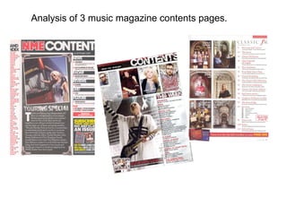
The document analyzes the contents pages of three different music magazines - NME, Kerrang, and Classic FM. For each magazine, key design elements of the contents page are identified and their purpose is discussed. Common elements analyzed across magazines include mastheads, images, color schemes, and subscription advertisements. Design choices are explained as ways to attract readers, visually organize information, promote a magazine's brand and target demographic, and encourage subscriptions which generate revenue.
«AgLora_Ericaceae»
ОПТИМИЗАЦИЯ РЕЖИМА МИНЕРАЛЬНОГО ПИТАНИЯ ВЕРЕСКОВЫХ ПРИ КУЛЬТИВИРОВАНИИ НА ПЛОЩАДЯХ ВЫБЫВШИХ ИЗ ПРОМЫШЛЕННОЙ ЭКСПЛУАТАЦИИ ТОРФЯНЫХ МЕСТОРОЖДЕНИЙ СЕВЕРА БЕЛАРУСИ
Яковлев А.П., Рупасова Ж.А., Панифедова Л.М., Бобров В.А., Титок В.В. , Лиштван И.И.
«AgLora_Ericaceae»
ОПТИМИЗАЦИЯ РЕЖИМА МИНЕРАЛЬНОГО ПИТАНИЯ ВЕРЕСКОВЫХ ПРИ КУЛЬТИВИРОВАНИИ НА ПЛОЩАДЯХ ВЫБЫВШИХ ИЗ ПРОМЫШЛЕННОЙ ЭКСПЛУАТАЦИИ ТОРФЯНЫХ МЕСТОРОЖДЕНИЙ СЕВЕРА БЕЛАРУСИ
Яковлев А.П., Рупасова Ж.А., Панифедова Л.М., Бобров В.А., Титок В.В. , Лиштван И.И.
conceptualisation leads to better clarity while doing research . It provides road map to progress and verify the outcome of research . Research questions , objectives , gaps and hypothesis can be mapped on the conceptual framework . It also helps in operationalisation of the variables.
Research questions are the starting point in any good research . They provide the road map to proceed and identify and focus on the research gaps . The research objectives are actions intended to answer the research questions .
Strategic plan is a road map for pro- growth and pro -active development of any organisation . It provides the ways and means of realising the vision and mission of an organization . It provides the strategies to achieve the goals both long and short term and also the metrics associated with the performance indicators.A good strategic plan is one when all the stakeholders are involved in its preparation rather than made by external consultants . These slide provide the readers step- by -step approach to prepare a strategic plan for any educational institution following the scientific theories involved in doing so .
The author may be referred for clarifications at the email ID given on the title slide.
Essentials of Automations: Optimizing FME Workflows with ParametersSafe Software
Are you looking to streamline your workflows and boost your projects’ efficiency? Do you find yourself searching for ways to add flexibility and control over your FME workflows? If so, you’re in the right place.
Join us for an insightful dive into the world of FME parameters, a critical element in optimizing workflow efficiency. This webinar marks the beginning of our three-part “Essentials of Automation” series. This first webinar is designed to equip you with the knowledge and skills to utilize parameters effectively: enhancing the flexibility, maintainability, and user control of your FME projects.
Here’s what you’ll gain:
- Essentials of FME Parameters: Understand the pivotal role of parameters, including Reader/Writer, Transformer, User, and FME Flow categories. Discover how they are the key to unlocking automation and optimization within your workflows.
- Practical Applications in FME Form: Delve into key user parameter types including choice, connections, and file URLs. Allow users to control how a workflow runs, making your workflows more reusable. Learn to import values and deliver the best user experience for your workflows while enhancing accuracy.
- Optimization Strategies in FME Flow: Explore the creation and strategic deployment of parameters in FME Flow, including the use of deployment and geometry parameters, to maximize workflow efficiency.
- Pro Tips for Success: Gain insights on parameterizing connections and leveraging new features like Conditional Visibility for clarity and simplicity.
We’ll wrap up with a glimpse into future webinars, followed by a Q&A session to address your specific questions surrounding this topic.
Don’t miss this opportunity to elevate your FME expertise and drive your projects to new heights of efficiency.
DevOps and Testing slides at DASA ConnectKari Kakkonen
My and Rik Marselis slides at 30.5.2024 DASA Connect conference. We discuss about what is testing, then what is agile testing and finally what is Testing in DevOps. Finally we had lovely workshop with the participants trying to find out different ways to think about quality and testing in different parts of the DevOps infinity loop.
Elevating Tactical DDD Patterns Through Object CalisthenicsDorra BARTAGUIZ
After immersing yourself in the blue book and its red counterpart, attending DDD-focused conferences, and applying tactical patterns, you're left with a crucial question: How do I ensure my design is effective? Tactical patterns within Domain-Driven Design (DDD) serve as guiding principles for creating clear and manageable domain models. However, achieving success with these patterns requires additional guidance. Interestingly, we've observed that a set of constraints initially designed for training purposes remarkably aligns with effective pattern implementation, offering a more ‘mechanical’ approach. Let's explore together how Object Calisthenics can elevate the design of your tactical DDD patterns, offering concrete help for those venturing into DDD for the first time!
Neuro-symbolic is not enough, we need neuro-*semantic*Frank van Harmelen
Neuro-symbolic (NeSy) AI is on the rise. However, simply machine learning on just any symbolic structure is not sufficient to really harvest the gains of NeSy. These will only be gained when the symbolic structures have an actual semantics. I give an operational definition of semantics as “predictable inference”.
All of this illustrated with link prediction over knowledge graphs, but the argument is general.
Securing your Kubernetes cluster_ a step-by-step guide to success !KatiaHIMEUR1
Today, after several years of existence, an extremely active community and an ultra-dynamic ecosystem, Kubernetes has established itself as the de facto standard in container orchestration. Thanks to a wide range of managed services, it has never been so easy to set up a ready-to-use Kubernetes cluster.
However, this ease of use means that the subject of security in Kubernetes is often left for later, or even neglected. This exposes companies to significant risks.
In this talk, I'll show you step-by-step how to secure your Kubernetes cluster for greater peace of mind and reliability.
Builder.ai Founder Sachin Dev Duggal's Strategic Approach to Create an Innova...Ramesh Iyer
In today's fast-changing business world, Companies that adapt and embrace new ideas often need help to keep up with the competition. However, fostering a culture of innovation takes much work. It takes vision, leadership and willingness to take risks in the right proportion. Sachin Dev Duggal, co-founder of Builder.ai, has perfected the art of this balance, creating a company culture where creativity and growth are nurtured at each stage.
Smart TV Buyer Insights Survey 2024 by 91mobiles.pdf91mobiles
91mobiles recently conducted a Smart TV Buyer Insights Survey in which we asked over 3,000 respondents about the TV they own, aspects they look at on a new TV, and their TV buying preferences.
GraphRAG is All You need? LLM & Knowledge GraphGuy Korland
Guy Korland, CEO and Co-founder of FalkorDB, will review two articles on the integration of language models with knowledge graphs.
1. Unifying Large Language Models and Knowledge Graphs: A Roadmap.
https://arxiv.org/abs/2306.08302
2. Microsoft Research's GraphRAG paper and a review paper on various uses of knowledge graphs:
https://www.microsoft.com/en-us/research/blog/graphrag-unlocking-llm-discovery-on-narrative-private-data/
UiPath Test Automation using UiPath Test Suite series, part 4DianaGray10
Welcome to UiPath Test Automation using UiPath Test Suite series part 4. In this session, we will cover Test Manager overview along with SAP heatmap.
The UiPath Test Manager overview with SAP heatmap webinar offers a concise yet comprehensive exploration of the role of a Test Manager within SAP environments, coupled with the utilization of heatmaps for effective testing strategies.
Participants will gain insights into the responsibilities, challenges, and best practices associated with test management in SAP projects. Additionally, the webinar delves into the significance of heatmaps as a visual aid for identifying testing priorities, areas of risk, and resource allocation within SAP landscapes. Through this session, attendees can expect to enhance their understanding of test management principles while learning practical approaches to optimize testing processes in SAP environments using heatmap visualization techniques
What will you get from this session?
1. Insights into SAP testing best practices
2. Heatmap utilization for testing
3. Optimization of testing processes
4. Demo
Topics covered:
Execution from the test manager
Orchestrator execution result
Defect reporting
SAP heatmap example with demo
Speaker:
Deepak Rai, Automation Practice Lead, Boundaryless Group and UiPath MVP
3. NME masthead same colour code as front: This helps to carry a colour theme. This allows the audience to easily recognise the magazine because of the colours help to indicate the magazine. The main image is: this image is of a women that is featured in magazine. The image ties in with the article and helps add interest to the text. The women seems inviting which allows the reader to feel as if they are actually there. Bands are listed in red with page number in black: Again this ties in with the colour theme, the use of this helps to add colour to the page and also makes the artists stand out, the reader is easily able to pick what they want to read, the use of a different colour for the numbers allows this to be a lot easier. Image is edited so it looks like a photograph. This is appropriate because: It gives a care free attitude which the readers are likely to want to feel, it also helps to add the ‘touring special’ as the picture compliments the text of being on tour, taking photographs for memories. Editors introduction to contents of magazine: This allows the reader to have an insight in what the magazine contains, it can help to promote the magazine to make the reader feel that this is the right magazine to choose. Banner at the top: is eye catching allowing the reader to see what the page is, it further matches the colour theme and helps to add Date: It helps to remind the audience which Is the latest magazine, although because of the small size shows the lack of importance Sub heading blocked out into black subsections: This breaks up the information making it easier to read and also helps to have different sections within the magazine. The bold background is eye catching as this is an important part of the contents page. Previous/feature editions of NME are shown with details of website/phone number ect : This is advertising there subscriptions this takes up a considerable amount of the page and they use bold bright writing to catch the readers eye because this is what makes them money, therefore is an important thing for them. They use words such as ‘just’ which makes the reader feel like they are gaining something too.
5. Date/issue : this tells the reader which is the most up to date issue if the magazine, the issue number allows the makers of the magazine to tell them which sells best, helps with the readers be able to get the correct issue they want. The colour stands out against the black background which makes it easier to see. Masthead: the text size is large, bold and bright when contrasted with the background. This enables the reader to see the tell what the page is and what the magazine entails. The use of the broken effect on the text ‘contents’ give an idea of the type of audience the magazine attracts rebellious e.c.t this is further added to with they music they portray within there magazine. Main image: the main image of this magazine takes up the majority of the room, the designers have used the background of the image and extended it for the whole page background. The image looks like it has been edited which allows the artist to stand out so it’s the first thing your eye notices, this is done because it makes the man the centre of attention further implying he is important. The image is taken looking up at him which makes him appear bigger and better than the reader showing his status within the music industry. Pervious magazines/subscriptions: the designers of the magazine do this as it gives the reader some detail on the other magazines that have been published, the text used is red which follows a colour scheme and by using an outstanding colour allows the reader to see it when contrasted with the background. The use of the colour red shows importance, and they use red font colour for the most important parts of the magazine therefore they use the red to detail the thing that will make them the most money this is the most important element for them. Header: this follows the colour scheme and background this creates a professional look and also helps the text stand out. Contents: the different sections are in bold red writing, the colour theme is carried out throughout this part of the contents page creating an eye catching yet professional look. The sections include what there audience are interested in, and because the contents are easy to see and read it becomes much more easier for the buyer to see what is contained within this further helps to sell the magazine. Personal language: this helps to feel as if the text is being directly aimed at you this gives the magazine a personal feel as the language used within the interview is made to feel as if your friends with the artist, this gives a welcoming feel to the magazine which makes people buy the magazine. Images: the majority of the images are looking at the reader and have used medium close up image shots, this allows the audience to see the emotions on the peoples faces, the expressions shown are stern which helps to show the type of people who read the magazine. Also, there is a variety of different people shown which enables the reader to see that the magazine is open to a wide range of different people.
7. Images: the images used are simplistic which makes helps add the calming and inviting atmosphere they are looking to achieve this is added to because the use of the images are mainly of religious things which in turn helps to show the target audience of the magazine which is older/ religious people. These type of people can be seen within the images portrayed. All the images are the same size and they take up the majority of the page, because they all look similar it helps to create a professional and mature look. Background: this contents page is clear and concise, it is plain and uses mature colours to help add to the atmosphere that is being created by a multitude of features the designers have put in the contents page. Advertisement: this is in red as it follows the colour scheme yet still stands out, the use if the word ‘free’ is in bolder and brighter writing as this is what the readers are interested in. by putting this at the bottom of the page enables the eye to be drawn there but it makes the eye catch everything else that is going on within the contents page too, so it is selling its self as well as the free cd’s on offer. Colour theme: the use of the plain colours helps to paint a calm and welcoming picture surrounding the magazine. The white background suggests religious attitudes which is linked to the images and genre of music, the red helps to catch the reader eye, yet creates a regal look which can be further linked to the target audience and shows passion and love which many classic songs are about. The black text helps to contrasts the two other prominent colours and allows the information to been seen easily. Header: the header uses mature writing which stands out against the background used. The mature look creates a stereotype of the people that are likely to buy the magazine, however it does make help the reader to recognise the magazine from all the other music magazine that can be brought. The date is written under the masthead but is hidden compared to other features of the page. This is because the date isn't really a major point of the magazine so doesn’t require much room. Subscriptions: this is bolder and stand out a it has a border, by doing this the reader is attracted to this point of the page making the reader think about the offer persuading them to spend more money on the magazine. The use of the language also helps to persuade the readers ‘us’ is used as it feels like everyone is being including and the magazine is your friend. Positive words such as ‘save’ are used to manipulate the reader feelings to buy the magazine as hey are getting something out of the deal to. This is the most important part f the magazine as it create the designers money.