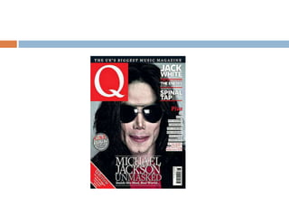
The magazine research document analyzes four magazine covers - Vibe, Q, Clash, and Billboard. For each magazine, it examines the genre, design elements, layout, use of color, and effectiveness. The key points made are:
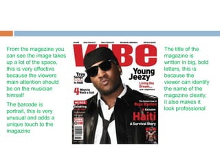
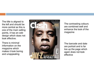
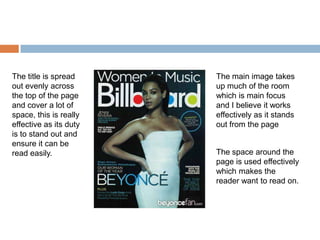
1) The titles take up large space at the top to ensure visibility, and the main images dominate the covers to attract attention.
2) Color choices and layouts vary between plain/boring to highly effective combinations that enhance the look.
3) Placement of elements like subtitles, barcodes, and dates differ - some locations like portrait barcodes add uniqueness while others appear out of place.
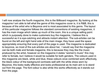
4) Genres are usually identifiable from the featured artists,


![Magazine research really official [recovered]](https://cdn.slidesharecdn.com/ss_thumbnails/magazine-research-really-official-recovered-160211094822-thumbnail.jpg?width=640&height=640&fit=bounds)


![Magazine research really official [recovered]](https://cdn.slidesharecdn.com/ss_thumbnails/magazineresearchreallyofficialrecovered-160222160255-thumbnail.jpg?width=640&height=640&fit=bounds)


