SlideShare a Scribd company logo
Media Studies – Front Cover Analysis

  In this essay I will compare and contrast the front covers of two very different music magazines.
The magazines I will be using are Q and NME.

  Each magazine attracts a specific target audience, for example the target audience for Q magazine
are the older generation such as people in their 30’s and 40’s who are looking for a different mode
of address and a more sophisticated insight and basically just want to know more about the actual
music rather than the style and or background of an artist. However the target audience for NME
Magazine would be of a younger audience of around 16 to early 20’s, I believe this because younger
people tend to be the ones who care more about the latest fashion, gossip and newest bands, they
are also more likely to go to concerts and gigs and would want to read up on the latest news about
the artists/bands.

  Both magazines have their own house styles for instance all Q magazines have the same masthead
to keep consistency throughout and also so the viewer always knows which magazine it is they are
purchasing. This could also be seen as the logo of the magazine as it’s short and easy to remember
and associate with as being the brand name. NME magazine is similar to that of Q as it also has the
same masthead for each magazine released which could also be considered as the logo as it’s short
and memorable. Other house styles which the magazine has would be that the photographs used for
the magazine make direct address with the reader, bold font colours and celebrities names in white
font as they are the main focal point of the magazine.

  The Guttenberg design principle is a suggestion that people are assumed to read the content top
to bottom and left to right. This will then help you to split a page into four quadrants. The primary
optical area which is in the top left the strong fallow area in the top right, the weak fallow area in the
bottom left area and the terminal area in the bottom right. When this is applied to my chosen
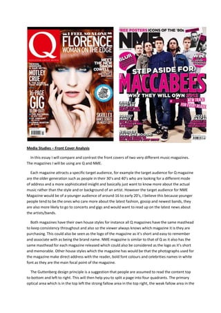
magazines it gives a similar effect for example for the Q magazine my eyes are firstly drawn to the
letter Q which is the masthead for the magazine and it straight away gives me ideas on what the
magazine will be about. My eyes are then straight away moved onto the big image of Florence the
main image of the artist, this is done purposely to as she is the unique selling point of the magazine.
Other stories are then place in the strong and weak fallow areas this is done because these are the
final things which we as the viewer will come across. In NME magazine it’s done in a similar way by
having the masthead in the primary optical area it straight away sells the magazine by giving the
viewer a big clue as to what the magazine will be about before they even look at any images. Also
like Q magazine we are then drawn to look at the main image of a band which is the unique selling
point of this magazine as it’s the main story, the fillers of the magazine are placed within the fallow
areas of the magazine just like on the Q magazine.

  The main images for each of the magazines are completely different. This is because Q magazine is
aimed at a much older audience and doesn’t concentrate on the style of the band or artist so
therefore doesn’t rely on a long shot of them to sell their magazine. For instance the main image for
the Q magazine which I have chosen is of the artist Florence. A close up image as shown, this makes
her look powerful and dominant yet sophisticated which is important as the magazines audience is
looking for sophistication rather than fashion. It also makes her look serious and focused which
would help to sell the magazines to its intended audience as it sells themselves as being confidant
and serious about music which is what older people like to see. However in NME magazine which I
have picked the main image used is a long shot of a band called The Maccabees. The use of the long
shot is important as it shows of their fashion sense which most young people are interested in also
the use of colour is important as its all high-key and bright which makes it stand out and come across
as more fun and less of a serious magazine which is important as the target is for a teenage audience
and also young adults who are stereotypically referred to as care free and outgoing.

More Related Content

What's hot

Analysis Of 3 Music Magazine Covers
Analysis Of 3 Music Magazine CoversAnalysis Of 3 Music Magazine Covers
Analysis Of 3 Music Magazine Covers
ryan lovejoy
 
Music frontcover
Music frontcoverMusic frontcover
Music frontcover
cusakthfc
 
Front cover for NME magazine
Front cover for NME magazineFront cover for NME magazine
Front cover for NME magazine
Kirsty Allen
 

What's hot (20)

Analysis Of 3 Music Magazine Covers
Analysis Of 3 Music Magazine CoversAnalysis Of 3 Music Magazine Covers
Analysis Of 3 Music Magazine Covers
 
Photography planning
Photography planningPhotography planning
Photography planning
 
Masthead analysis
Masthead analysisMasthead analysis
Masthead analysis
 
Music frontcover
Music frontcoverMusic frontcover
Music frontcover
 
Preliminary task and planning and research
Preliminary task and planning and researchPreliminary task and planning and research
Preliminary task and planning and research
 
Front cover for NME magazine
Front cover for NME magazineFront cover for NME magazine
Front cover for NME magazine
 
keerang analysis
keerang analysis keerang analysis
keerang analysis
 
Analysis of results
Analysis of resultsAnalysis of results
Analysis of results
 
Preliminary task and planning & research
Preliminary task and planning & research Preliminary task and planning & research
Preliminary task and planning & research
 
Genre compare
Genre compareGenre compare
Genre compare
 
Kerrang! magazine front cover analysis
Kerrang! magazine front cover analysisKerrang! magazine front cover analysis
Kerrang! magazine front cover analysis
 
music genre magazine analysis
music genre magazine analysismusic genre magazine analysis
music genre magazine analysis
 
Question 5
Question 5Question 5
Question 5
 
Identification of my demographic for my music magazine part 1
Identification of my demographic for my music magazine part 1Identification of my demographic for my music magazine part 1
Identification of my demographic for my music magazine part 1
 
Question 4
Question 4Question 4
Question 4
 
Identification of my demographic for my music magazine
Identification of my demographic for my music magazineIdentification of my demographic for my music magazine
Identification of my demographic for my music magazine
 
Music magazines
Music magazinesMusic magazines
Music magazines
 
Now Magazine Proposal
Now Magazine ProposalNow Magazine Proposal
Now Magazine Proposal
 
Textual analysis 2
Textual analysis 2Textual analysis 2
Textual analysis 2
 
KINGS Audience profile
KINGS Audience profileKINGS Audience profile
KINGS Audience profile
 

Similar to Media studies front cover[1] (20)

Evaluation music magazine
Evaluation music magazineEvaluation music magazine
Evaluation music magazine
 
Music magazine research
Music magazine researchMusic magazine research
Music magazine research
 
Evaluation Presentation
Evaluation PresentationEvaluation Presentation
Evaluation Presentation
 
Evaluation Presentation
Evaluation PresentationEvaluation Presentation
Evaluation Presentation
 
Evaluation Presentation
Evaluation PresentationEvaluation Presentation
Evaluation Presentation
 
Unit 13 LO2
Unit 13 LO2Unit 13 LO2
Unit 13 LO2
 
Proposal M magazine
Proposal M magazineProposal M magazine
Proposal M magazine
 
Foo figthers anal
Foo figthers analFoo figthers anal
Foo figthers anal
 
UNIT 30 LO2
UNIT 30 LO2UNIT 30 LO2
UNIT 30 LO2
 
UNIT 30 LO2
UNIT 30 LO2 UNIT 30 LO2
UNIT 30 LO2
 
Proposal
ProposalProposal
Proposal
 
Analysis of nme magazine
Analysis of nme magazineAnalysis of nme magazine
Analysis of nme magazine
 
Unit 30 - Pitch
Unit 30 - PitchUnit 30 - Pitch
Unit 30 - Pitch
 
Unit 13 - Pitch
Unit 13 - PitchUnit 13 - Pitch
Unit 13 - Pitch
 
Question 5
Question 5Question 5
Question 5
 
Brand guidelines
Brand guidelinesBrand guidelines
Brand guidelines
 
3 research
3 research3 research
3 research
 
Market research1
Market research1Market research1
Market research1
 
Alex Kingham Eval
Alex Kingham EvalAlex Kingham Eval
Alex Kingham Eval
 
Magazine analysis finshed
Magazine analysis finshedMagazine analysis finshed
Magazine analysis finshed
 

More from Jade_Challender

More from Jade_Challender (13)

Media project evaluation
Media project evaluationMedia project evaluation
Media project evaluation
 
Front cover research task
Front cover   research taskFront cover   research task
Front cover research task
 
Image manipulation 1
Image manipulation 1Image manipulation 1
Image manipulation 1
 
Raw images 3
Raw images 3Raw images 3
Raw images 3
 
Raw images 2
Raw images 2Raw images 2
Raw images 2
 
Raw images 1
Raw images 1Raw images 1
Raw images 1
 
Music magazine questionnaire analysis
Music magazine questionnaire analysisMusic magazine questionnaire analysis
Music magazine questionnaire analysis
 
Music magazine questionnaire
Music magazine questionnaireMusic magazine questionnaire
Music magazine questionnaire
 
Double page spread_analysis[1]
Double page spread_analysis[1]Double page spread_analysis[1]
Double page spread_analysis[1]
 
Contents page analysis 1
Contents page analysis 1Contents page analysis 1
Contents page analysis 1
 
Image Analysis
Image AnalysisImage Analysis
Image Analysis
 
Image Magazine Analysis - Media Studies
Image Magazine Analysis - Media StudiesImage Magazine Analysis - Media Studies
Image Magazine Analysis - Media Studies
 
Images for magazine
Images for magazineImages for magazine
Images for magazine
 

Recently uploaded

National-Learning-Camp 2024 deped....pptx
National-Learning-Camp 2024 deped....pptxNational-Learning-Camp 2024 deped....pptx
National-Learning-Camp 2024 deped....pptx
AlecAnidul
 
Research about Venice ppt for grade 6f anas
Research about Venice ppt for grade 6f anasResearch about Venice ppt for grade 6f anas
Research about Venice ppt for grade 6f anas
anasabutalha2013
 
Heuristic Evaluation of System & Application
Heuristic Evaluation of System & ApplicationHeuristic Evaluation of System & Application
Heuristic Evaluation of System & Application
Jaime Brown
 

Recently uploaded (16)

Dos And Dont's Of Logo Design For 2024..
Dos And Dont's Of Logo Design For 2024..Dos And Dont's Of Logo Design For 2024..
Dos And Dont's Of Logo Design For 2024..
 
Claire's designing portfolio presentation
Claire's designing portfolio presentationClaire's designing portfolio presentation
Claire's designing portfolio presentation
 
Common Designing Mistakes and How to avoid them
Common Designing Mistakes and How to avoid themCommon Designing Mistakes and How to avoid them
Common Designing Mistakes and How to avoid them
 
Art Nouveau Movement Presentation for Art History.
Art Nouveau Movement Presentation for Art History.Art Nouveau Movement Presentation for Art History.
Art Nouveau Movement Presentation for Art History.
 
FW25-26 Fashion Key Items Trend Book Peclers Paris
FW25-26 Fashion Key Items Trend Book Peclers ParisFW25-26 Fashion Key Items Trend Book Peclers Paris
FW25-26 Fashion Key Items Trend Book Peclers Paris
 
National-Learning-Camp 2024 deped....pptx
National-Learning-Camp 2024 deped....pptxNational-Learning-Camp 2024 deped....pptx
National-Learning-Camp 2024 deped....pptx
 
Pitch Presentation for Service Design in Technology
Pitch Presentation for Service Design in TechnologyPitch Presentation for Service Design in Technology
Pitch Presentation for Service Design in Technology
 
Extended Reality(XR) Development in immersive design
Extended Reality(XR) Development in immersive designExtended Reality(XR) Development in immersive design
Extended Reality(XR) Development in immersive design
 
The Design Code Google Developer Student Club.pptx
The Design Code Google Developer Student Club.pptxThe Design Code Google Developer Student Club.pptx
The Design Code Google Developer Student Club.pptx
 
CA OFFICE office office office _VIEWS.pdf
CA OFFICE office office office _VIEWS.pdfCA OFFICE office office office _VIEWS.pdf
CA OFFICE office office office _VIEWS.pdf
 
The Evolution of Fashion Trends: History to Fashion
The Evolution of Fashion Trends: History to FashionThe Evolution of Fashion Trends: History to Fashion
The Evolution of Fashion Trends: History to Fashion
 
BIT- Pinal .H. Prajapati Graphic Designer
BIT- Pinal .H. Prajapati  Graphic DesignerBIT- Pinal .H. Prajapati  Graphic Designer
BIT- Pinal .H. Prajapati Graphic Designer
 
Research about Venice ppt for grade 6f anas
Research about Venice ppt for grade 6f anasResearch about Venice ppt for grade 6f anas
Research about Venice ppt for grade 6f anas
 
Spring 2024 wkrm_Enhancing Campus Mobility.pdf
Spring 2024 wkrm_Enhancing Campus Mobility.pdfSpring 2024 wkrm_Enhancing Campus Mobility.pdf
Spring 2024 wkrm_Enhancing Campus Mobility.pdf
 
Design lessons from Singapore | Volume 3
Design lessons from Singapore | Volume 3Design lessons from Singapore | Volume 3
Design lessons from Singapore | Volume 3
 
Heuristic Evaluation of System & Application
Heuristic Evaluation of System & ApplicationHeuristic Evaluation of System & Application
Heuristic Evaluation of System & Application
 

Media studies front cover[1]

  • 1. Media Studies – Front Cover Analysis In this essay I will compare and contrast the front covers of two very different music magazines. The magazines I will be using are Q and NME. Each magazine attracts a specific target audience, for example the target audience for Q magazine are the older generation such as people in their 30’s and 40’s who are looking for a different mode of address and a more sophisticated insight and basically just want to know more about the actual music rather than the style and or background of an artist. However the target audience for NME Magazine would be of a younger audience of around 16 to early 20’s, I believe this because younger people tend to be the ones who care more about the latest fashion, gossip and newest bands, they are also more likely to go to concerts and gigs and would want to read up on the latest news about the artists/bands. Both magazines have their own house styles for instance all Q magazines have the same masthead to keep consistency throughout and also so the viewer always knows which magazine it is they are purchasing. This could also be seen as the logo of the magazine as it’s short and easy to remember and associate with as being the brand name. NME magazine is similar to that of Q as it also has the same masthead for each magazine released which could also be considered as the logo as it’s short and memorable. Other house styles which the magazine has would be that the photographs used for the magazine make direct address with the reader, bold font colours and celebrities names in white font as they are the main focal point of the magazine. The Guttenberg design principle is a suggestion that people are assumed to read the content top to bottom and left to right. This will then help you to split a page into four quadrants. The primary optical area which is in the top left the strong fallow area in the top right, the weak fallow area in the
  • 2. bottom left area and the terminal area in the bottom right. When this is applied to my chosen magazines it gives a similar effect for example for the Q magazine my eyes are firstly drawn to the letter Q which is the masthead for the magazine and it straight away gives me ideas on what the magazine will be about. My eyes are then straight away moved onto the big image of Florence the main image of the artist, this is done purposely to as she is the unique selling point of the magazine. Other stories are then place in the strong and weak fallow areas this is done because these are the final things which we as the viewer will come across. In NME magazine it’s done in a similar way by having the masthead in the primary optical area it straight away sells the magazine by giving the viewer a big clue as to what the magazine will be about before they even look at any images. Also like Q magazine we are then drawn to look at the main image of a band which is the unique selling point of this magazine as it’s the main story, the fillers of the magazine are placed within the fallow areas of the magazine just like on the Q magazine. The main images for each of the magazines are completely different. This is because Q magazine is aimed at a much older audience and doesn’t concentrate on the style of the band or artist so therefore doesn’t rely on a long shot of them to sell their magazine. For instance the main image for the Q magazine which I have chosen is of the artist Florence. A close up image as shown, this makes her look powerful and dominant yet sophisticated which is important as the magazines audience is looking for sophistication rather than fashion. It also makes her look serious and focused which would help to sell the magazines to its intended audience as it sells themselves as being confidant and serious about music which is what older people like to see. However in NME magazine which I have picked the main image used is a long shot of a band called The Maccabees. The use of the long shot is important as it shows of their fashion sense which most young people are interested in also the use of colour is important as its all high-key and bright which makes it stand out and come across as more fun and less of a serious magazine which is important as the target is for a teenage audience and also young adults who are stereotypically referred to as care free and outgoing.