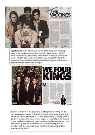
this magazine has a very sharp and straight style
which links to the serious/abruptness of the style of
music which they look into. The initial layout of the
magazine is quite scattered and comes across as
unorganized and that shows it is an indie magazine as it
is not following the general formal trend that other
magazines do. The colour scheme is quite somber but is
very simple as the indie scene is very neutral and not
bright or as loud as pop. This issue appears to have a
more indie rock approach to it as the artists on the
cover are more what you would associate with a rock
magazine through the way they’re dressed and the
unhappy facial expression.
This is another issue of the same magazine. It doesn’t
seem to follow the same layout as the other issue but
does follow the same general colour scheme. This
magazine has a more retro look to it as the colours are a
mixture of dirty whites and bolder text which draws you
attention more than the image on the cover. The mast
head in this magazine has contrasting colours being a
mixture of reds black and white this engages the
consumer more as it stands out more. The sell lines in it
are sentences which don’t make sense on their own for
example “ding dong round 2” seems intriguing which is a
good selling point.
The contents page of this magazine shows
all the main features like the key artists or
key events that they talk about inside the
magazine. This page seems to be quite
abstract and informal as some of these
photos don't look like staged planned
photos. this contents page only shows the
main sections of the magazine so it is only a
small in site into what is in the magazine.
the contents of this magazine is much
more organised than the previous
magazine which could be because this
magazine is aimed for a different age
demographic and so to appeal to these
people they have adopted a different
style and structure. a good feature of
this magazine is that it has subscription
details right at the front so it is easily
found.
this contents page appears to have a
lot of appealing content which means
that readers would be more inclined to
buy this magazine.
a good feature of this double page spread is that there is an intriguing
photo of the band which the writer then talks about. the way that this
article has an introductory sentence which helps to give n in site into the
band. this DPS is taken up mostly of one large image of the band this
means that there is not excessive amounts of writing in the article which
may out off some people from buying it.
this DPS is different to the one above as it has got more writing but this
may be because it is more of an analysis of their music and the band as a
whole and so they have more to say than if they were just writing about a
band's new album. this image is what may be seen as indie as the clothing
is very simple and dark earthy tones, the band members bar one are stood
very seriously. they are also stood in the usual positioning of band
members with the lead singer at the front then the guitarists and the
drummer at the back .

Magazine analysis

  • 1.
    this magazine hasa very sharp and straight style which links to the serious/abruptness of the style of music which they look into. The initial layout of the magazine is quite scattered and comes across as unorganized and that shows it is an indie magazine as it is not following the general formal trend that other magazines do. The colour scheme is quite somber but is very simple as the indie scene is very neutral and not bright or as loud as pop. This issue appears to have a more indie rock approach to it as the artists on the cover are more what you would associate with a rock magazine through the way they’re dressed and the unhappy facial expression. This is another issue of the same magazine. It doesn’t seem to follow the same layout as the other issue but does follow the same general colour scheme. This magazine has a more retro look to it as the colours are a mixture of dirty whites and bolder text which draws you attention more than the image on the cover. The mast head in this magazine has contrasting colours being a mixture of reds black and white this engages the consumer more as it stands out more. The sell lines in it are sentences which don’t make sense on their own for example “ding dong round 2” seems intriguing which is a good selling point.
  • 2.
    The contents pageof this magazine shows all the main features like the key artists or key events that they talk about inside the magazine. This page seems to be quite abstract and informal as some of these photos don't look like staged planned photos. this contents page only shows the main sections of the magazine so it is only a small in site into what is in the magazine. the contents of this magazine is much more organised than the previous magazine which could be because this magazine is aimed for a different age demographic and so to appeal to these people they have adopted a different style and structure. a good feature of this magazine is that it has subscription details right at the front so it is easily found. this contents page appears to have a lot of appealing content which means that readers would be more inclined to buy this magazine.
  • 3.
    a good featureof this double page spread is that there is an intriguing photo of the band which the writer then talks about. the way that this article has an introductory sentence which helps to give n in site into the band. this DPS is taken up mostly of one large image of the band this means that there is not excessive amounts of writing in the article which may out off some people from buying it. this DPS is different to the one above as it has got more writing but this may be because it is more of an analysis of their music and the band as a whole and so they have more to say than if they were just writing about a band's new album. this image is what may be seen as indie as the clothing is very simple and dark earthy tones, the band members bar one are stood very seriously. they are also stood in the usual positioning of band members with the lead singer at the front then the guitarists and the drummer at the back .