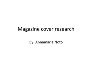
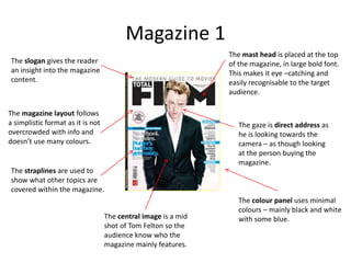
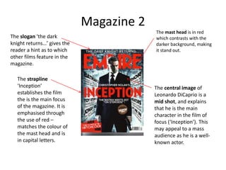
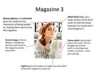
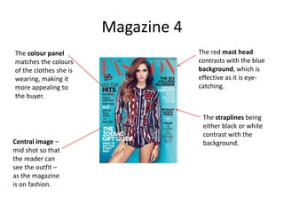
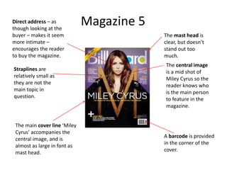
Magazine cover research
By: Annamaria Noto
Magazine 1
The mast head is placed at the top
of the magazine, in large bold font.
This makes it eye –catching and
easily recognisable to the target
audience.
The gaze is direct address as
he is looking towards the
camera – as though looking
at the person buying the
magazine.
The central image is a mid
shot of Tom Felton so the
audience know who the
magazine mainly features.
The slogan gives the reader
an insight into the magazine
content.
The colour panel uses minimal
colours – mainly black and white
with some blue.
The straplines are used to
show what other topics are
covered within the magazine.
The magazine layout follows
a simplistic format as it is not
overcrowded with info and
doesn’t use many colours.
Magazine 2
The mast head is in red
which contrasts with the
darker background, making
it stand out.
The slogan ‘the dark
knight returns…’ gives the
reader a hint as to which
other films feature in the
magazine.
The strapline
‘Inception’
establishes the film
the is the main focus
of the magazine. It is
emphasised through
the use of red –
matches the colour of
the mast head and is
in capital letters.
The central image of
Leonardo DiCaprio is a
mid shot, and explains
that he is the main
character in the film of
focus (‘Inception’). This
may appeal to a mass
audience as he is a well-
known actor.
Magazine 3
Taglines gives the reader an insight into what other
articles the magazine consists of.
Colour pallet: mainly pale
colours are used – for the
background and the
outfit, so the black text
creates a contrast – more
eye-catching.
Central image of Emma
Watson is establishes
that the main article in
the magazine centres
around her.
Direct address and mid shot
gives the audience the
impression of being looked
at, making them want to buy
the magazine.
Mast head takes up a
large section of the front
cover so that the those
buying it can easily see it
and recognise it.
Magazine 4
The red mast head
contrasts with the blue
background, which is
effective as it is eye-
catching.
The straplines being
either black or white
contrast with the
background.
The colour panel
matches the colours
of the clothes she is
wearing, making it
more appealing to
the buyer.
Central image –
mid shot so that
the reader can
see the outfit –
as the magazine
is on fashion.
Magazine 5
A barcode is provided
in the corner of the
cover.
The central image
is a mid shot of
Miley Cyrus so the
reader knows who
is the main person
to feature in the
magazine.
The main cover line ‘Miley
Cyrus’ accompanies the
central image, and is
almost as large in font as
mast head.
Straplines are
relatively small as
they are not the
main topic in
question.
The mast head is
clear, but doesn’t
stand out too
much.
Direct address – as
though looking at the
buyer – makes it seem
more intimate –
encourages the reader
to buy the magazine.

A9 magazine cover research

  • 1.
  • 2.
    Magazine 1 The masthead is placed at the top of the magazine, in large bold font. This makes it eye –catching and easily recognisable to the target audience. The gaze is direct address as he is looking towards the camera – as though looking at the person buying the magazine. The central image is a mid shot of Tom Felton so the audience know who the magazine mainly features. The slogan gives the reader an insight into the magazine content. The colour panel uses minimal colours – mainly black and white with some blue. The straplines are used to show what other topics are covered within the magazine. The magazine layout follows a simplistic format as it is not overcrowded with info and doesn’t use many colours.
  • 3.
    Magazine 2 The masthead is in red which contrasts with the darker background, making it stand out. The slogan ‘the dark knight returns…’ gives the reader a hint as to which other films feature in the magazine. The strapline ‘Inception’ establishes the film the is the main focus of the magazine. It is emphasised through the use of red – matches the colour of the mast head and is in capital letters. The central image of Leonardo DiCaprio is a mid shot, and explains that he is the main character in the film of focus (‘Inception’). This may appeal to a mass audience as he is a well- known actor.
  • 4.
    Magazine 3 Taglines givesthe reader an insight into what other articles the magazine consists of. Colour pallet: mainly pale colours are used – for the background and the outfit, so the black text creates a contrast – more eye-catching. Central image of Emma Watson is establishes that the main article in the magazine centres around her. Direct address and mid shot gives the audience the impression of being looked at, making them want to buy the magazine. Mast head takes up a large section of the front cover so that the those buying it can easily see it and recognise it.
  • 5.
    Magazine 4 The redmast head contrasts with the blue background, which is effective as it is eye- catching. The straplines being either black or white contrast with the background. The colour panel matches the colours of the clothes she is wearing, making it more appealing to the buyer. Central image – mid shot so that the reader can see the outfit – as the magazine is on fashion.
  • 6.
    Magazine 5 A barcodeis provided in the corner of the cover. The central image is a mid shot of Miley Cyrus so the reader knows who is the main person to feature in the magazine. The main cover line ‘Miley Cyrus’ accompanies the central image, and is almost as large in font as mast head. Straplines are relatively small as they are not the main topic in question. The mast head is clear, but doesn’t stand out too much. Direct address – as though looking at the buyer – makes it seem more intimate – encourages the reader to buy the magazine.