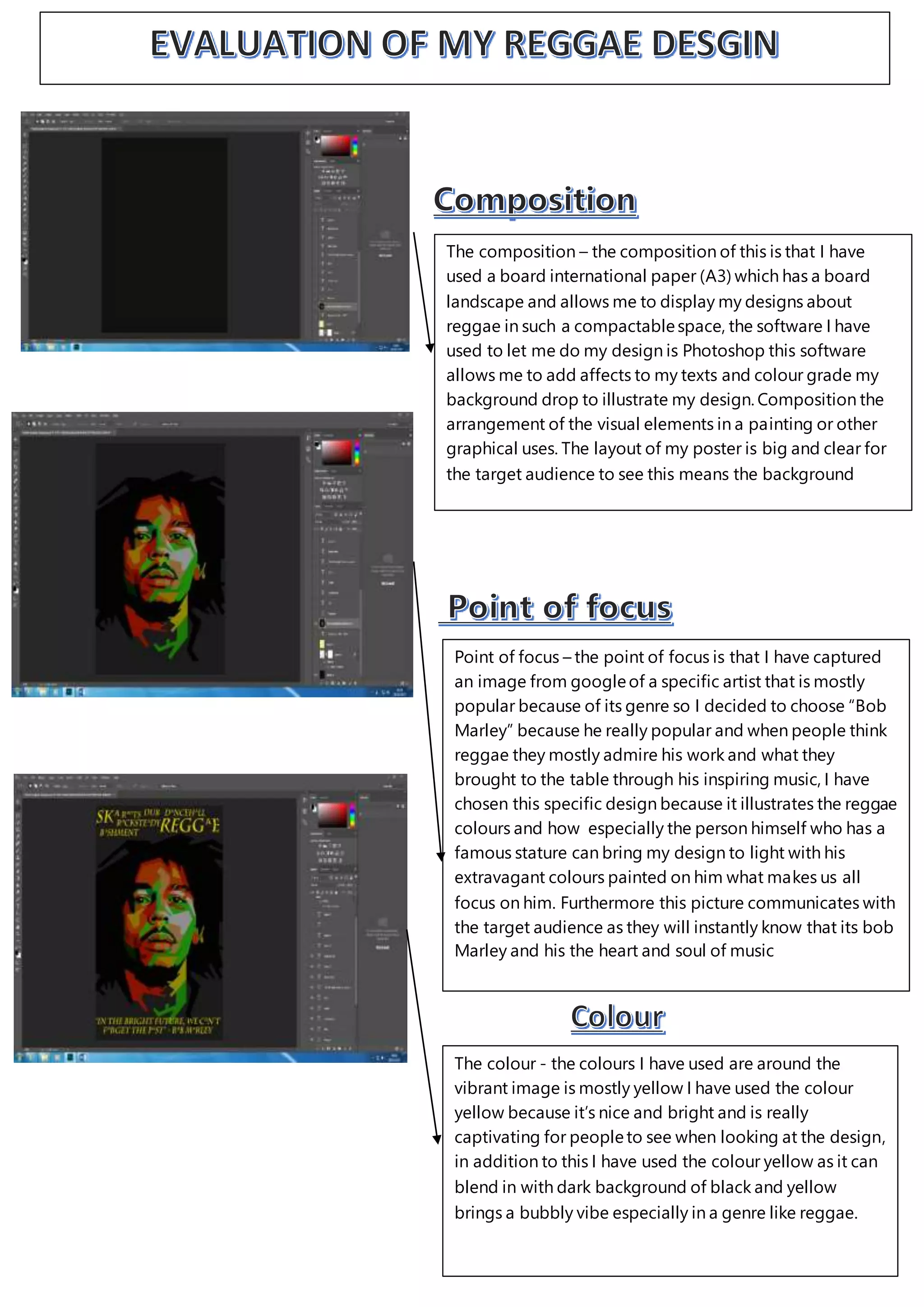
The composition – the composition of this is that I have
used a board international paper (A3) which has a board
landscape and allows me to display my designs about
reggae in such a compactablespace, the software I have
used to let me do my design is Photoshop this software
allows me to add affects to my texts and colour grade my
background drop to illustrate my design. Composition the
arrangement of the visual elements in a painting or other
graphical uses. The layout of my poster is big and clear for
the target audience to see this means the background
Point of focus – the point of focus is that I have captured
an image from googleof a specific artist that is mostly
popular because of its genre so I decided to choose “Bob
Marley” because he really popular and when people think
reggae they mostly admire his work and what they
brought to the table through his inspiring music, I have
chosen this specific design because it illustrates the reggae
colours and how especially the person himself who has a
famous stature can bring my design to light with his
extravagant colours painted on him what makes us all
focus on him. Furthermore this picture communicates with
the target audience as they will instantly know that its bob
Marley and his the heart and soul of music
The colour - the colours I have used are around the
vibrant image is mostly yellow I have used the colour
yellow because it’s nice and bright and is really
captivating for peopleto see when looking at the design,
in addition to this I have used the colour yellow as it can
blend in with dark background of black and yellow
brings a bubbly vibe especially in a genre like reggae.
Task 3B evaluation of final desgin

Task 3B evaluation of final desgin

  • 1.
    The composition –the composition of this is that I have used a board international paper (A3) which has a board landscape and allows me to display my designs about reggae in such a compactablespace, the software I have used to let me do my design is Photoshop this software allows me to add affects to my texts and colour grade my background drop to illustrate my design. Composition the arrangement of the visual elements in a painting or other graphical uses. The layout of my poster is big and clear for the target audience to see this means the background Point of focus – the point of focus is that I have captured an image from googleof a specific artist that is mostly popular because of its genre so I decided to choose “Bob Marley” because he really popular and when people think reggae they mostly admire his work and what they brought to the table through his inspiring music, I have chosen this specific design because it illustrates the reggae colours and how especially the person himself who has a famous stature can bring my design to light with his extravagant colours painted on him what makes us all focus on him. Furthermore this picture communicates with the target audience as they will instantly know that its bob Marley and his the heart and soul of music The colour - the colours I have used are around the vibrant image is mostly yellow I have used the colour yellow because it’s nice and bright and is really captivating for peopleto see when looking at the design, in addition to this I have used the colour yellow as it can blend in with dark background of black and yellow brings a bubbly vibe especially in a genre like reggae.