1. The document describes the process of evaluating and revising a poster design for a reggae music theme.
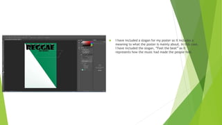
2. In the initial draft, the designer chose a simple color scheme and included a title, slogan, images of instruments and a lion. However, feedback indicated the poster was too bland.
3. For the revised draft, the designer changed the background color to resemble the Cameroon flag, blended the lion image into the background, changed the text style, and added additional images to make the poster less plain. The final product incorporated these revisions to better represent the reggae theme.