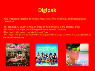
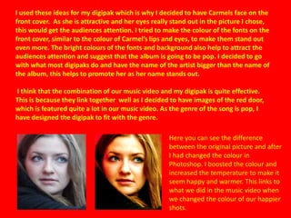
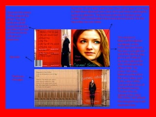
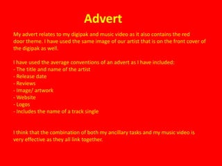
2. How effective is the
 combination of your main
product and ancillary tasks?
Digipak
I have produced a digipak to go with our music video. After researching other pop digipaks I
noticed that :

- The pop digipaks usually contain an image on the front cover of the attractive artist.
- The name of the singer is usually bigger than the name of the album.
- They have bright colours to make it eye catching.
- The images and colours on the front of the digipak reflect the genre of the music, bright colours
are associated with pop.
I used these ideas for my digipak which is why I decided to have Carmels face on the
front cover. As she is attractive and her eyes really stand out in the picture I chose,
this would get the audiences attention. I tried to make the colour of the fonts on the
front cover, similar to the colour of Carmel’s lips and eyes, to make them stand out
even more. The bright colours of the fonts and background also help to attract the
audiences attention and suggest that the album is going to be pop. I decided to go
with what most digipaks do and have the name of the artist bigger than the name of
the album, this helps to promote her as her name stands out.

I think that the combination of our music video and my digipak is quite effective.
This is because they link together well as I decided to have images of the red door,
which is featured quite a lot in our music video. As the genre of the song is pop, I
have designed the digipak to fit with the genre.

                                                    Here you can see the difference
                                                    between the original picture and after
                                                    I had changed the colour in
                                                    Photoshop. I boosted the colour and
                                                    increased the temperature to make it
                                                    seem happy and warmer. This links to
                                                    what we did in the music video when
                                                    we changed the colour of our happier
                                                    shots.
The colour red reflects
the pop genre as it can
represent love.
Advert
My advert relates to my digipak and music video as it also contains the red
door theme. I have used the same image of our artist that is on the front cover of
the digipak as well.

I have used the average conventions of an advert as I have included:
- The title and name of the artist
- Release date
- Reviews
- Image/ artwork
- Website
- Logos
- Includes the name of a track single


I think that the combination of both my ancillary tasks and my music video is
very effective as they all link together.

Question 2

  • 1.
    2. How effectiveis the combination of your main product and ancillary tasks?
  • 2.
    Digipak I have produceda digipak to go with our music video. After researching other pop digipaks I noticed that : - The pop digipaks usually contain an image on the front cover of the attractive artist. - The name of the singer is usually bigger than the name of the album. - They have bright colours to make it eye catching. - The images and colours on the front of the digipak reflect the genre of the music, bright colours are associated with pop.
  • 3.
    I used theseideas for my digipak which is why I decided to have Carmels face on the front cover. As she is attractive and her eyes really stand out in the picture I chose, this would get the audiences attention. I tried to make the colour of the fonts on the front cover, similar to the colour of Carmel’s lips and eyes, to make them stand out even more. The bright colours of the fonts and background also help to attract the audiences attention and suggest that the album is going to be pop. I decided to go with what most digipaks do and have the name of the artist bigger than the name of the album, this helps to promote her as her name stands out. I think that the combination of our music video and my digipak is quite effective. This is because they link together well as I decided to have images of the red door, which is featured quite a lot in our music video. As the genre of the song is pop, I have designed the digipak to fit with the genre. Here you can see the difference between the original picture and after I had changed the colour in Photoshop. I boosted the colour and increased the temperature to make it seem happy and warmer. This links to what we did in the music video when we changed the colour of our happier shots.
  • 4.
    The colour redreflects the pop genre as it can represent love.
  • 5.
    Advert My advert relatesto my digipak and music video as it also contains the red door theme. I have used the same image of our artist that is on the front cover of the digipak as well. I have used the average conventions of an advert as I have included: - The title and name of the artist - Release date - Reviews - Image/ artwork - Website - Logos - Includes the name of a track single I think that the combination of both my ancillary tasks and my music video is very effective as they all link together.