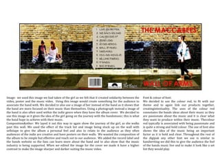
The document discusses the creative decisions behind the album cover design for an indie band. It was decided to use an image of a girl rather than the band to show their focus is on the music. The image depicts the girl on a journey to represent the experience of listening to the band's music. The layout places the image and tracklist on a wall to give it a personal feel that will appeal to indie audiences. Red was selected as the dominant color to link all the band's materials and convey their passion for music. The font choices are bold to emphasize the importance of the music and resemble handwriting to evoke the live music experience.