This is the front cover of the Digipack.
This picture was taken in Abney park
and we thought would be best for our
front cover.
As we are making
a video for an
indie pop song
we thought that
it would look
good if we add a
purple filter. This
makes it look
glamorous and
picturesque.
When using photoshop we thought that the
colours should be dark but appealing. We made
the green trees darker as this goes well with the
purple.
The mid shot of Anisha
here allows the audience
to see her clothes. When
dong our research we
found that most artist
use mid shots for their
album covers to show
their trendy clothes. Our
female actress is wearing
a checkered shirt with a
necklace, conforming to
this trend.
We decided the font
should be white. The
artists name in bold with
italic font making it look
feminine. The song name
should be clear and of a
small font that is not as
bold. This is because the
artists name should be the
first thing you look at
This is the inside
cover of the
digipack. We
added a purple
filter to it again as
it goes well with
our genre.
The heart is
symbolic of all
indie pop songs
the song is about
love. we used a
focus shot of our
hands allowing the
audience to
forcefully focus on
our hands. This is
something typical
of an indie pop
album
The fact that
we took this
picture with
the sun being
inside the
heart and
reflecting in
the water
makes the
whole image
look more
picturesque.
The female actress is also wearing a
ring which allows the audience to
distinguish between the females hand
and males hand
This image is
would be placed
on our CD and
just like all the
other images we
added a purple
filter and
creating our own
theme.
The branches
make the image
look sinister and
stands out from
the sky.The gothic
looking
buildings
make the
image look
mysterious
and eerie.
The suns reflection on the sea makes ties
the whole image together by
complimenting the cloudy sky and
building.
This is the back
of the cover. We
used a different
image that we
captured in
Abney Park. We
thought it is vital
to use similar
shots as it would
all link.
We created our
own logo
‘Indigo’ on
photoshop.
This font was
chosen as it
fitted with with
our genre.
We used a
darker shade of
green with the
paint tool on
photoshop as
we thought
this shade of
green really
compliments
the purple.
At the bottom we
used a blue/
purple filter to
make it look more
prominent. We
thought it will
contrast well with
the lighter shade
of purple.
As Anisha was positioned on the right side, we knew all the
soundtracks from the album would have to be on the left
side. We kept the font plain and simple as we didn’t want the
font to take away attention from the image.
Digipack final

Digipack final

  • 3.
    This is thefront cover of the Digipack. This picture was taken in Abney park and we thought would be best for our front cover. As we are making a video for an indie pop song we thought that it would look good if we add a purple filter. This makes it look glamorous and picturesque. When using photoshop we thought that the colours should be dark but appealing. We made the green trees darker as this goes well with the purple. The mid shot of Anisha here allows the audience to see her clothes. When dong our research we found that most artist use mid shots for their album covers to show their trendy clothes. Our female actress is wearing a checkered shirt with a necklace, conforming to this trend. We decided the font should be white. The artists name in bold with italic font making it look feminine. The song name should be clear and of a small font that is not as bold. This is because the artists name should be the first thing you look at
  • 4.
    This is theinside cover of the digipack. We added a purple filter to it again as it goes well with our genre. The heart is symbolic of all indie pop songs the song is about love. we used a focus shot of our hands allowing the audience to forcefully focus on our hands. This is something typical of an indie pop album The fact that we took this picture with the sun being inside the heart and reflecting in the water makes the whole image look more picturesque. The female actress is also wearing a ring which allows the audience to distinguish between the females hand and males hand
  • 5.
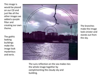
    This image is wouldbe placed on our CD and just like all the other images we added a purple filter and creating our own theme. The branches make the image look sinister and stands out from the sky.The gothic looking buildings make the image look mysterious and eerie. The suns reflection on the sea makes ties the whole image together by complimenting the cloudy sky and building.
  • 6.
    This is theback of the cover. We used a different image that we captured in Abney Park. We thought it is vital to use similar shots as it would all link. We created our own logo ‘Indigo’ on photoshop. This font was chosen as it fitted with with our genre. We used a darker shade of green with the paint tool on photoshop as we thought this shade of green really compliments the purple. At the bottom we used a blue/ purple filter to make it look more prominent. We thought it will contrast well with the lighter shade of purple. As Anisha was positioned on the right side, we knew all the soundtracks from the album would have to be on the left side. We kept the font plain and simple as we didn’t want the font to take away attention from the image.