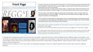
Website evaluation
Gaetan Lundula
I have put my banner across the top part of the website so it is the first thing the audience will see when they
go on the website. Furthermore this is a primary image as I made it myself. I have put the poster that I have
made myself in the centre of the website.
The reason for this was to include another primary image as I made this poster myself and to indicate to the
audience that this website is based on reggae. This can be seen with the colours that are used in my poster.
The main colours associated with reggae are yellow, green and red which is used in my poster which will
attract the audience in, if they like reggae. The poster also mentions different types of reggae styles which
will give the audience a brief background.
I have used the text boxes beside the image because I know its something people are going to be attracted
to as I already have a brief background of the different types of styles within reggae music, therefore adding
two different text box with more information about the genre.
I have include a cartoon image of bob Marley in the same space as my banner to indicate to the audience that
this website is about reggae.
The reason why I had chosen bob Marley was because he was very big reggae artist is well known in reggae.
This image supports what's being said in the banner. I have included other people art work on the left and right
side of my website in order to get rid of the extra space that was left without the art work being there. This is
another way to draw the audience attention in.
I included a bar of hyperlinks for when the consumer visit my website underneath my banner. There are different tabs for different pages on my website , all of
these tabs are hyperlinked therefore creating easy navigation for the audience to use the website. I have chosen the colour blue because I don’t want to have the
same modern contrast of the primary colours green yellow and red and this simply makes my design different I made my banner white in order to make the
colours contrast and stand out.
My banners font is looks as if it is 3d in the content of it looking like its going to come out its original shape this will be another way to draw the audiences
attention.
Front Page
Gallery
I have included a variety of images to interest the audience. The
images that I have chosen are vibrant and colourful which
makes this page eye catching.
The images that I have chosen all relate to reggae, this creates a
clear image for the target audience as they will be able to
understand what the company offers. These are a few examples
of posters that they would be able to create. This can give them
an insight into what the finished product will look like.
I have also chosen these images because the audience can also
draw inspiration from them, if they are looking to create their
own design. They can see the types of colours and pictures that
are used.
The audience is also able to select their chosen picture and
enlarge it, which allows them to see the image more clearly and
see all the details and text.
I have made the background black, in comparison to the colour of the
main page which is white. This creates a contrast, and in turn the
images that I have chosen stand out, and are more pleasing to the eye
to look at. If I chose a different colour for example, blue, the contrast
will be too high and unappealing to the audience which would distract
them from looking at the images.
Blogger
In this section of my website the audience are able to look at previous
designs. Which will give them an insight into what the finished products
will look like. The audience can also see a tutorial of how to create a
poster, which will allow them to be able to do it themselves as well as
seeing others do the designing.
The audience will also be able to find out how to promote their designs
and posters online. Either through e-books, e-magazines or other online
activities.
The audience is able to scroll down the page to see all the required
information. If they like the information that is provided on the blogger.
They are able to either ‘like’ or ‘tweet’ a certain section, they will then be
able to share the information with their friends. This could possibly
increase the websites activity, increasing the audience.
Form
The background contrast is white and I have not used the main primary colours of green
red and yellow I have done this because I want to keep my design nice and simple
This is my last page I have include details and information because I want the consumer to
be informed if they are interested in what to do within the reggae design I have left
information on where they could find us and how they can sign up. This will give a way for
the audience to interact with us.
I have included a map which is interactive for the target audience who will be using the
website. So the office will be easy to find as they will be able to use the features of google
maps to find the exact location. If they require any more information, or if they would like to
create their own design they are able to use the enquiry form which will allow them to send
a message to the company. They can enter their details such as name, email , subject and
their message. This information will then allow the company to contact them in regards to
their message.

Website evaluation

  • 1.
  • 2.
    I have putmy banner across the top part of the website so it is the first thing the audience will see when they go on the website. Furthermore this is a primary image as I made it myself. I have put the poster that I have made myself in the centre of the website. The reason for this was to include another primary image as I made this poster myself and to indicate to the audience that this website is based on reggae. This can be seen with the colours that are used in my poster. The main colours associated with reggae are yellow, green and red which is used in my poster which will attract the audience in, if they like reggae. The poster also mentions different types of reggae styles which will give the audience a brief background. I have used the text boxes beside the image because I know its something people are going to be attracted to as I already have a brief background of the different types of styles within reggae music, therefore adding two different text box with more information about the genre. I have include a cartoon image of bob Marley in the same space as my banner to indicate to the audience that this website is about reggae. The reason why I had chosen bob Marley was because he was very big reggae artist is well known in reggae. This image supports what's being said in the banner. I have included other people art work on the left and right side of my website in order to get rid of the extra space that was left without the art work being there. This is another way to draw the audience attention in. I included a bar of hyperlinks for when the consumer visit my website underneath my banner. There are different tabs for different pages on my website , all of these tabs are hyperlinked therefore creating easy navigation for the audience to use the website. I have chosen the colour blue because I don’t want to have the same modern contrast of the primary colours green yellow and red and this simply makes my design different I made my banner white in order to make the colours contrast and stand out. My banners font is looks as if it is 3d in the content of it looking like its going to come out its original shape this will be another way to draw the audiences attention. Front Page
  • 3.
    Gallery I have includeda variety of images to interest the audience. The images that I have chosen are vibrant and colourful which makes this page eye catching. The images that I have chosen all relate to reggae, this creates a clear image for the target audience as they will be able to understand what the company offers. These are a few examples of posters that they would be able to create. This can give them an insight into what the finished product will look like. I have also chosen these images because the audience can also draw inspiration from them, if they are looking to create their own design. They can see the types of colours and pictures that are used. The audience is also able to select their chosen picture and enlarge it, which allows them to see the image more clearly and see all the details and text. I have made the background black, in comparison to the colour of the main page which is white. This creates a contrast, and in turn the images that I have chosen stand out, and are more pleasing to the eye to look at. If I chose a different colour for example, blue, the contrast will be too high and unappealing to the audience which would distract them from looking at the images.
  • 4.
    Blogger In this sectionof my website the audience are able to look at previous designs. Which will give them an insight into what the finished products will look like. The audience can also see a tutorial of how to create a poster, which will allow them to be able to do it themselves as well as seeing others do the designing. The audience will also be able to find out how to promote their designs and posters online. Either through e-books, e-magazines or other online activities. The audience is able to scroll down the page to see all the required information. If they like the information that is provided on the blogger. They are able to either ‘like’ or ‘tweet’ a certain section, they will then be able to share the information with their friends. This could possibly increase the websites activity, increasing the audience.
  • 5.
    Form The background contrastis white and I have not used the main primary colours of green red and yellow I have done this because I want to keep my design nice and simple This is my last page I have include details and information because I want the consumer to be informed if they are interested in what to do within the reggae design I have left information on where they could find us and how they can sign up. This will give a way for the audience to interact with us. I have included a map which is interactive for the target audience who will be using the website. So the office will be easy to find as they will be able to use the features of google maps to find the exact location. If they require any more information, or if they would like to create their own design they are able to use the enquiry form which will allow them to send a message to the company. They can enter their details such as name, email , subject and their message. This information will then allow the company to contact them in regards to their message.