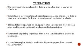
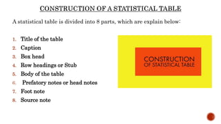
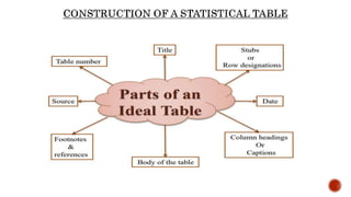
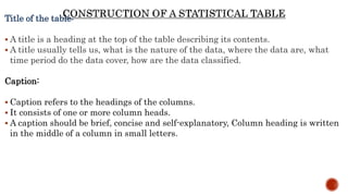
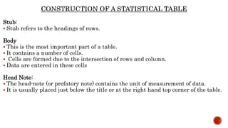
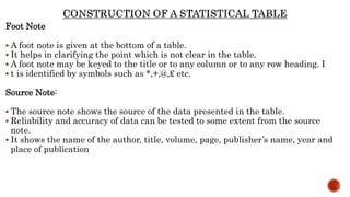
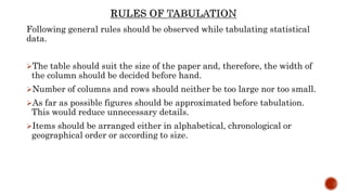
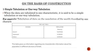
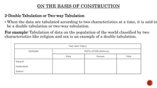
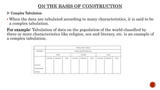
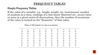
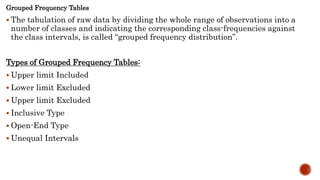
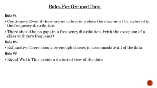
Topic
“Tabulation Of Data”
The classification of data leads to the problem of presentation of data.
Presentation of data refers to an exhibition or putting up data in an
attractive and useful manner such that it can be easily interpreted.
The three main forms of presentation of data are:
1. Textual presentation
2. Diagrammatic presentation
3. Tabular Presentation
 The process of placing classified data into tabular form is known as
tabulation.
 Tabulation is a systematic and logical representation of numeric data in
rows and columns to facilitate comparison and statistical analysis.
 It facilitates comparison by bringing related information close to each
other and helps in statistical analysis and interpretation
 the method of placing organized data into a tabular form is known as
tabulation.
 It may be complex, double, or simple, depending upon the nature of
categorization.
To make complex data simple:
 When data are arranged systematically in a table, such data become
more meaningful and can be easily understood.
To facilitate comparison
 When different data sets are presented in tables it becomes possible to
compare them.
To economize space:
 A statistical table furnishes maximum information relating to the study
in minimum space.
To facilitate statistical analysis
 Tables serve as the best source of organized data for statistical analysis.
 The task of computing average, dispersion, correlation, etc., becomes
easier if data is presented in the form of a table.
To bring out essential features of data
 It brings out the chief/main characteristics of data.
 It presents facts clearly and precisely without textual explanation.
A statistical table is divided into 8 parts, which are explain below:
1. Title of the table
2. Caption
3. Box head
4. Row headings or Stub
5. Body of the table
6. Prefatory notes or head notes
7. Foot note
8. Source note
Title of the table:
 A title is a heading at the top of the table describing its contents.
 A title usually tells us, what is the nature of the data, where the data are, what
time period do the data cover, how are the data classified.
Caption:
 Caption refers to the headings of the columns.
 It consists of one or more column heads.
 A caption should be brief, concise and self-explanatory, Column heading is written
in the middle of a column in small letters.
Stub:
 Stub refers to the headings of rows.
Body
 This is the most important part of a table.
 It contains a number of cells.
 Cells are formed due to the intersection of rows and column.
 Data are entered in these cells
Head Note:
 The head-note (or prefatory note) contains the unit of measurement of data.
 It is usually placed just below the title or at the right hand top corner of the table.
Foot Note
 A foot note is given at the bottom of a table.
 It helps in clarifying the point which is not clear in the table.
 A foot note may be keyed to the title or to any column or to any row heading. I
 t is identified by symbols such as *,+,@,£ etc.
Source Note:
 The source note shows the source of the data presented in the table.
 Reliability and accuracy of data can be tested to some extent from the source
note.
 It shows the name of the author, title, volume, page, publisher’s name, year and
place of publication
Following general rules should be observed while tabulating statistical
data.
The table should suit the size of the paper and, therefore, the width of
the column should be decided before hand.
Number of columns and rows should neither be too large nor too small.
As far as possible figures should be approximated before tabulation.
This would reduce unnecessary details.
Items should be arranged either in alphabetical, chronological or
geographical order or according to size.
 The sub-total and total of the items of the table must be written.
 Percentages are given in the tables if necessary.
 Ditto marks should not be used in a table because sometimes it create
confusion. Table should be simple and attractive.
 A table should be logical, well-balanced in length and breadth and the
comparable columns should be placed side by side.
 Light/heavy/thick or double rulings may be used to distinguish sub
columns, main columns and totals.
There are three basis of classifying tables.
I. Purpose of a table
II. Originality of a table
III. Construction of a table.
General Purpose Table:
 General purpose table is that table which is of general use. It is does
not serve any specific purpose or specific problem under consideration.
Special Purpose Table:
 Special Purpose table is that table which is prepared with some specific
purpose in mind
Original Table:
 An original table is that in which data are presented in the same form
and manner in which they are collected.
Derived Table:
 A derived table is that in which data are not presented in the form or
manner in which these are collected.
 Instead the data are first converted into ratios or percentage and then
presented.
1-Simple Tabulation or One-way Tabulation
 When the data are tabulated to one characteristic, it is said to be a simple
tabulation or one-way tabulation.
For example: Tabulation of data on the population of the world classified by one
characteristic like religion is an example of a simple tabulation.
2-Double Tabulation or Two-way Tabulation
 When the data are tabulated according to two characteristics at a time, it is said to
be a double tabulation or two-way tabulation.
For example: Tabulation of data on the population of the world classified by two
characteristics like religion and sex is an example of a double tabulation.
3- Complex Tabulation
 When the data are tabulated according to many characteristics, it is said to be
a complex tabulation.
For example: Tabulation of data on the population of the world classified by
three or more characteristics like religion, sex and literacy, etc. is an example of
a complex tabulation.
 Tabulation makes complex data simple and as a result of this, it becomes easy
to understand the data.
 This form of the presentation of data is helpful in finding mistakes.
 Tabulation is useful in condensing the collected data.
 Tabulation makes it easy to analyze the data from tables.
 Tabulation is a very cheap mode to present the data. It saves time as well as
space.
 Tabulation is a device to summaries the large scattered data. So, the maximum
information may be collected from these tables.
 Under tabulation, data is divided into various parts and for each part there are
totals and sub totals. Therefore, relationship between different parts can be
easily known.
 Since data are arranged in a table with a title and a number so these can be
easily identified and used for the required purpose
 Tabulation makes the data brief. Therefore, it can be easily presented in the
form of graphs.
 Tabulation presents the numerical figures in an attractive form.
Ease of representation:
 A large amount of data can be easily confined in a data table. Evidently, it is the
simplest form of data presentation.
Ease of analysis:
 Data tables are frequently used for statistical analysis like calculation of central
tendency, dispersion etc.
Helps in comparison:
 In a data table, the rows and columns which are required to be compared can be
placed next to each other.
Economical:
 Construction of a data table is fairly easy and presents the data in a manner
which is really easy on the eyes of a reader.
 Tables contain only numerical data.
 They do not contain details.
 Qualitative expression is not possible through tables.
 Tables can be used by experts only to draw conclusions.
 Common men do not understand them properly.
Simple Frequency Tables
If the value of a variable, e.g., height, weight, etc. (continuous), number
of students in a class, readings of a taxi-meter (discrete) etc., occurs twice
or more in a given series of observations, then the number of occurrence
of the value is termed as the “frequency” of that value.
Grouped Frequency Tables
 The tabulation of raw data by dividing the whole range of observations into a
number of classes and indicating the corresponding class-frequencies against
the class intervals, is called “grouped frequency distribution”.
Types of Grouped Frequency Tables:
 Upper limit Included
 Lower limit Excluded
 Upper limit Excluded
 Inclusive Type
 Open-End Type
 Unequal Intervals
Guidelines for classes
• There should be between 5 and 20 classes.
• The class width should be an odd number. This will guarantee that the class
midpoints are integers instead of decimals.
• The classes must be mutually exclusive. The classes must be all inclusive or
exhaustive. The classes must be continuous.
• There are no gaps in a frequency distribution.
• Classes that have no values in them must be included (unless it's the first or
last class which are dropped).
• The classes must be equal in width. The exception here is the first or last
class. It is possible to have an "below ..." or "... and above" class. This is often
used with ages.
Rules For Grouped Data
Rule #1:
 Choose the classes You will normally be told how many classes you need
Rule #2:
 Choose Class Width always round up to the next whole number
Rule #3:
Mutually Exclusive
 This means the class limits cannot overlap or be contained in more than one
class
Rule #4:
 Continuous Even if there are no values in a class the class must be included in
the frequency distribution.
 There should be no gaps in a frequency distribution. (with the exception of a
class with zero frequency)
Rule #5:
 Exhaustive There should be enough classes to accommodate all of the data
Rule #6:
 Equal Width This avoids a distorted view of the data
Rules For Grouped Data
Cumulative Frequency Tables
The cumulative frequency table of a set of data is a table which indicates the
sum of the frequencies of the data up to a required level.
It can be used to determine the number of items that have values below a
particular level.
An ogive is a curve drawn for the cumulative frequency distribution by
joining with straight lines the dots marked above the upper boundaries of
classes at heights equal to the cumulative frequencies of respective classes.
Shape
• A graph shows the shape of the distribution.
• A distribution is symmetrical if the left side of the graph is (roughly) a
mirror image of the right side.
• One example of a symmetrical distribution is the bell-shaped normal
distribution.
• On the other hand, distributions are skewed when scores pile up on one side
of the distribution, leaving a "tail" of a few extreme values on the other side.
 Cross-tabs or cross tabulation is a quantitative research method
appropriate for analyzing the relationship between two or more
variables.
 Data about variables is recorded in a table or matrix. A sample is used
to gather information about the variable.
 Cross Tabulation gives you the ability to compare two questions to each
other and evaluate relationships between the responses of those
questions.
 Cross tabulation is particularly useful when you want to assess
whether there is a relationship between how your entire respondent
base, or a specific subset of respondents, answered two questions.
Make sure that all the categories of the variables presented in the
tables have been specified and that they are mutually exclusive (i.e. no
overlaps and no gaps) and exhaustive.
When making cross-tabulations, check that the column and row counts
correspond to the frequency counts for each variable.
Check that the grand total in the table corresponds to the number of
subjects in the sample. If not, an explanation is required. This could be
presented as a footnote. (Missing data, for example.)
Think of a clear title for each table. Also be sure that the headings of
rows and columns leave no room for misinterpretation.
Number your tables and keep them together with the objectives to
which they are related. This will assist in organizing your report and
ensure that work is not duplicated.
Thank You

Tabulation of data-Development of Research Instrument/ Tool and Analysis

  • 1.
  • 2.
    The classification ofdata leads to the problem of presentation of data. Presentation of data refers to an exhibition or putting up data in an attractive and useful manner such that it can be easily interpreted. The three main forms of presentation of data are: 1. Textual presentation 2. Diagrammatic presentation 3. Tabular Presentation
  • 3.
     The processof placing classified data into tabular form is known as tabulation.  Tabulation is a systematic and logical representation of numeric data in rows and columns to facilitate comparison and statistical analysis.  It facilitates comparison by bringing related information close to each other and helps in statistical analysis and interpretation  the method of placing organized data into a tabular form is known as tabulation.  It may be complex, double, or simple, depending upon the nature of categorization.
  • 4.
    To make complexdata simple:  When data are arranged systematically in a table, such data become more meaningful and can be easily understood. To facilitate comparison  When different data sets are presented in tables it becomes possible to compare them. To economize space:  A statistical table furnishes maximum information relating to the study in minimum space.
  • 5.
    To facilitate statisticalanalysis  Tables serve as the best source of organized data for statistical analysis.  The task of computing average, dispersion, correlation, etc., becomes easier if data is presented in the form of a table. To bring out essential features of data  It brings out the chief/main characteristics of data.  It presents facts clearly and precisely without textual explanation.
  • 6.
    A statistical tableis divided into 8 parts, which are explain below: 1. Title of the table 2. Caption 3. Box head 4. Row headings or Stub 5. Body of the table 6. Prefatory notes or head notes 7. Foot note 8. Source note
  • 8.
    Title of thetable:  A title is a heading at the top of the table describing its contents.  A title usually tells us, what is the nature of the data, where the data are, what time period do the data cover, how are the data classified. Caption:  Caption refers to the headings of the columns.  It consists of one or more column heads.  A caption should be brief, concise and self-explanatory, Column heading is written in the middle of a column in small letters.
  • 9.
    Stub:  Stub refersto the headings of rows. Body  This is the most important part of a table.  It contains a number of cells.  Cells are formed due to the intersection of rows and column.  Data are entered in these cells Head Note:  The head-note (or prefatory note) contains the unit of measurement of data.  It is usually placed just below the title or at the right hand top corner of the table.
  • 10.
    Foot Note  Afoot note is given at the bottom of a table.  It helps in clarifying the point which is not clear in the table.  A foot note may be keyed to the title or to any column or to any row heading. I  t is identified by symbols such as *,+,@,£ etc. Source Note:  The source note shows the source of the data presented in the table.  Reliability and accuracy of data can be tested to some extent from the source note.  It shows the name of the author, title, volume, page, publisher’s name, year and place of publication
  • 11.
    Following general rulesshould be observed while tabulating statistical data. The table should suit the size of the paper and, therefore, the width of the column should be decided before hand. Number of columns and rows should neither be too large nor too small. As far as possible figures should be approximated before tabulation. This would reduce unnecessary details. Items should be arranged either in alphabetical, chronological or geographical order or according to size.
  • 12.
     The sub-totaland total of the items of the table must be written.  Percentages are given in the tables if necessary.  Ditto marks should not be used in a table because sometimes it create confusion. Table should be simple and attractive.  A table should be logical, well-balanced in length and breadth and the comparable columns should be placed side by side.  Light/heavy/thick or double rulings may be used to distinguish sub columns, main columns and totals.
  • 13.
    There are threebasis of classifying tables. I. Purpose of a table II. Originality of a table III. Construction of a table.
  • 15.
    General Purpose Table: General purpose table is that table which is of general use. It is does not serve any specific purpose or specific problem under consideration. Special Purpose Table:  Special Purpose table is that table which is prepared with some specific purpose in mind
  • 16.
    Original Table:  Anoriginal table is that in which data are presented in the same form and manner in which they are collected. Derived Table:  A derived table is that in which data are not presented in the form or manner in which these are collected.  Instead the data are first converted into ratios or percentage and then presented.
  • 17.
    1-Simple Tabulation orOne-way Tabulation  When the data are tabulated to one characteristic, it is said to be a simple tabulation or one-way tabulation. For example: Tabulation of data on the population of the world classified by one characteristic like religion is an example of a simple tabulation.
  • 18.
    2-Double Tabulation orTwo-way Tabulation  When the data are tabulated according to two characteristics at a time, it is said to be a double tabulation or two-way tabulation. For example: Tabulation of data on the population of the world classified by two characteristics like religion and sex is an example of a double tabulation.
  • 19.
    3- Complex Tabulation When the data are tabulated according to many characteristics, it is said to be a complex tabulation. For example: Tabulation of data on the population of the world classified by three or more characteristics like religion, sex and literacy, etc. is an example of a complex tabulation.
  • 20.
     Tabulation makescomplex data simple and as a result of this, it becomes easy to understand the data.  This form of the presentation of data is helpful in finding mistakes.  Tabulation is useful in condensing the collected data.  Tabulation makes it easy to analyze the data from tables.  Tabulation is a very cheap mode to present the data. It saves time as well as space.  Tabulation is a device to summaries the large scattered data. So, the maximum information may be collected from these tables.
  • 21.
     Under tabulation,data is divided into various parts and for each part there are totals and sub totals. Therefore, relationship between different parts can be easily known.  Since data are arranged in a table with a title and a number so these can be easily identified and used for the required purpose  Tabulation makes the data brief. Therefore, it can be easily presented in the form of graphs.  Tabulation presents the numerical figures in an attractive form.
  • 22.
    Ease of representation: A large amount of data can be easily confined in a data table. Evidently, it is the simplest form of data presentation. Ease of analysis:  Data tables are frequently used for statistical analysis like calculation of central tendency, dispersion etc. Helps in comparison:  In a data table, the rows and columns which are required to be compared can be placed next to each other. Economical:  Construction of a data table is fairly easy and presents the data in a manner which is really easy on the eyes of a reader.
  • 23.
     Tables containonly numerical data.  They do not contain details.  Qualitative expression is not possible through tables.  Tables can be used by experts only to draw conclusions.  Common men do not understand them properly.
  • 24.
    Simple Frequency Tables Ifthe value of a variable, e.g., height, weight, etc. (continuous), number of students in a class, readings of a taxi-meter (discrete) etc., occurs twice or more in a given series of observations, then the number of occurrence of the value is termed as the “frequency” of that value.
  • 25.
    Grouped Frequency Tables The tabulation of raw data by dividing the whole range of observations into a number of classes and indicating the corresponding class-frequencies against the class intervals, is called “grouped frequency distribution”. Types of Grouped Frequency Tables:  Upper limit Included  Lower limit Excluded  Upper limit Excluded  Inclusive Type  Open-End Type  Unequal Intervals
  • 26.
    Guidelines for classes •There should be between 5 and 20 classes. • The class width should be an odd number. This will guarantee that the class midpoints are integers instead of decimals. • The classes must be mutually exclusive. The classes must be all inclusive or exhaustive. The classes must be continuous. • There are no gaps in a frequency distribution. • Classes that have no values in them must be included (unless it's the first or last class which are dropped). • The classes must be equal in width. The exception here is the first or last class. It is possible to have an "below ..." or "... and above" class. This is often used with ages.
  • 27.
    Rules For GroupedData Rule #1:  Choose the classes You will normally be told how many classes you need Rule #2:  Choose Class Width always round up to the next whole number Rule #3: Mutually Exclusive  This means the class limits cannot overlap or be contained in more than one class
  • 28.
    Rule #4:  ContinuousEven if there are no values in a class the class must be included in the frequency distribution.  There should be no gaps in a frequency distribution. (with the exception of a class with zero frequency) Rule #5:  Exhaustive There should be enough classes to accommodate all of the data Rule #6:  Equal Width This avoids a distorted view of the data Rules For Grouped Data
  • 29.
    Cumulative Frequency Tables Thecumulative frequency table of a set of data is a table which indicates the sum of the frequencies of the data up to a required level. It can be used to determine the number of items that have values below a particular level. An ogive is a curve drawn for the cumulative frequency distribution by joining with straight lines the dots marked above the upper boundaries of classes at heights equal to the cumulative frequencies of respective classes.
  • 30.
    Shape • A graphshows the shape of the distribution. • A distribution is symmetrical if the left side of the graph is (roughly) a mirror image of the right side. • One example of a symmetrical distribution is the bell-shaped normal distribution. • On the other hand, distributions are skewed when scores pile up on one side of the distribution, leaving a "tail" of a few extreme values on the other side.
  • 31.
     Cross-tabs orcross tabulation is a quantitative research method appropriate for analyzing the relationship between two or more variables.  Data about variables is recorded in a table or matrix. A sample is used to gather information about the variable.  Cross Tabulation gives you the ability to compare two questions to each other and evaluate relationships between the responses of those questions.  Cross tabulation is particularly useful when you want to assess whether there is a relationship between how your entire respondent base, or a specific subset of respondents, answered two questions.
  • 32.
    Make sure thatall the categories of the variables presented in the tables have been specified and that they are mutually exclusive (i.e. no overlaps and no gaps) and exhaustive. When making cross-tabulations, check that the column and row counts correspond to the frequency counts for each variable. Check that the grand total in the table corresponds to the number of subjects in the sample. If not, an explanation is required. This could be presented as a footnote. (Missing data, for example.) Think of a clear title for each table. Also be sure that the headings of rows and columns leave no room for misinterpretation. Number your tables and keep them together with the objectives to which they are related. This will assist in organizing your report and ensure that work is not duplicated.
  • 33.