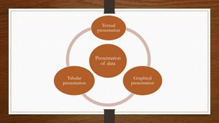
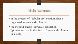
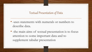
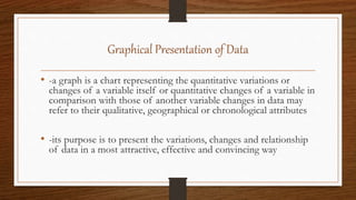
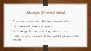
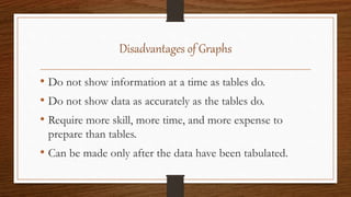
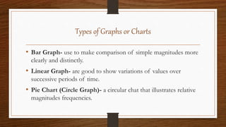
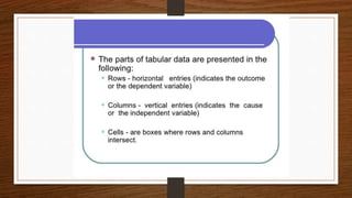
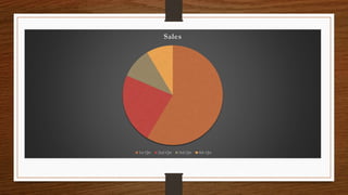
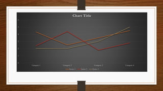
PRESENTATION OF DATA
BY: Charlene Eve L. Saligumba
What is presentation?
• It is the process of organizing data into logical
and meaningful categories and classification to
make them amenable to study.
What is data?
• A collection of facts and figures that needs to be
justified.
PRESENTATION OF DATA
• The presentation of data means exhibition of the data in
such a clear and attractive manner that these are easily
understood and analyzed. There are many forms of
presentation of data.
Presentation
of data
Textual
presentation
Graphical
presentation
Tabular
presentation
Tabular Presentation
• in the process of Tabular presentation, data is
organized in rows and columns.
• the method used is known as Tabulation
( presenting data in the form of rows and columns
in a table ).
Textual Presentation of Data
• -uses statements with numerals or numbers to
describe data.
• -the main aims of textual presentation is to focus
attention to some important data and to
supplement tabular presentation
Graphical Presentation of Data
• -a graph is a chart representing the quantitative variations or
changes of a variable itself or quantitative changes of a variable in
comparison with those of another variable changes in data may
refer to their qualitative, geographical or chronological attributes
• -its purpose is to present the variations, changes and relationship
of data in a most attractive, effective and convincing way
Advantages of Tabular over Textual
• Statistical tables are concise
• Data are more easy to read: and
• Tables give the whole information even without
combining numerals with textual matter
Advantages of Graphical Method
• Attracts attention more effectively than to tables.
• Use colors and pictorial diagrams.
• Gives comprehensive view of quantitative data.
• Enable to grasp the essential facts quickly without much
trouble.
Disadvantages of Graphs
• Do not show information at a time as tables do.
• Do not show data as accurately as the tables do.
• Require more skill, more time, and more expense to
prepare than tables.
• Can be made only after the data have been tabulated.
Types of Graphs or Charts
• Bar Graph- use to make comparison of simple magnitudes more
clearly and distinctly.
• Linear Graph- are good to show variations of values over
successive periods of time.
• Pie Chart (Circle Graph)- a circular chat that illustrates relative
magnitudes frequencies.
Sales
1st Qtr 2nd Qtr 3rd Qtr 4th Qtr
0
1
2
3
4
5
6
Category 1 Category 2 Category 3 Category 4
Chart Title
Series 1 Series 2 Series 3
0 1 2 3 4 5 6
Category 1
Category 2
Category 3
Category 4
Chart Title
Series 3 Series 2 Series 1
0
1
2
3
4
5
6
Category 1 Category 2 Category 3 Category 4
Chart Title
Series 1 Series 2 Series 3
Answers:
• Pie Chart
• Linear or Line Graph
• Bar Graph
• Column Chart
The End……
Thank you for listening!   

Presentation of Data (thesis writing)

  • 1.
    PRESENTATION OF DATA BY:Charlene Eve L. Saligumba
  • 2.
    What is presentation? •It is the process of organizing data into logical and meaningful categories and classification to make them amenable to study.
  • 3.
    What is data? •A collection of facts and figures that needs to be justified.
  • 4.
    PRESENTATION OF DATA •The presentation of data means exhibition of the data in such a clear and attractive manner that these are easily understood and analyzed. There are many forms of presentation of data.
  • 5.
  • 6.
    Tabular Presentation • inthe process of Tabular presentation, data is organized in rows and columns. • the method used is known as Tabulation ( presenting data in the form of rows and columns in a table ).
  • 7.
    Textual Presentation ofData • -uses statements with numerals or numbers to describe data. • -the main aims of textual presentation is to focus attention to some important data and to supplement tabular presentation
  • 8.
    Graphical Presentation ofData • -a graph is a chart representing the quantitative variations or changes of a variable itself or quantitative changes of a variable in comparison with those of another variable changes in data may refer to their qualitative, geographical or chronological attributes • -its purpose is to present the variations, changes and relationship of data in a most attractive, effective and convincing way
  • 9.
    Advantages of Tabularover Textual • Statistical tables are concise • Data are more easy to read: and • Tables give the whole information even without combining numerals with textual matter
  • 10.
    Advantages of GraphicalMethod • Attracts attention more effectively than to tables. • Use colors and pictorial diagrams. • Gives comprehensive view of quantitative data. • Enable to grasp the essential facts quickly without much trouble.
  • 11.
    Disadvantages of Graphs •Do not show information at a time as tables do. • Do not show data as accurately as the tables do. • Require more skill, more time, and more expense to prepare than tables. • Can be made only after the data have been tabulated.
  • 12.
    Types of Graphsor Charts • Bar Graph- use to make comparison of simple magnitudes more clearly and distinctly. • Linear Graph- are good to show variations of values over successive periods of time. • Pie Chart (Circle Graph)- a circular chat that illustrates relative magnitudes frequencies.
  • 16.
    Sales 1st Qtr 2ndQtr 3rd Qtr 4th Qtr
  • 17.
    0 1 2 3 4 5 6 Category 1 Category2 Category 3 Category 4 Chart Title Series 1 Series 2 Series 3
  • 18.
    0 1 23 4 5 6 Category 1 Category 2 Category 3 Category 4 Chart Title Series 3 Series 2 Series 1
  • 19.
    0 1 2 3 4 5 6 Category 1 Category2 Category 3 Category 4 Chart Title Series 1 Series 2 Series 3
  • 20.
    Answers: • Pie Chart •Linear or Line Graph • Bar Graph • Column Chart
  • 21.
    The End…… Thank youfor listening!   