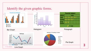
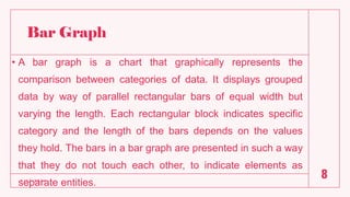
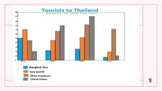
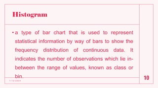
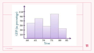
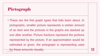
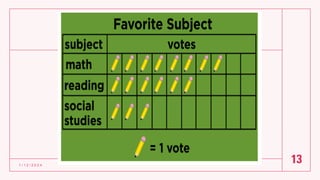
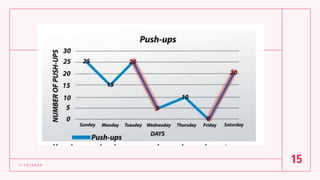
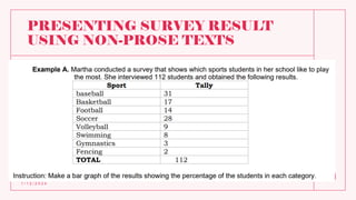
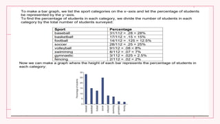
English for
Academic and
Professional
Purposes
Quarter 2 Lesson 5
Objectives:
a.identify the given graphic forms;
b.appreciate the importance of non-prose text; and
c.summarizes findings and executes the report through
narrative and visual/graphic forms and writes
various reports by answering the given questions.
1 / 1 2 / 2 0 2 4
2
Identify the given graphic forms.
1 / 1 2 / 2 0 2 4
3
Bar Graph Histogram Pictograph
Line Graph
Pie Graph
Graphic
Forms/Non-Prose
Text
Quarter 2 Lesson 5
What are non-prose texts?
• Non-prose texts consist of disconnected words and
numbers instead of the sentences and paragraphs.
• Such as tables, figures or charts are used in
presenting a survey result that will be useful for the
readers. These can make your content more
engaging, more memorable, and easier to
understand.
1 / 1 2 / 2 0 2 4
5
Uses of non-prose materials are:
1. Present data in an organized and systematic way.
2. Allow the reader to absorb the information fast and
efficiently.
3. Explain abstract concepts, processes, relationships
in a concrete manner
4. Provide only the useful and relevant data
1 / 1 2 / 2 0 2 4
6
Examples of Non-Prose Text
• Bar Graph
• Histogram
• Pictograph
• Line Graph
• Pie Graph
• Tables
1 / 1 2 / 2 0 2 4
7
Bar Graph
• A bar graph is a chart that graphically represents the
comparison between categories of data. It displays grouped
data by way of parallel rectangular bars of equal width but
varying the length. Each rectangular block indicates specific
category and the length of the bars depends on the values
they hold. The bars in a bar graph are presented in such a way
that they do not touch each other, to indicate elements as
separate entities.
1 / 1 2 / 2 0 2 4
8
9
Histogram
• a type of bar chart that is used to represent
statistical information by way of bars to show the
frequency distribution of continuous data. It
indicates the number of observations which lie in-
between the range of values, known as class or
bin.
1 / 1 2 / 2 0 2 4
10
1 / 1 2 / 2 0 2 4
11
Pictograph
• These are the first graph types that kids learn about. In
pictographs, smaller picture represents a certain amount
of an item and the pictures in the graphs are stacked up
one after another. Picture fractions represent the portions
represented by the picture. If an approximation would be
estimated or given, the pictograph is representing used
for these amounts visually.
1 / 1 2 / 2 0 2 4
12
1 / 1 2 / 2 0 2 4
13
Line Graph
• Used to display comparisons between 2 variables, line graphs
involve an x-axis horizontally and a y-axis vertically on a grid. Dot-
connected and grid-plotted lines are what comprise a line graph.
These lines monitor and compare various data sets. Usually, the x-
axis represents time measurements while the y-axis is a
representative of measure or percentage of quantity. For this
reason, a line graph is used often for tracking variables of one or
more subjects in time.
1 / 1 2 / 2 0 2 4
14
1 / 1 2 / 2 0 2 4
15
Pie Graph
1 / 1 2 / 2 0 2 4
16
• Sometimes called a circle graph, pie charts represent
the parts of a whole. Each ‘section’ or ‘slice of the pie
is a data percentage. From biggest to smallest,
segments are arranged in a clockwise formation. This
way, the pie chart features easy-to-compare subjects
presented in a neat, easy-to-understand way.
1 / 1 2 / 2 0 2 4
17
Tables
•present a great deal of numerical
information in a very clear and
concise way, with very minimal
space to occupy.
1 / 1 2 / 2 0 2 4
18
PRESENTING SURVEY RESULT
USING NON-PROSE TEXTS
1 / 1 2 / 2 0 2 4
19
1 / 1 2 / 2 0 2 4
20

EASS-PPT-Q2-Lesson-5-Non-Prose-Text..pdf

  • 1.
  • 2.
    Objectives: a.identify the givengraphic forms; b.appreciate the importance of non-prose text; and c.summarizes findings and executes the report through narrative and visual/graphic forms and writes various reports by answering the given questions. 1 / 1 2 / 2 0 2 4 2
  • 3.
    Identify the givengraphic forms. 1 / 1 2 / 2 0 2 4 3 Bar Graph Histogram Pictograph Line Graph Pie Graph
  • 4.
  • 5.
    What are non-prosetexts? • Non-prose texts consist of disconnected words and numbers instead of the sentences and paragraphs. • Such as tables, figures or charts are used in presenting a survey result that will be useful for the readers. These can make your content more engaging, more memorable, and easier to understand. 1 / 1 2 / 2 0 2 4 5
  • 6.
    Uses of non-prosematerials are: 1. Present data in an organized and systematic way. 2. Allow the reader to absorb the information fast and efficiently. 3. Explain abstract concepts, processes, relationships in a concrete manner 4. Provide only the useful and relevant data 1 / 1 2 / 2 0 2 4 6
  • 7.
    Examples of Non-ProseText • Bar Graph • Histogram • Pictograph • Line Graph • Pie Graph • Tables 1 / 1 2 / 2 0 2 4 7
  • 8.
    Bar Graph • Abar graph is a chart that graphically represents the comparison between categories of data. It displays grouped data by way of parallel rectangular bars of equal width but varying the length. Each rectangular block indicates specific category and the length of the bars depends on the values they hold. The bars in a bar graph are presented in such a way that they do not touch each other, to indicate elements as separate entities. 1 / 1 2 / 2 0 2 4 8
  • 9.
  • 10.
    Histogram • a typeof bar chart that is used to represent statistical information by way of bars to show the frequency distribution of continuous data. It indicates the number of observations which lie in- between the range of values, known as class or bin. 1 / 1 2 / 2 0 2 4 10
  • 11.
    1 / 12 / 2 0 2 4 11
  • 12.
    Pictograph • These arethe first graph types that kids learn about. In pictographs, smaller picture represents a certain amount of an item and the pictures in the graphs are stacked up one after another. Picture fractions represent the portions represented by the picture. If an approximation would be estimated or given, the pictograph is representing used for these amounts visually. 1 / 1 2 / 2 0 2 4 12
  • 13.
    1 / 12 / 2 0 2 4 13
  • 14.
    Line Graph • Usedto display comparisons between 2 variables, line graphs involve an x-axis horizontally and a y-axis vertically on a grid. Dot- connected and grid-plotted lines are what comprise a line graph. These lines monitor and compare various data sets. Usually, the x- axis represents time measurements while the y-axis is a representative of measure or percentage of quantity. For this reason, a line graph is used often for tracking variables of one or more subjects in time. 1 / 1 2 / 2 0 2 4 14
  • 15.
    1 / 12 / 2 0 2 4 15
  • 16.
    Pie Graph 1 /1 2 / 2 0 2 4 16 • Sometimes called a circle graph, pie charts represent the parts of a whole. Each ‘section’ or ‘slice of the pie is a data percentage. From biggest to smallest, segments are arranged in a clockwise formation. This way, the pie chart features easy-to-compare subjects presented in a neat, easy-to-understand way.
  • 17.
    1 / 12 / 2 0 2 4 17
  • 18.
    Tables •present a greatdeal of numerical information in a very clear and concise way, with very minimal space to occupy. 1 / 1 2 / 2 0 2 4 18
  • 19.
    PRESENTING SURVEY RESULT USINGNON-PROSE TEXTS 1 / 1 2 / 2 0 2 4 19
  • 20.
    1 / 12 / 2 0 2 4 20