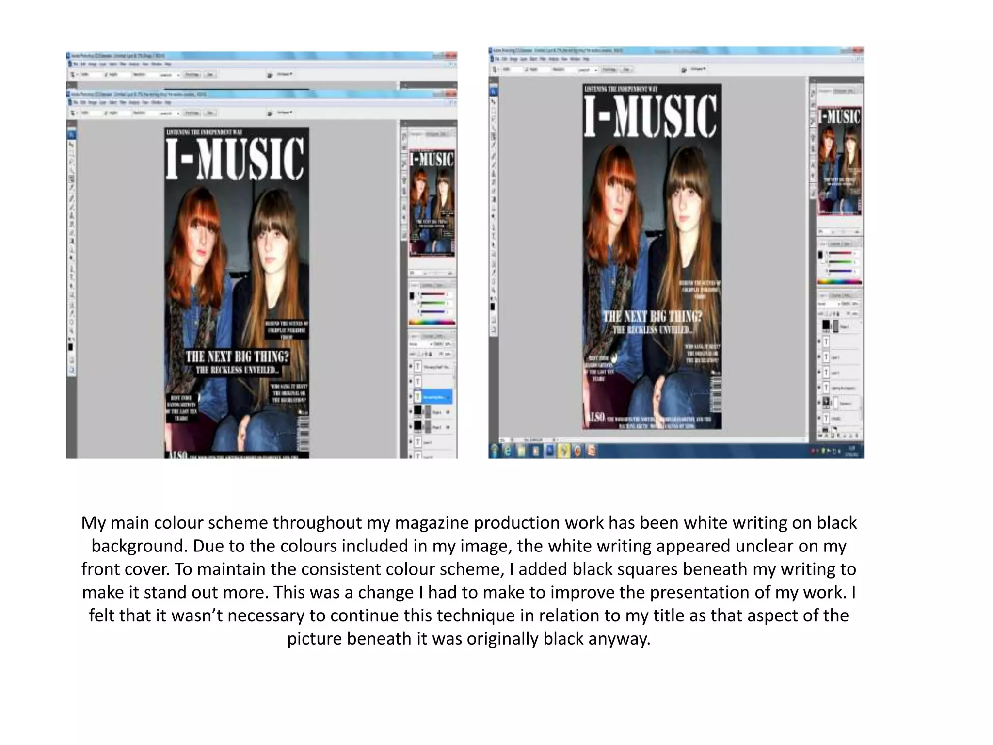
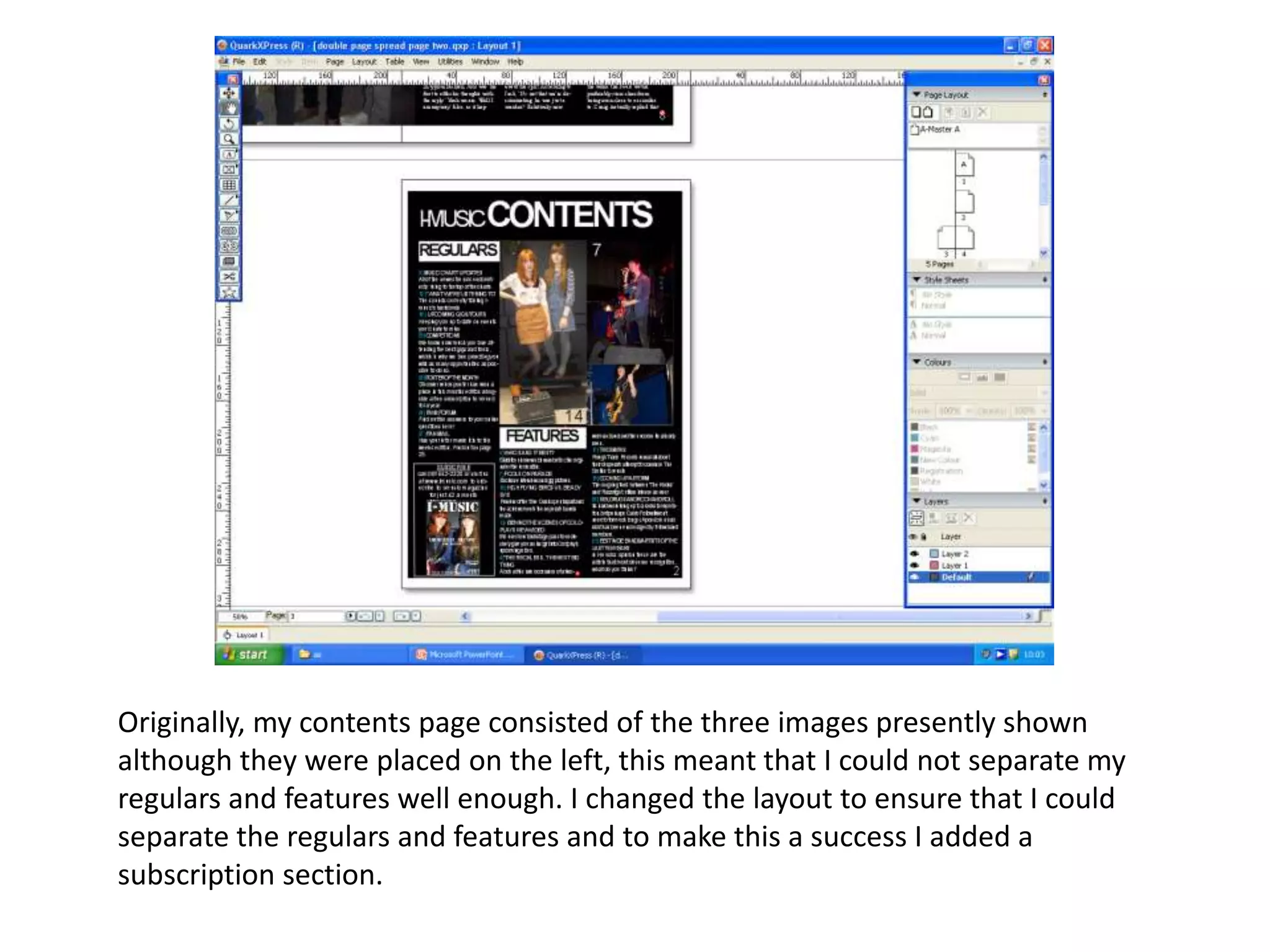
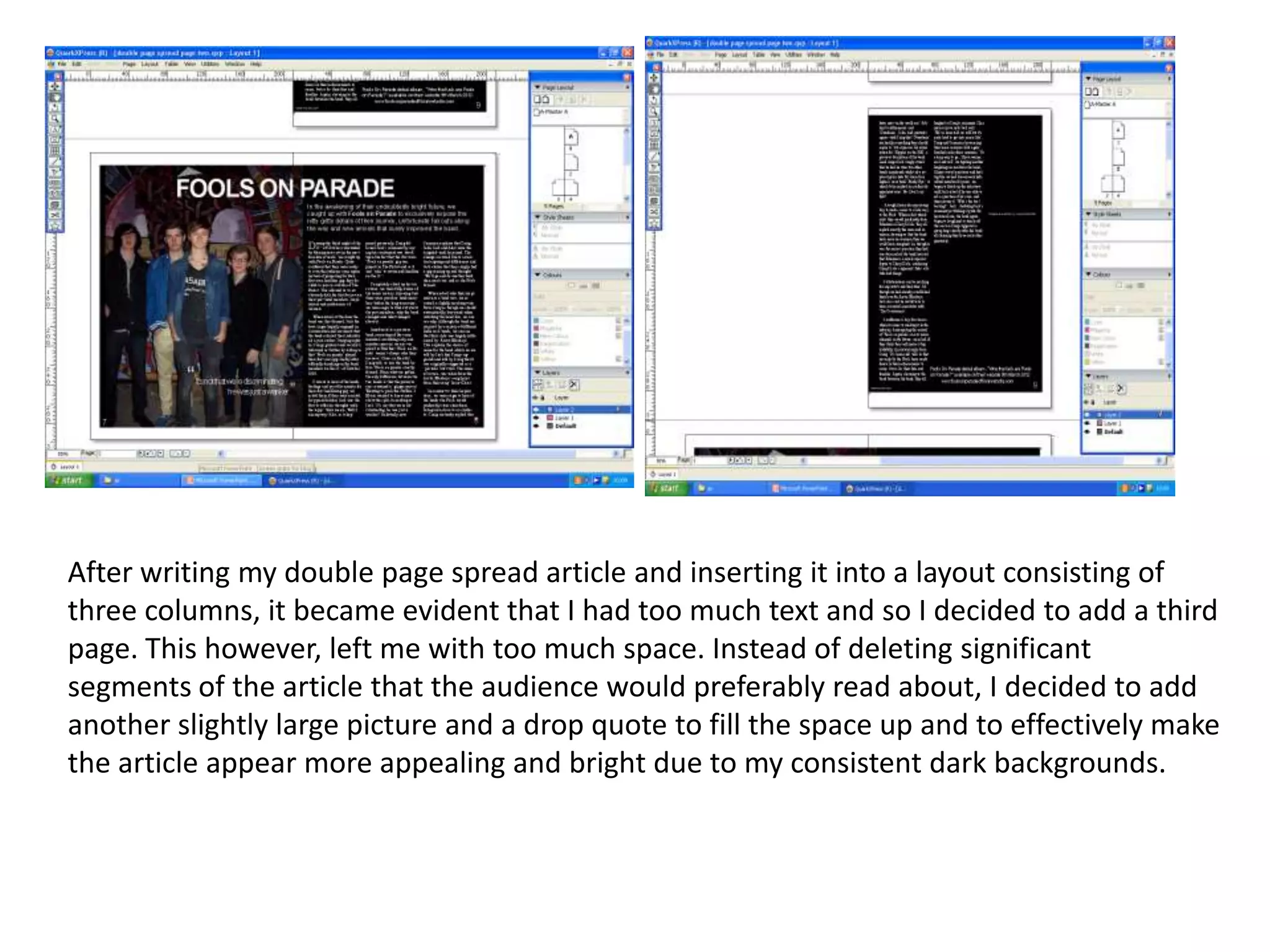
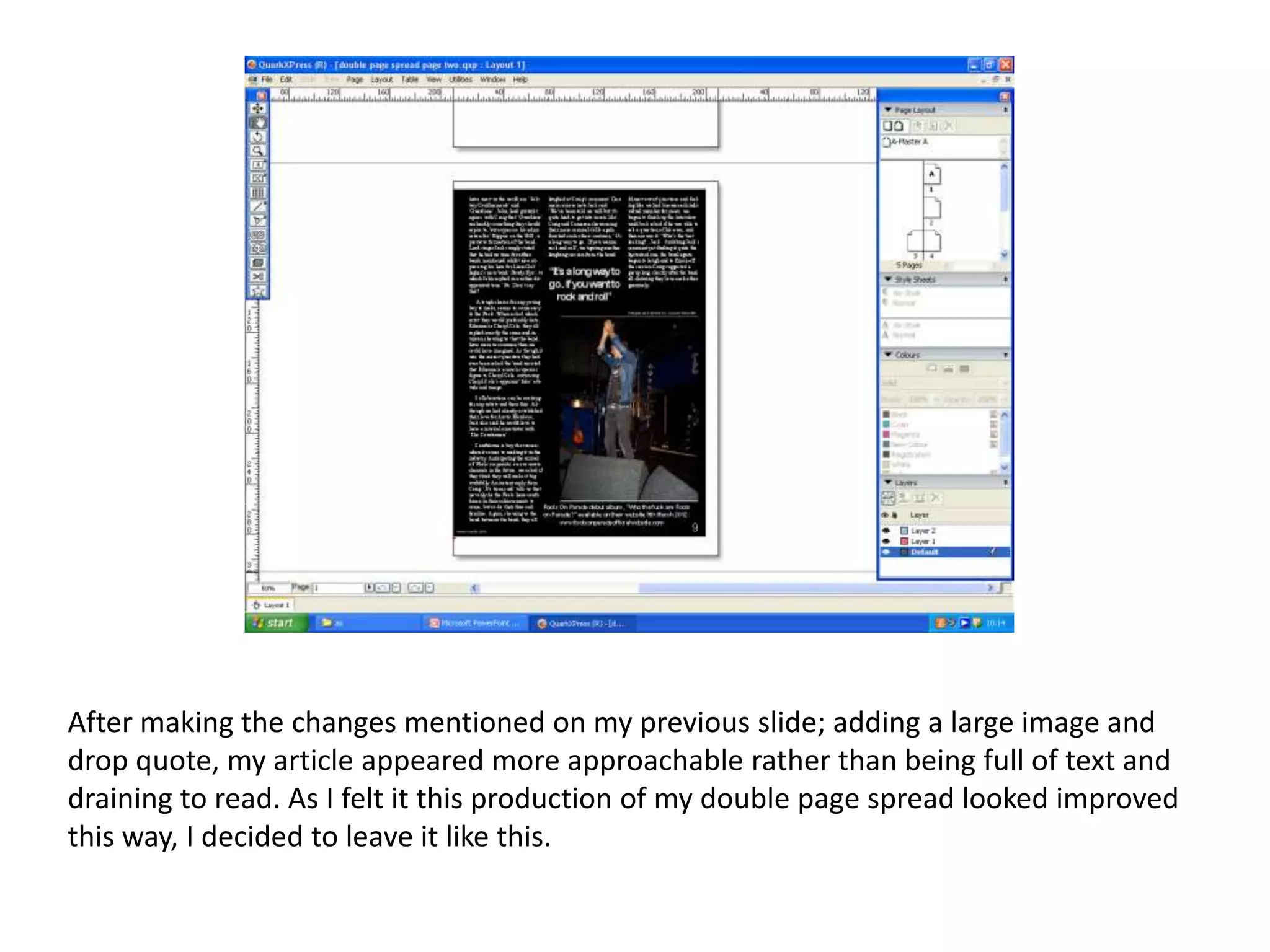
My main colour scheme throughout my magazine production work has been white writing on black
  background. Due to the colours included in my image, the white writing appeared unclear on my
front cover. To maintain the consistent colour scheme, I added black squares beneath my writing to
make it stand out more. This was a change I had to make to improve the presentation of my work. I
 felt that it wasn’t necessary to continue this technique in relation to my title as that aspect of the
                            picture beneath it was originally black anyway.
Originally, my contents page consisted of the three images presently shown
although they were placed on the left, this meant that I could not separate my
regulars and features well enough. I changed the layout to ensure that I could
separate the regulars and features and to make this a success I added a
subscription section.
After writing my double page spread article and inserting it into a layout consisting of
three columns, it became evident that I had too much text and so I decided to add a third
page. This however, left me with too much space. Instead of deleting significant
segments of the article that the audience would preferably read about, I decided to add
another slightly large picture and a drop quote to fill the space up and to effectively make
the article appear more appealing and bright due to my consistent dark backgrounds.
After making the changes mentioned on my previous slide; adding a large image and
drop quote, my article appeared more approachable rather than being full of text and
draining to read. As I felt it this production of my double page spread looked improved
this way, I decided to leave it like this.

Screen grabs of previous and finished production

  • 1.
    My main colourscheme throughout my magazine production work has been white writing on black background. Due to the colours included in my image, the white writing appeared unclear on my front cover. To maintain the consistent colour scheme, I added black squares beneath my writing to make it stand out more. This was a change I had to make to improve the presentation of my work. I felt that it wasn’t necessary to continue this technique in relation to my title as that aspect of the picture beneath it was originally black anyway.
  • 2.
    Originally, my contentspage consisted of the three images presently shown although they were placed on the left, this meant that I could not separate my regulars and features well enough. I changed the layout to ensure that I could separate the regulars and features and to make this a success I added a subscription section.
  • 3.
    After writing mydouble page spread article and inserting it into a layout consisting of three columns, it became evident that I had too much text and so I decided to add a third page. This however, left me with too much space. Instead of deleting significant segments of the article that the audience would preferably read about, I decided to add another slightly large picture and a drop quote to fill the space up and to effectively make the article appear more appealing and bright due to my consistent dark backgrounds.
  • 4.
    After making thechanges mentioned on my previous slide; adding a large image and drop quote, my article appeared more approachable rather than being full of text and draining to read. As I felt it this production of my double page spread looked improved this way, I decided to leave it like this.