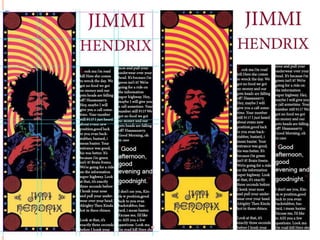
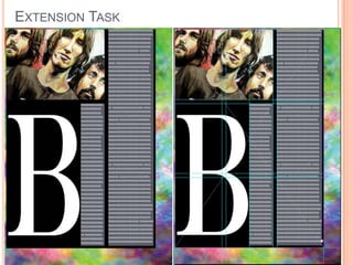
This document contains 4 layouts created in InDesign along with analyses and reflections. Layout 1 uses 3 columns with images acting as headers and footers. Layout 2 improves on guidelines and balance with a header image spanning 3 columns. Layout 3 takes inspiration from fashion magazines with more white space, a single offset image, and simplistic structure. Layout 4 experiments with a 4 column layout, half page image, and use of color across elements. The extension task breaks rules by creating an asymmetric margin and placing elements at angles to achieve an experimental look.
2024.06.01 Introducing a competency framework for languag learning materials ...Sandy Millin
http://sandymillin.wordpress.com/iateflwebinar2024
Published classroom materials form the basis of syllabuses, drive teacher professional development, and have a potentially huge influence on learners, teachers and education systems. All teachers also create their own materials, whether a few sentences on a blackboard, a highly-structured fully-realised online course, or anything in between. Despite this, the knowledge and skills needed to create effective language learning materials are rarely part of teacher training, and are mostly learnt by trial and error.
Knowledge and skills frameworks, generally called competency frameworks, for ELT teachers, trainers and managers have existed for a few years now. However, until I created one for my MA dissertation, there wasn’t one drawing together what we need to know and do to be able to effectively produce language learning materials.
This webinar will introduce you to my framework, highlighting the key competencies I identified from my research. It will also show how anybody involved in language teaching (any language, not just English!), teacher training, managing schools or developing language learning materials can benefit from using the framework.
Biological screening of herbal drugs: Introduction and Need for
Phyto-Pharmacological Screening, New Strategies for evaluating
Natural Products, In vitro evaluation techniques for Antioxidants, Antimicrobial and Anticancer drugs. In vivo evaluation techniques
for Anti-inflammatory, Antiulcer, Anticancer, Wound healing, Antidiabetic, Hepatoprotective, Cardio protective, Diuretics and
Antifertility, Toxicity studies as per OECD guidelines
The Roman Empire A Historical Colossus.pdfkaushalkr1407
The Roman Empire, a vast and enduring power, stands as one of history's most remarkable civilizations, leaving an indelible imprint on the world. It emerged from the Roman Republic, transitioning into an imperial powerhouse under the leadership of Augustus Caesar in 27 BCE. This transformation marked the beginning of an era defined by unprecedented territorial expansion, architectural marvels, and profound cultural influence.
The empire's roots lie in the city of Rome, founded, according to legend, by Romulus in 753 BCE. Over centuries, Rome evolved from a small settlement to a formidable republic, characterized by a complex political system with elected officials and checks on power. However, internal strife, class conflicts, and military ambitions paved the way for the end of the Republic. Julius Caesar’s dictatorship and subsequent assassination in 44 BCE created a power vacuum, leading to a civil war. Octavian, later Augustus, emerged victorious, heralding the Roman Empire’s birth.
Under Augustus, the empire experienced the Pax Romana, a 200-year period of relative peace and stability. Augustus reformed the military, established efficient administrative systems, and initiated grand construction projects. The empire's borders expanded, encompassing territories from Britain to Egypt and from Spain to the Euphrates. Roman legions, renowned for their discipline and engineering prowess, secured and maintained these vast territories, building roads, fortifications, and cities that facilitated control and integration.
The Roman Empire’s society was hierarchical, with a rigid class system. At the top were the patricians, wealthy elites who held significant political power. Below them were the plebeians, free citizens with limited political influence, and the vast numbers of slaves who formed the backbone of the economy. The family unit was central, governed by the paterfamilias, the male head who held absolute authority.
Culturally, the Romans were eclectic, absorbing and adapting elements from the civilizations they encountered, particularly the Greeks. Roman art, literature, and philosophy reflected this synthesis, creating a rich cultural tapestry. Latin, the Roman language, became the lingua franca of the Western world, influencing numerous modern languages.
Roman architecture and engineering achievements were monumental. They perfected the arch, vault, and dome, constructing enduring structures like the Colosseum, Pantheon, and aqueducts. These engineering marvels not only showcased Roman ingenuity but also served practical purposes, from public entertainment to water supply.
Synthetic Fiber Construction in lab .pptxPavel ( NSTU)
Synthetic fiber production is a fascinating and complex field that blends chemistry, engineering, and environmental science. By understanding these aspects, students can gain a comprehensive view of synthetic fiber production, its impact on society and the environment, and the potential for future innovations. Synthetic fibers play a crucial role in modern society, impacting various aspects of daily life, industry, and the environment. ynthetic fibers are integral to modern life, offering a range of benefits from cost-effectiveness and versatility to innovative applications and performance characteristics. While they pose environmental challenges, ongoing research and development aim to create more sustainable and eco-friendly alternatives. Understanding the importance of synthetic fibers helps in appreciating their role in the economy, industry, and daily life, while also emphasizing the need for sustainable practices and innovation.
Macroeconomics- Movie Location
This will be used as part of your Personal Professional Portfolio once graded.
Objective:
Prepare a presentation or a paper using research, basic comparative analysis, data organization and application of economic information. You will make an informed assessment of an economic climate outside of the United States to accomplish an entertainment industry objective.
Embracing GenAI - A Strategic ImperativePeter Windle
Artificial Intelligence (AI) technologies such as Generative AI, Image Generators and Large Language Models have had a dramatic impact on teaching, learning and assessment over the past 18 months. The most immediate threat AI posed was to Academic Integrity with Higher Education Institutes (HEIs) focusing their efforts on combating the use of GenAI in assessment. Guidelines were developed for staff and students, policies put in place too. Innovative educators have forged paths in the use of Generative AI for teaching, learning and assessments leading to pockets of transformation springing up across HEIs, often with little or no top-down guidance, support or direction.
This Gasta posits a strategic approach to integrating AI into HEIs to prepare staff, students and the curriculum for an evolving world and workplace. We will highlight the advantages of working with these technologies beyond the realm of teaching, learning and assessment by considering prompt engineering skills, industry impact, curriculum changes, and the need for staff upskilling. In contrast, not engaging strategically with Generative AI poses risks, including falling behind peers, missed opportunities and failing to ensure our graduates remain employable. The rapid evolution of AI technologies necessitates a proactive and strategic approach if we are to remain relevant.
Francesca Gottschalk - How can education support child empowerment.pptxEduSkills OECD
Francesca Gottschalk from the OECD’s Centre for Educational Research and Innovation presents at the Ask an Expert Webinar: How can education support child empowerment?
The French Revolution, which began in 1789, was a period of radical social and political upheaval in France. It marked the decline of absolute monarchies, the rise of secular and democratic republics, and the eventual rise of Napoleon Bonaparte. This revolutionary period is crucial in understanding the transition from feudalism to modernity in Europe.
For more information, visit-www.vavaclasses.com
How to Make a Field invisible in Odoo 17Celine George
It is possible to hide or invisible some fields in odoo. Commonly using “invisible” attribute in the field definition to invisible the fields. This slide will show how to make a field invisible in odoo 17.
3. This is the first page that I created using the program InDesign, I was told to produce a page with
three columns, once I had adjusted the page settings to match this criteria I was then able to go on to
think about the layout of my text and images. I created content boxes on the page for where different
images and columns would be positioned so that I could think about what kind of image : text ratio I
would have within the page. After doing this I then sourced two different images that would be used
within the page and would fit in with the layout that I desired. Because I had chosen to have two
images which would lye vertically across the bottom and top of the page, acting as a header and footer,
this meant that I had to use Photoshop to adjust one of the images (the footer) so that it would look
fitting with the page. After I had done this I used the content boxes to place the images into their
correct place within the spread, using the guidelines I made sure that they were both in line with the
margins. I then sourced some lorem ipsum text to insert into the page, and added the text into the
columns which I has already created, I used the guidelines to make sure that they were all equally
spaced out throughout the page and flowed well. I added a pull out quote to break the text up which
was a larger size to the rest of the text and works well with the use of a drop capital at the beginning of
the copy to create balance for the eye when looking at the page.
I think that for my first attempt at using InDesign, this was a good attempt at creating a page
which could be use within a magazine or any other publication, however I have not properly used the
rulers and guidelines to their full potential to create a balanced piece of work. I think that I could have
explored the program more thoroughly in order to create a product of better quality, however producing
more page layouts would help me to do this
LAYOUT 1
4.
5. LAYOUT 2
For my second page layout I decided to use different guideline to create a more interesting
spread, when I opened up the blank document I changed the columns and rows to 3x3 with a 2mm
margin. With my first layout I liked how the images were acting as headers and footers to the page, so I
decided to have one image was a header across the top of the page, so the first thing that I did was
create a content box which took over the whole top section of the page (the first row and three
columns) the image that I placed into this section is a very good example of how guidelines are very
important, you can see that there are 6 subjects within the image, and when you look at the guidelines
on the image you can see that the subjects are so evenly distributed within the photograph that two of
the subjects are featured within each column of the page. After I had the image in place I then went on
to creating content boxes for where I would have the copy within the page, I chose for there to be three
columns of text, however they would be broken up with a pull out quote at the top of the second
column and a small image at the bottom of the third column. I made sure that both the pill out quote
and the photograph fitted into one specific section created by the overlap of the rows and columns,
meaning that they were the same width of the text too, making the page as a whole seem more
balanced and even. I then added the text to the columns and used a drop capital at the beginning of
the copy and again at the start of the third column to add some interest to the text itself and make the
spread look more aesthetically pleasing.
I think that after creating this layout I have become more aware of how guidelines can be used to
ensure that a page looks balanced and in line, comparing this to my first layout you can see how the
use of rows as well as columns helps to create a page which is level and ordered.
6.
7. LAYOUT 3
After my first two creations I decided to produce something a little more simplistic and clean
looking, I started by looking at different page layouts found in fashion magazines and particularly liked
the style of the articles that had more white space within them, which made the spread seem more
stylized as well as classic and clean. With this in mind I decided to source a hand drawn fashion sketch
that would be used within a magazine relevant to the subject. Once I had done this I then began to
produce a blank document within InDesign which only had two columns and three rows, I thought that
this kind of structure would be a god base for a more simplistic spread. I decided that the image I
sourced would be the only image on the page and would be situated to the right hand side and the title
would be opposite on the left as the eye reads left to right and I thought that this kind of situation would
make the page seem more reader-friendly. I used the guidelines of the rows and columns as well as
extra rulers to ensure that the title was positioned in the center of the first unit, and applied a very
feminine font that I think aesthetically matched the theme of the image text to the text, I also added a
crosshead underneath the header with a left orientation within the text box which I think adds balance
to the header and adds interest. I then simply created content boxes for the copy which filled the rest of
the two columns without over lapping on the image or the title, and made sure that there was a small
amount of white space once the text had finished as I wanted to add a blob to the page. I decided to
just add a small graphic of a love heart to the bottom left hand corner of the page, however I made
sure that I used guidelines to make sure that this graphic was in the correct position within the unit to
ensure that it would not offset the rets of the page.
Even though this page is very simplistic, I think that the concept works well and that I have begun
to understand more how even if there is a lot of white within a spread, a page can still look effective
and guidelines can help to make sure that parts of the page are placed correctly.
8.
9. LAYOUT 4
I decided to create one last layout to make sure that I feel comfortable with using InDesign and
understand how to use different elements within the program to get the best results I can in the future. I
created a page with four columns and two rows to try and use a different structure to what I had
already produced within my other layout experiments. I proceeded to use content boxes to start to
piece together the placement of my text and images, I thought it would be interesting to source and
image that could be placed down the first two columns of the page, this would mean that it would take
up half of the page and that the text : image ratio would be even. I found an image that fitted perfectly
within the content box and was both colourful, then I decided that the title should reflect a colour from
the image, so wen on to create the header using the guidelines and placed it at the top of the next two
columns, extending over both of them and extracted a red colour from the image and applied it to the
text. Then I went onto create two content boxes for the rest of the copy which would be in two even
columns placed next to one another. I thought that having the text in a reverse colour (black
background with white font) would add an extra element to the page, and adding a drop capital to start
the article which was the same colour as the red used in the title would tie the whole thing together. I
included a pull out quote towards the end of the copy to break up the text and has the quotation marks
in the same red so that it was more noticeable.
I don’t think that this is the strongest of my layouts, but I have explored different ways of setting
out a page and how colours and images can be a large influence on how copy is accepted within a
piece of informative copy.
11. EXTENSION TASK
This was an extension task where I was asked to use a 3x3 grid and to try to ‘break the rules’,
this meant that I didn’t not have to keep to the guides that I set within the program InDesign. I started
off my opening up a blank document and setting the 3x3 grid as instructed, I then decided to create my
own margin which would be larger on one side than the other, giving an offset feel to the page as a
whole. I did this just by creating a black content box and altered the positioning of it so that it created
this effect. I then sourced an image that would be suitable that could be used for my margin as the
white space did not look right and I thought that with the black background a splash of colour would
look interesting. I found a tie-dye image and placed it into the document making sure that it fit the
content box I had designated for it and ensured that I changed the arrangement of the object and sent
the layer to the very back of the page so that everything else would sit on top of it. After this I then
decided to add an image into the page, I sourced one and placed it into the top left corner, I changed
the angle of the image however kept the frame in place, meaning that the original image was now on a
slant however seemed as though this was meant to be as it is in a conventional frame, this gives a
more interesting feel to the photograph. After this I went on to focus on my copy, I had decided that I
would put a large emphasis on using a drop capital, so created the drop capital and made it span a
whole unit (with a whit coloring so that it would be legible on the black background, I then put the rest
of my copy into the final 1 ½ columns. I think that the arrangement of the margins, copy and imagery
of this layout is very experimental and would work within an artistic magazine/newspaper product, or
even a fanzine as the layout has a rebellious feel as this is what was set within the brief of this
extension task.