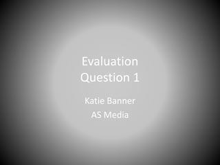
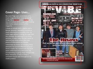
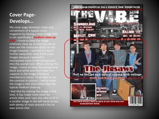
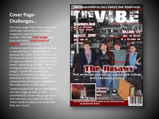
Evaluation
Question 1
Katie Banner
AS Media
Cover Page- Uses…
My cover Page uses conventions of a
music magazine front cover by having
things like a banner and a skyline at the
top and bottom of the page; both holding
information about content of the
magazine.
I chose to include both a skyline and a
banner because I wanted to include as
much information as possible onto my
cover page without making the page look
too cramped. By splitting it in to these
sections, it helps make the text easier to
read and you know where the main
pieces of information are located.
I think that my choice of including these
elements has proved effective because I
think it makes the overall look and finish
seem uniformed and professional. By
incorporating on-going shape designs into
these elements, it helps to keep a
consistent house style throughout my
media product.
Cover PageDevelops…
My cover page develops codes and
conventions of a typical music
magazine by having a main image that
is not specifically a medium close up
shot. I chose to keep the image
relatively close up so that you can at
least see the necessary detail on the
image however, I wanted to have it
further away than most front cover
images because I wanted to
incorporate more of the background
into the overall look. When editing this
image, I chose to keep the background
black and white and then make the
subjects in the image (the band
members) in colour. To be able to see
the contrast in colours, I had to make
the image a mid-shot rather than the
typical medium close-up.
I feel that by making the image a midshot, it has made more room for
article titles and I was also able to fit in
a smaller image in the left hand corner,
with plenty of room around it for its
own article title.
Cover PageChallenges…
The cover page that I have produced
challenges conventions of a music
magazine cover by having one
member from the main image who
does not have a direct mode of
address with the camera.
I chose to use this image even though
it was lacking the above feature
because the other three members of
the band all had a strong direct mode
of address individually, that the fourth
wasn’t necessarily needed. I think by
having this one abnormality in the
image, it gives off a quirky vibe
because it immediately draws your
attention to that subject; which
subsequently draws your attention to
the main article on the cover.
I have included the bands instruments
into the image as well, so this
automatically shows the group are as
one and does not need that fourth
direct mode of address to show that
they are a band.
Contents- Uses…
My contents page uses the key code
and convention of having a banner at
the bottom of the page.
I wanted to include subscription
information somewhere on the page
so I chose to add the banner thinking it
would fit appropriately in my media
product.
After reviewing this area of my
contents page, I have realised that
there is too much empty space in the
right hand area of the banner and
therefore, does not look like the
banner is formatted and spaced out
correctly. If I were to change this area,
I would maybe think about adding
more information/text within the
banner to make it look more
uniformed.
Contents- Develops…
Having formatted columns on my
contnents page is a code and
convention that I have developed.
I chose to only have two columns for
my article information because I
wanted to have an area made solely
for my smaller, supporting images. I
believe that this is effective because
you can clearly see all of my articles
and know which articles my image
match up to, even though they are not
necessarily next to each other.
My ‘Regulars’ article space is a lot
smaller than the Features so I
therefore, made the fonts smaller so I
could fit in an extra image. This
develops the consistency of columns
and font size because you would
usually see both sets of information in
the same font size. I wanted to have
more room for images and feature
content so believe that the decision of
making this area of font smaller, has
been well thought through.
ContentsChallenges…
One thing that I have done in the
production of my music magazine that
challenges the conventions of a
professional music magazine contents
page is that I have not put a caption on
top of each image that I have used. On
the bottom image, I have decided to
refrain from adding a caption to it. This
was mainly due to the use of colour in
the image and the fact that I did not
want to defy the house style of my
overall magazine. I have however,
placed said image next to the article it
relates to. Although it is not extremely
obvious as to which article it relates to,
there are certain aspects of both the
image and the article that relate.
Also, because the image already has
text on it, if I had of added a caption to
it, it may have looked too busy and
would have drawn your attention away
from the actual image itself.
DPS- Uses…
My magazines DPS uses codes and
conventions such as: a main article
image and smaller images that relate
to the article.
When I was preparing my photoshoots, I chose to prepare two
different locations and styles so that I
would end up with a variety of images
that I could use throughout my media
product. This proved successful as my
end product resulted in many images
that I could not only use on my DPS
but I could also incorporate into my
cover and contents pages.
I chose to edit the smaller images in a
similar way with a similar colour
scheme so to keep my overall house
style consistent and professional. I
made the main image fit the entire left
hand page so that I could use a pull
quote as a design feature.
DPS- Develops…
My DPS develops certain codes and
convention of a typical music magazine
in areas such as using the artists name
as the main article title.
My reasoning for doing this was that I
didn’t want to have too many large
pieces of texts; having a main title, a
sub heading and then a pull quote,
would have looked too busy on the
page. By using the artists name as the
main title, it pulls everything on the
two pages together because
everything looks like it links together.
I believe that choosing to do this has
proved effective because I have
managed to Include a title that Is
relevant, links in with the text and
images and is in keeping with the
overall house style.
DPS- Challenges…
My magazine Double Page Spread,
challenges some codes and conventions of
the typical music magazine DPS. One of
these challenges, is that I have chosen not
to include a magazine website address or
the magazines name, anywhere on the
page.
I have chosen not to include these because
I felt that they weren’t a necessity at the
time of production. I didn’t think the room
I had available would benefit from having
either of these extra elements.
Now that I have looked back and reviewed
this area of my DPS, I have come to realise
that my DPS would have benefited from
having the masthead and a website address
on the page. This is because it would have
filled in some of the empty space and
made the overall finish look more
professional. If I had more time to go over
and change anything on my DPS, this would
definitely be an area that I would re-visit.

Question 1

  • 1.
  • 2.
    Cover Page- Uses… Mycover Page uses conventions of a music magazine front cover by having things like a banner and a skyline at the top and bottom of the page; both holding information about content of the magazine. I chose to include both a skyline and a banner because I wanted to include as much information as possible onto my cover page without making the page look too cramped. By splitting it in to these sections, it helps make the text easier to read and you know where the main pieces of information are located. I think that my choice of including these elements has proved effective because I think it makes the overall look and finish seem uniformed and professional. By incorporating on-going shape designs into these elements, it helps to keep a consistent house style throughout my media product.
  • 3.
    Cover PageDevelops… My coverpage develops codes and conventions of a typical music magazine by having a main image that is not specifically a medium close up shot. I chose to keep the image relatively close up so that you can at least see the necessary detail on the image however, I wanted to have it further away than most front cover images because I wanted to incorporate more of the background into the overall look. When editing this image, I chose to keep the background black and white and then make the subjects in the image (the band members) in colour. To be able to see the contrast in colours, I had to make the image a mid-shot rather than the typical medium close-up. I feel that by making the image a midshot, it has made more room for article titles and I was also able to fit in a smaller image in the left hand corner, with plenty of room around it for its own article title.
  • 4.
    Cover PageChallenges… The coverpage that I have produced challenges conventions of a music magazine cover by having one member from the main image who does not have a direct mode of address with the camera. I chose to use this image even though it was lacking the above feature because the other three members of the band all had a strong direct mode of address individually, that the fourth wasn’t necessarily needed. I think by having this one abnormality in the image, it gives off a quirky vibe because it immediately draws your attention to that subject; which subsequently draws your attention to the main article on the cover. I have included the bands instruments into the image as well, so this automatically shows the group are as one and does not need that fourth direct mode of address to show that they are a band.
  • 5.
    Contents- Uses… My contentspage uses the key code and convention of having a banner at the bottom of the page. I wanted to include subscription information somewhere on the page so I chose to add the banner thinking it would fit appropriately in my media product. After reviewing this area of my contents page, I have realised that there is too much empty space in the right hand area of the banner and therefore, does not look like the banner is formatted and spaced out correctly. If I were to change this area, I would maybe think about adding more information/text within the banner to make it look more uniformed.
  • 6.
    Contents- Develops… Having formattedcolumns on my contnents page is a code and convention that I have developed. I chose to only have two columns for my article information because I wanted to have an area made solely for my smaller, supporting images. I believe that this is effective because you can clearly see all of my articles and know which articles my image match up to, even though they are not necessarily next to each other. My ‘Regulars’ article space is a lot smaller than the Features so I therefore, made the fonts smaller so I could fit in an extra image. This develops the consistency of columns and font size because you would usually see both sets of information in the same font size. I wanted to have more room for images and feature content so believe that the decision of making this area of font smaller, has been well thought through.
  • 7.
    ContentsChallenges… One thing thatI have done in the production of my music magazine that challenges the conventions of a professional music magazine contents page is that I have not put a caption on top of each image that I have used. On the bottom image, I have decided to refrain from adding a caption to it. This was mainly due to the use of colour in the image and the fact that I did not want to defy the house style of my overall magazine. I have however, placed said image next to the article it relates to. Although it is not extremely obvious as to which article it relates to, there are certain aspects of both the image and the article that relate. Also, because the image already has text on it, if I had of added a caption to it, it may have looked too busy and would have drawn your attention away from the actual image itself.
  • 8.
    DPS- Uses… My magazinesDPS uses codes and conventions such as: a main article image and smaller images that relate to the article. When I was preparing my photoshoots, I chose to prepare two different locations and styles so that I would end up with a variety of images that I could use throughout my media product. This proved successful as my end product resulted in many images that I could not only use on my DPS but I could also incorporate into my cover and contents pages. I chose to edit the smaller images in a similar way with a similar colour scheme so to keep my overall house style consistent and professional. I made the main image fit the entire left hand page so that I could use a pull quote as a design feature.
  • 9.
    DPS- Develops… My DPSdevelops certain codes and convention of a typical music magazine in areas such as using the artists name as the main article title. My reasoning for doing this was that I didn’t want to have too many large pieces of texts; having a main title, a sub heading and then a pull quote, would have looked too busy on the page. By using the artists name as the main title, it pulls everything on the two pages together because everything looks like it links together. I believe that choosing to do this has proved effective because I have managed to Include a title that Is relevant, links in with the text and images and is in keeping with the overall house style.
  • 10.
    DPS- Challenges… My magazineDouble Page Spread, challenges some codes and conventions of the typical music magazine DPS. One of these challenges, is that I have chosen not to include a magazine website address or the magazines name, anywhere on the page. I have chosen not to include these because I felt that they weren’t a necessity at the time of production. I didn’t think the room I had available would benefit from having either of these extra elements. Now that I have looked back and reviewed this area of my DPS, I have come to realise that my DPS would have benefited from having the masthead and a website address on the page. This is because it would have filled in some of the empty space and made the overall finish look more professional. If I had more time to go over and change anything on my DPS, this would definitely be an area that I would re-visit.