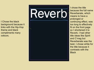
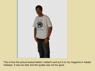
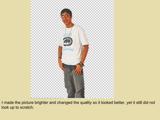
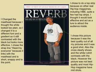
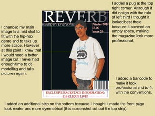
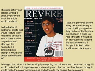
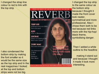
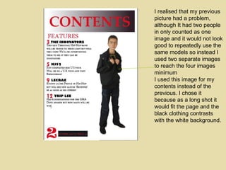
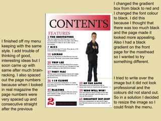
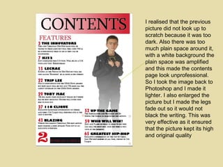
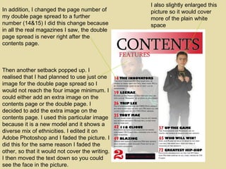
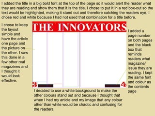
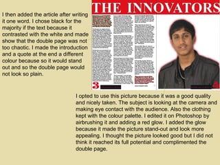
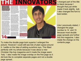
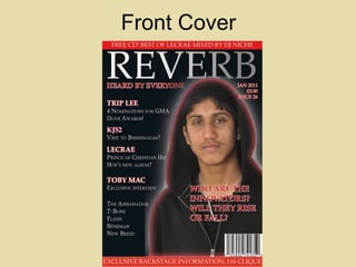
SlideShare a Scribd company logo
Music Magazine Construction
I chose the title because the full name Reverberate, which means  to have a prolonged or continuing effect, was too long to effectively fit on the front page so I shortened it to Reverb. I had other title ideas like Spirit and C’mag but Reverberate was the best. I chose white for the title because it contrasts with the Black I Chose the black background because it links with the Hip-Hop theme and black compliments many colours.
This is how the picture looked before I edited it and put it on my magazine in Adobe Indesign. It was too dark and the quality was not too good
I made the picture brighter and changed the quality so it looked better, yet it still did not look up to scratch.
I chose to do a top strip because on other real Hip-hop magazines, including VIBE, quite a few had top strips. I thought it would look effective and act as a lure to attract the audience inside. I chose this picture because it was the best quality out of all my pictures and it was a good shot. Also the cross clearly shows and the white t-shirt contrasts with the black. However the picture was not best quality and most Hip-Hop magazine have mid shots. I Changed the masthead because I thought the white looked too plain, so I changed it to a different font and a gradient so it still contrasted with the black but looks more effective. I chose the strap line “Heard by everyone” because it links with the masthead and is short, snappy and to the point.
I changed my main image to a mid shot to fit with the hip-hop genre and to take up more space. However at this point I knew that I would need a better image but I never had enough time to do modelling and take pictures again. I added a bar code to make it look professional and to fit with the conventions.  I added an additional strip on the bottom because I thought it made the front page look neater and more symmetrical (this screenshot cut out the top strip). I added a pug at the top right corner. Although it did not go with the rule of left third I thought it looked best there because it covered an empty space, making the magazine look more professional.
Then I started to add in the sub articles in by lines featuring in the magazine. I tried to add the most important/ interesting articles that would catch the audiences attention. I put in a feature article over the picture over the picture and made the text bold and large to make it stand out and to alert readers it is one of the main text on the front page. Text and font for effect attracts the readership.
I took the previous picture away because looking at other Hip-Hop magazines they had a shot between a mid shot and a close up. Also I thought it would be an improvement. I added the new picture and I thought it looked better and took up black space. I added a list of additional artists that would feature in my magazine because I saw it done in other magazines and although it is normally in a different place I though it would look better at the bottom left. I finished off my sub articles writing a quick overview on what the article would be about. I changed the colour the bottom strip by swapping the colours round because I thought it would make the front page look more interesting and I had too much white so I thought I would make the colour scheme equal and adhere to my original house colours.
Like I previously stated, I thought my other image on the front cover did not look smart and professional, even when I had altered the image more than once. So I had to take a new batch of images in a spontaneous decision and I luckily had clothes to model with. I decided to use this particular image (above) for my front cover.
I added the picture after altering it in Photoshop but then I realised that the clothes and the background were both black so it would not look effective. Fortunately I overcame this dilemma by adding a red and white glow so the picture would stand out. I chose those pictures because they look good with black and link with the colour scheme and house style.
I changed the top strip to the same colour as the bottom strip because I thought it made the front cover look neater, symmetrical and more professional. Also I chose them both to be red because red links more with the hip-hop/ black theme, symbolising danger. I changed the strap line colour to red to link with the top strip Then I added a white outline to the headline  making it stand out and because I thought it made it look more interesting. I also condensed the bottom strip by making the font smaller so it would be the same size as the top strip and In the real magazines I looked at the top and bottom strips were not too big.
I added a title in a big red font so readers would know it is the contents page. I put it in a gradient box because the background white so it made the title stand out even more. I added a big, clear page number so readers would be clear on what page it was. I added this box because it reminds the readers what magazine they are reading and what date/issue it is. I chose to do it in this way because I never saw it on any real magazines and I thought it looked good. I chose the colours red in a black box because it contrasted with the white, catching the reader’s eye. I chose to put my images at the two corners because I thought it looked effective but I realised that if I did it in this way, I would not have enough room to write the menu. I started adding my menu using an idea from real magazines by making the page number and article title bold then the information smaller. I chose red and black to keep with my colour scheme. I chose to put the background white because I did not think black or red looked good, also it contrasts with black and red. By having a white background I thought it complimented the red and black and it did look good. I thought having black again would seem foreboding and not be too ‘in your face’.
I used this picture for my contents page, first editing it in Photoshop, cutting it out and using the air brush tool.
I decided to use this picture for my contents page because it shows people of different ethnicities , therefore I would not be targeting only one ethnicity. As a result people would not be put off. I inserted the picture but I did not think it looked good as a mid shot instead of the original long shot. I tried re-arranging the contents page but I would still have the predicament of not being able to put my full menu in  I started to add in more articles, keeping with the same style as the previous
I realised that my previous picture had a problem, although It had two people in only counted as one image and it would not look good to repeatedly use the same models so instead I used two separate images to reach the four images minimum  I used this image (pictured) for my contents instead of the previous. I chose it because as a long shot it would fit the page and the black clothing contrasts with the white background.
I realised that my previous picture had a problem, although It had two people in only counted as one image and it would not look good to repeatedly use the same models so instead I used two separate images to reach the four images minimum  I used this image for my contents instead of the previous. I chose it because as a long shot it would fit the page and the black clothing contrasts with the white background.
I tried to write over the image but it did not look professional and the colours did not stand out. So in a solution I decided to resize the image so I could finish the menu. I finished off my menu keeping with the same style. I add trouble of thinking of good, interesting ideas but I soon came up with same after much brain-racking. I also spaced out the page numbers because when I looked in real magazine the page numbers were very spaced up and consecutive straight after the previous I changed the gradient box from black to red and I changed the font colour to black. I did this because I thought that there was too much black and the page made it looked more appealing. Also I had a black gradient on the front page for the masthead  so I wanted to try something different.
I realised that the previous picture did not look up to scratch because it was too dark. Also there was too much plain space around it, with a white background the plain space was amplified and this made the contents page look unprofessional. So I took the image back to Photoshop and I made it lighter. I also enlarged the picture but I made the legs fade out so it would not black the writing. This was very effective as it ensured that the picture kept its high and original quality
Then another setback popped up. I realised that I had planned to use just one image for the double page spread so I would not reach the four image minimum. I could either add an extra image on the contents page or the double page. I decided to add the extra image on the contents page. I used this particular image because it is a new model and it shows a diverse mix of ethnicities. I edited it on Adobe Photoshop and I faded the picture. I did this for the same reason I faded the other, so that it would not cover the writing. I then moved the text down so you could see the face in the picture. I also slightly enlarged this picture so it would cover more of the plain white space In addition, I changed the page number of my double page spread to a further number (14&15) I did this change because in all the real magazines I saw, the double page spread is never right after the contents page.
I added the title in a big bold font at the top of the page so it would alert the reader what they are reading and show them that it is the title. I chose to put It in a red box-out so the text would be highlighted, making it stand out and therefore catching the readers eye. I chose red and white because I had not used that combination for a title before. I added a page number on both pages and the black box that reminds readers what magazine/ issue they are reading. I kept the same font and colour as the contents page I decided to use a white background to make the other colours stand out and because I thought that when I had my article and my image that any colour other than white would be chaotic and confusing for the readers. I chose to keep the layout simple and have the article one page and the picture on the other. I saw this done in a few other real magazines and I thought it would look effective.
I then added the article after writing it one word. I chose black for the majority if the text because it contrasted with the white and made show that the double page was not too chaotic. I made the introduction and a quote at the end a different colour because so it would stand out and so the double page would not look so plain. I opted to use this picture because it was a good quality and nicely taken. The subject is looking at the camera and making eye contact with the audience. Also the clothing kept with the colour palette. I edited it on Photoshop by airbrushing it and adding a red glow. I added the glow because it made the picture stand-out and look more appealing. I thought the picture looked good but I did not think it reached its full potential and complimented the double page.
I changed part of the title to black because I thought that just white made it look slightly  dull. I also changed the font to look bolder. To make the double page look superior I enlarged the picture. However I could still see lots of plain space around it. I settle on the idea of adding sunshine rays. This fitted perfectly with my article because it was about a new Christian Hip-hop magazine and it made the image seem ‘holy’. I also made the image overlap on the first page so it did look like to complete separate pages and not a double page spread. Like I previously stated, I changed the page number to 14  and 15 because most double page spreads are further into the magazine. I also made the change on the contents page.
Finished Magazine:
Front Cover
Contents Page
Double Page Spread

More Related Content

What's hot

Construction Process
Construction ProcessConstruction Process
Construction ProcessNatalie
 
Construction Process
Construction ProcessConstruction Process
Construction ProcessNatalie
 
Planning and style sheets
Planning and style sheetsPlanning and style sheets
Planning and style sheets
caitlinabell98
 
Evaluation copy
Evaluation copyEvaluation copy
Evaluation copy
Emma Leslie
 
Front cover & contents evaluation
Front cover & contents evaluationFront cover & contents evaluation
Front cover & contents evaluation
bethhupchurchh
 
Magazine design evaluation
Magazine design evaluationMagazine design evaluation
Magazine design evaluationWanderingHalle
 
6. production reflection f
6. production reflection f 6. production reflection f
6. production reflection f
AlicjaMorawska
 
7. evaluation(2) powerpoint
7. evaluation(2) powerpoint7. evaluation(2) powerpoint
7. evaluation(2) powerpoint
thomasmoore143
 
Magazine design evaluation
Magazine design evaluationMagazine design evaluation
Magazine design evaluationWanderingHalle
 
Print Rotation Evaluation
Print Rotation EvaluationPrint Rotation Evaluation
Print Rotation Evaluation
Charlie Atkin
 
Question 7 - final evaluation
Question 7 - final evaluationQuestion 7 - final evaluation
Question 7 - final evaluationShivani_Mohan
 
Question 7 - Evalutation
Question 7 - EvalutationQuestion 7 - Evalutation
Question 7 - EvalutationShivani_Mohan
 
Development pro forma
Development pro formaDevelopment pro forma
Development pro forma
Tom-Brett
 
Development pro forma
Development pro formaDevelopment pro forma
Development pro forma
Tom-Brett
 
3. production experiments (1)
3. production experiments (1)3. production experiments (1)
3. production experiments (1)
MadeleineRoss7
 
4. pre production fmp
4. pre production fmp4. pre production fmp
4. pre production fmp
AlicjaMorawska
 
Development of contents page
Development of contents pageDevelopment of contents page
Development of contents page
imogenlaw12
 
3. production experiments
3. production experiments 3. production experiments
3. production experiments
AlicjaMorawska
 

What's hot (20)

Construction Process
Construction ProcessConstruction Process
Construction Process
 
Construction Process
Construction ProcessConstruction Process
Construction Process
 
Planning and style sheets
Planning and style sheetsPlanning and style sheets
Planning and style sheets
 
Evaluation copy
Evaluation copyEvaluation copy
Evaluation copy
 
Front cover & contents evaluation
Front cover & contents evaluationFront cover & contents evaluation
Front cover & contents evaluation
 
Magazine design evaluation
Magazine design evaluationMagazine design evaluation
Magazine design evaluation
 
6. production reflection f
6. production reflection f 6. production reflection f
6. production reflection f
 
7. evaluation(2) powerpoint
7. evaluation(2) powerpoint7. evaluation(2) powerpoint
7. evaluation(2) powerpoint
 
Magazine design evaluation
Magazine design evaluationMagazine design evaluation
Magazine design evaluation
 
Evaluation
EvaluationEvaluation
Evaluation
 
Question 7
Question 7Question 7
Question 7
 
Print Rotation Evaluation
Print Rotation EvaluationPrint Rotation Evaluation
Print Rotation Evaluation
 
Question 7 - final evaluation
Question 7 - final evaluationQuestion 7 - final evaluation
Question 7 - final evaluation
 
Question 7 - Evalutation
Question 7 - EvalutationQuestion 7 - Evalutation
Question 7 - Evalutation
 
Development pro forma
Development pro formaDevelopment pro forma
Development pro forma
 
Development pro forma
Development pro formaDevelopment pro forma
Development pro forma
 
3. production experiments (1)
3. production experiments (1)3. production experiments (1)
3. production experiments (1)
 
4. pre production fmp
4. pre production fmp4. pre production fmp
4. pre production fmp
 
Development of contents page
Development of contents pageDevelopment of contents page
Development of contents page
 
3. production experiments
3. production experiments 3. production experiments
3. production experiments
 

Viewers also liked

Music magazine evaluation
Music magazine evaluationMusic magazine evaluation
Music magazine evaluationbenjichandra
 
Music magazine evaluation
Music magazine evaluationMusic magazine evaluation
Music magazine evaluationbenjichandra
 
N:\Gsce Media\Analysis Of Magazines
N:\Gsce Media\Analysis Of MagazinesN:\Gsce Media\Analysis Of Magazines
N:\Gsce Media\Analysis Of Magazinesbenjichandra
 
Written Promotional Magazine Poster Advertisement Evaluation
Written Promotional Magazine Poster Advertisement EvaluationWritten Promotional Magazine Poster Advertisement Evaluation
Written Promotional Magazine Poster Advertisement Evaluationbenjichandra
 
Promotion Magazine Poster Contruction
Promotion Magazine Poster ContructionPromotion Magazine Poster Contruction
Promotion Magazine Poster Contructionbenjichandra
 
Written Evaluation
Written Evaluation Written Evaluation
Written Evaluation benjichandra
 
DVD Cover Analysis
DVD Cover AnalysisDVD Cover Analysis
DVD Cover Analysisbenjichandra
 
School Magazine Evaluation
School Magazine EvaluationSchool Magazine Evaluation
School Magazine Evaluationbenjichandra
 
Magazine advert construction 2
Magazine advert construction 2Magazine advert construction 2
Magazine advert construction 2benjichandra
 
Magazine poster construction
Magazine poster construction Magazine poster construction
Magazine poster construction benjichandra
 
Images I Took For School Magazine
Images I Took For School MagazineImages I Took For School Magazine
Images I Took For School Magazinebenjichandra
 

Viewers also liked (13)

Music magazine evaluation
Music magazine evaluationMusic magazine evaluation
Music magazine evaluation
 
Equipment used
Equipment usedEquipment used
Equipment used
 
Music magazine evaluation
Music magazine evaluationMusic magazine evaluation
Music magazine evaluation
 
N:\Gsce Media\Analysis Of Magazines
N:\Gsce Media\Analysis Of MagazinesN:\Gsce Media\Analysis Of Magazines
N:\Gsce Media\Analysis Of Magazines
 
Written Promotional Magazine Poster Advertisement Evaluation
Written Promotional Magazine Poster Advertisement EvaluationWritten Promotional Magazine Poster Advertisement Evaluation
Written Promotional Magazine Poster Advertisement Evaluation
 
Promotion Magazine Poster Contruction
Promotion Magazine Poster ContructionPromotion Magazine Poster Contruction
Promotion Magazine Poster Contruction
 
Written Evaluation
Written Evaluation Written Evaluation
Written Evaluation
 
My pictures
My picturesMy pictures
My pictures
 
DVD Cover Analysis
DVD Cover AnalysisDVD Cover Analysis
DVD Cover Analysis
 
School Magazine Evaluation
School Magazine EvaluationSchool Magazine Evaluation
School Magazine Evaluation
 
Magazine advert construction 2
Magazine advert construction 2Magazine advert construction 2
Magazine advert construction 2
 
Magazine poster construction
Magazine poster construction Magazine poster construction
Magazine poster construction
 
Images I Took For School Magazine
Images I Took For School MagazineImages I Took For School Magazine
Images I Took For School Magazine
 

Similar to Music magazine construction

Magazine Drafts
Magazine DraftsMagazine Drafts
Magazine Draftsliv1308
 
Analysis of my music magazine
Analysis of my music magazineAnalysis of my music magazine
Analysis of my music magazine07palmerdan
 
Double page process
Double page processDouble page process
Double page processr06424
 
Construction douple page article
Construction douple page articleConstruction douple page article
Construction douple page articlemediafan
 
Construction Douple Page Article
Construction Douple Page ArticleConstruction Douple Page Article
Construction Douple Page Articlemediafan
 
Evaluation
EvaluationEvaluation
Evaluationmediafan
 
Screenshots
ScreenshotsScreenshots
Screenshots
asmediae15
 
Screenshots
ScreenshotsScreenshots
Screenshots
asmediae15
 
Construction of contents page
Construction of contents pageConstruction of contents page
Construction of contents page
sophcanning
 
Construction process
Construction processConstruction process
Construction processNatalie
 
Making of contents page
Making of contents pageMaking of contents page
Making of contents page
Katielewis98
 
Making of the double page spread
Making of the double page spreadMaking of the double page spread
Making of the double page spreadjoshfoo
 

Similar to Music magazine construction (20)

Print scry of contents!
Print scry of contents!Print scry of contents!
Print scry of contents!
 
Magazine Drafts
Magazine DraftsMagazine Drafts
Magazine Drafts
 
Print screen front cover
Print screen front cover Print screen front cover
Print screen front cover
 
Print screen front cover
Print screen front coverPrint screen front cover
Print screen front cover
 
Skills development for blog
Skills development for blogSkills development for blog
Skills development for blog
 
Print screen front cover
Print screen front coverPrint screen front cover
Print screen front cover
 
Print screens of contents
Print screens of contentsPrint screens of contents
Print screens of contents
 
Print screens
Print screensPrint screens
Print screens
 
Analysis of my music magazine
Analysis of my music magazineAnalysis of my music magazine
Analysis of my music magazine
 
Print screens2
Print screens2Print screens2
Print screens2
 
Double page process
Double page processDouble page process
Double page process
 
Construction douple page article
Construction douple page articleConstruction douple page article
Construction douple page article
 
Construction Douple Page Article
Construction Douple Page ArticleConstruction Douple Page Article
Construction Douple Page Article
 
Evaluation
EvaluationEvaluation
Evaluation
 
Screenshots
ScreenshotsScreenshots
Screenshots
 
Screenshots
ScreenshotsScreenshots
Screenshots
 
Construction of contents page
Construction of contents pageConstruction of contents page
Construction of contents page
 
Construction process
Construction processConstruction process
Construction process
 
Making of contents page
Making of contents pageMaking of contents page
Making of contents page
 
Making of the double page spread
Making of the double page spreadMaking of the double page spread
Making of the double page spread
 

More from benjichandra

Music Magazine Analysis
Music Magazine AnalysisMusic Magazine Analysis
Music Magazine Analysisbenjichandra
 
DVD Cover Analysis
DVD Cover AnalysisDVD Cover Analysis
DVD Cover Analysisbenjichandra
 
Magazine Advert Construction
Magazine Advert Construction Magazine Advert Construction
Magazine Advert Construction benjichandra
 
Music DVD Cover Construction
Music DVD Cover ConstructionMusic DVD Cover Construction
Music DVD Cover Constructionbenjichandra
 
Music DVD Cover Construction
Music DVD Cover Construction Music DVD Cover Construction
Music DVD Cover Construction benjichandra
 
Magazine Poster Construction
Magazine Poster Construction Magazine Poster Construction
Magazine Poster Construction benjichandra
 
Music DVD Cover Construction
Music DVD Cover ConstructionMusic DVD Cover Construction
Music DVD Cover Constructionbenjichandra
 
Written DVD Cover Evaluation
Written DVD Cover EvaluationWritten DVD Cover Evaluation
Written DVD Cover Evaluationbenjichandra
 
School Magazine Evaluation
School Magazine EvaluationSchool Magazine Evaluation
School Magazine Evaluationbenjichandra
 
Images I took for school magazine
Images I took for school magazineImages I took for school magazine
Images I took for school magazinebenjichandra
 
Images I took for school magazine
Images I took for school magazineImages I took for school magazine
Images I took for school magazinebenjichandra
 

More from benjichandra (11)

Music Magazine Analysis
Music Magazine AnalysisMusic Magazine Analysis
Music Magazine Analysis
 
DVD Cover Analysis
DVD Cover AnalysisDVD Cover Analysis
DVD Cover Analysis
 
Magazine Advert Construction
Magazine Advert Construction Magazine Advert Construction
Magazine Advert Construction
 
Music DVD Cover Construction
Music DVD Cover ConstructionMusic DVD Cover Construction
Music DVD Cover Construction
 
Music DVD Cover Construction
Music DVD Cover Construction Music DVD Cover Construction
Music DVD Cover Construction
 
Magazine Poster Construction
Magazine Poster Construction Magazine Poster Construction
Magazine Poster Construction
 
Music DVD Cover Construction
Music DVD Cover ConstructionMusic DVD Cover Construction
Music DVD Cover Construction
 
Written DVD Cover Evaluation
Written DVD Cover EvaluationWritten DVD Cover Evaluation
Written DVD Cover Evaluation
 
School Magazine Evaluation
School Magazine EvaluationSchool Magazine Evaluation
School Magazine Evaluation
 
Images I took for school magazine
Images I took for school magazineImages I took for school magazine
Images I took for school magazine
 
Images I took for school magazine
Images I took for school magazineImages I took for school magazine
Images I took for school magazine
 

Recently uploaded

How libraries can support authors with open access requirements for UKRI fund...
How libraries can support authors with open access requirements for UKRI fund...How libraries can support authors with open access requirements for UKRI fund...
How libraries can support authors with open access requirements for UKRI fund...
Jisc
 
TESDA TM1 REVIEWER FOR NATIONAL ASSESSMENT WRITTEN AND ORAL QUESTIONS WITH A...
TESDA TM1 REVIEWER  FOR NATIONAL ASSESSMENT WRITTEN AND ORAL QUESTIONS WITH A...TESDA TM1 REVIEWER  FOR NATIONAL ASSESSMENT WRITTEN AND ORAL QUESTIONS WITH A...
TESDA TM1 REVIEWER FOR NATIONAL ASSESSMENT WRITTEN AND ORAL QUESTIONS WITH A...
EugeneSaldivar
 
Chapter 3 - Islamic Banking Products and Services.pptx
Chapter 3 - Islamic Banking Products and Services.pptxChapter 3 - Islamic Banking Products and Services.pptx
Chapter 3 - Islamic Banking Products and Services.pptx
Mohd Adib Abd Muin, Senior Lecturer at Universiti Utara Malaysia
 
Francesca Gottschalk - How can education support child empowerment.pptx
Francesca Gottschalk - How can education support child empowerment.pptxFrancesca Gottschalk - How can education support child empowerment.pptx
Francesca Gottschalk - How can education support child empowerment.pptx
EduSkills OECD
 
Instructions for Submissions thorugh G- Classroom.pptx
Instructions for Submissions thorugh G- Classroom.pptxInstructions for Submissions thorugh G- Classroom.pptx
Instructions for Submissions thorugh G- Classroom.pptx
Jheel Barad
 
CLASS 11 CBSE B.St Project AIDS TO TRADE - INSURANCE
CLASS 11 CBSE B.St Project AIDS TO TRADE - INSURANCECLASS 11 CBSE B.St Project AIDS TO TRADE - INSURANCE
CLASS 11 CBSE B.St Project AIDS TO TRADE - INSURANCE
BhavyaRajput3
 
Embracing GenAI - A Strategic Imperative
Embracing GenAI - A Strategic ImperativeEmbracing GenAI - A Strategic Imperative
Embracing GenAI - A Strategic Imperative
Peter Windle
 
The approach at University of Liverpool.pptx
The approach at University of Liverpool.pptxThe approach at University of Liverpool.pptx
The approach at University of Liverpool.pptx
Jisc
 
Adversarial Attention Modeling for Multi-dimensional Emotion Regression.pdf
Adversarial Attention Modeling for Multi-dimensional Emotion Regression.pdfAdversarial Attention Modeling for Multi-dimensional Emotion Regression.pdf
Adversarial Attention Modeling for Multi-dimensional Emotion Regression.pdf
Po-Chuan Chen
 
The Roman Empire A Historical Colossus.pdf
The Roman Empire A Historical Colossus.pdfThe Roman Empire A Historical Colossus.pdf
The Roman Empire A Historical Colossus.pdf
kaushalkr1407
 
The geography of Taylor Swift - some ideas
The geography of Taylor Swift - some ideasThe geography of Taylor Swift - some ideas
The geography of Taylor Swift - some ideas
GeoBlogs
 
Operation Blue Star - Saka Neela Tara
Operation Blue Star   -  Saka Neela TaraOperation Blue Star   -  Saka Neela Tara
Operation Blue Star - Saka Neela Tara
Balvir Singh
 
Home assignment II on Spectroscopy 2024 Answers.pdf
Home assignment II on Spectroscopy 2024 Answers.pdfHome assignment II on Spectroscopy 2024 Answers.pdf
Home assignment II on Spectroscopy 2024 Answers.pdf
Tamralipta Mahavidyalaya
 
Polish students' mobility in the Czech Republic
Polish students' mobility in the Czech RepublicPolish students' mobility in the Czech Republic
Polish students' mobility in the Czech Republic
Anna Sz.
 
1.4 modern child centered education - mahatma gandhi-2.pptx
1.4 modern child centered education - mahatma gandhi-2.pptx1.4 modern child centered education - mahatma gandhi-2.pptx
1.4 modern child centered education - mahatma gandhi-2.pptx
JosvitaDsouza2
 
aaaaaaaaaaaaaaaaaaaaaaaaaaaaaaaaaaaaaaaaa
aaaaaaaaaaaaaaaaaaaaaaaaaaaaaaaaaaaaaaaaaaaaaaaaaaaaaaaaaaaaaaaaaaaaaaaaaaaaaaaaaa
aaaaaaaaaaaaaaaaaaaaaaaaaaaaaaaaaaaaaaaaa
siemaillard
 
Sha'Carri Richardson Presentation 202345
Sha'Carri Richardson Presentation 202345Sha'Carri Richardson Presentation 202345
Sha'Carri Richardson Presentation 202345
beazzy04
 
Digital Tools and AI for Teaching Learning and Research
Digital Tools and AI for Teaching Learning and ResearchDigital Tools and AI for Teaching Learning and Research
Digital Tools and AI for Teaching Learning and Research
Vikramjit Singh
 
Thesis Statement for students diagnonsed withADHD.ppt
Thesis Statement for students diagnonsed withADHD.pptThesis Statement for students diagnonsed withADHD.ppt
Thesis Statement for students diagnonsed withADHD.ppt
EverAndrsGuerraGuerr
 
Supporting (UKRI) OA monographs at Salford.pptx
Supporting (UKRI) OA monographs at Salford.pptxSupporting (UKRI) OA monographs at Salford.pptx
Supporting (UKRI) OA monographs at Salford.pptx
Jisc
 

Recently uploaded (20)

How libraries can support authors with open access requirements for UKRI fund...
How libraries can support authors with open access requirements for UKRI fund...How libraries can support authors with open access requirements for UKRI fund...
How libraries can support authors with open access requirements for UKRI fund...
 
TESDA TM1 REVIEWER FOR NATIONAL ASSESSMENT WRITTEN AND ORAL QUESTIONS WITH A...
TESDA TM1 REVIEWER  FOR NATIONAL ASSESSMENT WRITTEN AND ORAL QUESTIONS WITH A...TESDA TM1 REVIEWER  FOR NATIONAL ASSESSMENT WRITTEN AND ORAL QUESTIONS WITH A...
TESDA TM1 REVIEWER FOR NATIONAL ASSESSMENT WRITTEN AND ORAL QUESTIONS WITH A...
 
Chapter 3 - Islamic Banking Products and Services.pptx
Chapter 3 - Islamic Banking Products and Services.pptxChapter 3 - Islamic Banking Products and Services.pptx
Chapter 3 - Islamic Banking Products and Services.pptx
 
Francesca Gottschalk - How can education support child empowerment.pptx
Francesca Gottschalk - How can education support child empowerment.pptxFrancesca Gottschalk - How can education support child empowerment.pptx
Francesca Gottschalk - How can education support child empowerment.pptx
 
Instructions for Submissions thorugh G- Classroom.pptx
Instructions for Submissions thorugh G- Classroom.pptxInstructions for Submissions thorugh G- Classroom.pptx
Instructions for Submissions thorugh G- Classroom.pptx
 
CLASS 11 CBSE B.St Project AIDS TO TRADE - INSURANCE
CLASS 11 CBSE B.St Project AIDS TO TRADE - INSURANCECLASS 11 CBSE B.St Project AIDS TO TRADE - INSURANCE
CLASS 11 CBSE B.St Project AIDS TO TRADE - INSURANCE
 
Embracing GenAI - A Strategic Imperative
Embracing GenAI - A Strategic ImperativeEmbracing GenAI - A Strategic Imperative
Embracing GenAI - A Strategic Imperative
 
The approach at University of Liverpool.pptx
The approach at University of Liverpool.pptxThe approach at University of Liverpool.pptx
The approach at University of Liverpool.pptx
 
Adversarial Attention Modeling for Multi-dimensional Emotion Regression.pdf
Adversarial Attention Modeling for Multi-dimensional Emotion Regression.pdfAdversarial Attention Modeling for Multi-dimensional Emotion Regression.pdf
Adversarial Attention Modeling for Multi-dimensional Emotion Regression.pdf
 
The Roman Empire A Historical Colossus.pdf
The Roman Empire A Historical Colossus.pdfThe Roman Empire A Historical Colossus.pdf
The Roman Empire A Historical Colossus.pdf
 
The geography of Taylor Swift - some ideas
The geography of Taylor Swift - some ideasThe geography of Taylor Swift - some ideas
The geography of Taylor Swift - some ideas
 
Operation Blue Star - Saka Neela Tara
Operation Blue Star   -  Saka Neela TaraOperation Blue Star   -  Saka Neela Tara
Operation Blue Star - Saka Neela Tara
 
Home assignment II on Spectroscopy 2024 Answers.pdf
Home assignment II on Spectroscopy 2024 Answers.pdfHome assignment II on Spectroscopy 2024 Answers.pdf
Home assignment II on Spectroscopy 2024 Answers.pdf
 
Polish students' mobility in the Czech Republic
Polish students' mobility in the Czech RepublicPolish students' mobility in the Czech Republic
Polish students' mobility in the Czech Republic
 
1.4 modern child centered education - mahatma gandhi-2.pptx
1.4 modern child centered education - mahatma gandhi-2.pptx1.4 modern child centered education - mahatma gandhi-2.pptx
1.4 modern child centered education - mahatma gandhi-2.pptx
 
aaaaaaaaaaaaaaaaaaaaaaaaaaaaaaaaaaaaaaaaa
aaaaaaaaaaaaaaaaaaaaaaaaaaaaaaaaaaaaaaaaaaaaaaaaaaaaaaaaaaaaaaaaaaaaaaaaaaaaaaaaaa
aaaaaaaaaaaaaaaaaaaaaaaaaaaaaaaaaaaaaaaaa
 
Sha'Carri Richardson Presentation 202345
Sha'Carri Richardson Presentation 202345Sha'Carri Richardson Presentation 202345
Sha'Carri Richardson Presentation 202345
 
Digital Tools and AI for Teaching Learning and Research
Digital Tools and AI for Teaching Learning and ResearchDigital Tools and AI for Teaching Learning and Research
Digital Tools and AI for Teaching Learning and Research
 
Thesis Statement for students diagnonsed withADHD.ppt
Thesis Statement for students diagnonsed withADHD.pptThesis Statement for students diagnonsed withADHD.ppt
Thesis Statement for students diagnonsed withADHD.ppt
 
Supporting (UKRI) OA monographs at Salford.pptx
Supporting (UKRI) OA monographs at Salford.pptxSupporting (UKRI) OA monographs at Salford.pptx
Supporting (UKRI) OA monographs at Salford.pptx
 

Music magazine construction

  • 2. I chose the title because the full name Reverberate, which means to have a prolonged or continuing effect, was too long to effectively fit on the front page so I shortened it to Reverb. I had other title ideas like Spirit and C’mag but Reverberate was the best. I chose white for the title because it contrasts with the Black I Chose the black background because it links with the Hip-Hop theme and black compliments many colours.
  • 3. This is how the picture looked before I edited it and put it on my magazine in Adobe Indesign. It was too dark and the quality was not too good
  • 4. I made the picture brighter and changed the quality so it looked better, yet it still did not look up to scratch.
  • 5. I chose to do a top strip because on other real Hip-hop magazines, including VIBE, quite a few had top strips. I thought it would look effective and act as a lure to attract the audience inside. I chose this picture because it was the best quality out of all my pictures and it was a good shot. Also the cross clearly shows and the white t-shirt contrasts with the black. However the picture was not best quality and most Hip-Hop magazine have mid shots. I Changed the masthead because I thought the white looked too plain, so I changed it to a different font and a gradient so it still contrasted with the black but looks more effective. I chose the strap line “Heard by everyone” because it links with the masthead and is short, snappy and to the point.
  • 6. I changed my main image to a mid shot to fit with the hip-hop genre and to take up more space. However at this point I knew that I would need a better image but I never had enough time to do modelling and take pictures again. I added a bar code to make it look professional and to fit with the conventions. I added an additional strip on the bottom because I thought it made the front page look neater and more symmetrical (this screenshot cut out the top strip). I added a pug at the top right corner. Although it did not go with the rule of left third I thought it looked best there because it covered an empty space, making the magazine look more professional.
  • 7. Then I started to add in the sub articles in by lines featuring in the magazine. I tried to add the most important/ interesting articles that would catch the audiences attention. I put in a feature article over the picture over the picture and made the text bold and large to make it stand out and to alert readers it is one of the main text on the front page. Text and font for effect attracts the readership.
  • 8. I took the previous picture away because looking at other Hip-Hop magazines they had a shot between a mid shot and a close up. Also I thought it would be an improvement. I added the new picture and I thought it looked better and took up black space. I added a list of additional artists that would feature in my magazine because I saw it done in other magazines and although it is normally in a different place I though it would look better at the bottom left. I finished off my sub articles writing a quick overview on what the article would be about. I changed the colour the bottom strip by swapping the colours round because I thought it would make the front page look more interesting and I had too much white so I thought I would make the colour scheme equal and adhere to my original house colours.
  • 9. Like I previously stated, I thought my other image on the front cover did not look smart and professional, even when I had altered the image more than once. So I had to take a new batch of images in a spontaneous decision and I luckily had clothes to model with. I decided to use this particular image (above) for my front cover.
  • 10. I added the picture after altering it in Photoshop but then I realised that the clothes and the background were both black so it would not look effective. Fortunately I overcame this dilemma by adding a red and white glow so the picture would stand out. I chose those pictures because they look good with black and link with the colour scheme and house style.
  • 11. I changed the top strip to the same colour as the bottom strip because I thought it made the front cover look neater, symmetrical and more professional. Also I chose them both to be red because red links more with the hip-hop/ black theme, symbolising danger. I changed the strap line colour to red to link with the top strip Then I added a white outline to the headline making it stand out and because I thought it made it look more interesting. I also condensed the bottom strip by making the font smaller so it would be the same size as the top strip and In the real magazines I looked at the top and bottom strips were not too big.
  • 12. I added a title in a big red font so readers would know it is the contents page. I put it in a gradient box because the background white so it made the title stand out even more. I added a big, clear page number so readers would be clear on what page it was. I added this box because it reminds the readers what magazine they are reading and what date/issue it is. I chose to do it in this way because I never saw it on any real magazines and I thought it looked good. I chose the colours red in a black box because it contrasted with the white, catching the reader’s eye. I chose to put my images at the two corners because I thought it looked effective but I realised that if I did it in this way, I would not have enough room to write the menu. I started adding my menu using an idea from real magazines by making the page number and article title bold then the information smaller. I chose red and black to keep with my colour scheme. I chose to put the background white because I did not think black or red looked good, also it contrasts with black and red. By having a white background I thought it complimented the red and black and it did look good. I thought having black again would seem foreboding and not be too ‘in your face’.
  • 13. I used this picture for my contents page, first editing it in Photoshop, cutting it out and using the air brush tool.
  • 14. I decided to use this picture for my contents page because it shows people of different ethnicities , therefore I would not be targeting only one ethnicity. As a result people would not be put off. I inserted the picture but I did not think it looked good as a mid shot instead of the original long shot. I tried re-arranging the contents page but I would still have the predicament of not being able to put my full menu in I started to add in more articles, keeping with the same style as the previous
  • 15. I realised that my previous picture had a problem, although It had two people in only counted as one image and it would not look good to repeatedly use the same models so instead I used two separate images to reach the four images minimum I used this image (pictured) for my contents instead of the previous. I chose it because as a long shot it would fit the page and the black clothing contrasts with the white background.
  • 16. I realised that my previous picture had a problem, although It had two people in only counted as one image and it would not look good to repeatedly use the same models so instead I used two separate images to reach the four images minimum I used this image for my contents instead of the previous. I chose it because as a long shot it would fit the page and the black clothing contrasts with the white background.
  • 17. I tried to write over the image but it did not look professional and the colours did not stand out. So in a solution I decided to resize the image so I could finish the menu. I finished off my menu keeping with the same style. I add trouble of thinking of good, interesting ideas but I soon came up with same after much brain-racking. I also spaced out the page numbers because when I looked in real magazine the page numbers were very spaced up and consecutive straight after the previous I changed the gradient box from black to red and I changed the font colour to black. I did this because I thought that there was too much black and the page made it looked more appealing. Also I had a black gradient on the front page for the masthead so I wanted to try something different.
  • 18. I realised that the previous picture did not look up to scratch because it was too dark. Also there was too much plain space around it, with a white background the plain space was amplified and this made the contents page look unprofessional. So I took the image back to Photoshop and I made it lighter. I also enlarged the picture but I made the legs fade out so it would not black the writing. This was very effective as it ensured that the picture kept its high and original quality
  • 19. Then another setback popped up. I realised that I had planned to use just one image for the double page spread so I would not reach the four image minimum. I could either add an extra image on the contents page or the double page. I decided to add the extra image on the contents page. I used this particular image because it is a new model and it shows a diverse mix of ethnicities. I edited it on Adobe Photoshop and I faded the picture. I did this for the same reason I faded the other, so that it would not cover the writing. I then moved the text down so you could see the face in the picture. I also slightly enlarged this picture so it would cover more of the plain white space In addition, I changed the page number of my double page spread to a further number (14&15) I did this change because in all the real magazines I saw, the double page spread is never right after the contents page.
  • 20. I added the title in a big bold font at the top of the page so it would alert the reader what they are reading and show them that it is the title. I chose to put It in a red box-out so the text would be highlighted, making it stand out and therefore catching the readers eye. I chose red and white because I had not used that combination for a title before. I added a page number on both pages and the black box that reminds readers what magazine/ issue they are reading. I kept the same font and colour as the contents page I decided to use a white background to make the other colours stand out and because I thought that when I had my article and my image that any colour other than white would be chaotic and confusing for the readers. I chose to keep the layout simple and have the article one page and the picture on the other. I saw this done in a few other real magazines and I thought it would look effective.
  • 21. I then added the article after writing it one word. I chose black for the majority if the text because it contrasted with the white and made show that the double page was not too chaotic. I made the introduction and a quote at the end a different colour because so it would stand out and so the double page would not look so plain. I opted to use this picture because it was a good quality and nicely taken. The subject is looking at the camera and making eye contact with the audience. Also the clothing kept with the colour palette. I edited it on Photoshop by airbrushing it and adding a red glow. I added the glow because it made the picture stand-out and look more appealing. I thought the picture looked good but I did not think it reached its full potential and complimented the double page.
  • 22. I changed part of the title to black because I thought that just white made it look slightly dull. I also changed the font to look bolder. To make the double page look superior I enlarged the picture. However I could still see lots of plain space around it. I settle on the idea of adding sunshine rays. This fitted perfectly with my article because it was about a new Christian Hip-hop magazine and it made the image seem ‘holy’. I also made the image overlap on the first page so it did look like to complete separate pages and not a double page spread. Like I previously stated, I changed the page number to 14 and 15 because most double page spreads are further into the magazine. I also made the change on the contents page.