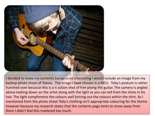
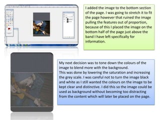
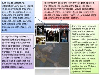
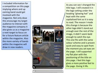
The document summarizes the process of designing a contents page for a magazine. It describes choosing a gray background color to avoid blank space and make the page more visually interesting. An image of a musician was selected from a photo shoot and adjusted to blend into the background without being distracting. Text elements like the title and section information were positioned according to the design plan. The title logo was modified to stand out better against the background images and colors.