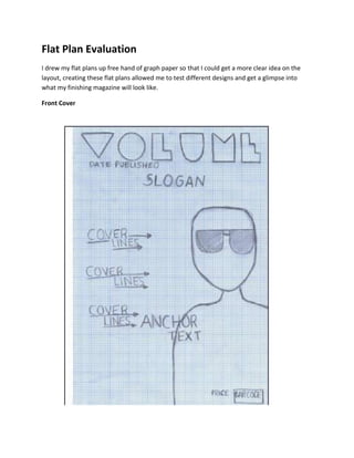
The document provides details on the flat plan evaluation for a music magazine called "Volume". Key points include:
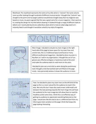
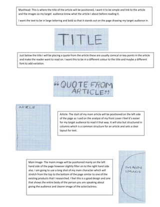
- The front cover features the magazine title "Volume" in an urban font, the main image is a mid-shot of an actor in sunglasses to draw readers in, and cover lines with arrows guide readers between the text and image.
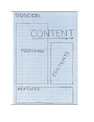
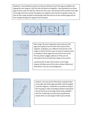
- The contents page positions the title overlapping the main image and uses arrows underneath for consistency. It also features the main image and white, easily readable text for the contents.
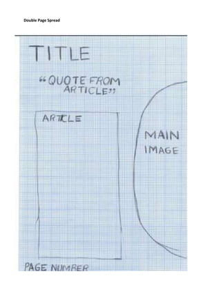
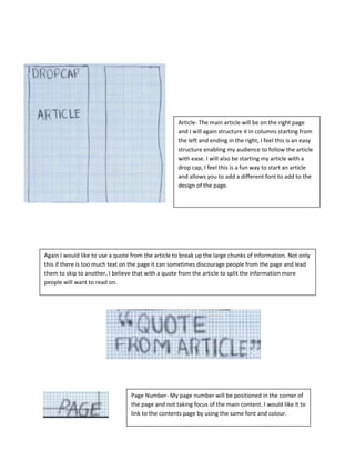
- The double page article spread positions the headline and quote above the columned text, with a full-length main image stretching across both pages. Page numbers are placed discreetly in


![Looking back at your preliminary task, what [autosaved]](https://cdn.slidesharecdn.com/ss_thumbnails/lookingbackatyourpreliminarytaskwhatautosaved-120503190551-phpapp02-thumbnail.jpg?width=640&height=640&fit=bounds)


