The document provides feedback on how to improve various pages of a draft magazine, including:
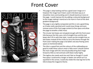
1) The front cover could stand out more by adding color to the main image and removing some compacted content to allow more spacing.
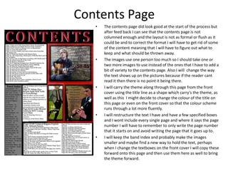
2) The contents page needs to be more formal with columns and some images/content could be replaced or modified for better readability.
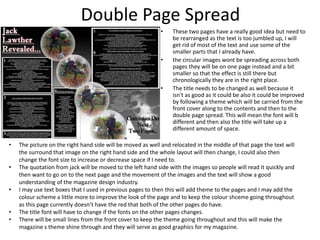
3) The double-page spread has too much jumbled text and could be improved by rearranging images and text onto separate pages, changing the title to follow a consistent theme, and incorporating more of the color scheme and design elements from other pages.


![Looking back at your preliminary task, what [autosaved]](https://cdn.slidesharecdn.com/ss_thumbnails/lookingbackatyourpreliminarytaskwhatautosaved-120503190551-phpapp02-thumbnail.jpg?width=640&height=640&fit=bounds)


