The document discusses three draft layouts for magazine contents pages and double page spreads. Draft 1 contents page uses blocks of color and images to showcase featured articles in a simple visual design. The double page spread uses a large central image and title to feature a celebrity interview. Draft 2 contents page focuses on pictures over text to clearly show what's included. The double page spread lines up columns of text over a full-width background image. Draft 3 contents page includes more text sections and linear organization, with the double page spread dividing the page into image sections for a photo shoot feel.
I conducted this research to generate ideas for my magazine ancillary task and to identify the elements of a magazine spread featuring a film review, that create a professional style.
I conducted this research to generate ideas for my magazine ancillary task and to identify the elements of a magazine spread featuring a film review, that create a professional style.
This is a brief presentation detailing the functions of such characteristics within the flat plan template for my G321 magazine product as well as of course the flat plan itself.
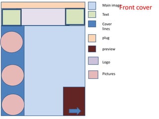
1. Main image
Front cover
Text
Cover
lines
plug
preview
Logo
Pictures
2. Draft 1 front cover
• This draft I think is very complicated however when it has pictures and
writing on it may look less busy. I like the layout of this one as all the
features that would be on a professional magazine such as a preview of
certain articles and pages in the magazine to get people to buy it has been
included. I have also thought about cover lines and where they would be
placed on a professional glossy magazine. I have placed the logo in the
middle of the page I am not sure whether a industry would place it here
and of its size as they would be more likely to put it on the left hand side.
The fact that there would be text placed either side of this logo is very
unusual and may distract from the main logo which would not be good.
There would be a main image placed directly in the middle of the page this
would fill up most of the front cover. On the top of the magazine the plug
would be included so on the newsstand this would be seen. In the circle
boxes pictures of the people included would be on here to give a sneak
peak into what's included.
3. Background
Main image
logo
images
text
Draft 2 front cover
4. Draft 2 front cover
• This front cover is in the middle of complicated and simple there is a lot of
layering of pictures and text on top of each other. The master head would
be behind the main image blending with the background. On the
background the cover lines would be written so they would have there
own text box this would be transparent. The light blue box there would be
a series of images of the band/singer the same picture of the same model
however they would be in different outfits and different poses. This would
give a photo shoot effect – I like this idea and think its effective even
though it takes up a lot of space but this front cover is more picture based
than text based which would make it stand out.
5. Main image
Logo
Cover lines
Draft 3 front cover
6. Draft three front cover
• This front cover I have based on the layout of a more expensive magazine
where it more simple with the main image taking centre stage. The image
on a more expensive magazine will be the only one and will be often be
stretched to fit the whole page – with as little other things on there as
possible. To get this layout to be successful the photo would have to be
detailed this is why this layout is common among fashion magazines. The
photo would have to be eye-catching not just by its size but in colour and
in styling. There will always be a logo on every magazine however on this
layout it isn't central being placed in the left hand corner. If there is any
cover lines there will be a limited amount so on my layout I’ve just added
on on the left hand side – this should not distract from the image though.
7. Contents
page 1
Title
Picture
Main image
Featured/co
ntent
8. Draft 1 contents page
• This contents page is very simple and I like this element of it the orange
section of it would be a main image so it would take up all of the page. On
a contents page writing other than the featured items are too busy and
distracting. The purple section is the section where what's included would
be placed. The blue boxes piled on top of another will be the word
‘contents’ broken up into three pieces I will do this because it makes the
title more appealing and forces you to read it as its enjambment onto
different lines. The pink circles will pictures of the model that will be
linked to the main image.
9. Background colour
Strip of colour
Title - contents
Pictures of
featured
Text of featured
Contents page 2
10. Draft 2 contents page
• This contents page layout I like because it is more picture based to reveal
what's featured in the magazine rather than a lot of text. The only bit of
detail or design is the strip of colour this makes it very simple but clear to
understand. The yellow boxes will be pictures to what articles/
competitions and interviews will be in the magazine. My choice to do this
visually gives a professional outlook on the contents page as people only
flick through on the newsstand if they see straight away what they will be
getting they are more likely to buy it.
11. Background
colour
Image
Title
Text –
featured
Contents page 3
12. Draft 3 contents page
• This contents page includes more text based with only a big main image
on the left hand side and two little images at the top of the page. The
amount of yellow boxes is the text and this is separated by the orange
lines this is done if the magazine is split into sections and makes it more
organised. This layout is very neat and I think its effective if the right
images are taken / chosen. Everything in the layout is very linear.
13. Background Main image Text
colour
Double page spread 1
Quote from ‘celeb’
14. Draft layout of double page spread 1
This layout is based on a more expensive magazine that you would see
this layout of a double page spread – its very simple and pictorial. The
main image takes up over half of the double page and this would
normally be done if there was a interview with a celeb as there face
would be bigger than the title. The title would either be a quote they
have said and this also would be quite big. The dark red box would be the
introduction to the interview – for example giving an insight into their
history and their job which is in the public eye. I quite like this layout of
an interview based feature. Its not over complicated but doesn’t have a
range of pictures which I think a interview would need to highlight how
far they have come this gives a the reader a emotional link with the
interview to the person they are reading.
16. Draft layout of double page spread 2
• This double page spread is also very article / interview based and is
picture based to. The image would take up all of the page and then the
writing or columns would be placed over this – again a very simple way of
presenting a feature. But this very popular choice within the industry gives
a glossy and expensive feel to the magazine. With the columns being
placed side by side it allows you to read over and fluently without a
picture breaking it off.
17. Text Background image
colour
Double page spread 3
18. Double page spread 3
• This double page spread is very over complicated but this works because it
gives the opportunity to display a lot of pictures. Along the top of the page
it is cut into sections this is where pictures will go to give a photo-shoot
feel to the page the model will only change clothes or pose but this
feature as I have been researching is used quite frequently in fashion
magazines but it gives a nice visual display and could be applied to a music
magazine just as well. The blue boxes will be the text – in columns and are
placed aligned and neatly demonstrated this is good for long interviews or
articles – as text is placed neatly and chunked. The long orange box
represents a image of the ‘celeb’ – it would be a body shot.