This document provides a comparison of the preliminary products created by the author for a college magazine assignment versus the final products created for an indie music magazine. For the preliminary products, elements like the masthead, main image, color scheme, plug, fonts, layout, and lack of skyline/footer were basic and unconventional. The final products showed more sophisticated and professional design choices across all elements that better represented the target audience and genre. These included a simpler masthead, improved main image with lighting and posing, coordinated color scheme, more appealing plug placement and design, varied yet cohesive fonts, balanced layout, and addition of a header to grab attention.
Ajaran ldii menyimpang, ajaran ldii yg sesat, ajaran ldii sesat, ajaran ldii menurut mui, ajaran ldii menurut islam, ajaran ldii yang menyimpang, ajaran ldii yang dianggap sesat, ajaran ldii menyesatkan, ajaran ldii yang menyesatkan, ajaran dasar ldii, ajaran dalam ldii
LDII memiliki tiga target untuk suksesnya generasi peneru yaitu, alim(berilmu) dalam hal agama, berakhlaqul karimah, dan mandiri. Berbekal dari itu maka LDII Sidoarjo menggelar acara bazaar guna mencapai sukses yang ketiga yaitu mandiri.
No-Code SAML Support for SaaS Applications with StormpathLindsay Brunner
In this presentation, Stormpath Product Lead, Tom Abbott, will Stormpath SAML support gives your customers a seamless single sign-on experience, enhances user profiles with Stormpath Identity functionality, and enables SAML in your applications without custom code.
You Can't Spell Enterprise Security without MFA Ping Identity
Sure, you can spell enterprise security without the letters M-F-A, but the modern digital enterprise isn't as secure without a strong multi-factor authentication (MFA) strategy. Enterprises are under attack, and credentials are a primary target. Many leading enterprises are enhancing their security and control with MFA, allowing them to move away from a high-risk, password-based security approach and to give their employees, partners, and customers a better user experience. View this slide deck for best practices for a MFA strategy.
Presentatie ontbijtsessie inergy 22 maart 2016Daniëlle Pels
De rol van CFO is ingrijpend aan het veranderen. De business neemt geen genoegen meer met rapportages over het verleden maar heeft veel meer behoefte aan een blik op de toekomst. Ondersteunen van groei, het verbeteren van de organizational performance en kostenreductie zijn belangrijke doelen geworden van de CFO office. Thema’s als digitalisering, automatisering en efficiënt gebruiken van data staan prominent op uw agenda. Om relevant te blijven voor de business is het van cruciaal belang om het resultaat en de business waarde van betrouwbare data-analyse op een leesbare, toegankelijke manier te presenteren. Actionable! Maar hoe kunt u snel en effectief met uw data experimenteren? Hoe zet u enorme hoeveelheden data om in leesbare dashboards? In business cases? In vervolgacties? Op dinsdagochtend 22 maart presenteren Inergy en IBM in anderhalf uur drie klinkende business cases.
Wij zijn ervan overtuigd dat succes geen toeval is. Beter gefundeerde beslissingen op basis van big data, leiden tot beter resultaat. Voor veel CFO’s is de vraag ook niet óf ze aan de slag moeten met analytics en Business Intelligence, maar hoe ze moeten beginnen. En precies op die vraag geven wij u graag een antwoord. We laten aan de hand van concrete praktijkvoorbeelden zien dat klein beginnen vaak de sleutel is. En wie eenmaal aan de slag is, bouwt van daaruit gemakkelijk verder.
7+1 Consejos que Ayudaran a Proteger la Red de Computadoras de tu Empresaservidoresdedic
La seguridad de la red de computadoras de una empresa debe tomarse en serio ante las posibles amenazas internas, por ello aquí hay algunas precauciones que debe tomar, ya sea una pequeña o gran empresa.
Português - VideoAula Sobre Novo Pontuação. Cadastre-se em nosso site para receber em seu e-mail nosso material dessa videoaula : www.videoaulagratisapoio.com.br - contato@videoaulagratisapoio.com.br ou ligue: 21 2267-6443 ou 9350-3004
Read| The latest issue of The Challenger is here! We are thrilled to announce that our school paper has qualified for the NATIONAL SCHOOLS PRESS CONFERENCE (NSPC) 2024. Thank you for your unwavering support and trust. Dive into the stories that made us stand out!
Introduction to AI for Nonprofits with Tapp NetworkTechSoup
Dive into the world of AI! Experts Jon Hill and Tareq Monaur will guide you through AI's role in enhancing nonprofit websites and basic marketing strategies, making it easy to understand and apply.
Palestine last event orientationfvgnh .pptxRaedMohamed3
An EFL lesson about the current events in Palestine. It is intended to be for intermediate students who wish to increase their listening skills through a short lesson in power point.
Synthetic Fiber Construction in lab .pptxPavel ( NSTU)
Synthetic fiber production is a fascinating and complex field that blends chemistry, engineering, and environmental science. By understanding these aspects, students can gain a comprehensive view of synthetic fiber production, its impact on society and the environment, and the potential for future innovations. Synthetic fibers play a crucial role in modern society, impacting various aspects of daily life, industry, and the environment. ynthetic fibers are integral to modern life, offering a range of benefits from cost-effectiveness and versatility to innovative applications and performance characteristics. While they pose environmental challenges, ongoing research and development aim to create more sustainable and eco-friendly alternatives. Understanding the importance of synthetic fibers helps in appreciating their role in the economy, industry, and daily life, while also emphasizing the need for sustainable practices and innovation.
2024.06.01 Introducing a competency framework for languag learning materials ...Sandy Millin
http://sandymillin.wordpress.com/iateflwebinar2024
Published classroom materials form the basis of syllabuses, drive teacher professional development, and have a potentially huge influence on learners, teachers and education systems. All teachers also create their own materials, whether a few sentences on a blackboard, a highly-structured fully-realised online course, or anything in between. Despite this, the knowledge and skills needed to create effective language learning materials are rarely part of teacher training, and are mostly learnt by trial and error.
Knowledge and skills frameworks, generally called competency frameworks, for ELT teachers, trainers and managers have existed for a few years now. However, until I created one for my MA dissertation, there wasn’t one drawing together what we need to know and do to be able to effectively produce language learning materials.
This webinar will introduce you to my framework, highlighting the key competencies I identified from my research. It will also show how anybody involved in language teaching (any language, not just English!), teacher training, managing schools or developing language learning materials can benefit from using the framework.
June 3, 2024 Anti-Semitism Letter Sent to MIT President Kornbluth and MIT Cor...Levi Shapiro
Letter from the Congress of the United States regarding Anti-Semitism sent June 3rd to MIT President Sally Kornbluth, MIT Corp Chair, Mark Gorenberg
Dear Dr. Kornbluth and Mr. Gorenberg,
The US House of Representatives is deeply concerned by ongoing and pervasive acts of antisemitic
harassment and intimidation at the Massachusetts Institute of Technology (MIT). Failing to act decisively to ensure a safe learning environment for all students would be a grave dereliction of your responsibilities as President of MIT and Chair of the MIT Corporation.
This Congress will not stand idly by and allow an environment hostile to Jewish students to persist. The House believes that your institution is in violation of Title VI of the Civil Rights Act, and the inability or
unwillingness to rectify this violation through action requires accountability.
Postsecondary education is a unique opportunity for students to learn and have their ideas and beliefs challenged. However, universities receiving hundreds of millions of federal funds annually have denied
students that opportunity and have been hijacked to become venues for the promotion of terrorism, antisemitic harassment and intimidation, unlawful encampments, and in some cases, assaults and riots.
The House of Representatives will not countenance the use of federal funds to indoctrinate students into hateful, antisemitic, anti-American supporters of terrorism. Investigations into campus antisemitism by the Committee on Education and the Workforce and the Committee on Ways and Means have been expanded into a Congress-wide probe across all relevant jurisdictions to address this national crisis. The undersigned Committees will conduct oversight into the use of federal funds at MIT and its learning environment under authorities granted to each Committee.
• The Committee on Education and the Workforce has been investigating your institution since December 7, 2023. The Committee has broad jurisdiction over postsecondary education, including its compliance with Title VI of the Civil Rights Act, campus safety concerns over disruptions to the learning environment, and the awarding of federal student aid under the Higher Education Act.
• The Committee on Oversight and Accountability is investigating the sources of funding and other support flowing to groups espousing pro-Hamas propaganda and engaged in antisemitic harassment and intimidation of students. The Committee on Oversight and Accountability is the principal oversight committee of the US House of Representatives and has broad authority to investigate “any matter” at “any time” under House Rule X.
• The Committee on Ways and Means has been investigating several universities since November 15, 2023, when the Committee held a hearing entitled From Ivory Towers to Dark Corners: Investigating the Nexus Between Antisemitism, Tax-Exempt Universities, and Terror Financing. The Committee followed the hearing with letters to those institutions on January 10, 202
Francesca Gottschalk - How can education support child empowerment.pptxEduSkills OECD
Francesca Gottschalk from the OECD’s Centre for Educational Research and Innovation presents at the Ask an Expert Webinar: How can education support child empowerment?
Macroeconomics- Movie Location
This will be used as part of your Personal Professional Portfolio once graded.
Objective:
Prepare a presentation or a paper using research, basic comparative analysis, data organization and application of economic information. You will make an informed assessment of an economic climate outside of the United States to accomplish an entertainment industry objective.
Biological screening of herbal drugs: Introduction and Need for
Phyto-Pharmacological Screening, New Strategies for evaluating
Natural Products, In vitro evaluation techniques for Antioxidants, Antimicrobial and Anticancer drugs. In vivo evaluation techniques
for Anti-inflammatory, Antiulcer, Anticancer, Wound healing, Antidiabetic, Hepatoprotective, Cardio protective, Diuretics and
Antifertility, Toxicity studies as per OECD guidelines
Honest Reviews of Tim Han LMA Course Program.pptxtimhan337
Personal development courses are widely available today, with each one promising life-changing outcomes. Tim Han’s Life Mastery Achievers (LMA) Course has drawn a lot of interest. In addition to offering my frank assessment of Success Insider’s LMA Course, this piece examines the course’s effects via a variety of Tim Han LMA course reviews and Success Insider comments.
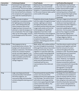
1. Convention PreliminaryProducts Final Products Justification/Development
Masthead Positionedinthe toplefthand
side of the page,whichis fairly
conventional. The fontwastaken
froma fontgeneratorwebsiteon
the internetandfroma distance
the complexityof itsappearance
may make the mastheadhardto
read.
Mastheadwas createdthrough
Photoshop.Usesconventional
typographyandcolourscheme for
the genre.It’spositionedtothe top
of the screenhowevertakesupthe
entire widthof the page.
My mastheadonmyfinal front
coverwas more sophisticated.It
betterrepresenteditstarget
audience andalsousedthe
contrastingcoloursof blackand
white insteadof the brightyellow
seeninthe college magazine
masthead.
Main Image No directmode of address
established,inconsistencywithin
the lightinganduninteresting
pose.Little editingwithinthe
colourshoweverpartsof the
image have beenremovedinan
attemptto make the background
lesscomplicated.The mainimage
takesup the whole page,andacts
as the backgroundfor the entire
frontcover.
Establishesdirectmode of address
withthe readersthroughdirecteye
contact. Lightingisconsistent
throughoutthe photo,andthe
increasedcontrastmeansthe main
image reallystands outfromthe
white background.Significant
adaptationshave beenmade
withinPhotoshop,withchangedof
colour,saturationandbrightness
as well asthe improved
complexionthatthe coverstar
displays.Interestingpose whichis
lessformulaic.
The main image onmy frontcover
looksformore professional,and
standsout meaningreadersare
more likelytobuythe magazine.I
learntthat eye contactwas
essential ingrabbingthe reader’s
attention.A seriouspose suitedthe
genre of my magazine andthe
pose itself wasslightlymore
interestingthanthatshownon the
college magazine.Bothre
examplesof mediumclose up
shots.
Colourscheme There appearsto be no
coordinatedcolourscheme.The
backgroundisdesaturatedand
displaysasepiatone.The feature
storiesare a varietyof colours
and do notmatch togetherinan
organisedorcreative way.Bright
coloursprobablysuitedforthe
target audience asitwasa
college magazine.
Black,white,pink,yellow andblue
are seenthroughoutmyproducts.
Althoughthese coloursmaynotbe
totallyconventional,theywork
togetherina waythat makesthe
contentvisuallyinterestingwhilst
alsomaintainingaprofessional
appeal,andnot lookinglikea
children’smagazine.The black,
white andredusedwithinthe
mastheaditself are very
representative of the indierock
genre.
I feel the coloursusedinmyfinal
productsworktogetherwell and
that the inclusionof acolour
scheme throughoutthe three
productsis vital.The yellow maybe
consideredmore of amasculine
colourwiththe pinkbeing
consideredmore of afeminine
colour.However,mymagazine
usesan array of coloursas it
choosestoavoidthe traditional
colours associatedwithmasculinity
and femininityasmytarget
demographicisyoungand
therefore perhapsmore open
mindedtocreative freedom.
Plug Large oval shape positioned
unconventionallyinthe bottom
leftof the magazine.Un-
necessarilylarge andsomewhat
uninterestingwithaboringuse of
colours.
Placedtowardsthe topleftof the
screen,lessintrusive of the
backgroundand more appropriate
size andshape.The colourslinkin
withothersonthe page and the
textismore appealingwithbright
outline andstroke effects.The
visual appearance of the
typographyismore interesting
withchangesinthe size and font.
The plugis far more effectiveon
my final frontcoveranddoesn’t
lookout of place withthe restof
the magazinesfeatures.Ilearnt
that a plughas to be catchy and
therefore drasticallyimprovedthe
wayin whichisdesignedthem
frommy preliminarytasktomy
final products.
2. Fonts The fontson my frontcoverare
all the same,but capitalisation is
usedinattemptto highlight
certainwords,howeveritisused
inan irrational mannerand
doesn’tseemeffective.
UsingPhotoshop,myfonts are
more visuallyappealingtothe
reader.The fontsare consistent
throughoutthe frontcover,
althoughmaybe emboldenedor
editeddifferentlytocreate a more
visuallyinterestingcomposition.
The size and lookof the fontson
my initial tasklookedverysimilar
throughoutthe whole page.
However,myfinal frontcover
displaysdifferentsizesandspacing
gradientstomake the more
importantfeaturesstandoutina
subtle way.
Layout Extremelybasicwithvery
conventional featuressucha
skyline andheadermissing
completely.Coverfeaturesdown
one side withthe otherside
lookingverybare.
Layout isorganisedandfollowsa
structure withcontentsurrounding
the mainimage,without
obstructingittoo much.Textis
made to fill the space onthe cover,
and cohesivelylinkswiththe main
image to create a visuallyintriguing
composition.Contentisheavy,
howeverthe page doesnotfeel
overcrowded.
The front coverof mypreliminary
college magazine wasfartoobasic
and manywouldargue itis barely
recognisable asajustifiable
magazine frontcover.IknewI had
to make my musicmagazine cover
far more contentfocused,however
I feel Iachievedagoodbalance
betweenbeingtoobasicandtoo
complex.
Skyline and
footer
My preliminary magazinefront
coverdisplayedneitheraskyline
nor footer.Thisledtoa verybasic
cover,and ledtoa verypoor
qualityfinish.
My musicmagazine coverdisplays
a header.The colourof the header
contraststhe backgroundand
makesthe headerstandout.The
headercontainscontentwhichis
heavilyiconicof the indie genre,
helpingtoestablishanareaof
interestforthe readersandgrab
people’s attention.
My preliminary taskshowedno
headeror footer. Thismeantthe
coverwas visuallylessappealing.
On the otherhand,my music
magazine displaysaheader
specificallytoserve the purpose of
grabbingthe reader’sattention
and drawingfocusto the restof
the magazine.Idecidednotto
include footerinmymagazine
because the informationthe footer
wouldcontainwasdisplayedina
differentformonthe page.
However,myprelimamrytaskhad
no alternative toeitherof the
features.
Secondary
Images
My preliminarytaskshowedno
otherimagesonthe front cover
page.
My musicmagazine alsoshowed
no otherphotographyonits front
cover.
Thiswas a consciousdecision,
especiallyformymusicmagazine,
as I tookinspirationfrom
magazinessuchas Q where the
mainimage isthe onlyimage.This
placesmore emphasisonthe main
image.
3. Background The main image isspreadacross
the entirelyof the page,meaning
the backgroundinthe medium
close upof the coverstar iswhat
makesup the backgroundof the
magazine.Ifeltthiswascreative
as the time,howeverthe
complexityof the background
make the texthard to readand
perhaps made the whole
magazine lookslightly
amateurish.
The backgroundfor my magazine
was totallywhite.Thiscontrasted
withthe colourful textandalsothe
brightblue colourpresentinthe
mainimage.
Conventionally,afrontcoverof a
magazine displaysamediumclose
up photowhichisplacedona plain
background.Therefore,Ifeelthe
backgroundof my musicmagazine
frontcover wasmore conventional,
and allowedmymainimage to
standout more.
Photography
Props No propswhere usedinanyof
the photographsI tookto use for
my preliminary task.Iwas
unaware of the effectivenessof
themat the time.
No propswhere usedonmyfront
cover,howeveraguitarwas used
on mydouble page spread.A guitar
representsthe genre of music,and
isa commonprop seenthroughout
existingproductswithinthe Indie
rock genre.
Priorto creatingmy music
magazine,Idecidedtoresearchthe
use of propswithinexisting
magazinesof the same genre. Ifelt
thiswouldmake mymagazine
more attractive to my target
audience.
Camera The photoswere takenfrommy
phone at the time whichwasan
iPhone 5.
The photosfor my double page
spreadwhere takenwithmynewer
phone,the iPhone 6s.
Afterconcludingthata physical
camera wasproblematicandless
convenient,Iestablishedmy
iPhone tookgoodenoughquality
photosto use for myfinal media
products.ObviouslyasIupgraded
my phone model,the qualityof the
imageswentupslightly.
Sharpness The image was outof focusand
noticeablyblurry.
The imagesseeninmyproducts
are all infocusand not blurry.This
ledto a more professional looking
magazine.
The advancements inhardware
helpedthe sharpnessof myphotos
improve;howeverI became more
patientwhentakingthe photosfor
my final products,andtherefore
the consistencyof themimproved
greatly.
Framing The image was a mediumclose
up withthe modelsshoulders
beingcutoff at the bottomof the
page.
My image forthe frontcover was
alsoa mediumclose up.Thiswas
conventional of manymusic
magazines.
The image on my final frontcover
was muchlarger,and filledthe
space more effectivelywhen
comparedto the mainimage on
the front coverof the college
magazine.
Mise-En-Scene
Costume The magazine model waswearing
a white t shirtand a leather
jacket. Little emphasiswasplaced
uponthe costume inthe
preliminarytaskdue tothe
editingwhichdidn’tmake itstand
out.The costume alsohaslimited
visibilitywithverylittleof it
actuallyshownof the frontcover.
My final frontcovermakesthe
costume almostunrecognisable,
withthe editingmakingthe
clothingpurelyblack.Onthe other
hand,my otherproductssuch as
contentspage and DPSshow many
examplesof conventional clothing
such a denimjacketsandleather
jackets.
I feltthe clothingchoiceshadtobe
thoughtaboutgreatlybefore the
creationof my products.In my
opinion,the clothinghadtobe
representative of the genre and
currentartist – there was a distinct
lack of emphasisinmypreliminary
tasks.
4. Hair The hair of myfemale model in
my firstcoverwasn’tgivenany
thought.
The hair of mycover star isone
whichisreasonablycommonin
today’sworld.Thismakesthe main
image more relatable tomyyoung
demographicasyoungadultsand
teenagersare mostlikelyveryup
to date withcurrent fashion
trends.My coverstar also had
facial hair,helpinghimfulfil the
male stereotype of ruff andrugged.
Whenchoosingmymodelsformy
products,I realisedIneededa
range of haircutsinorder to
representcurrentartists,wholike
to lookunique inordertogain
publicityandappeardifferentfrom
otherartists.The hair of an
individualonmycontentspage
was made deliberatelymessyto
reflectthe pose he wasup taking;
hishair wasmessy,perhaps
alludingtoa more confrontational
personality. Thiswasalsohintedat
inthe correspondingtext.
Facial
Expressions
The model wassmilingandalso
had hereyesclosed.Thisdidn’t
make for a professionappeal,but
the smile wassomewhat
representative of college life,asa
college magazine wouldwant to
promote college assomewhere
enjoyable.
The cover star wasveryseriousand
displayedanalmostomniscient
look.Thiswasmore relatable to
the target audience,whoviewrock
and roll as a serioussubject.
I found,whenresearchingexisting
indie rock magazines,thatfacial
expressionswhereveryoftenlight
heartedandmore serious.Thisis
how in mytransitiontosmiley
model toserious,somewhat
arrogant lookingmodel.