Download to read offline

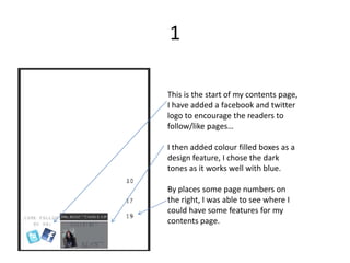
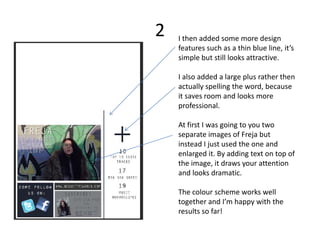
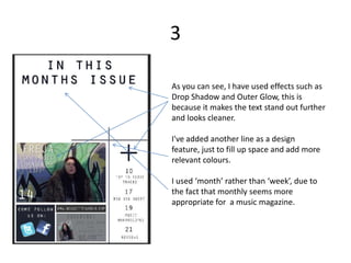

1. The document describes the process of designing a contents page for a magazine, adding various design elements like colored boxes, lines, images, and logos to make it look more professional and finished. 2. Revisions were made such as changing colors to be lighter and more readable, removing Facebook/Twitter logos and replacing with simpler logos, and adjusting images and text sizes to fit additional content. 3. The final version has additional articles, photos, contact information, issue numbering, and other elements to create a polished, fully-designed contents page.


