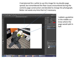
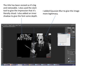
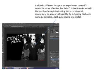
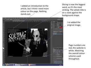
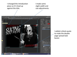
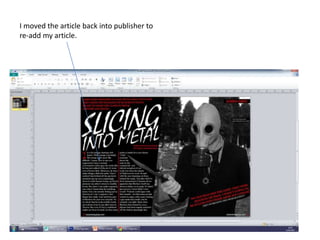
I had planned for a while to use this image for my double page
spread, but remembered the floor issues encountered during the
contents page construction and decided to change the photograph.
Better not waste any time that isn’t necessary.
I added a guideline
in the middle so I
knew where the
page would split in
half.
The knife held out will cross into the
other page. Although I am
concerned that it’s too prominent
and may be a problem, but it’s hard
to say without trying it out first.
This image is a more conventional shot. I
need to add a new background as the
double page spread is going to appear to
be extremely empty without anything
behind him.
I altered the image so that it is in black
and white, the same as the front cover.
I went selected the lenses using the magnetic lasoo tool, then
adjusted the brightness and contrast till the eyes had been fully
darkened, the same as the front cover. I did the same for the next
eyes too.
I added a rectangle to place the text upon.
I added the page numbers,
which match the articles
location on the contents page.
I placed a background
behind the image. I need to place the page
numbers symmetrically.
I adjusted brightness and contrast to
make the background more visually
appealing.
The background is black and white
now to match the image.
I added a title to the
left, which obviously
needs resizing and
editing.
The image was
resized to bring
more focus
onto him.
I changed the right
page number to red,
but it is too difficult
to read so needs
changing.
The title has been resized so it’s big
and noticeable. I also used the slant
tool to give the impression that it’s
literally sliced. I also added an inner
shadow to give the font some depth.
I added Gaussian Blur to give the image
more legitimacy.
I duplicated the image and deleted
half of it, leaving only the upper half.
I added extra blur to this part, given
the background a layer of depth that
further increases the focus on James
Grey as well as make the image
more realistic
I added a different image as an experiment to see if it
would be more effective, but I don’t think it works as well.
Rather than being intimidating like in most metal
magazines, he appears almost like he is holding his hands
up to be arrested… Not quite slicing into metal.
I added an introduction to the
article, but I think I need more
colour on the page. Nothing
stands out.
I re-added the
original image.
Page numbers are
red, the website is
white. Matching
the overall colour
scheme used
throughout.
Slicing is now the biggest
word, as it’s the most
striking. The whole title is
on a slant against the
background shape.
I changed the intro to a red, given the
double page spread more colour.
I added a small feature
title so the audience is
aware this is definitely
the “James Grey” piece.
I added a border
around the
page, but it just
looks intrusive.
I changed the introduction
piece so it’s lined up
against the title.
I made some
slight width and
size adjustments.
I added a block quote
to make the double
page spread look
busier.
I added a large letter for
the article beginning. The
lines are guidelines to keep
it symmetrical.
The line separates the
article in the middle
A note that lists
who wrote the
article and took
the pictures for
the audience
(not legitimate).
I added a small
note
underneath to
list who said
the quote.
I changed the first letter to
the chiller font and increased
the size.
I added my article through
publisher, as spelling and
grammatical errors are more
easily noticed.
I changed the colour to a
brighter red so it’s more
prominent.
A small note to
describe the image.
The block quote is
now in bold and
slightly larger. I
moved it fully
behind James so
it’s more readable.
I moved the article back into publisher to
re-add my article.

Double page spread construction

  • 1.
    I had plannedfor a while to use this image for my double page spread, but remembered the floor issues encountered during the contents page construction and decided to change the photograph. Better not waste any time that isn’t necessary. I added a guideline in the middle so I knew where the page would split in half.
  • 2.
    The knife heldout will cross into the other page. Although I am concerned that it’s too prominent and may be a problem, but it’s hard to say without trying it out first. This image is a more conventional shot. I need to add a new background as the double page spread is going to appear to be extremely empty without anything behind him.
  • 3.
    I altered theimage so that it is in black and white, the same as the front cover.
  • 4.
    I went selectedthe lenses using the magnetic lasoo tool, then adjusted the brightness and contrast till the eyes had been fully darkened, the same as the front cover. I did the same for the next eyes too.
  • 5.
    I added arectangle to place the text upon.
  • 6.
    I added thepage numbers, which match the articles location on the contents page. I placed a background behind the image. I need to place the page numbers symmetrically.
  • 7.
    I adjusted brightnessand contrast to make the background more visually appealing. The background is black and white now to match the image.
  • 8.
    I added atitle to the left, which obviously needs resizing and editing. The image was resized to bring more focus onto him. I changed the right page number to red, but it is too difficult to read so needs changing.
  • 9.
    The title hasbeen resized so it’s big and noticeable. I also used the slant tool to give the impression that it’s literally sliced. I also added an inner shadow to give the font some depth. I added Gaussian Blur to give the image more legitimacy.
  • 10.
    I duplicated theimage and deleted half of it, leaving only the upper half. I added extra blur to this part, given the background a layer of depth that further increases the focus on James Grey as well as make the image more realistic
  • 11.
    I added adifferent image as an experiment to see if it would be more effective, but I don’t think it works as well. Rather than being intimidating like in most metal magazines, he appears almost like he is holding his hands up to be arrested… Not quite slicing into metal.
  • 12.
    I added anintroduction to the article, but I think I need more colour on the page. Nothing stands out. I re-added the original image. Page numbers are red, the website is white. Matching the overall colour scheme used throughout. Slicing is now the biggest word, as it’s the most striking. The whole title is on a slant against the background shape.
  • 13.
    I changed theintro to a red, given the double page spread more colour. I added a small feature title so the audience is aware this is definitely the “James Grey” piece. I added a border around the page, but it just looks intrusive.
  • 14.
    I changed theintroduction piece so it’s lined up against the title. I made some slight width and size adjustments. I added a block quote to make the double page spread look busier.
  • 15.
    I added alarge letter for the article beginning. The lines are guidelines to keep it symmetrical. The line separates the article in the middle A note that lists who wrote the article and took the pictures for the audience (not legitimate). I added a small note underneath to list who said the quote.
  • 16.
    I changed thefirst letter to the chiller font and increased the size. I added my article through publisher, as spelling and grammatical errors are more easily noticed.
  • 17.
    I changed thecolour to a brighter red so it’s more prominent. A small note to describe the image. The block quote is now in bold and slightly larger. I moved it fully behind James so it’s more readable.
  • 18.
    I moved thearticle back into publisher to re-add my article.